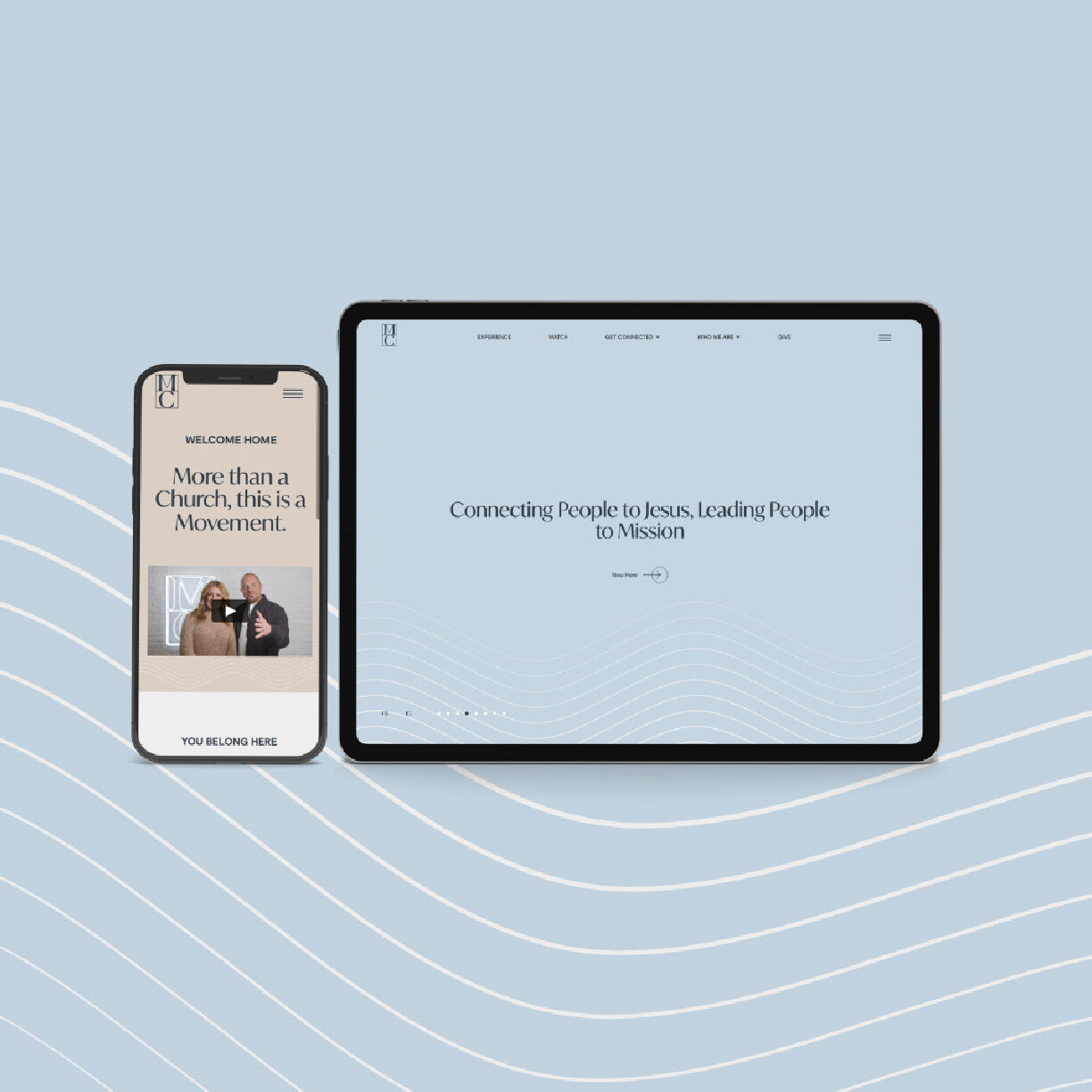
text1movement-churchThe identity is built on waves—the ocean as a stand-in for the movement of God's presence, straight from their own brief: "waves in the ocean as the waves of God's presence, and also symbolizes movement." No red, no orange, nothing that read as churchy or corporate—their words, not ours. The result leans into their coastline: Orange County clean, not a surf shop, not buttoned-up. Their own language carried the rest of it: Find Jesus. Find Mission. Be the Movement. With the identity locked, we went back to the website build—Lottie animation to keep the graphics moving without slowing the site down, and a custom scroll on the homepage we're still proud of.
![]()
![]()