Kalee Bernard had a finished manuscript, five years in the making, and a fixed launch deadline—but no brand, no site, and no way to sell the book yet.
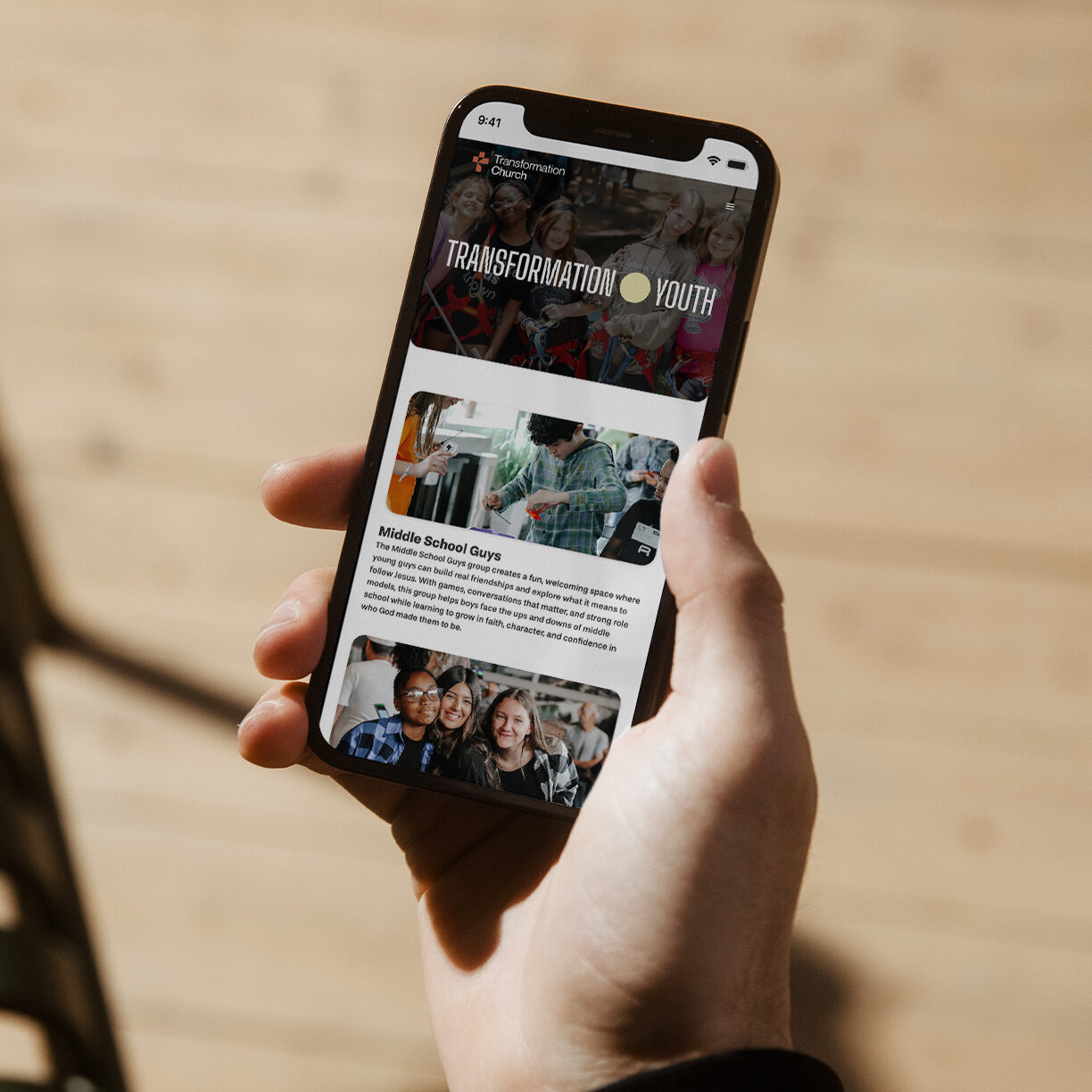
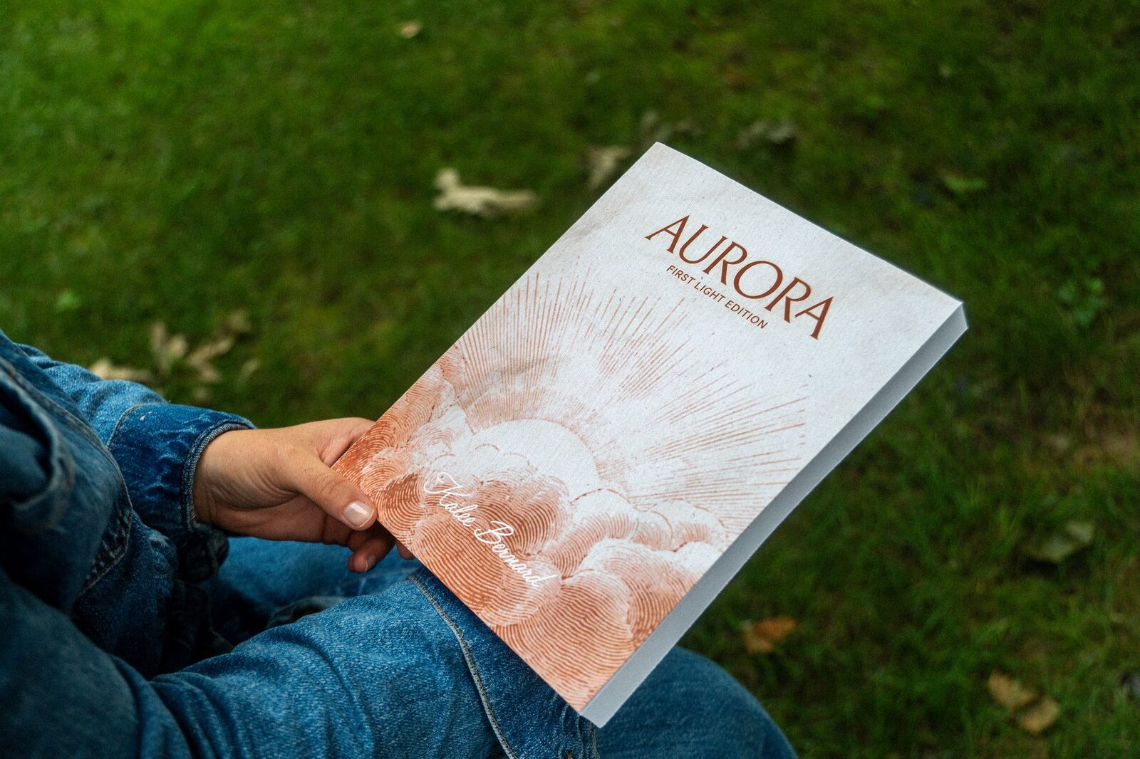
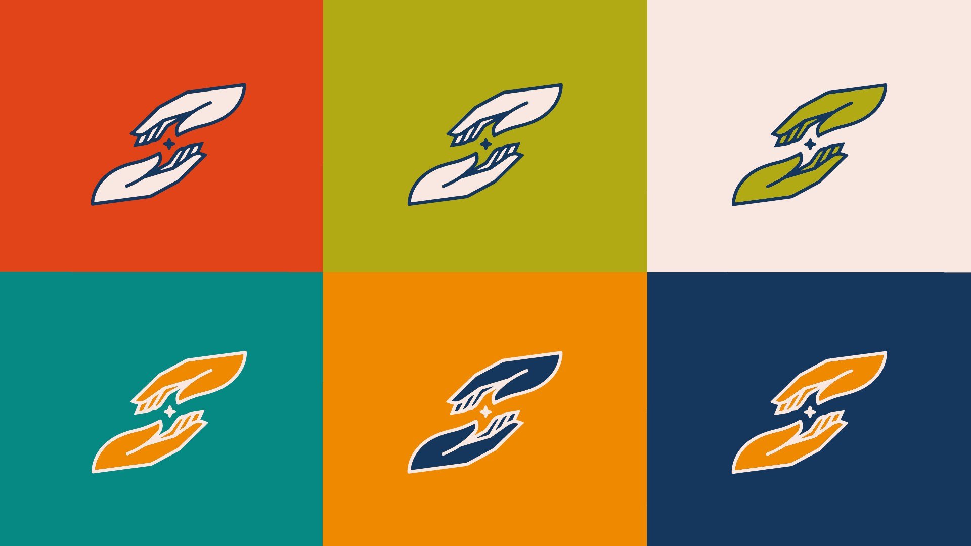
Aurora started as a manuscript with no visual language. We built the brand from the ground up: a custom wordmark, a warm nine-color palette, and a historical engraving illustration style that carries through the book's own chapter art. From there, the identity had to hold up across formats that don't normally share a system—a 212-page printed interior in two bindings, a Webflow website and checkout, email, and social—without drifting.
The launch itself ran through a waitlist: a personal, non-marketing announcement email went out to readers who signed up ahead of release, timed around Kalee's appearance at the "Dear Girls" conference in Memphis.
Rather than a one-off logo handoff, we built Aurora as a living brand system—colors, type, voice, and usage rules organized into a reference hub—so the book, the site, and every email stay consistent as Kalee's team keeps creating without us in the room.