Three locations were opening under one new identity built around a campaign line, A Gym For Everybody. Partway through the rollout, co-founder Ashley Williams flagged that the collateral read the campaign as the headline: “the collateral pieces currently read as if 'A Gym For Everybody' is more of a title than a slogan, as 'The League' feels secondary and small in the present design scheme.”
Before the campaign had a look, it needed a line. Four name-and-tagline options went to the client with the moodboard directions; the team voted, 3-2, for the one that didn't try to sound clever—and paired it with an audience insight (35–45, $125k+ household income, lululemon-adjacent) that shaped the winning visual direction too.
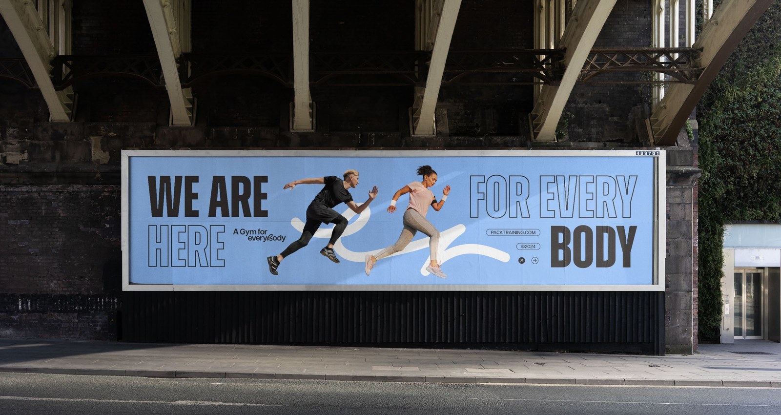
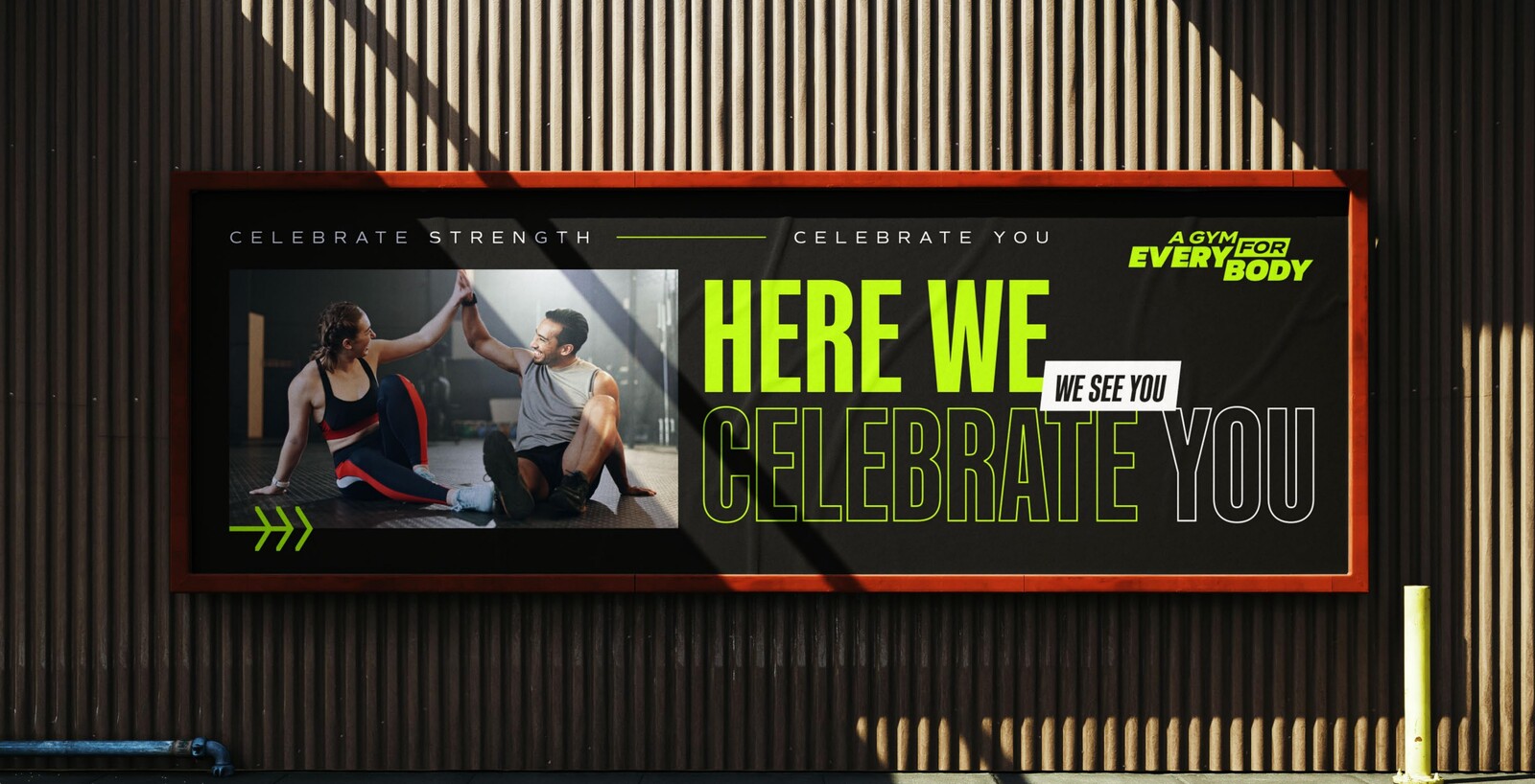
Alongside the naming vote, the client reviewed two full campaign-identity directions built around The League's existing ant mark—lockup, palette, type, and applications carried through to an on-site billboard mockup for each. Direction 01 leaned civic and celebratory; Direction 02 leaned inclusive and direct. One of them shipped.
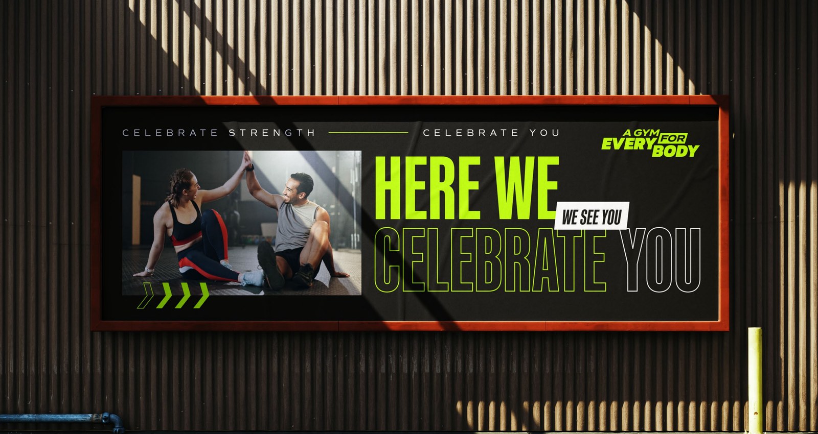
 https://assets.yellowboxcreative.agency/clients/the-league/agfe-brandkit-d1-logo-lockup-w1600.jpeg | The lockup, reversed on black and neon green
https://assets.yellowboxcreative.agency/clients/the-league/agfe-brandkit-d1-palette-w1600.jpeg | Neon Green, Jet Black, Off-White, Flame
https://assets.yellowboxcreative.agency/clients/the-league/agfe-brandkit-d1-typography-w1600.jpeg | Kaneda Gothic Bold — big enough to read from the parking lot
https://assets.yellowboxcreative.agency/clients/the-league/agfe-brandkit-d1-social-mockup-w1600.jpeg | “We see you” — the celebration, in the feed
https://assets.yellowboxcreative.agency/clients/the-league/agfe-brandkit-d1-apparel-mockup-w1600.jpeg | On a hoodie and a bag, not just a wall
https://assets.yellowboxcreative.agency/clients/the-league/agfe-brandkit-d1-cap-mockup-w1600.jpeg | On a cap — team gear for showing uphttps://assets.yellowboxcreative.agency/clients/the-league/agfe-brandkit-d2-logo-lockup-w1600.jpeg | The same wordmark, softened and wider
https://assets.yellowboxcreative.agency/clients/the-league/agfe-brandkit-d2-palette-w1600.jpeg | Charcoal, Orange, Apricot, Pearl, Silver, Lime, Cornflower
https://assets.yellowboxcreative.agency/clients/the-league/agfe-brandkit-d2-typography-w1600.jpeg | Zuume Bold — rounder, more direct
https://assets.yellowboxcreative.agency/clients/the-league/agfe-brandkit-d2-social-mockup-w1600.jpeg | “We're a gym for every body” — the invitation, in the feed
https://assets.yellowboxcreative.agency/clients/the-league/agfe-brandkit-d2-apparel-mockup-w1600.jpeg | On a hoodie and a bag, every body included
https://assets.yellowboxcreative.agency/clients/the-league/agfe-brandkit-d2-billboard-alt-w1600.jpeg | “We are here for every body” — the billboard, another angle
https://assets.yellowboxcreative.agency/clients/the-league/agfe-brandkit-d1-logo-lockup-w1600.jpeg | The lockup, reversed on black and neon green
https://assets.yellowboxcreative.agency/clients/the-league/agfe-brandkit-d1-palette-w1600.jpeg | Neon Green, Jet Black, Off-White, Flame
https://assets.yellowboxcreative.agency/clients/the-league/agfe-brandkit-d1-typography-w1600.jpeg | Kaneda Gothic Bold — big enough to read from the parking lot
https://assets.yellowboxcreative.agency/clients/the-league/agfe-brandkit-d1-social-mockup-w1600.jpeg | “We see you” — the celebration, in the feed
https://assets.yellowboxcreative.agency/clients/the-league/agfe-brandkit-d1-apparel-mockup-w1600.jpeg | On a hoodie and a bag, not just a wall
https://assets.yellowboxcreative.agency/clients/the-league/agfe-brandkit-d1-cap-mockup-w1600.jpeg | On a cap — team gear for showing uphttps://assets.yellowboxcreative.agency/clients/the-league/agfe-brandkit-d2-logo-lockup-w1600.jpeg | The same wordmark, softened and wider
https://assets.yellowboxcreative.agency/clients/the-league/agfe-brandkit-d2-palette-w1600.jpeg | Charcoal, Orange, Apricot, Pearl, Silver, Lime, Cornflower
https://assets.yellowboxcreative.agency/clients/the-league/agfe-brandkit-d2-typography-w1600.jpeg | Zuume Bold — rounder, more direct
https://assets.yellowboxcreative.agency/clients/the-league/agfe-brandkit-d2-social-mockup-w1600.jpeg | “We're a gym for every body” — the invitation, in the feed
https://assets.yellowboxcreative.agency/clients/the-league/agfe-brandkit-d2-apparel-mockup-w1600.jpeg | On a hoodie and a bag, every body included
https://assets.yellowboxcreative.agency/clients/the-league/agfe-brandkit-d2-billboard-alt-w1600.jpeg | “We are here for every body” — the billboard, another angleRather than rewrite the line, the system got rebuilt mid-campaign so The League's name and ant mark carried the same weight as the tagline on every surface—flyers, monument screens, and social—while the supporting lines (Always a kind coach. Always a lit playlist. Always a great sweat.) stayed in a supporting role.
A campaign identity system built around The League's existing ant mark, paired with Gosha Sans for structure and Cedarville Cursive for the campaign's handwritten line—one system built to run consistently across Cedar Park, EADO, and Oak Forest.
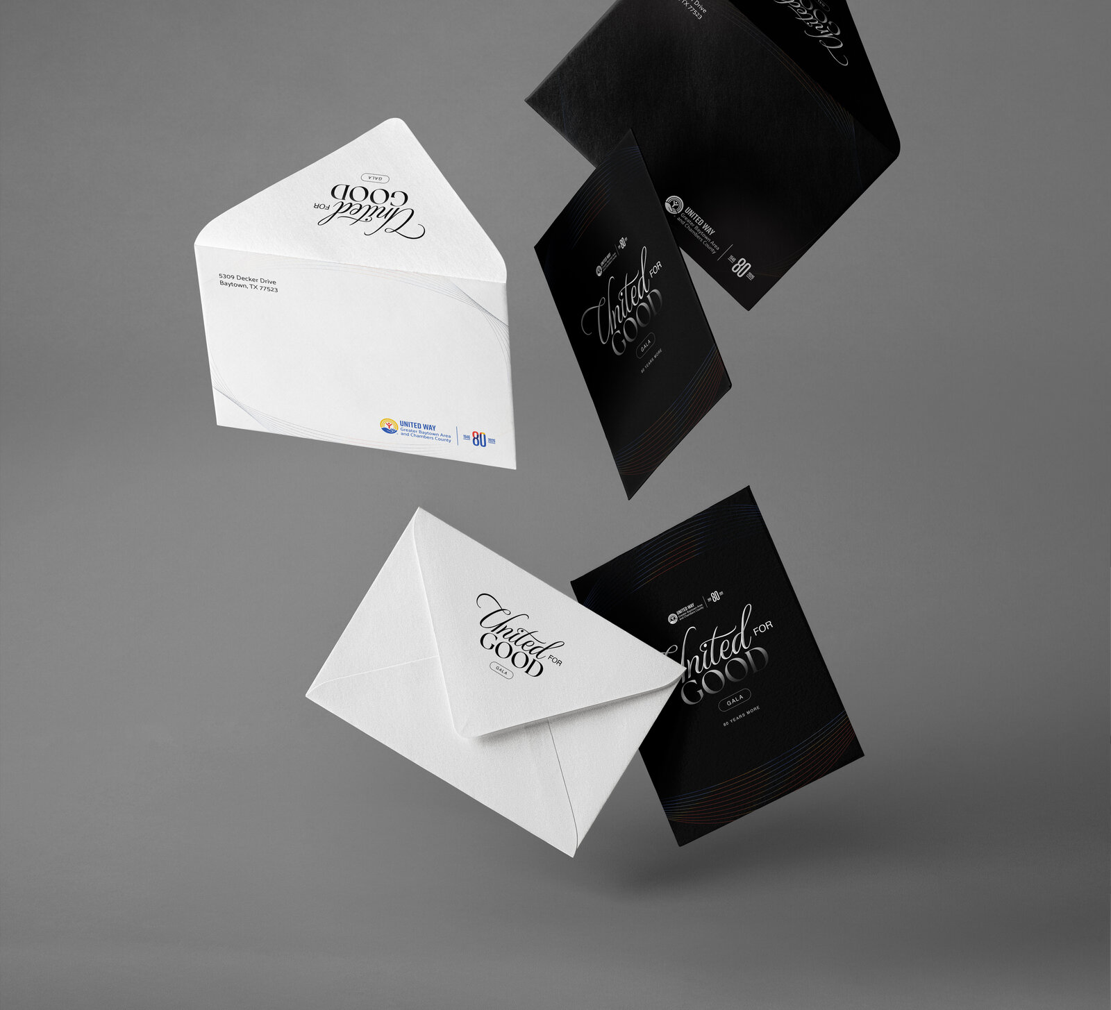
Location-specific flyers, mailers, a magazine ad, and invite cards carried the launch offer—$15 intro classes, promo code INTRO24—into all three neighborhoods, each one leading with The League's name first.
Digital OOH crossover ads ran on the location's on-site monument and jumbotron screens, while Facebook, Instagram, and Twitter/X carried the same look and offer into the feed.
I am the strongest I've ever been… and it all is because of the league.
Campaign Identity — Visual system built around The League's existing ant mark, Gosha Sans + Cedarville Cursive type pairing
Print — Location flyers, mailers, magazine ad, and invite cards for Cedar Park, EADO, and Oak Forest
Digital OOH — Monument and jumbotron crossover ads
Film — Launch spot, reel, 30-second cut, vertical Story cut
Social — Facebook, Instagram, and Twitter/X campaign posts




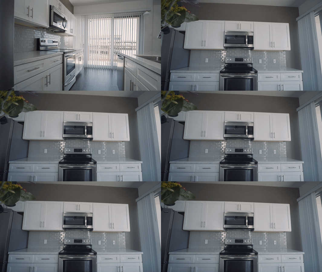




I am the strongest I've ever been… and it all is because of the league.
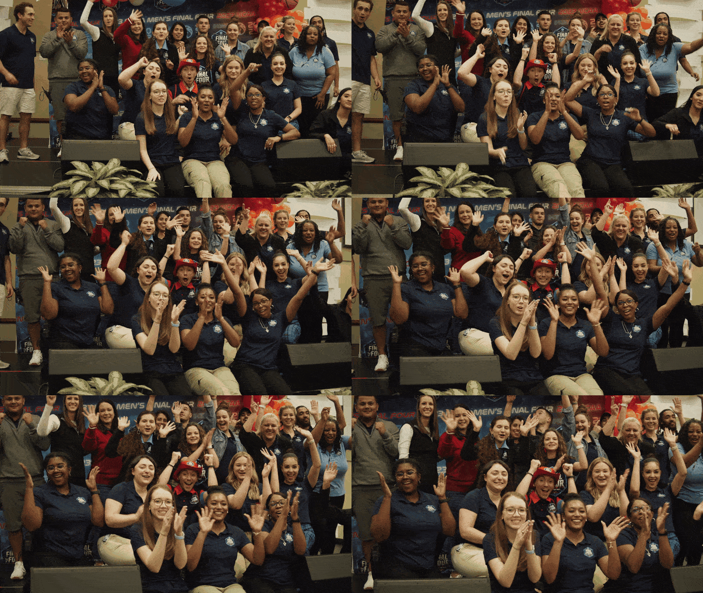
Member testimonial, from the film


