In May 2026, Corey Sanders sent us four culture statements and the church’s MC monogram. “It’s our brand,” he wrote. Motion meets on Sundays in a 10,000-square-foot CrossFit building, a space Corey said “communicates movement, transformation, discipline, community, and growth.” The ask was to refine the mark, not start over, and have it ready for a September launch.
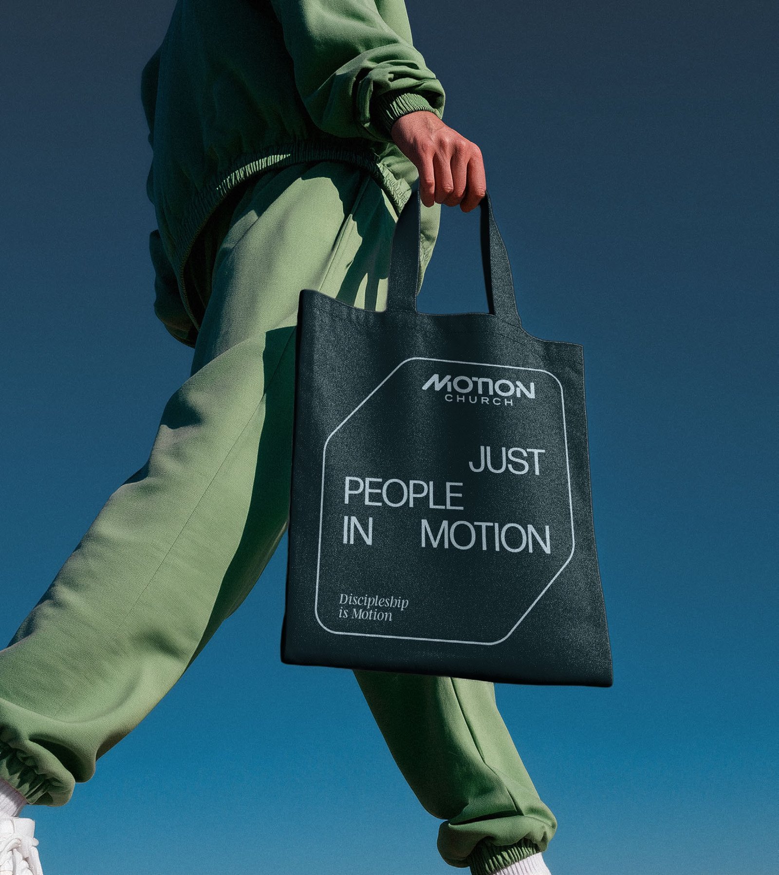
Corey’s third statement says it plainly: “following Jesus means movement.” So the M became the icon, drawn as one continuous diagonal, and the wordmark got a custom geometric face with connected shapes. Then one rule for every headline: the words sit apart on the grid, so even the type looks like it’s moving.
We presented two directions in June. One kept the cross from the original monogram. The other made the M the icon, and that’s the one the church chose.
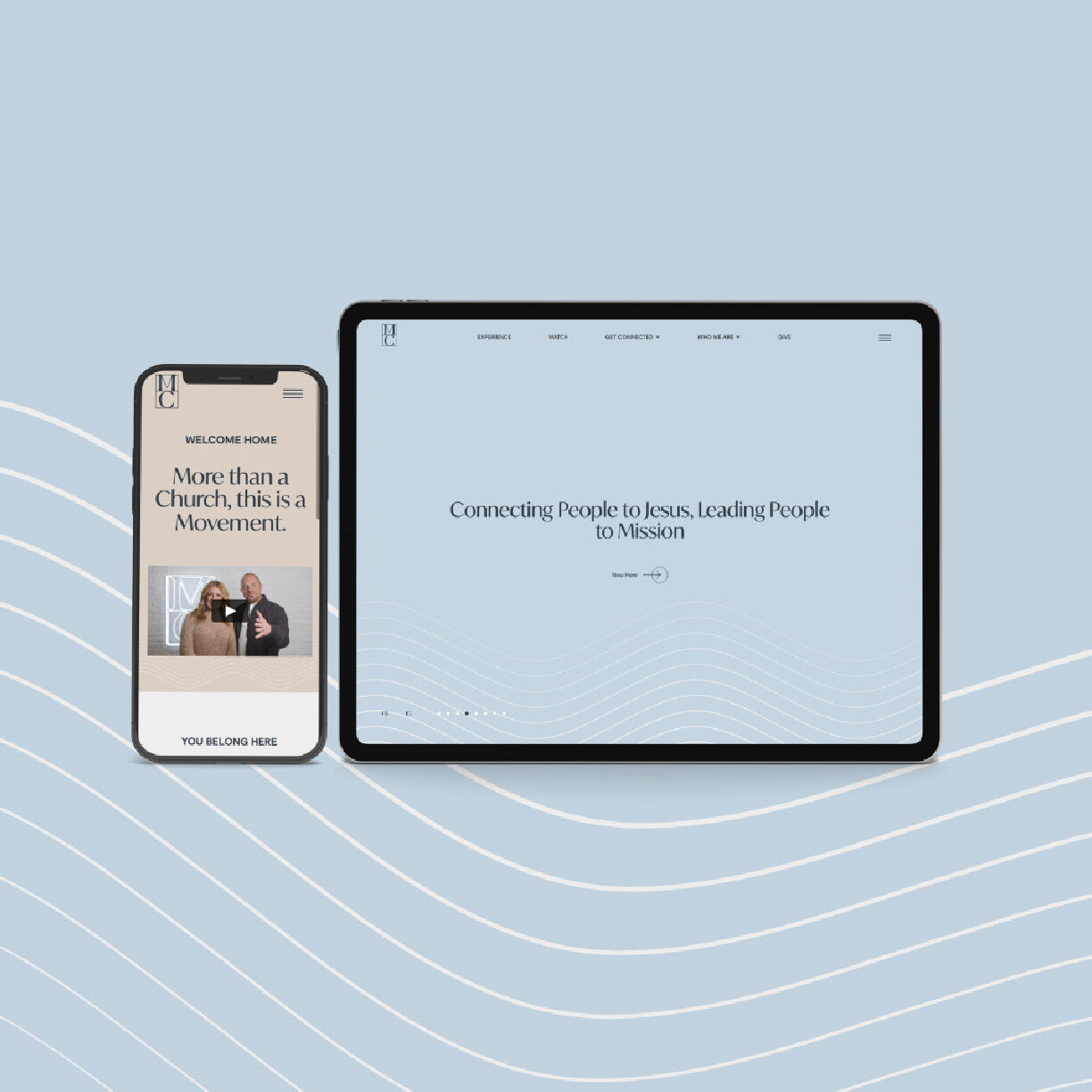
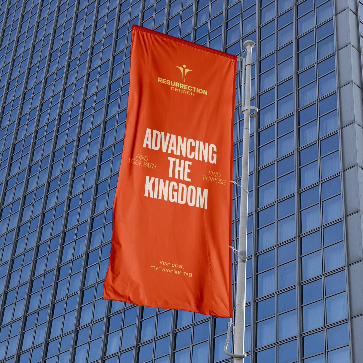
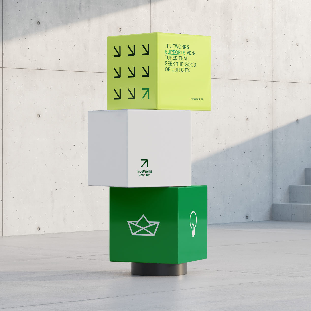
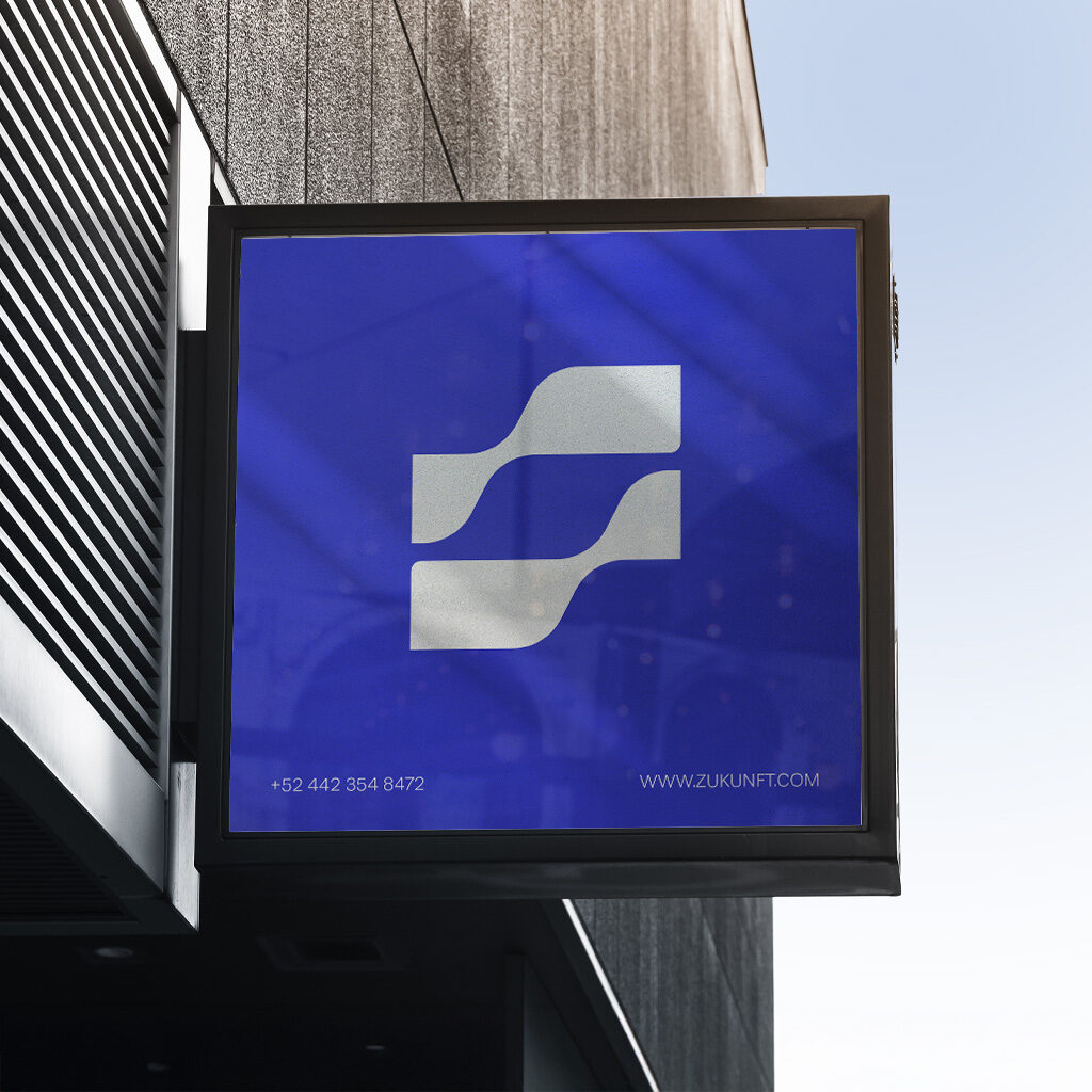
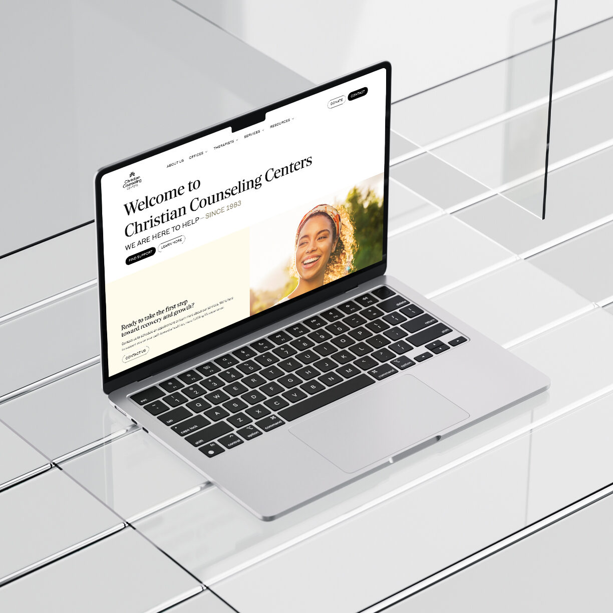
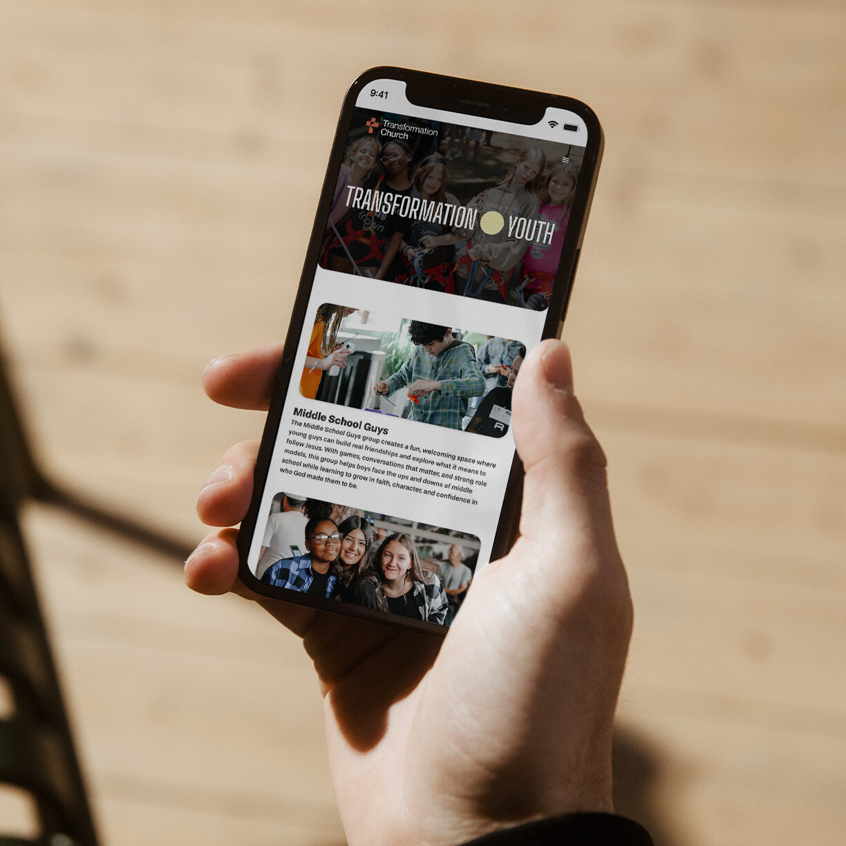
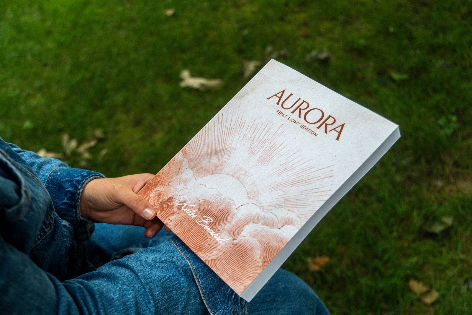
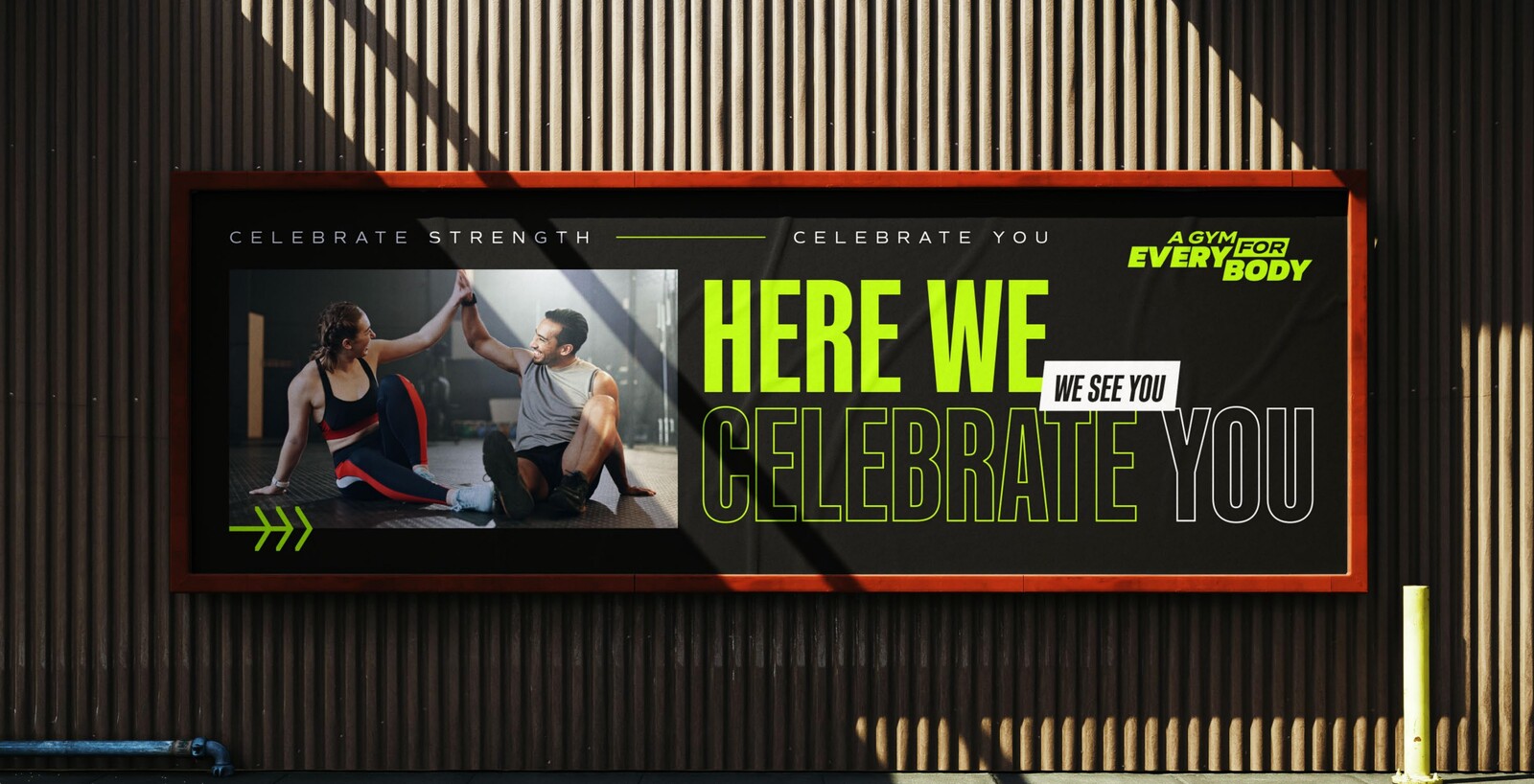
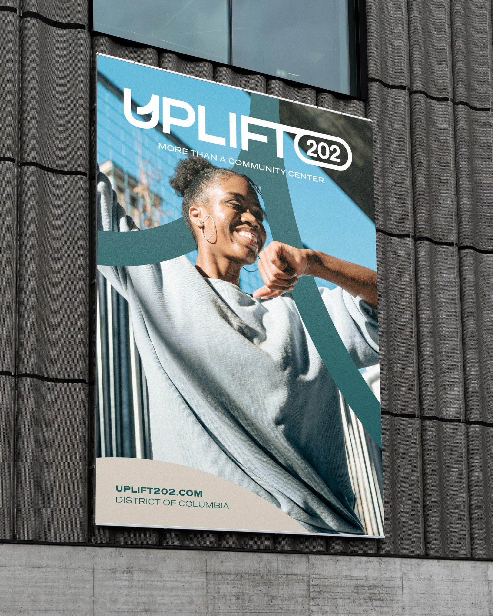
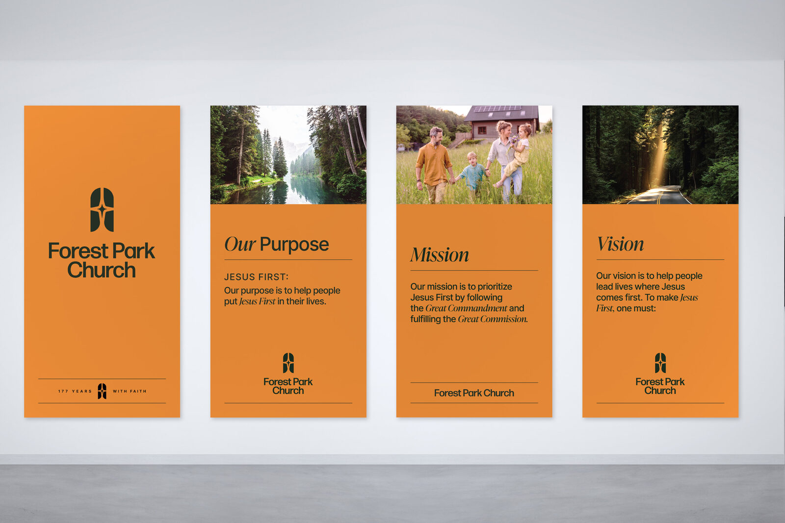
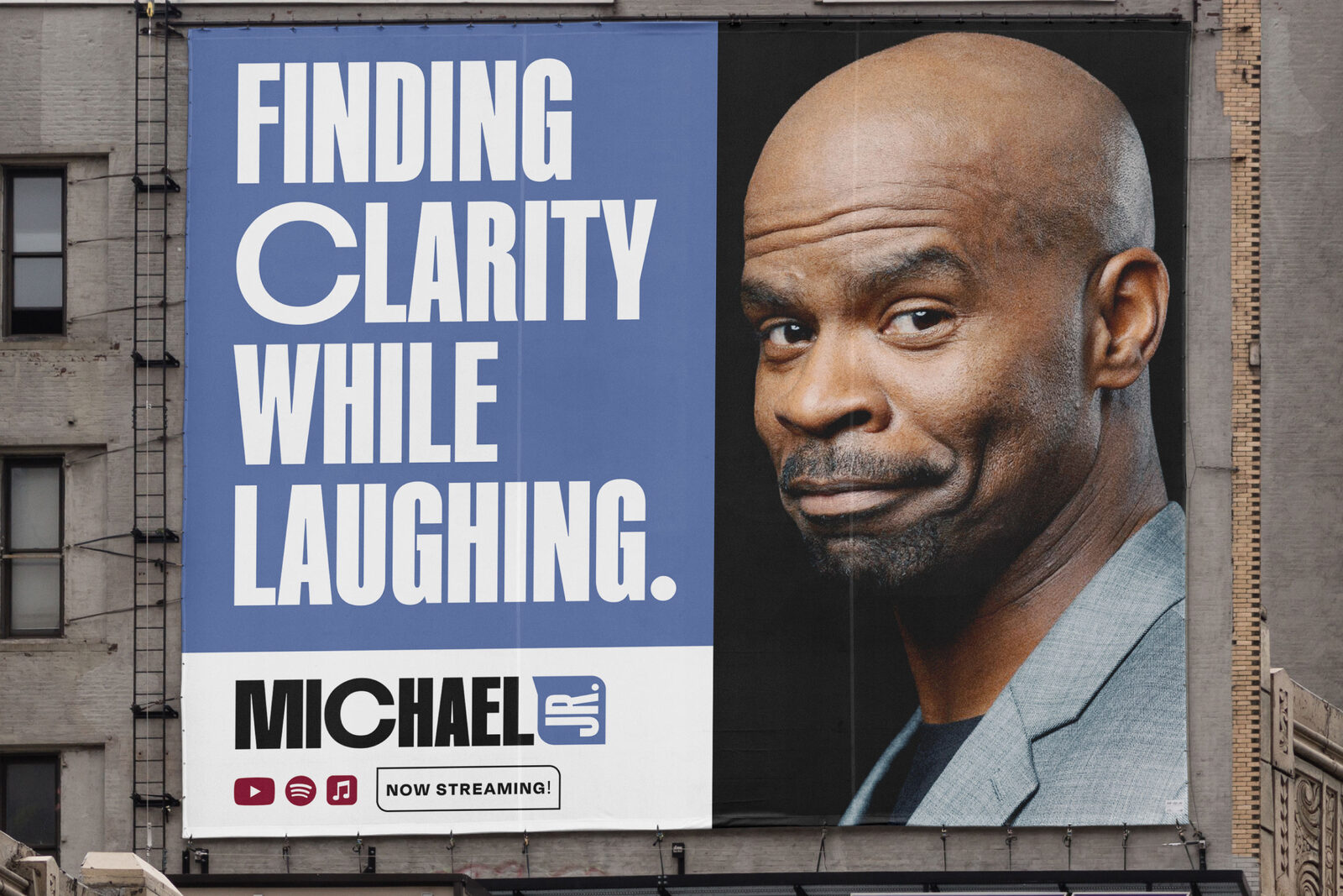
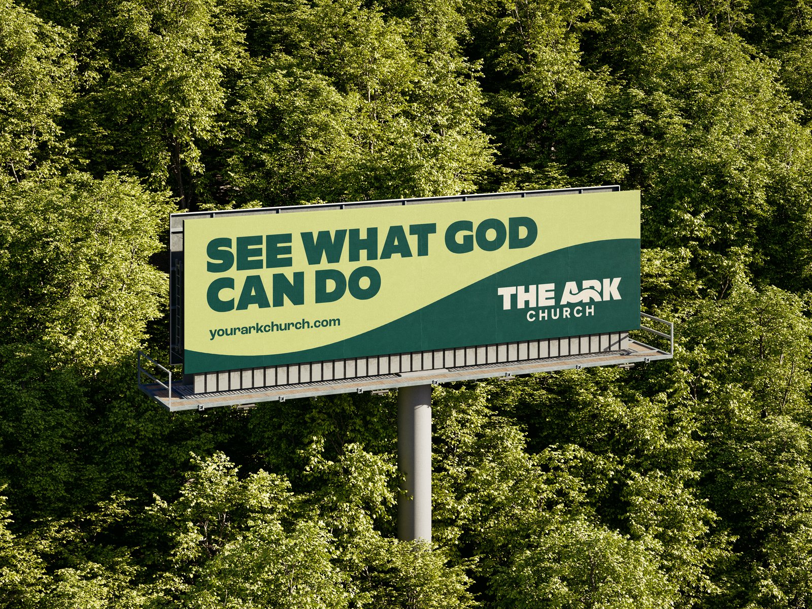
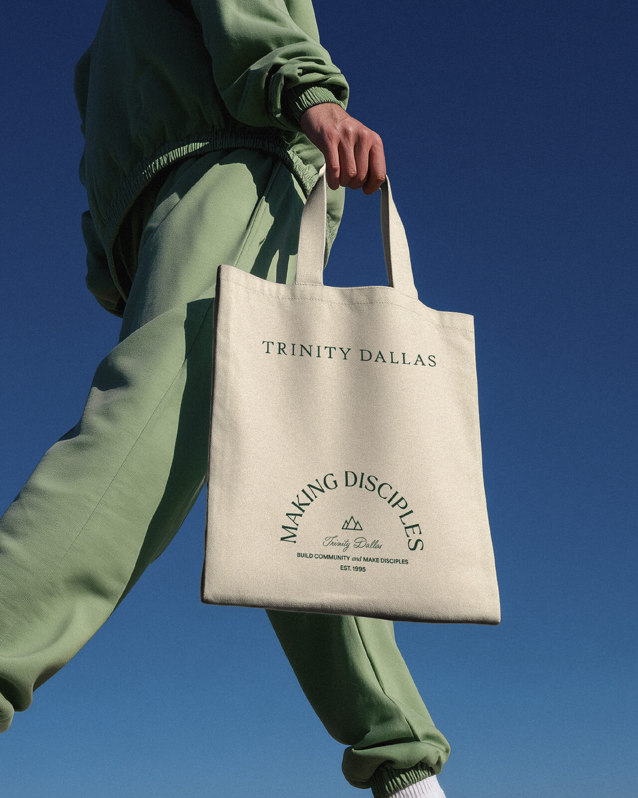
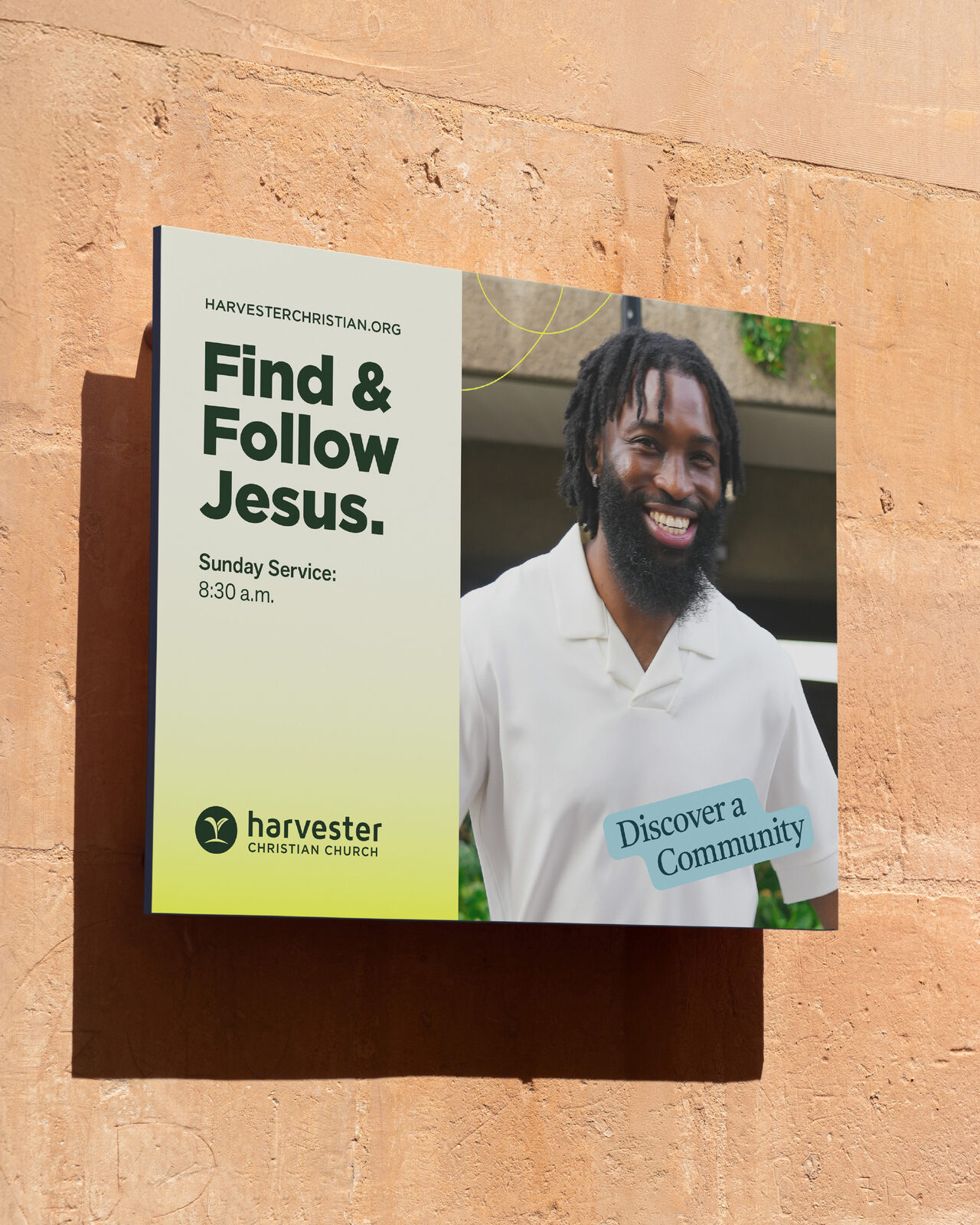
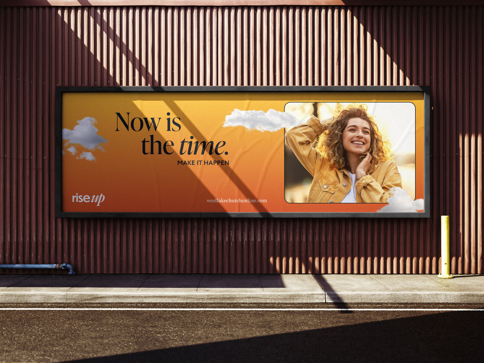
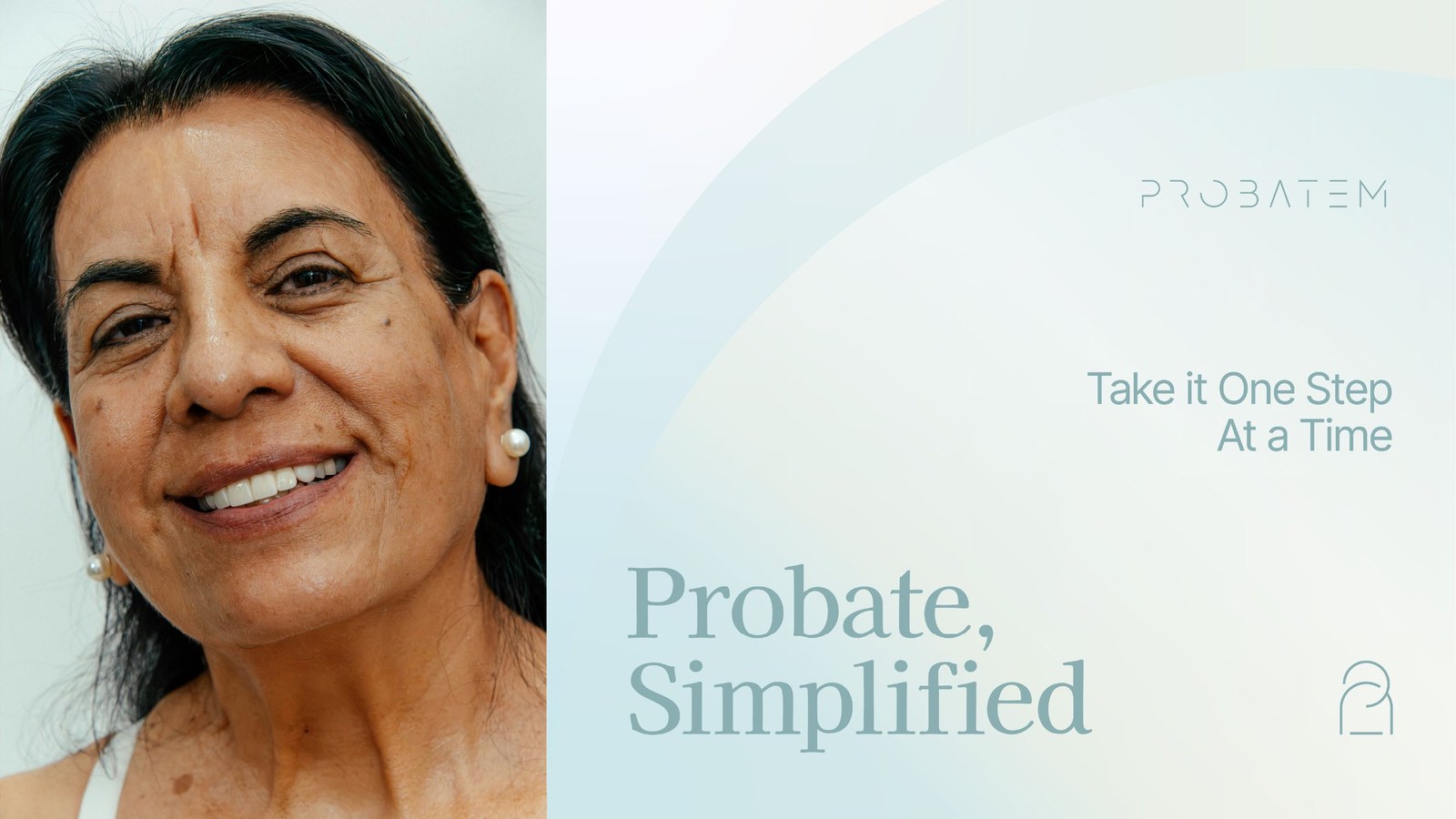
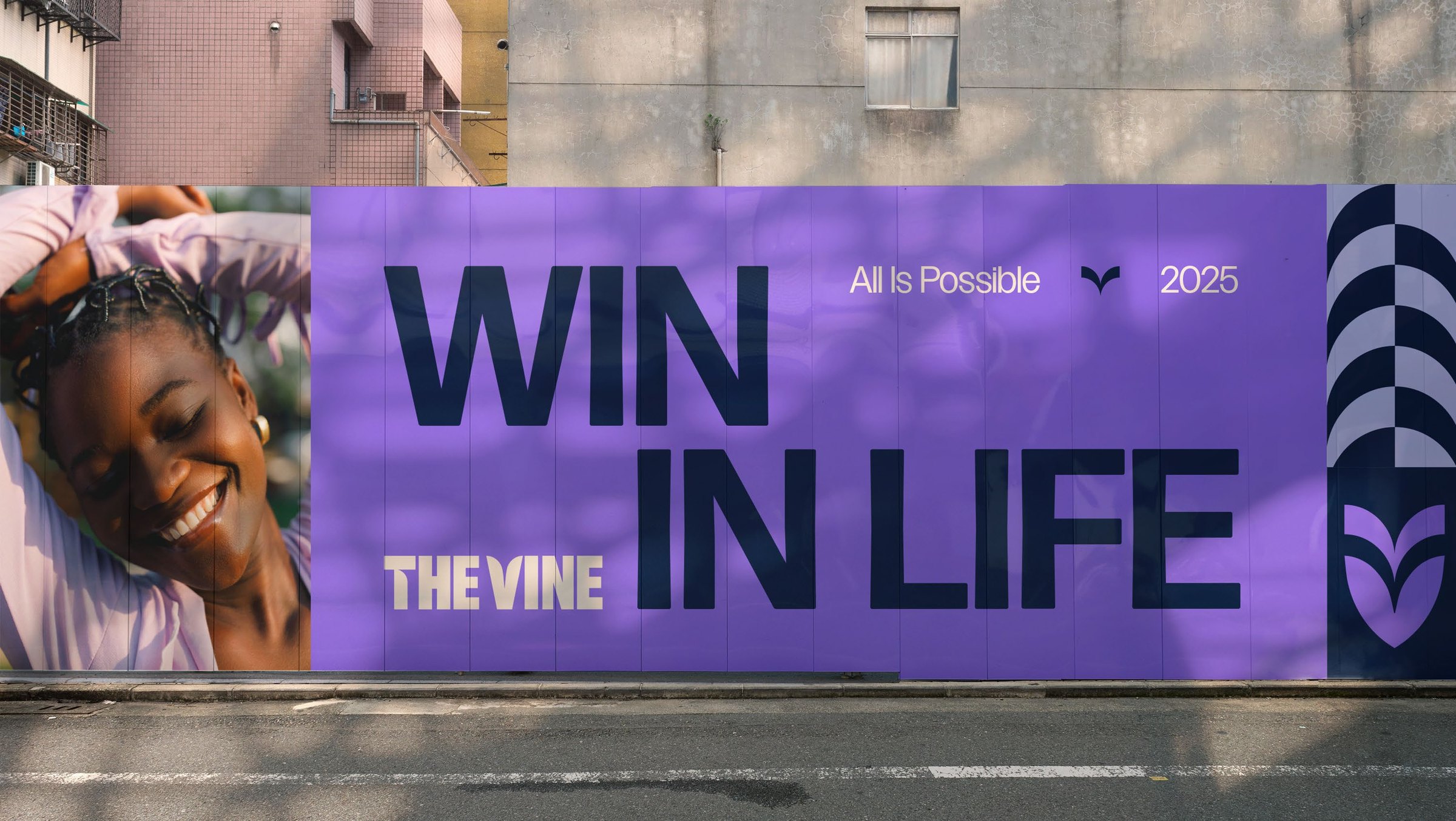
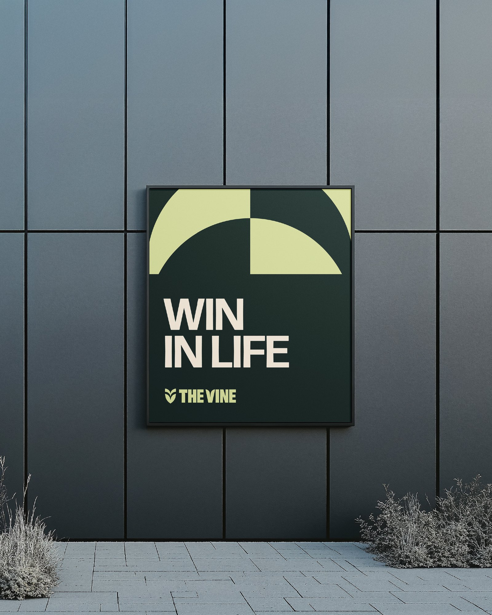
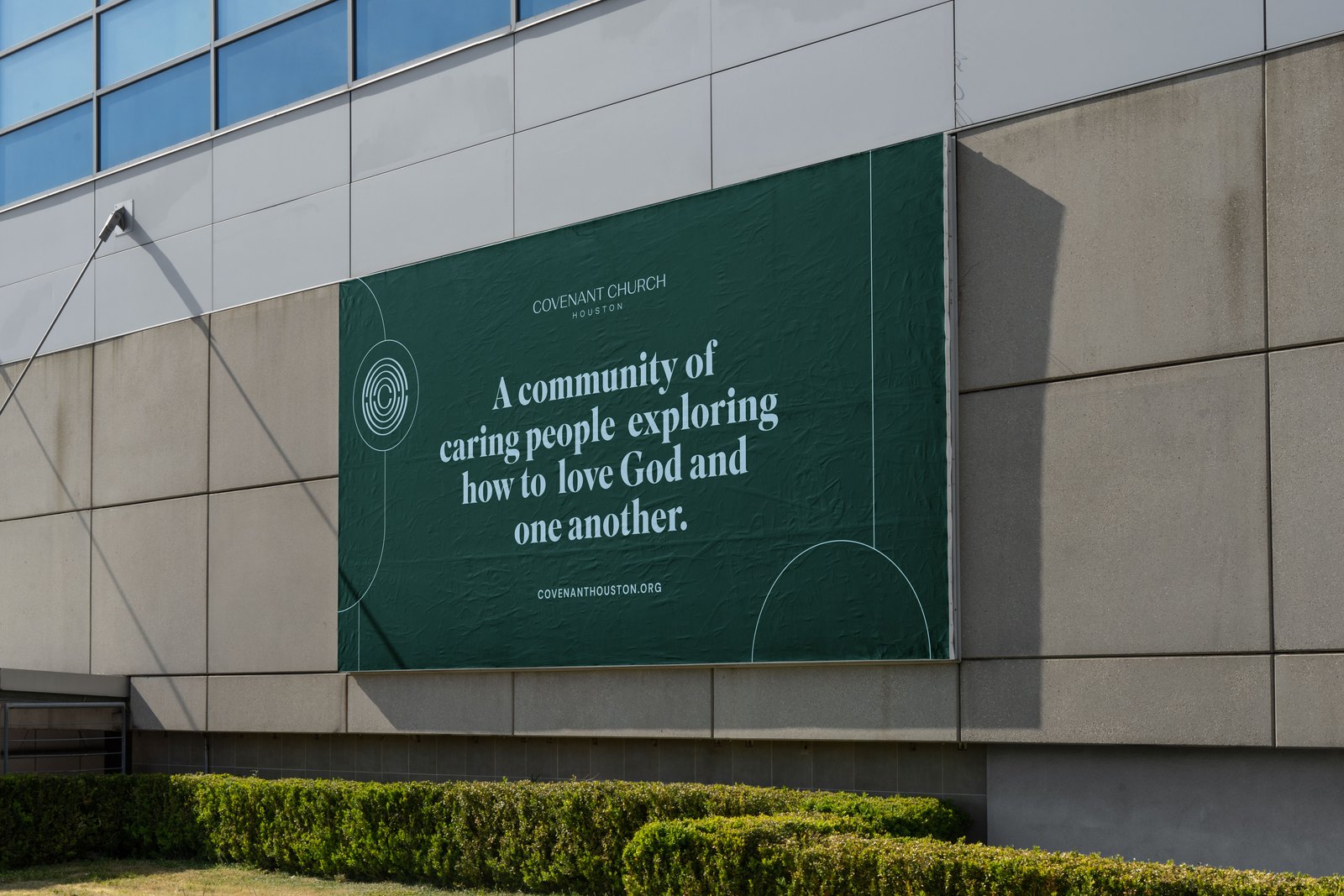
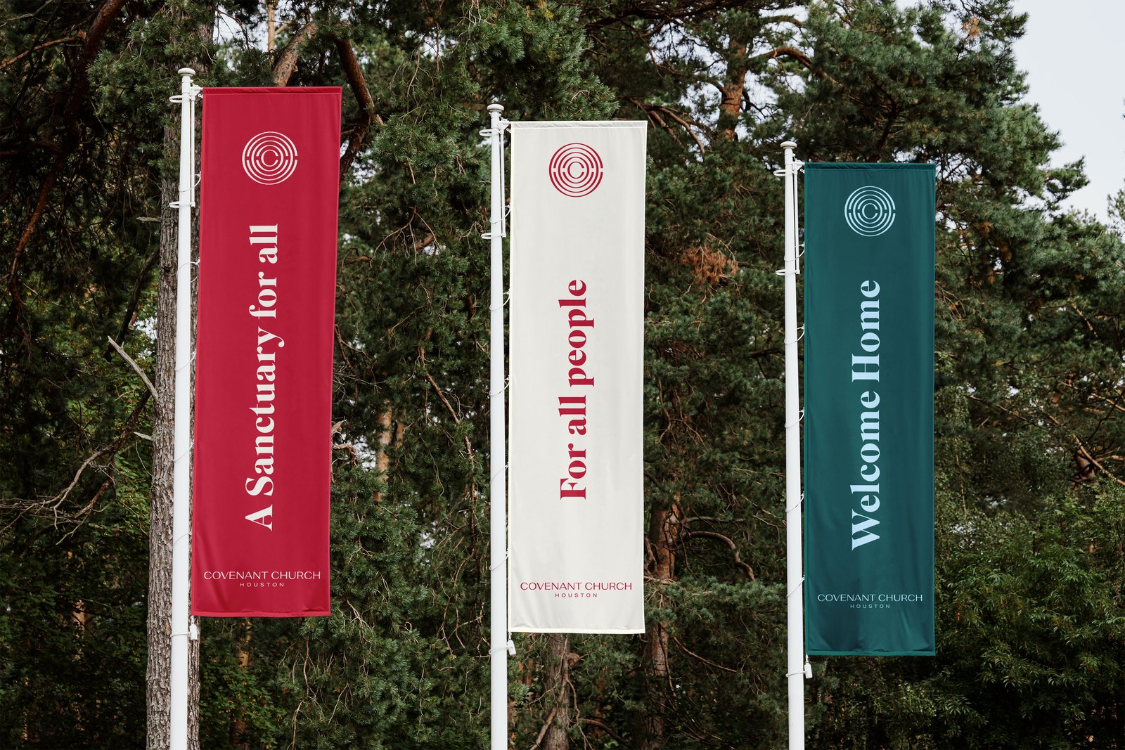
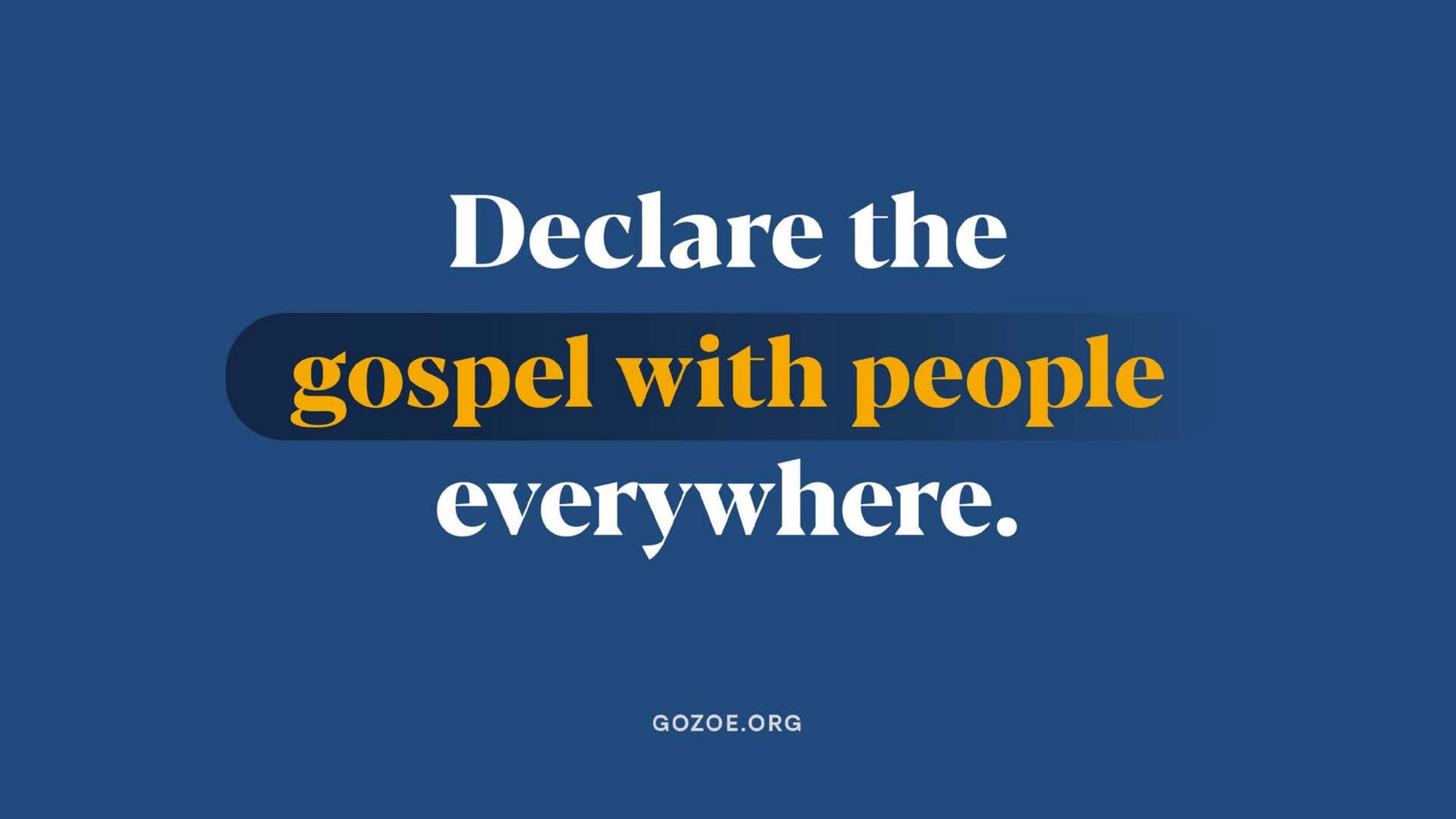
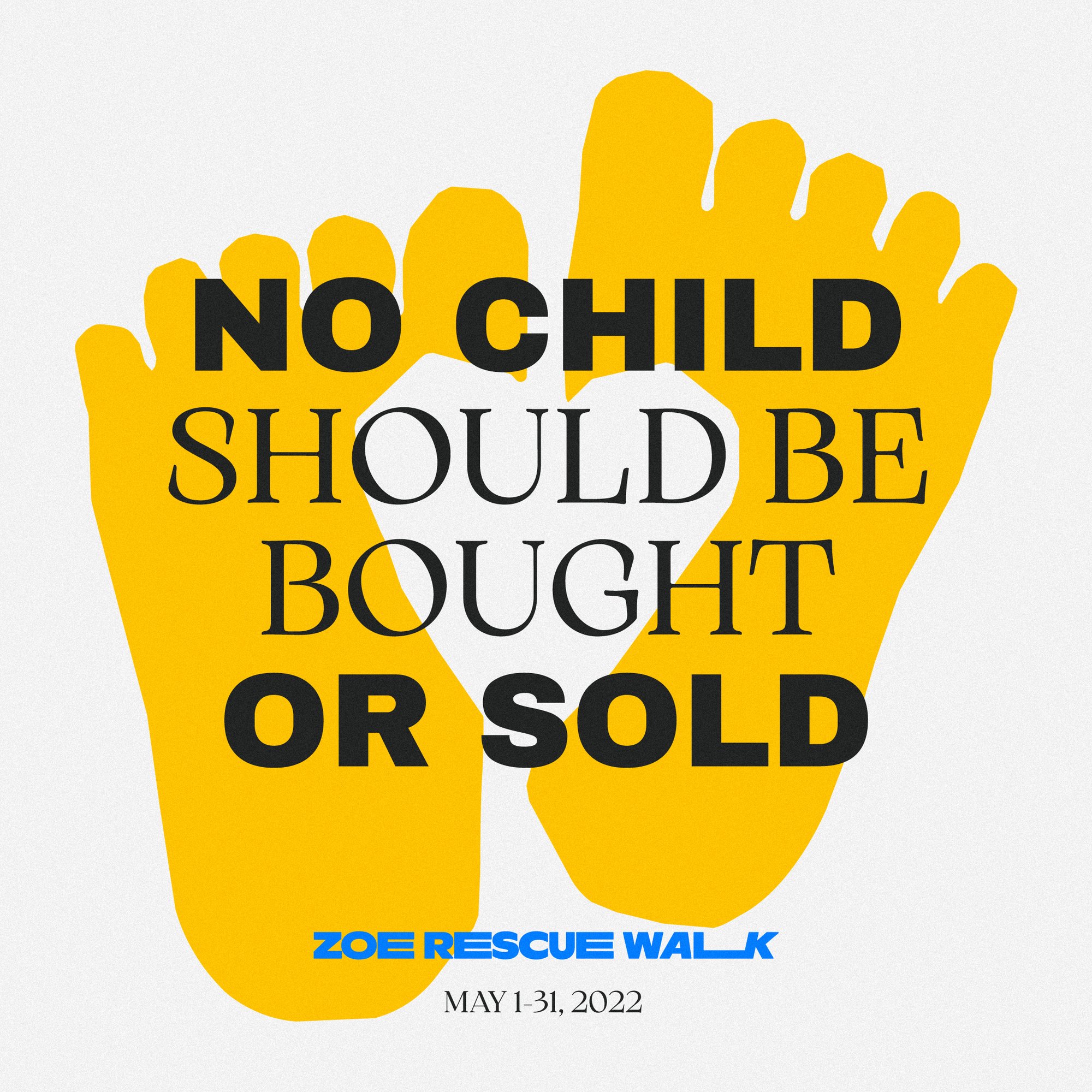
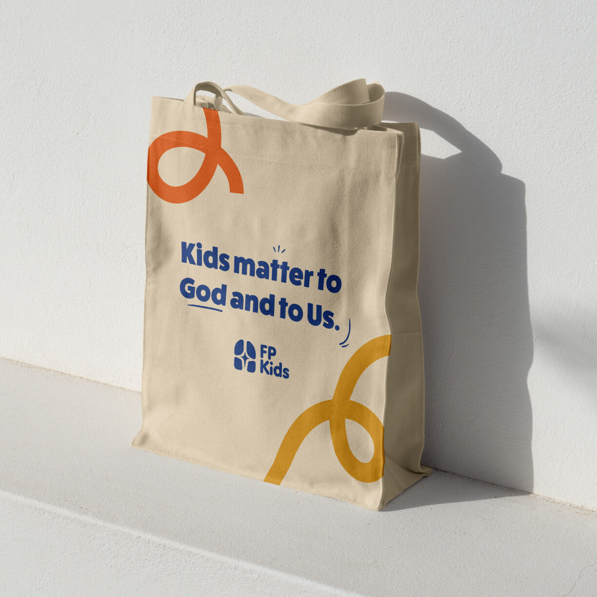
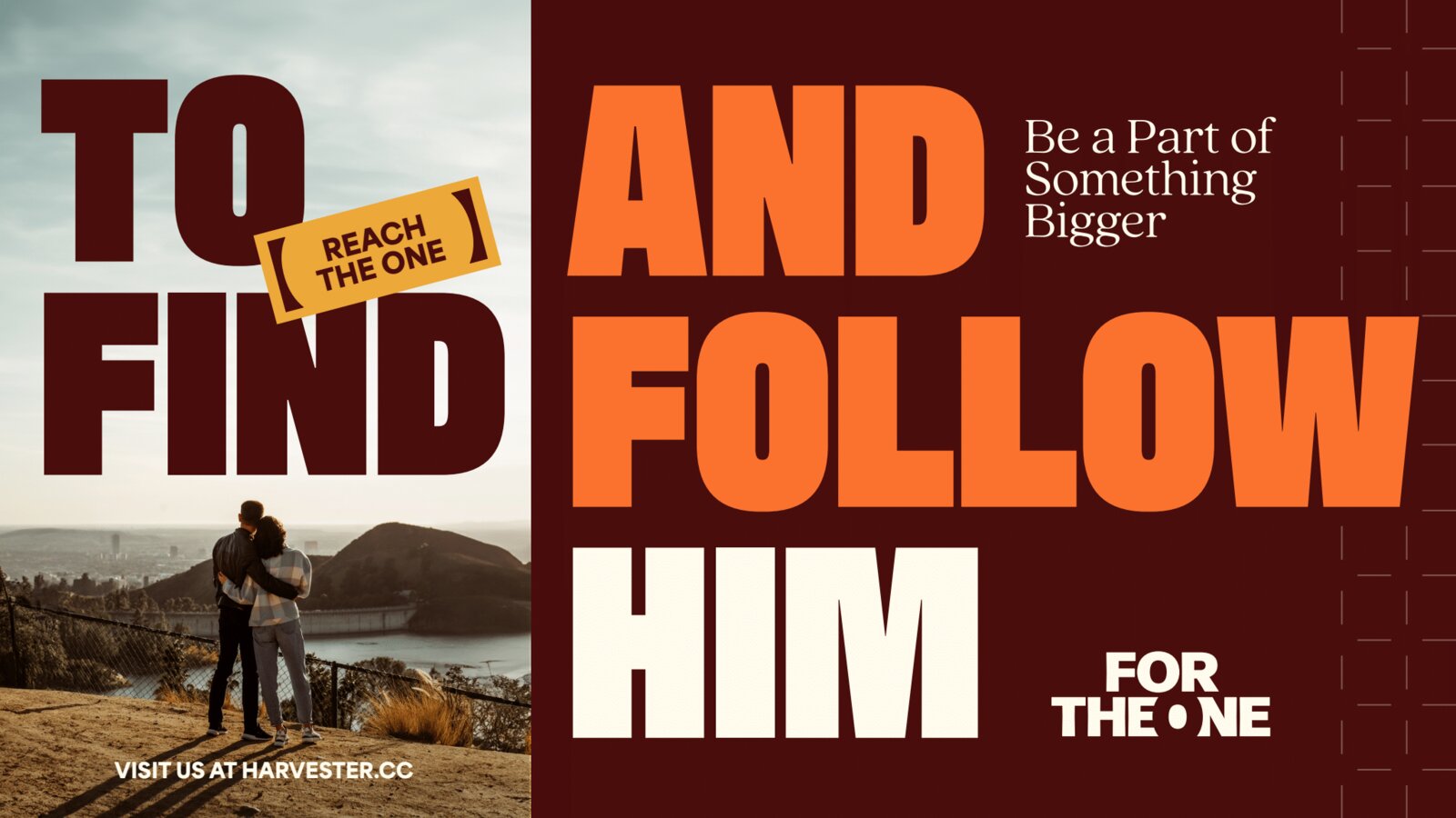
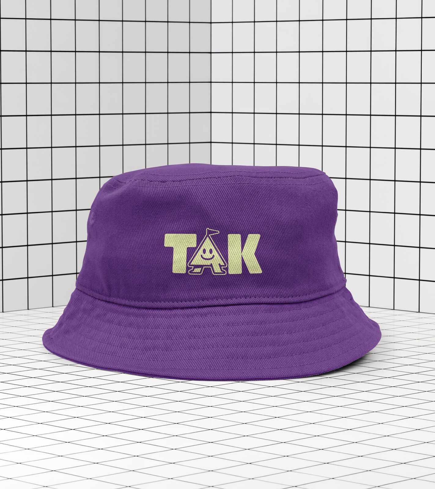
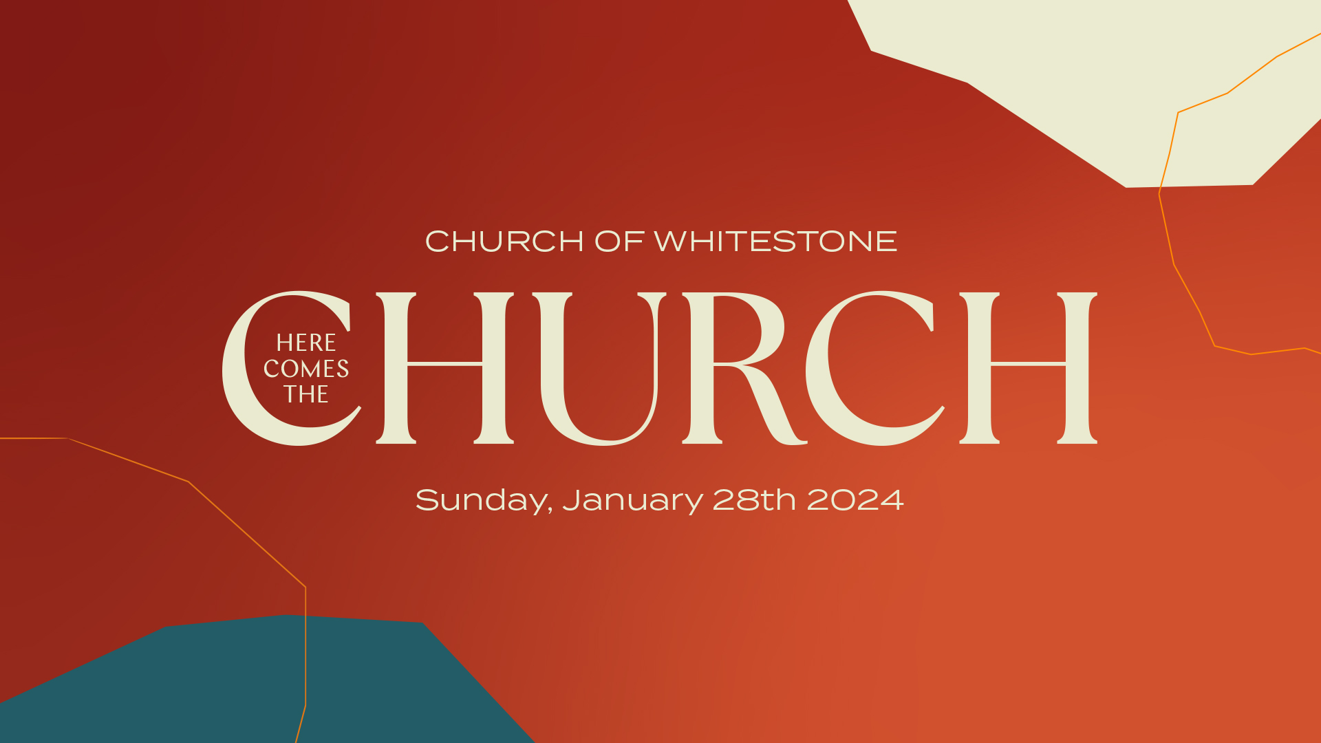
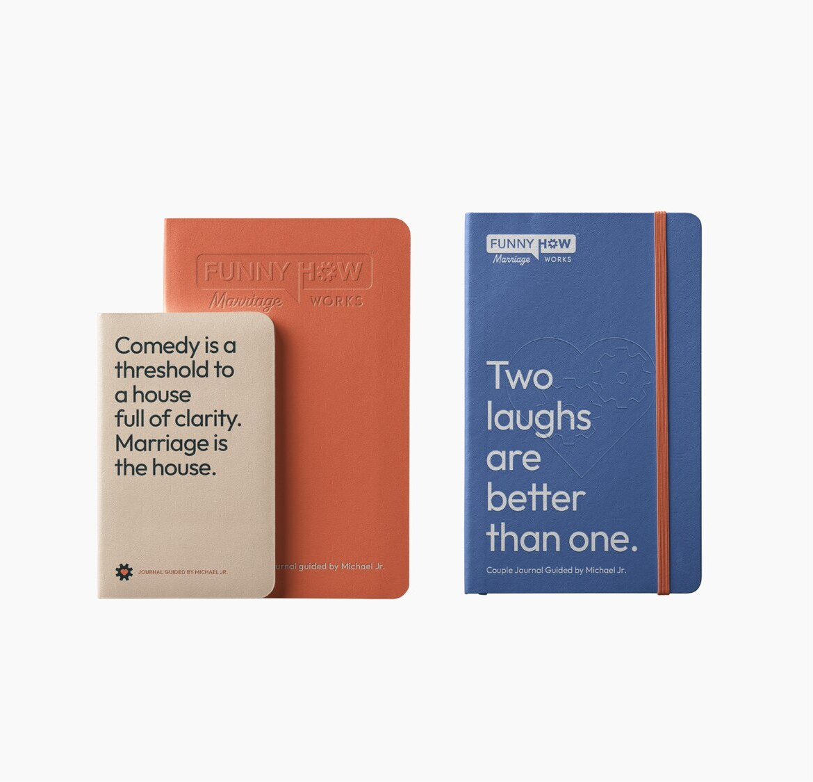
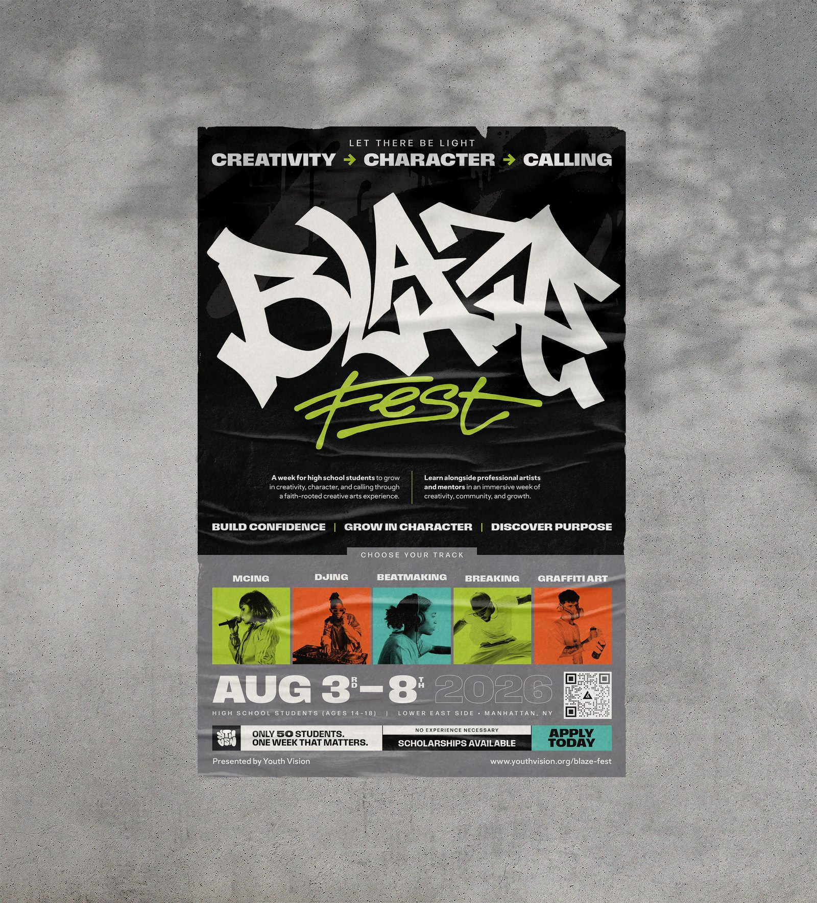
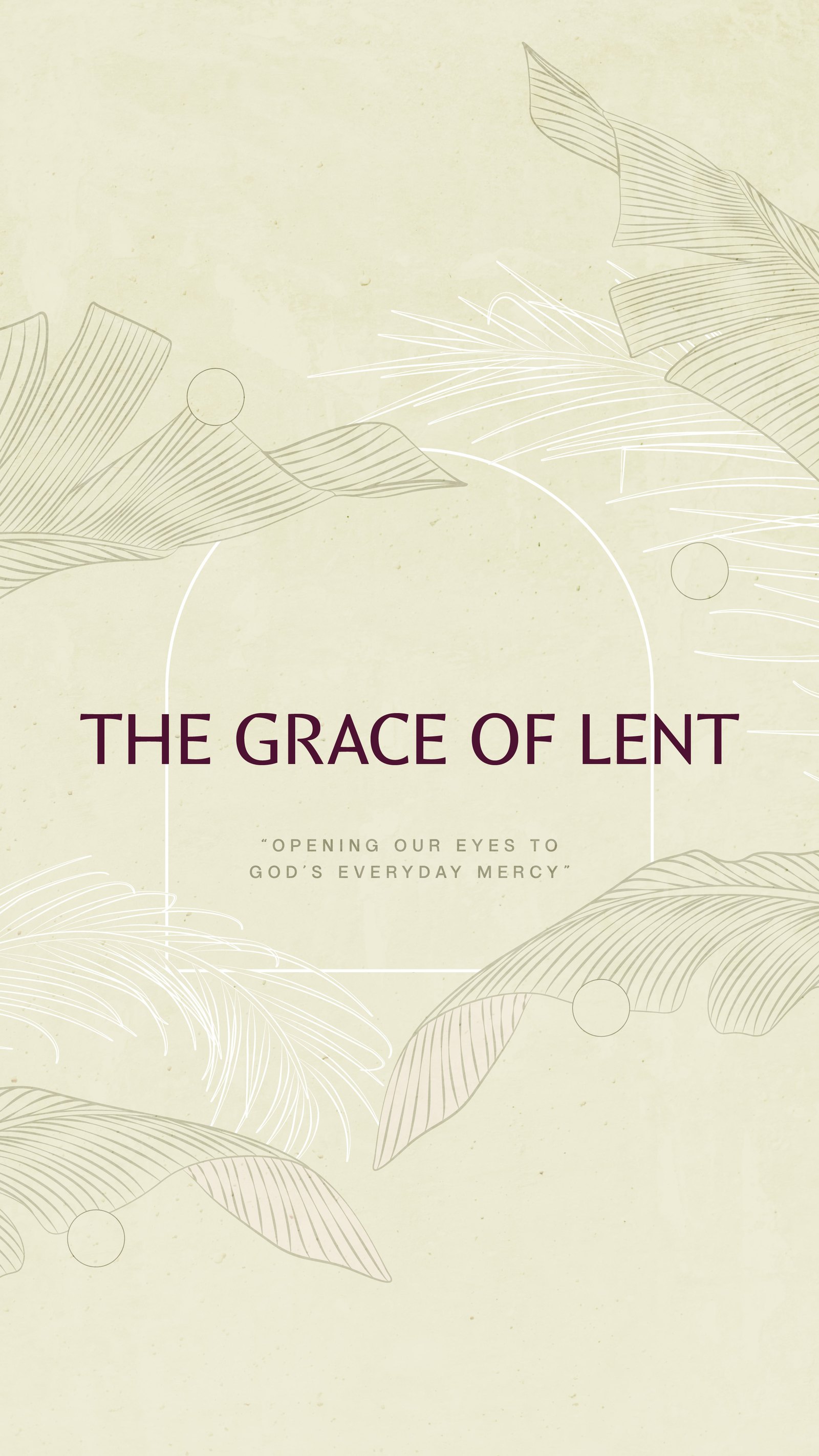
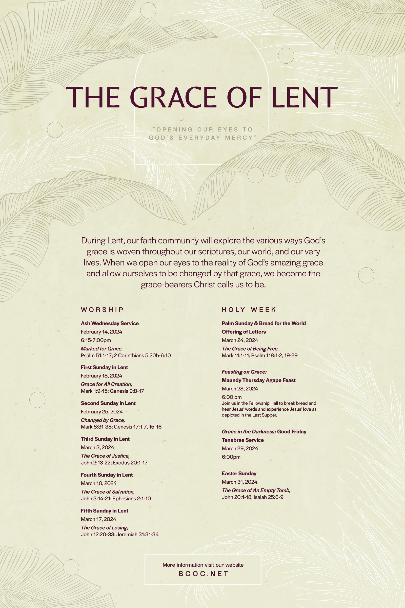
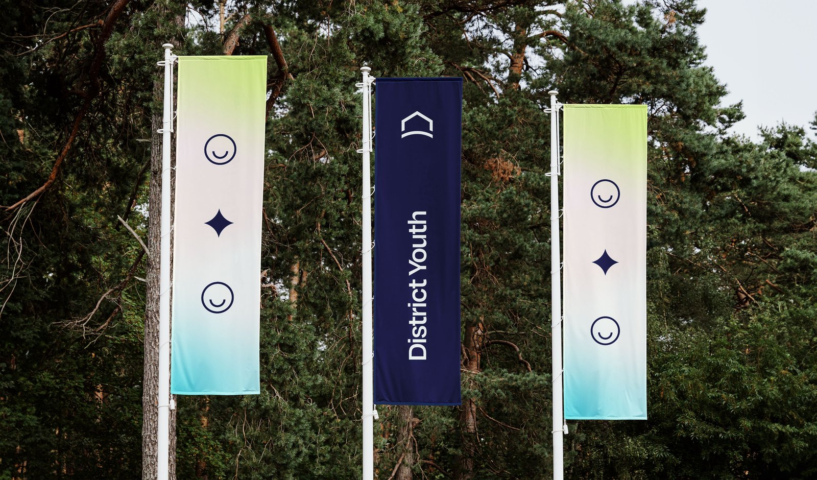
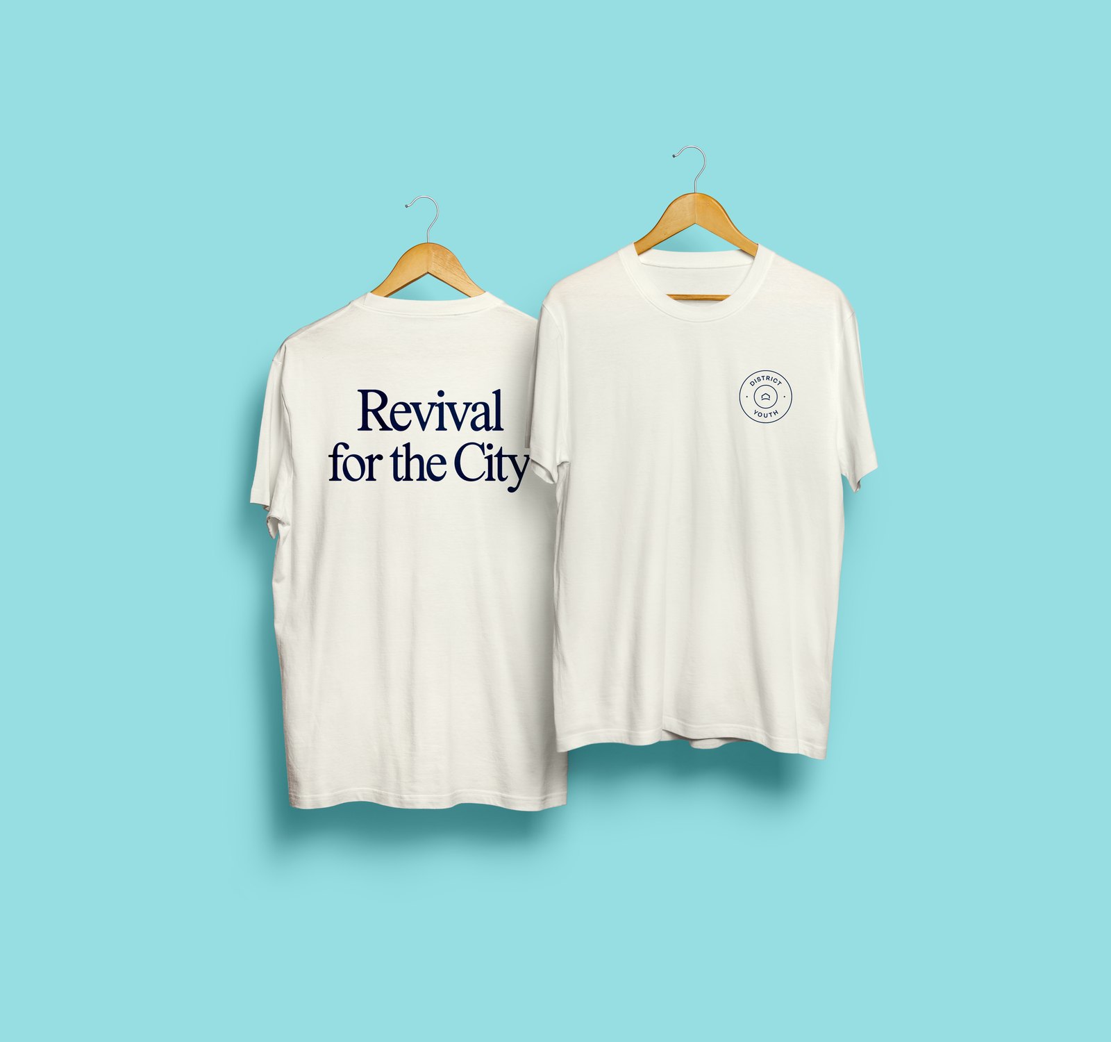
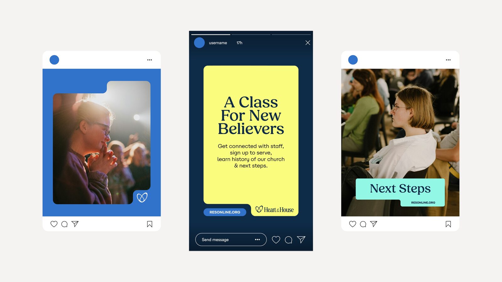
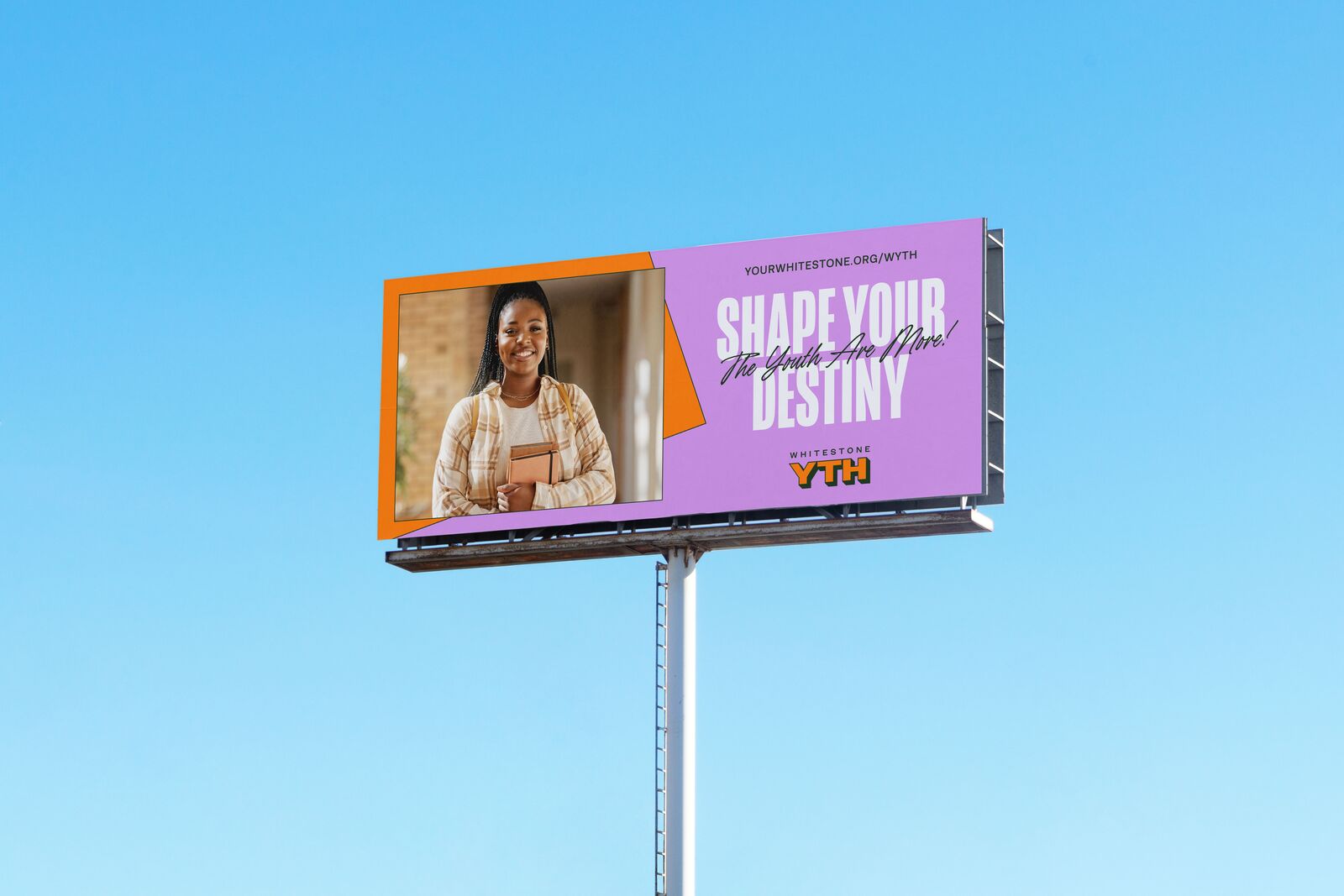
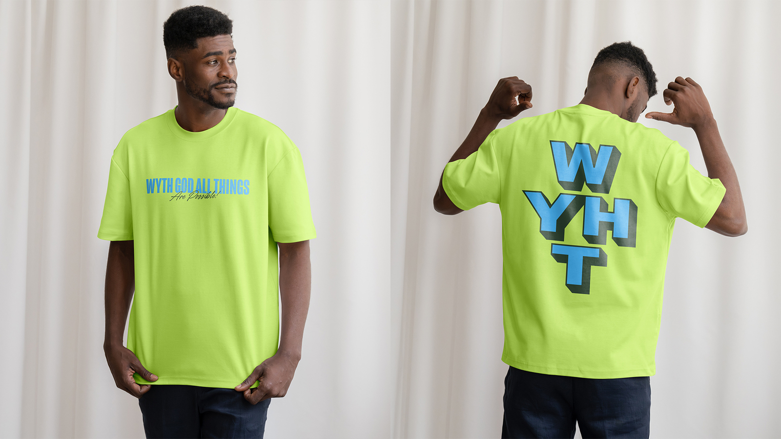
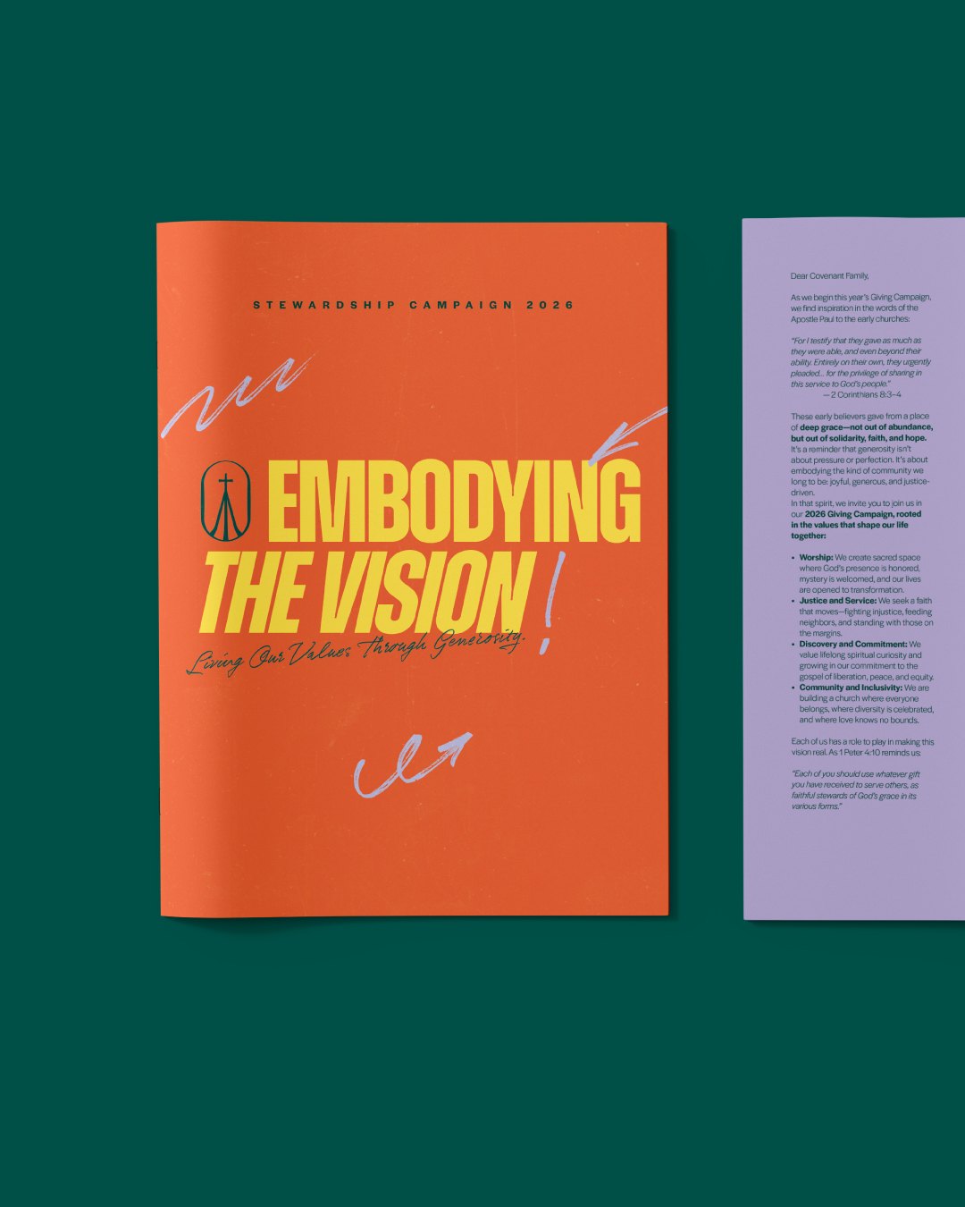
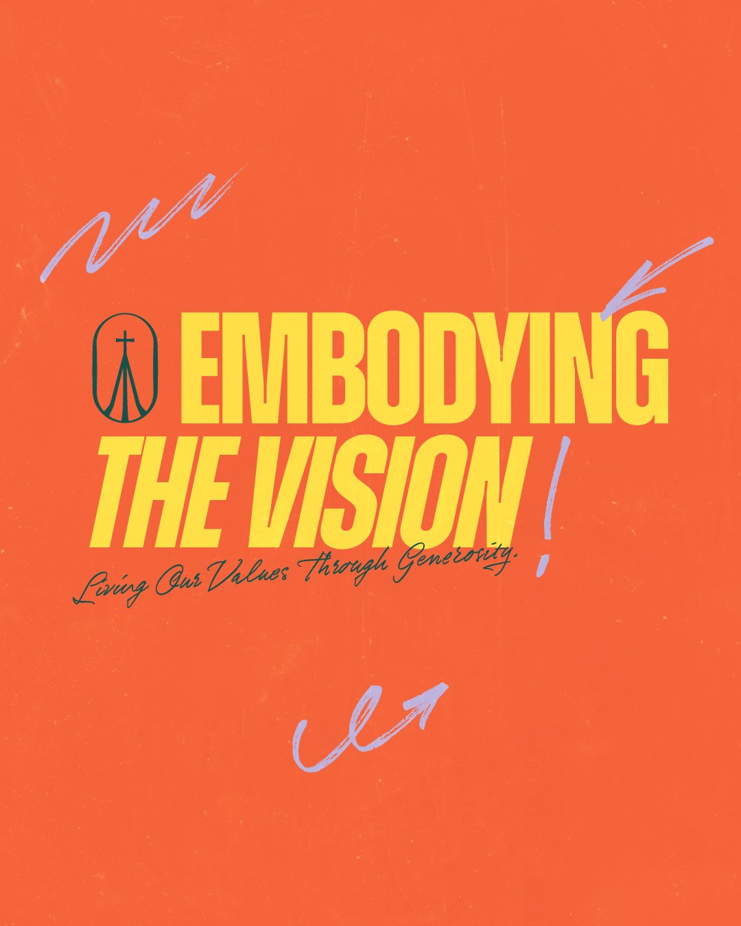
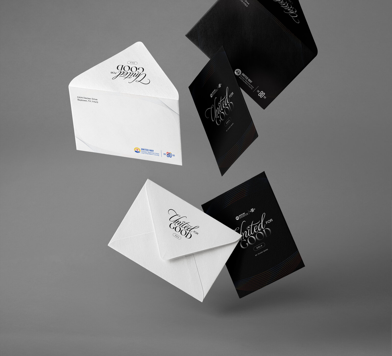
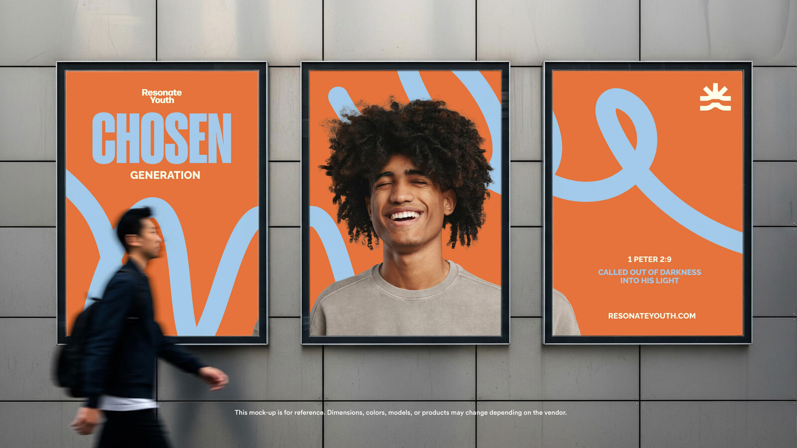
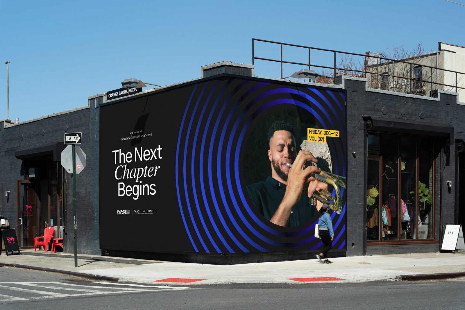
Concept mockups from the style guide and from our October brand post.
Brand evolution: refined icon and wordmark, colour palette, type system, brand elements and a brand style guide.
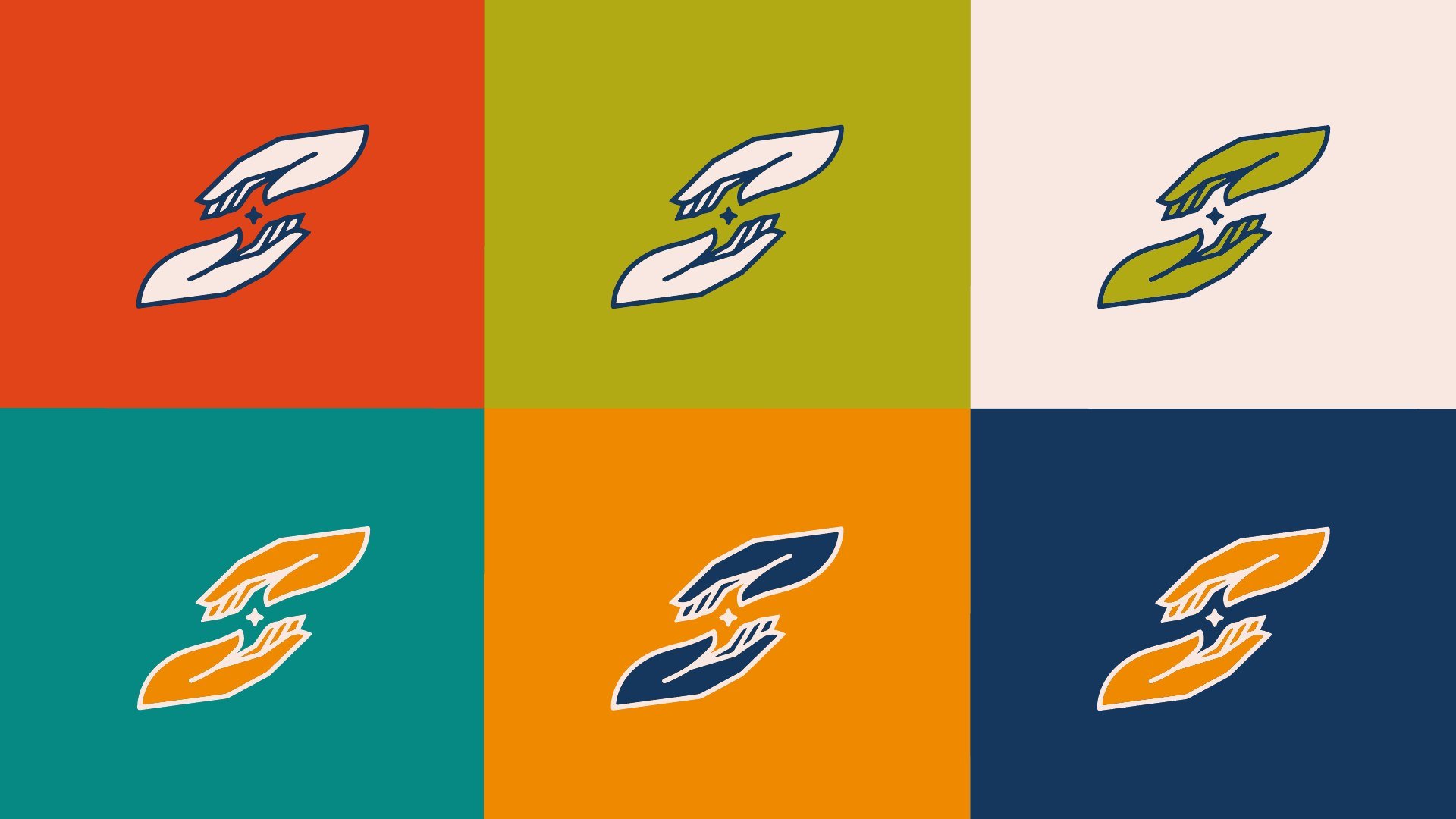
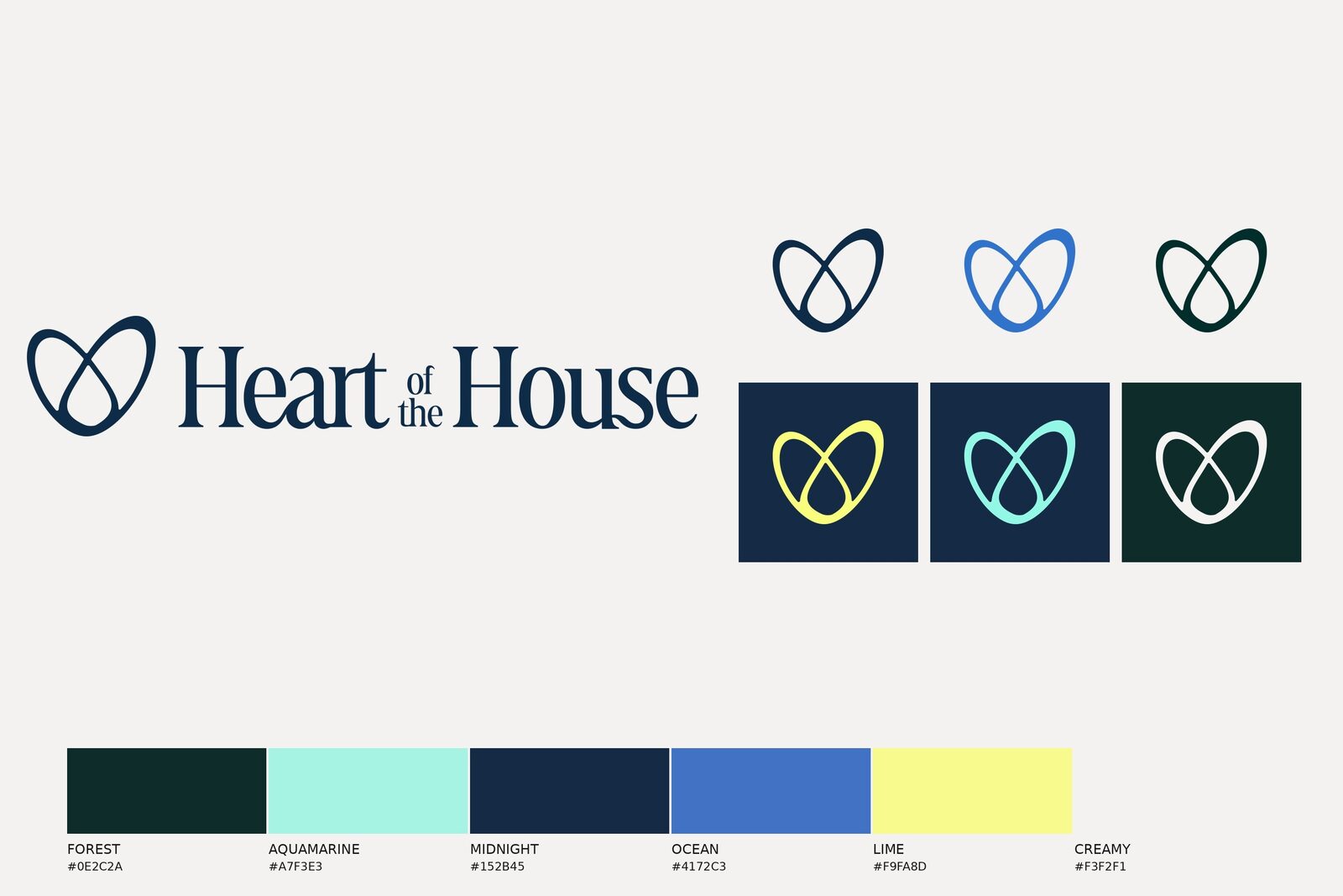
Brand assets: logo formats in every colourway, favicons and social profile assets.
Kids In Motion: the children’s ministry sub-brand, on its own page.





























Corey Sanders, Lead Pastor, Motion Church


