Jennifer Evans founded Probatem after more than twenty years in probate and estate settlement. Jonathan Bernard is co-founder.
The funeral-home deck lists what families ask after a loss: whether probate is needed, how to reach the bank accounts, what happens to the house, and what paperwork comes next. The brand had to read as steady to someone asking those questions.
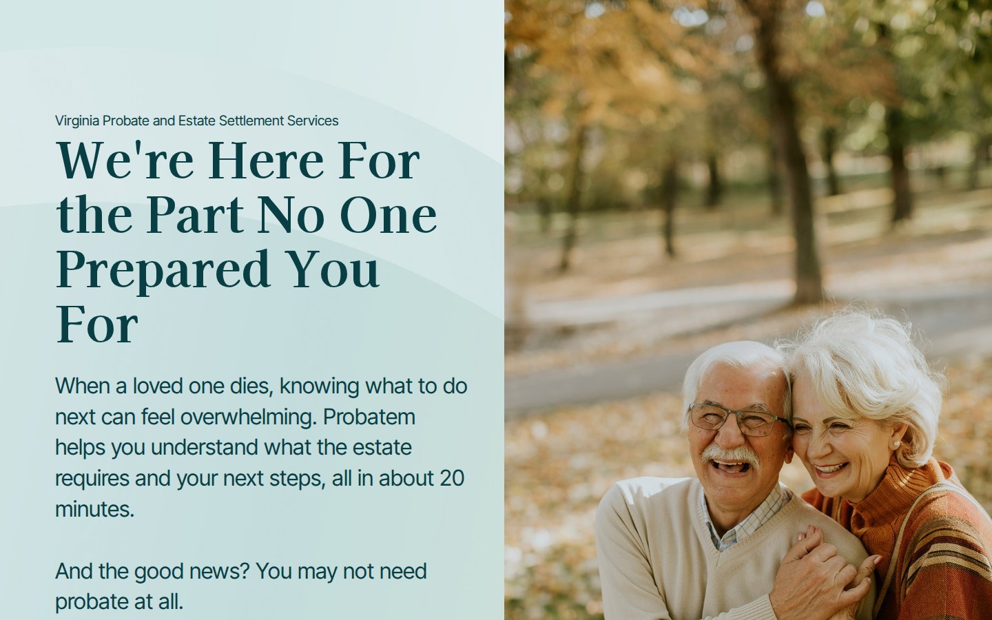
The identity deck set the direction in one paragraph: "In this visual direction, we focus on the use of soft elements and light colors that inspire tranquility and calm in the main user, reflecting the core values of the brand." The keywords on the next page were Calm, Minimal, Understanding, and Human. The type page sets a line to match: "You're not alone in this journey."
A thin, wide-set wordmark with a small icon beside it. The deck shows it on white, on black, and on the gradient.
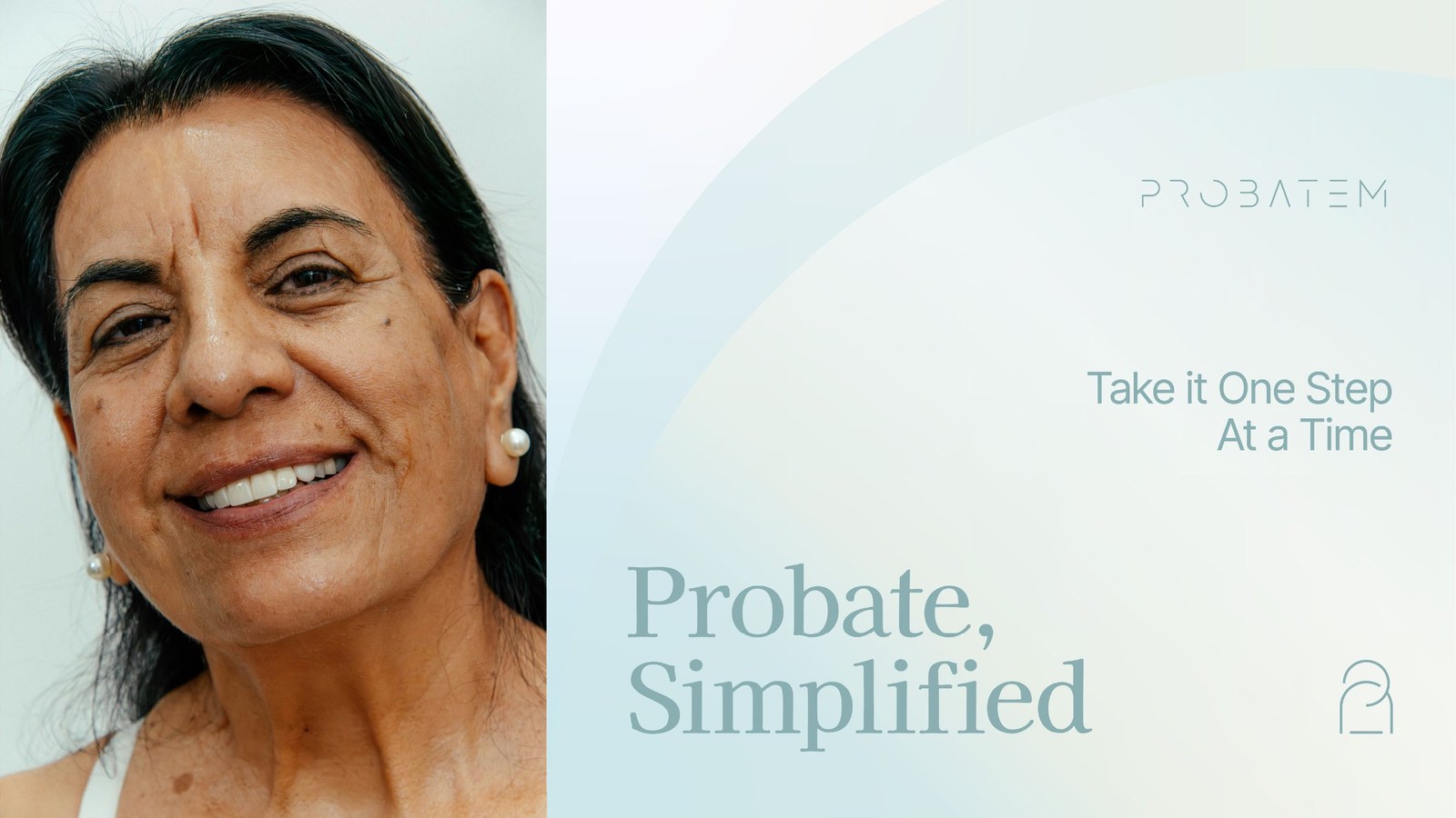
The second brand element is a soft gradient with an arc cut through it. It sits behind headlines, covers, and mockups. The palette runs from Wind, Sky, and Cloud through Midnight and Night, with Light, Oak, and Sepia as the warm neutrals.
Kaisei Opti Medium carries headlines, set at 100 pt over 110. Inter Tight Regular sets subheads at half that size, and Inter Tight Light sets body copy at 20 pt over 24. Cloud, a near-white at #FBFBFB, is the eighth color.
These applications came with the identity deck as examples of where the brand can go. Every one is a concept. The deck prints its own note under most of them: "This mock-up is for reference."
The stationery set carries the wordmark and the arc onto paper: a letterhead, an envelope, business cards, and email signatures. The trifold brochure opens with a question families ask after a loss.
Funeral directors are often the first professional a family turns to after a loss, so Probatem needed a deck for them. We built it on the same system as the rest of the brand: the gradient cover, serif headlines, and midnight-teal slides for the hard questions. A PowerPoint template carries the same look.
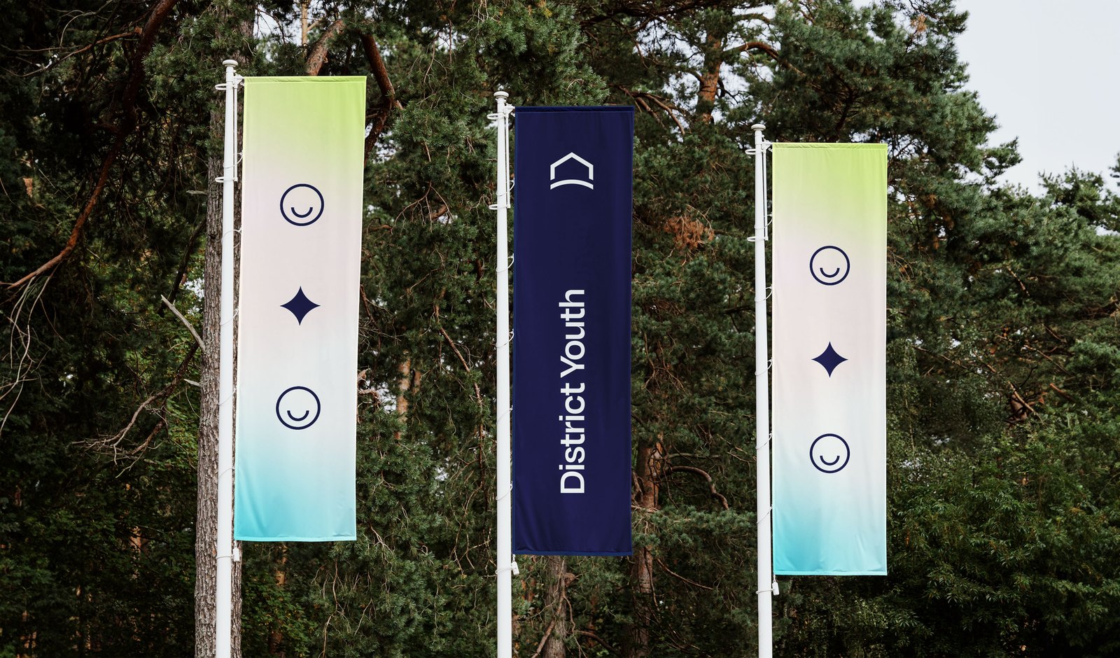
The events kit is two banner stands and a table cover. One banner reads "Your Next Step After the Funeral." The other reads "We're Here for the Part Nobody Prepared You For." Both are mockups of the printed pieces.
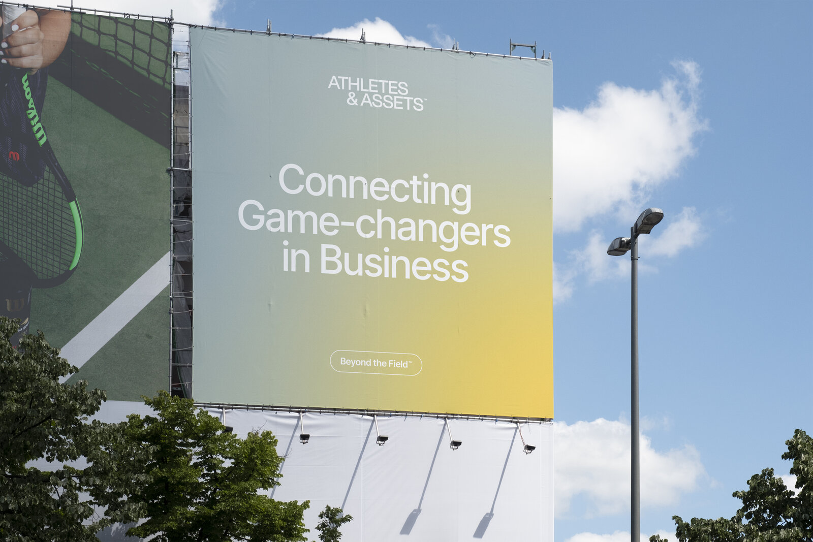
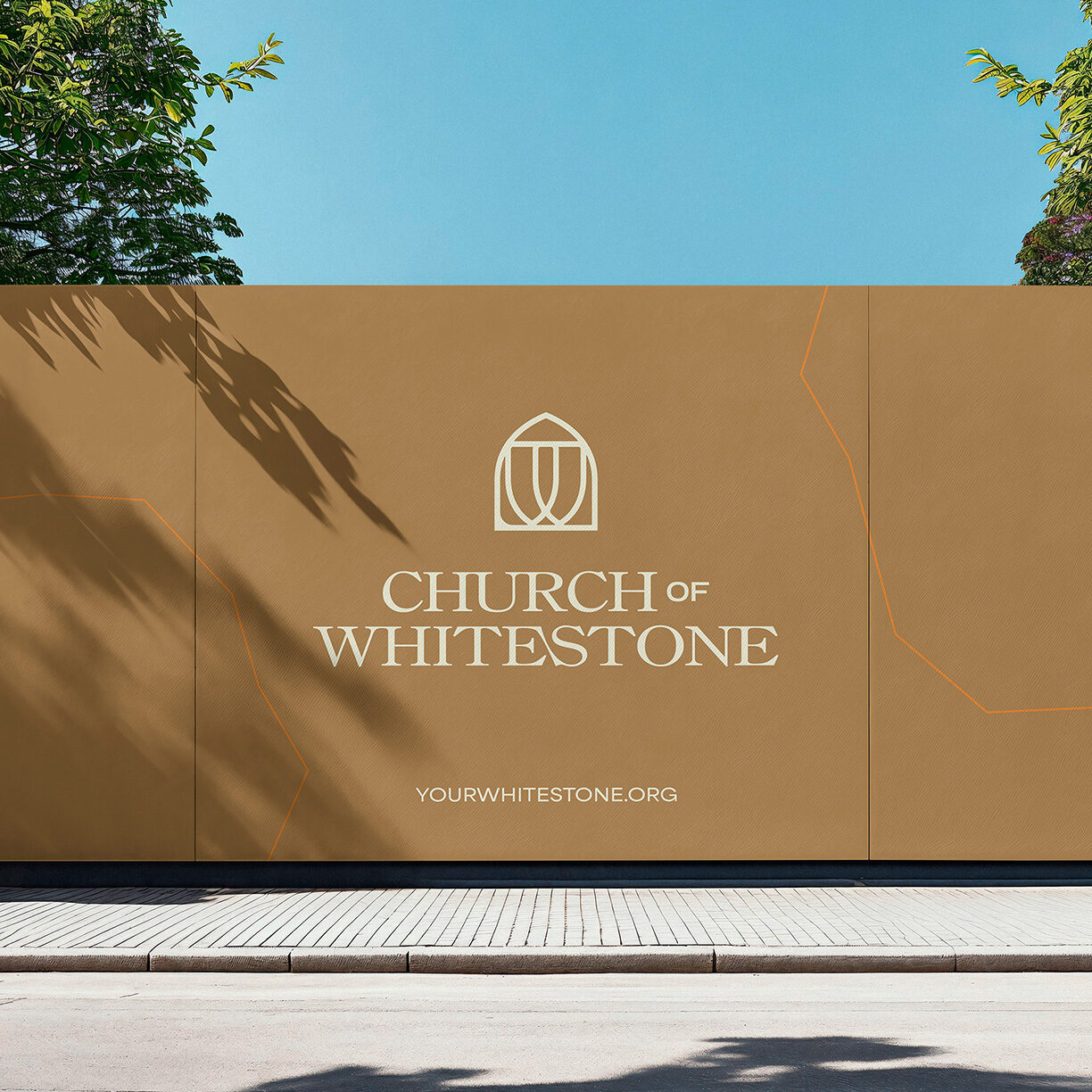
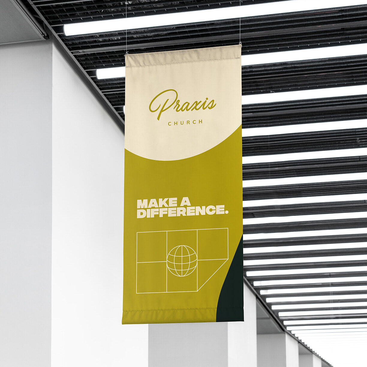
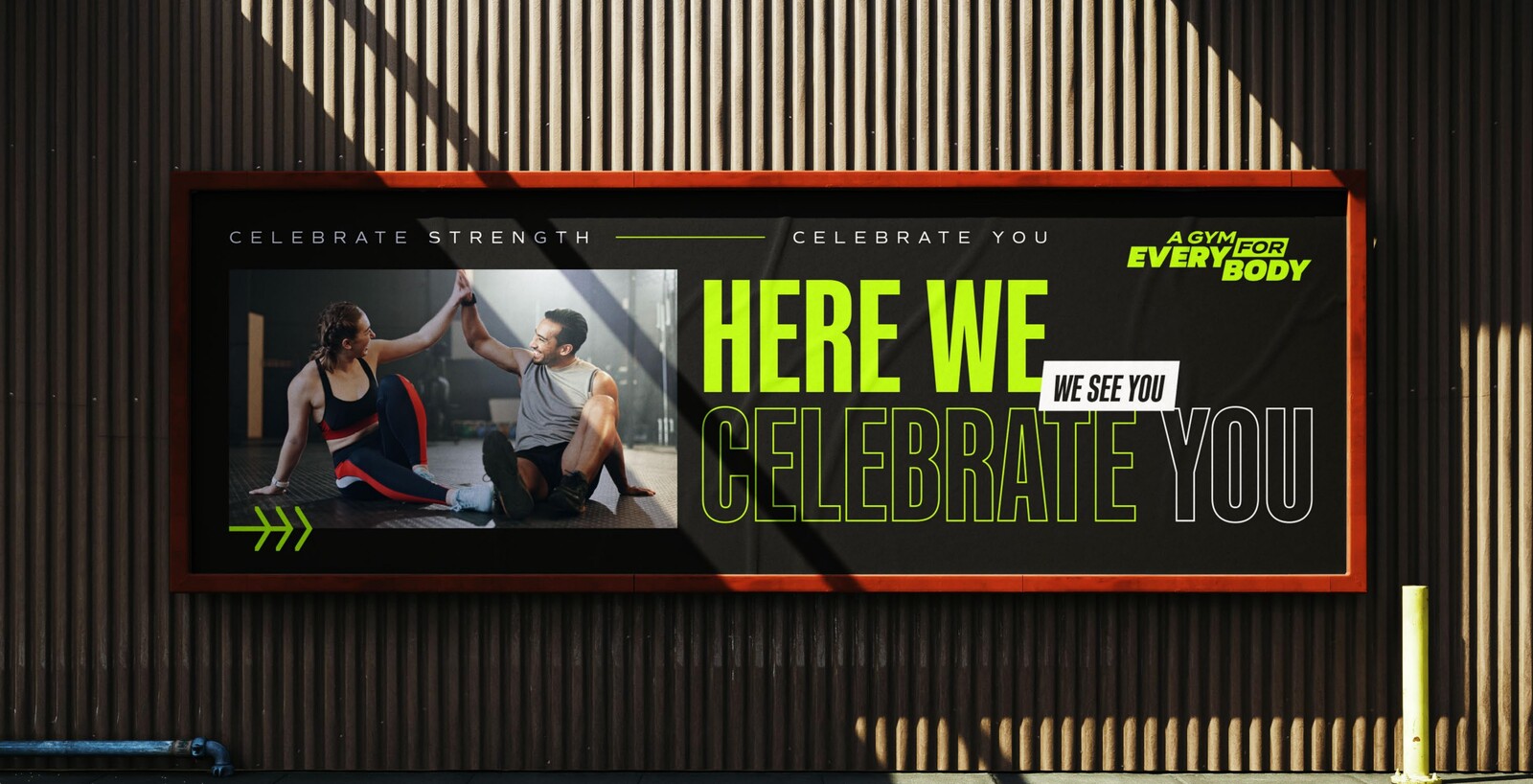
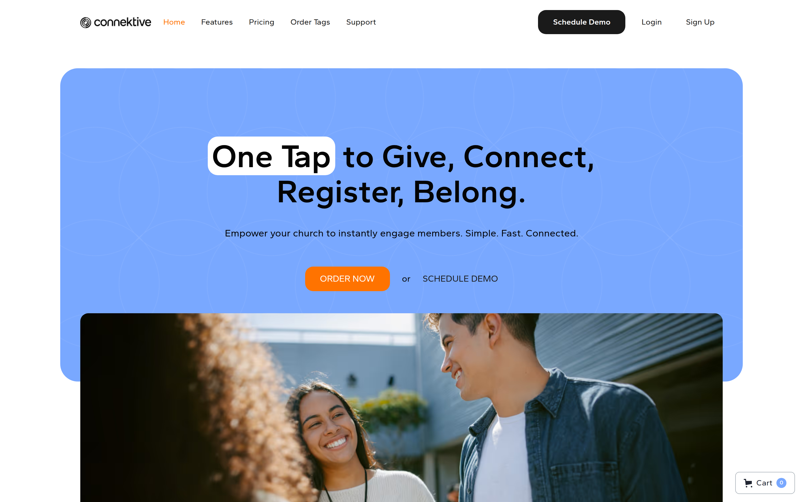
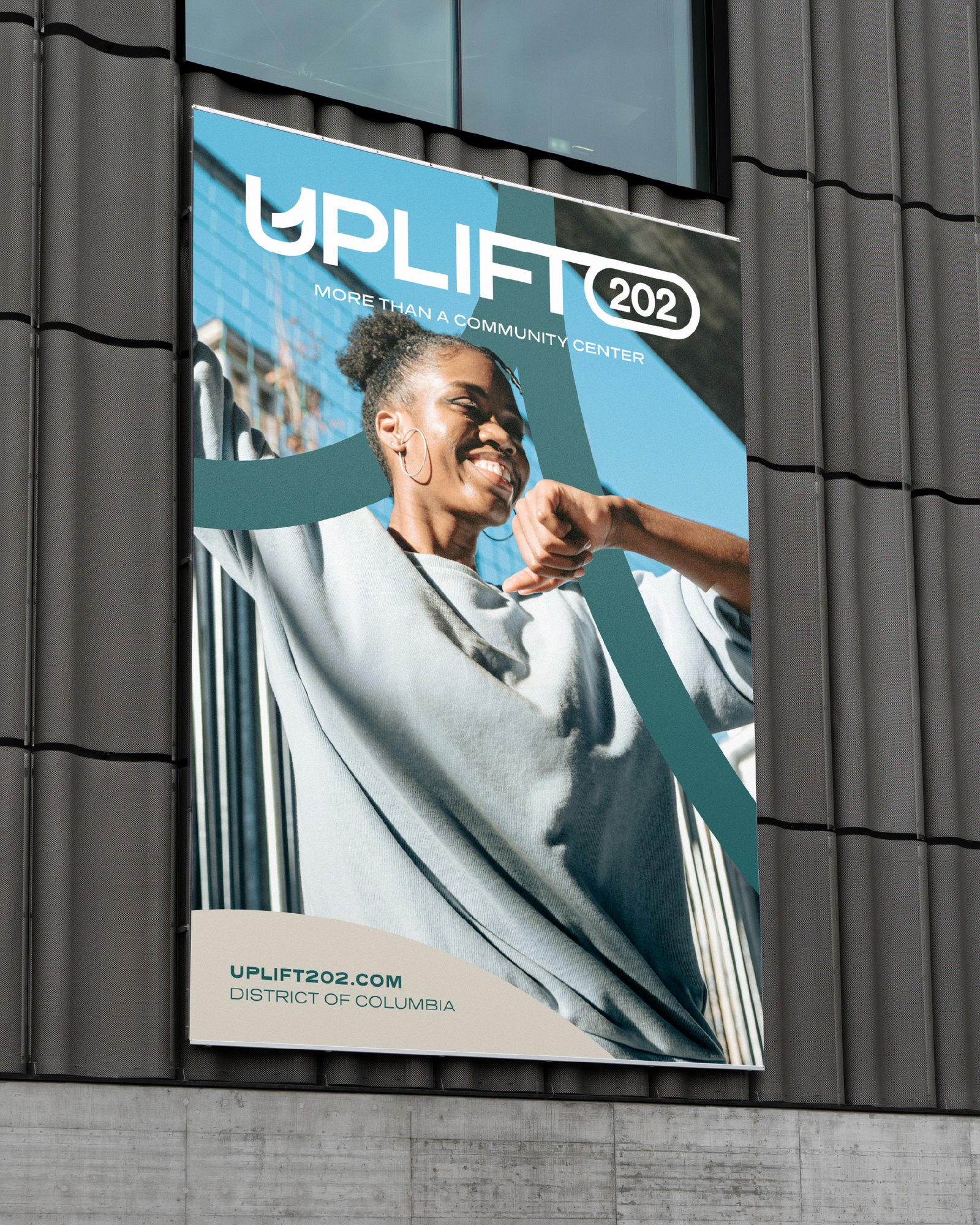
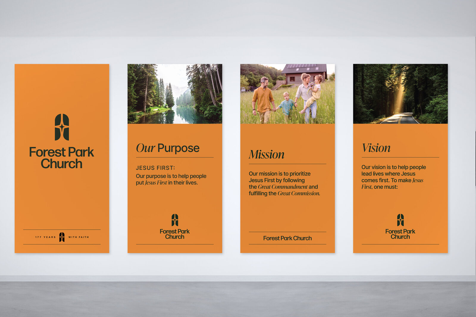
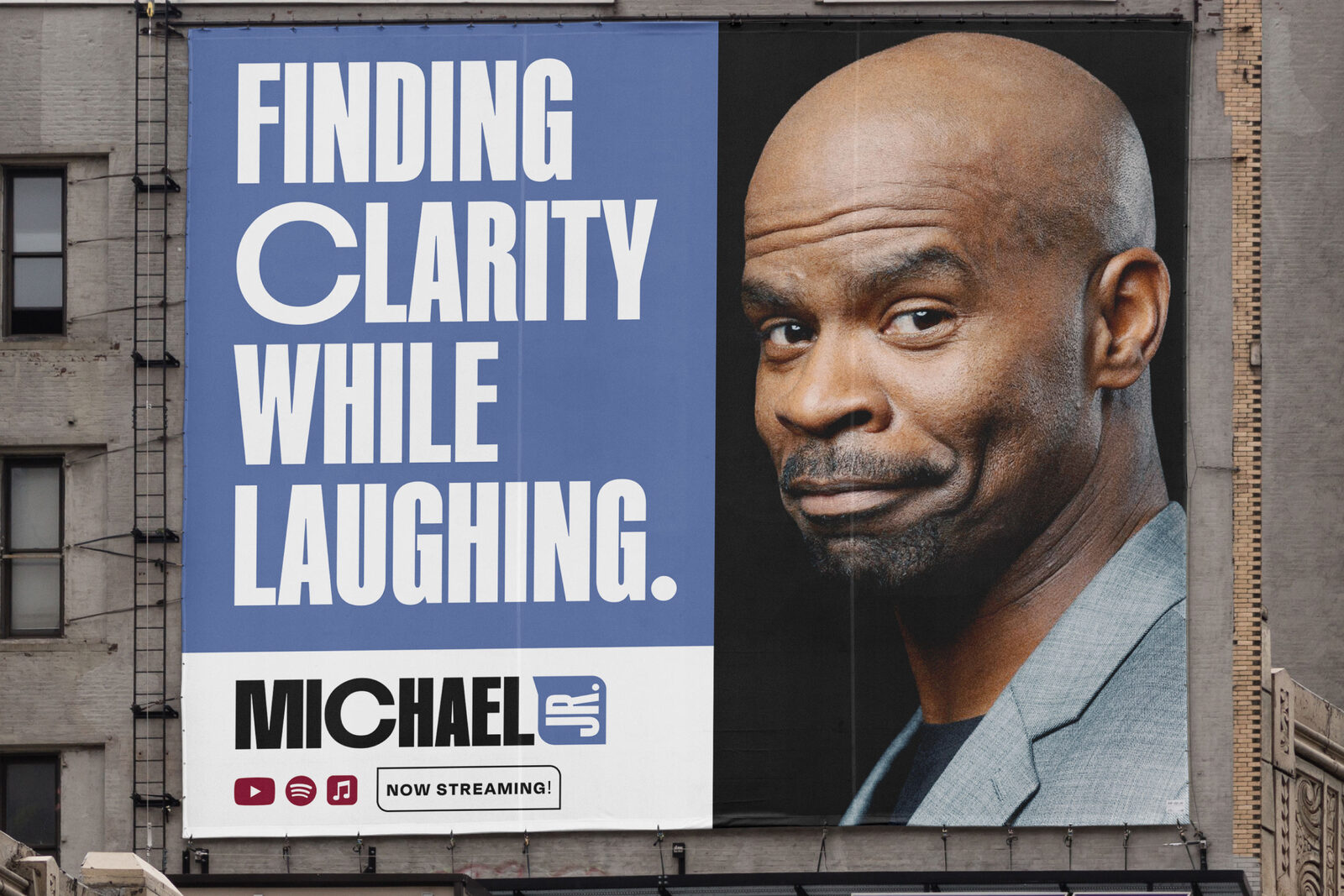
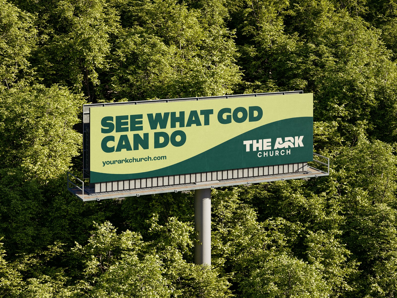
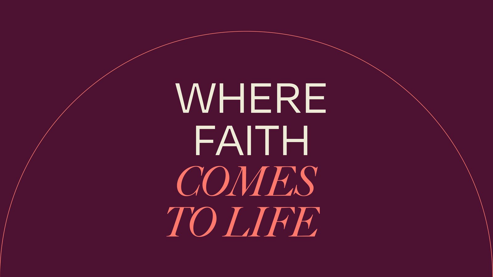
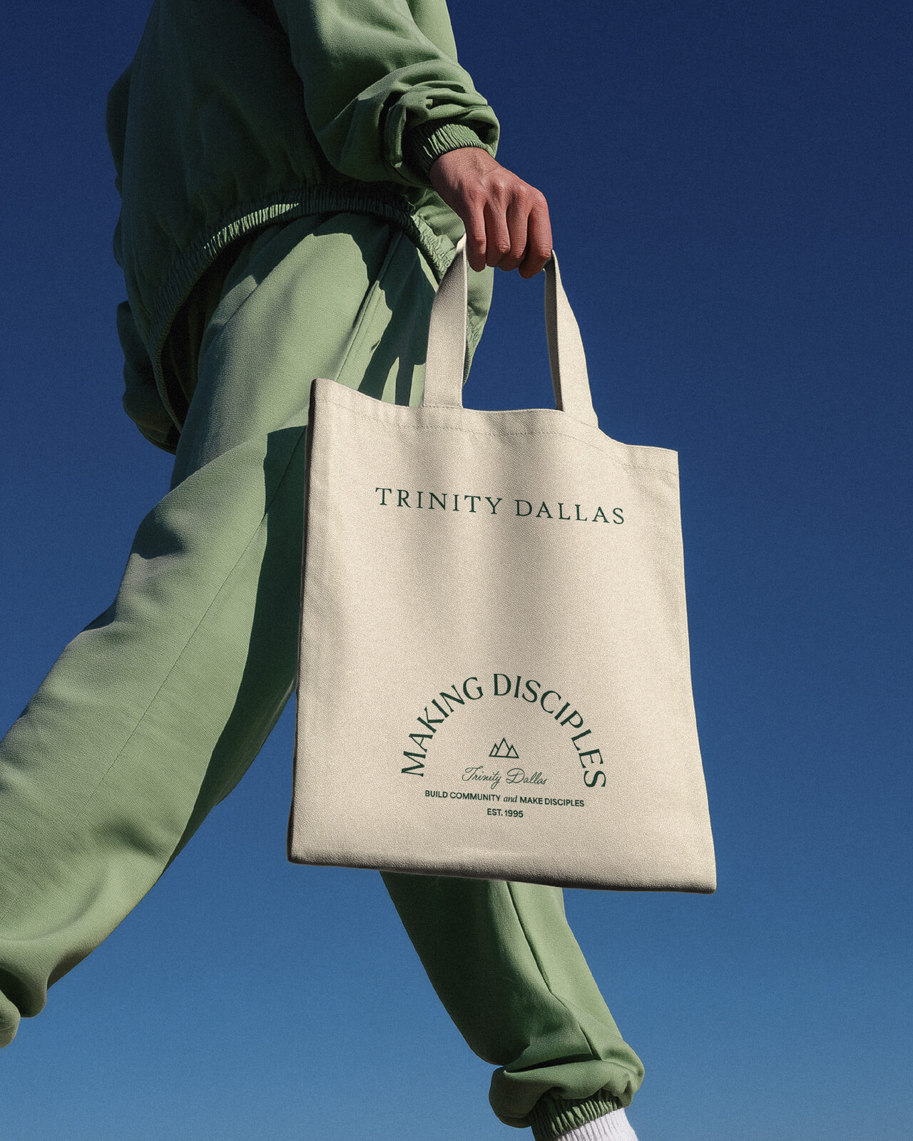
The brand was introduced in June as a set of social posts. These are four of them: a street poster, a desk display, and two billboards.
Identity: the wordmark, the icon, and the logo formats in RGB and CMYK.
Brand Style Guide: a 37-page guide to the mark, color, type, and elements.
Stationery: letterhead, envelope, business cards, email signatures, and a trifold brochure.
Funeral-home deck and a PowerPoint template.
Event signage: two banner stands and a table cover.
The June brand-reveal posts.
probatem.com.
Designed and built on Webflow. We host it; their team edits it, and our support desk handles what they send in.