Uplift 202 came in under Focus DC as a church sub-ministry. Branding came first, then a website with one job from the client: introduce people to Uplift's vision and mission, and give them a way to connect.
Moodboards came before any design work. Jerry's note on them set the mix of palette and logo mark, and the brand proposals built on it.
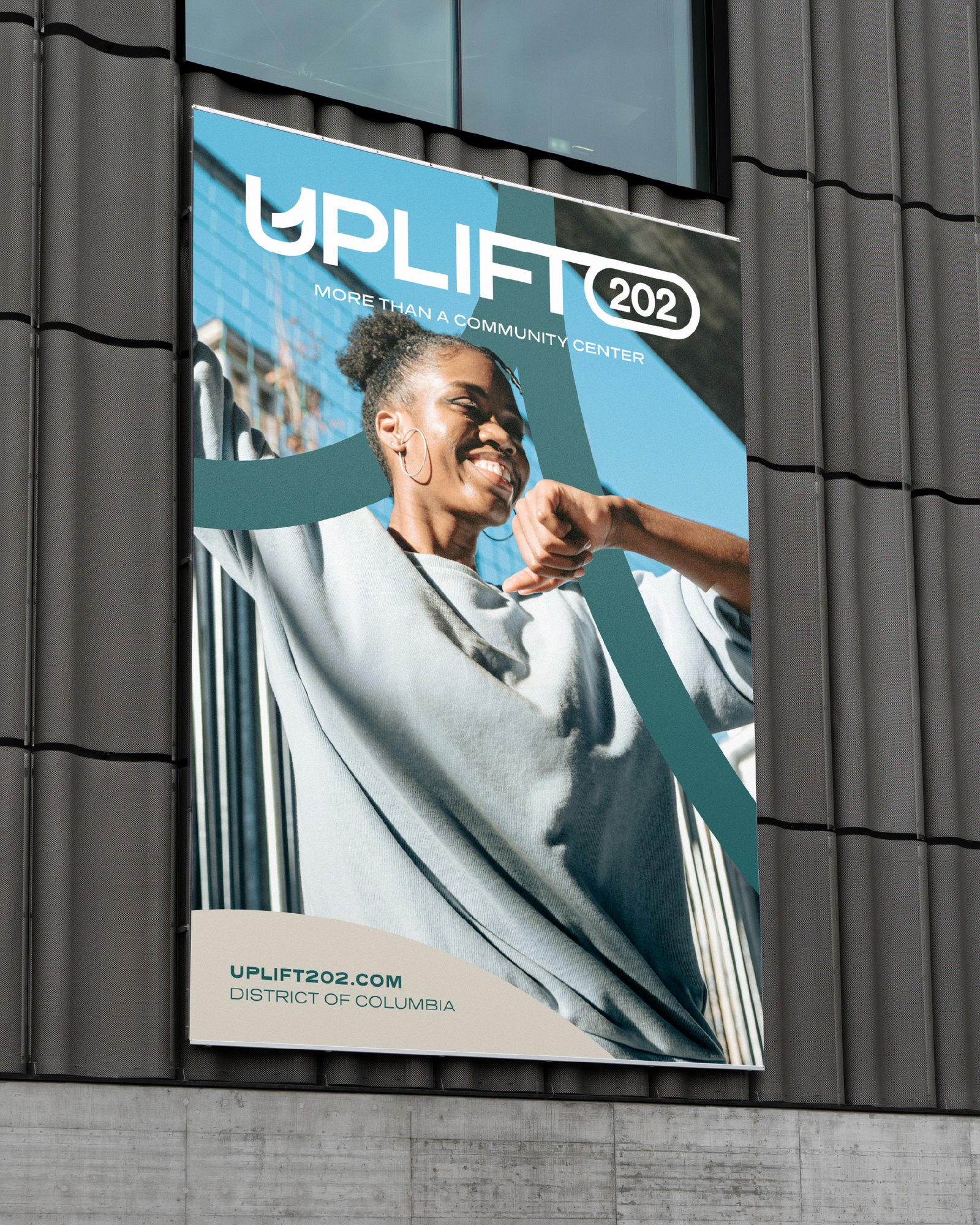
The wordmark sets UPLIFT in a clean, modern face and holds 202 in its own rounded tag. The icon pulls out the U, with a rising curve inside it. The guide lets the icon stand apart from the wordmark.
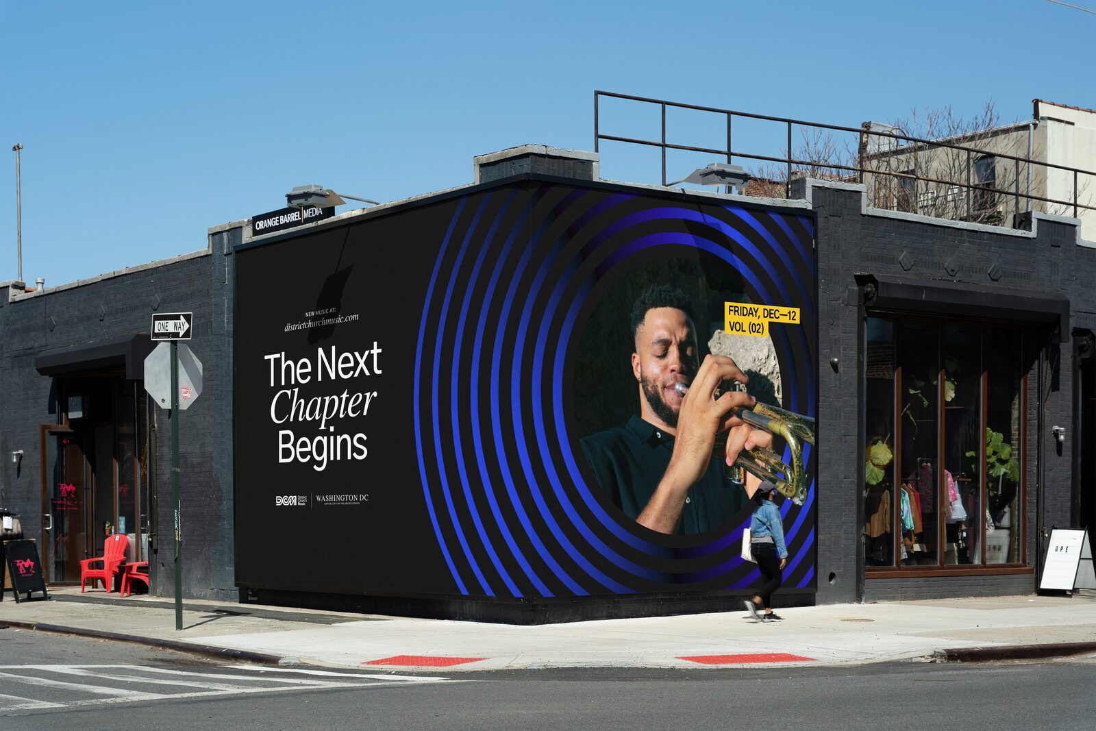
Arcs frame a photo or carry a whole panel. Nine named colors hold it together, from Charcoal and Ignite to Glacier and Soft Cream.
District Pro sets the headlines and the body copy. The guide notes it was designed in the suburbs of Washington, D.C. Presicav, a wide-set grotesque, sets the subheads.
Profile pictures use the icon in three colorways. The Facebook and Twitter covers each carry one of the brand's lines.
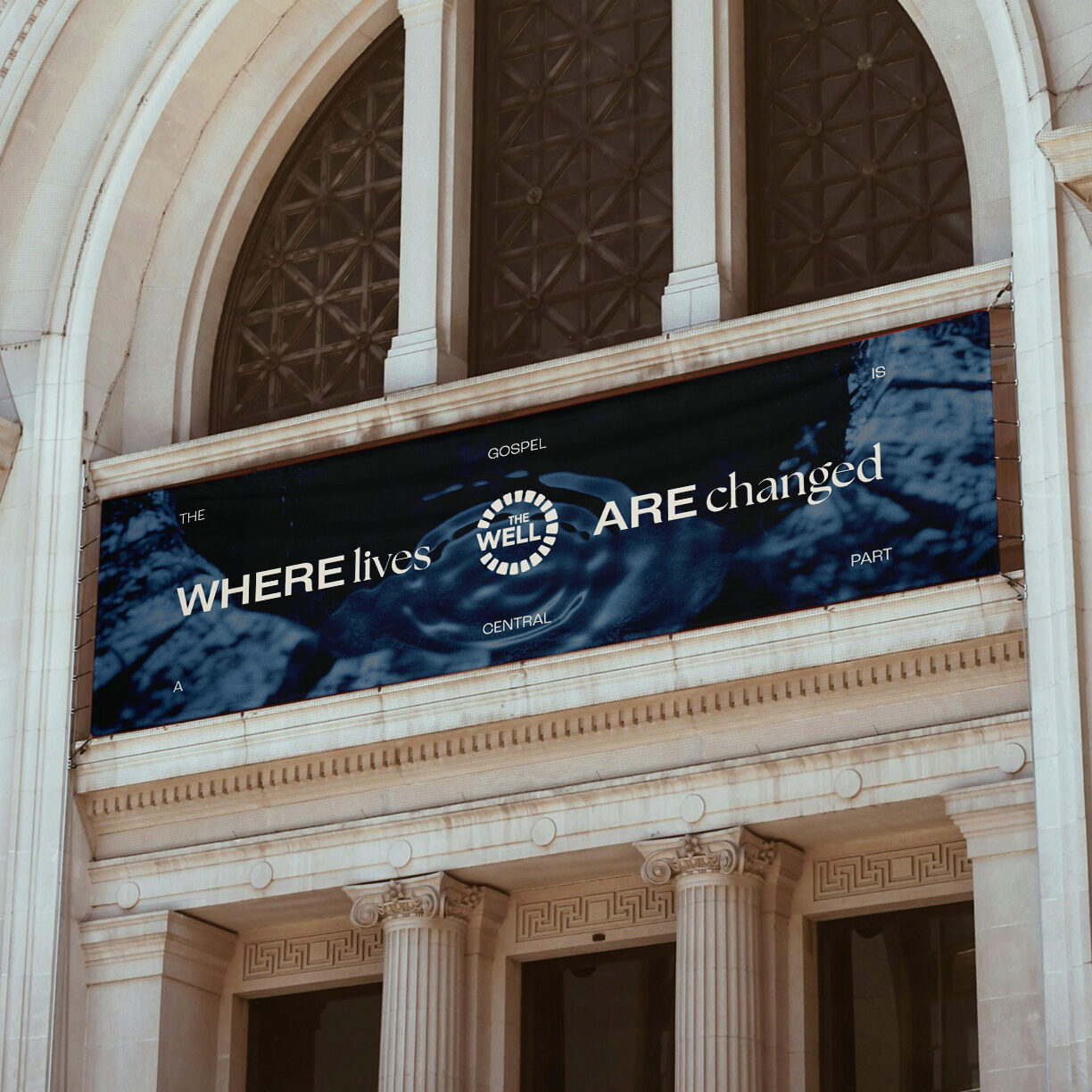
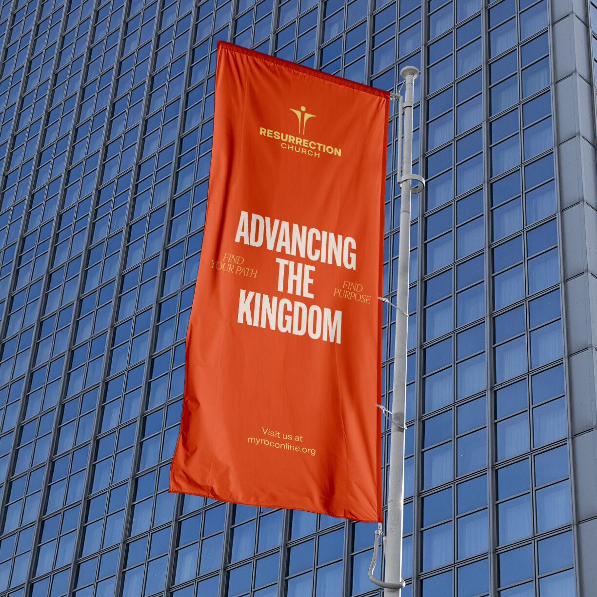
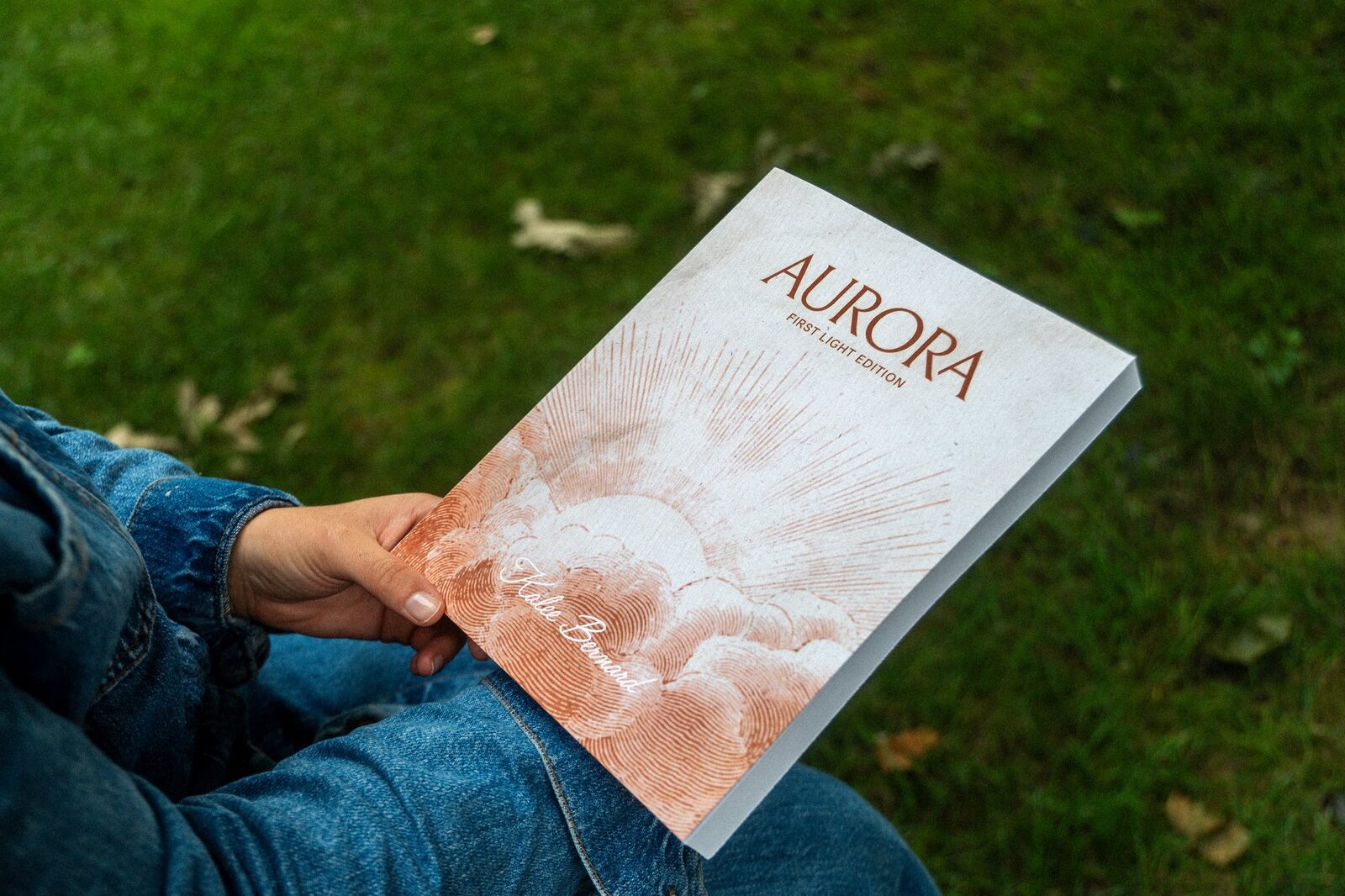
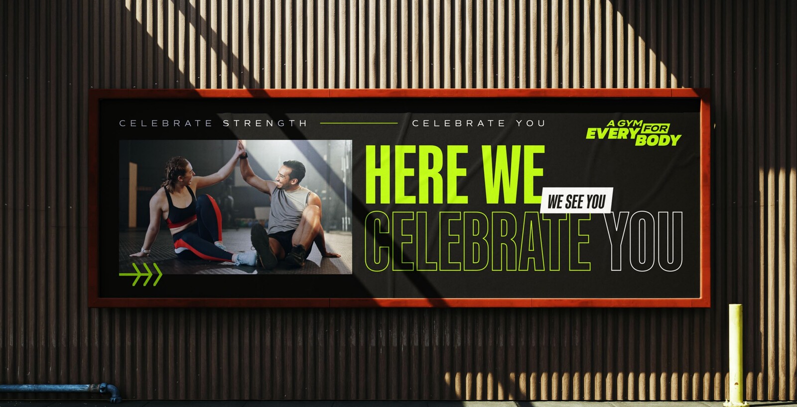
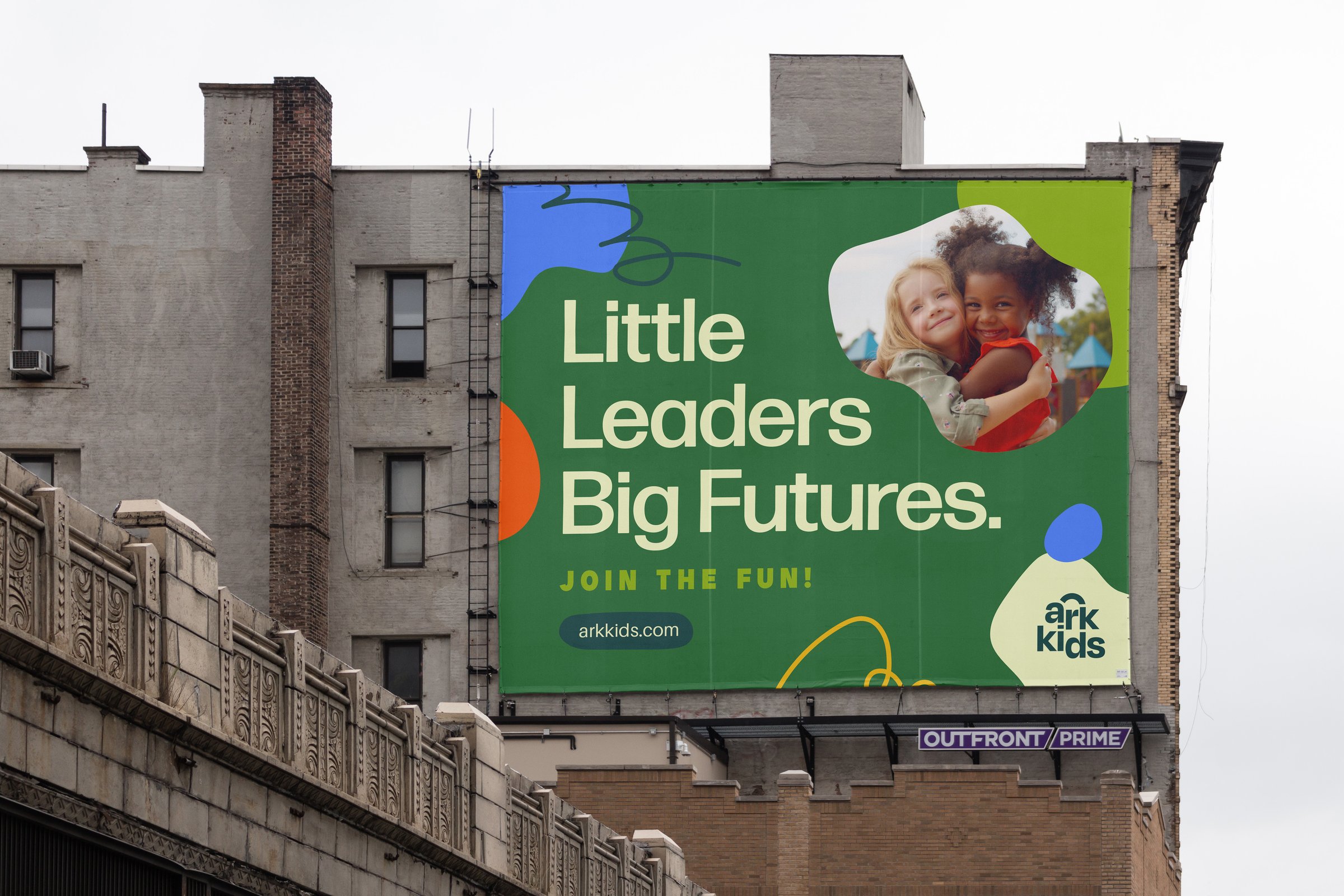
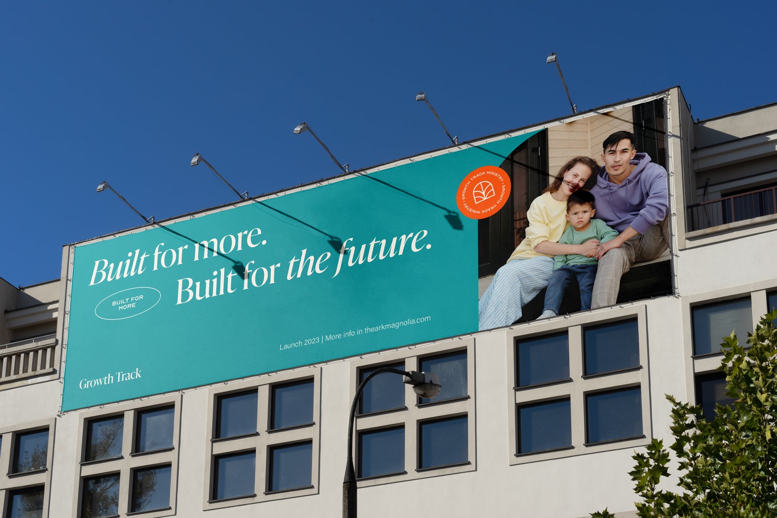
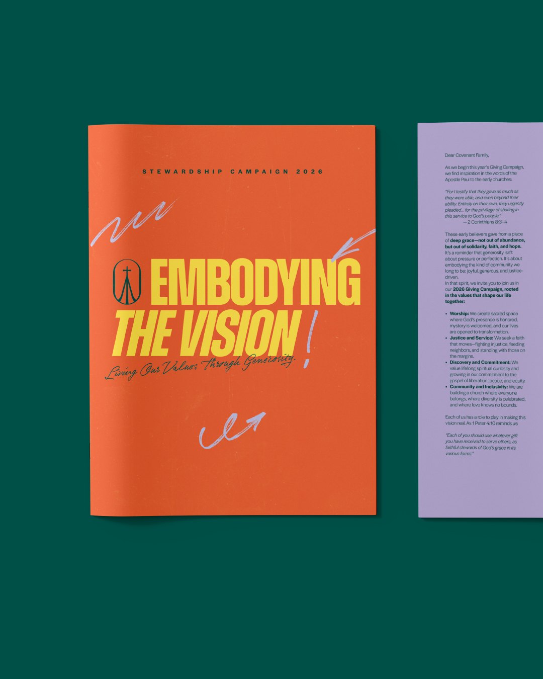
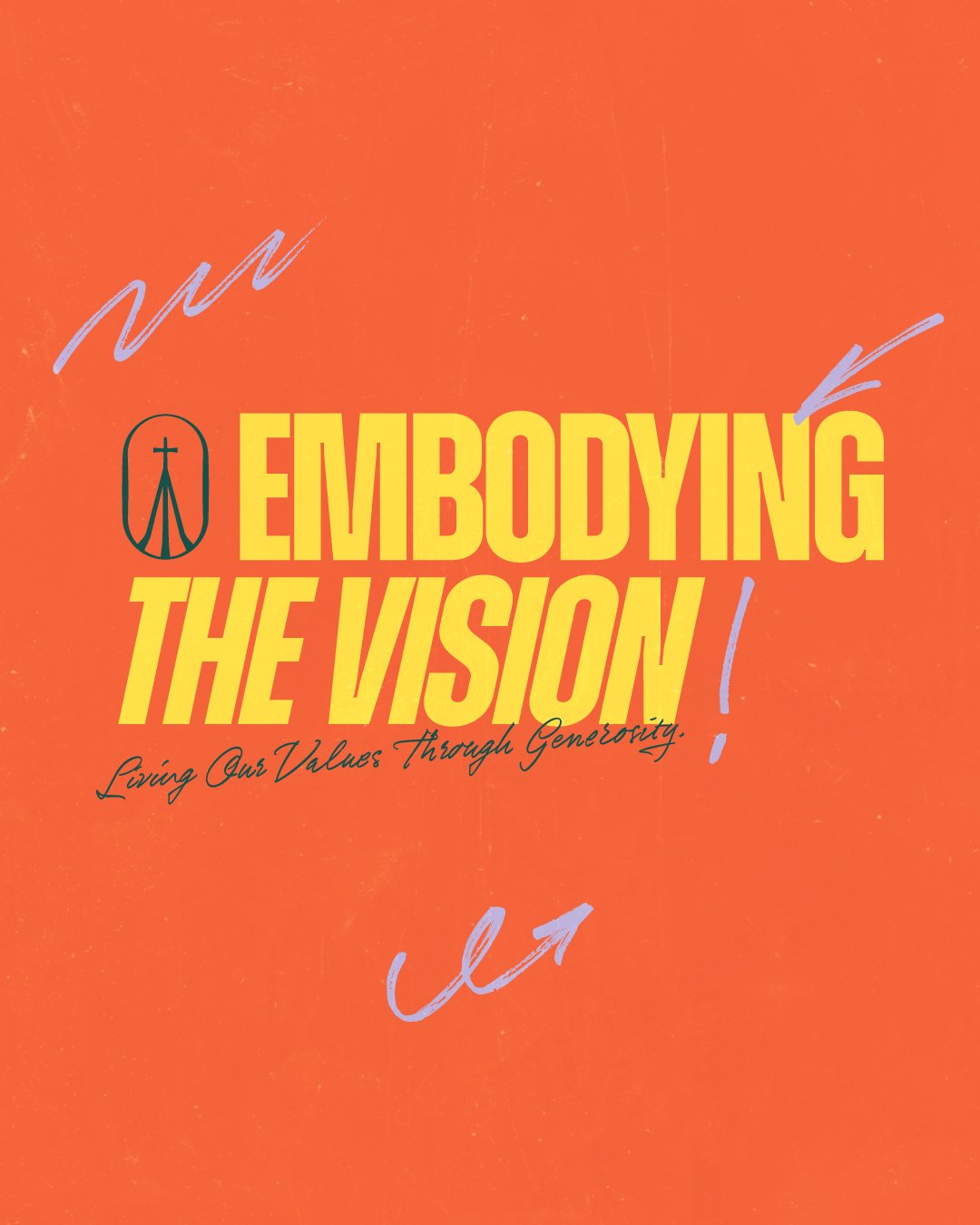
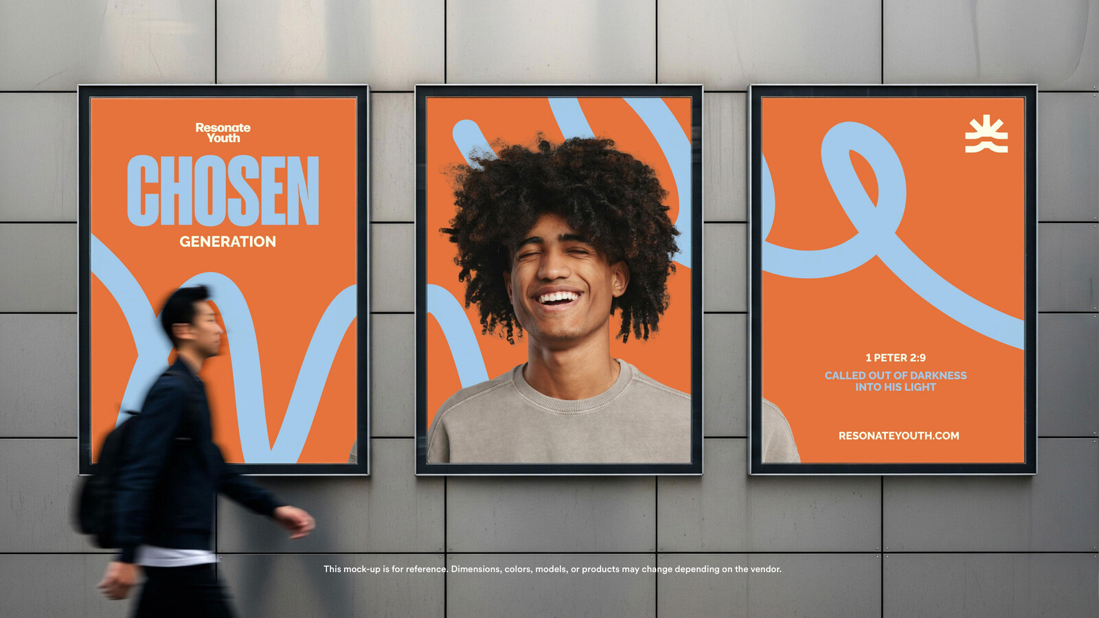
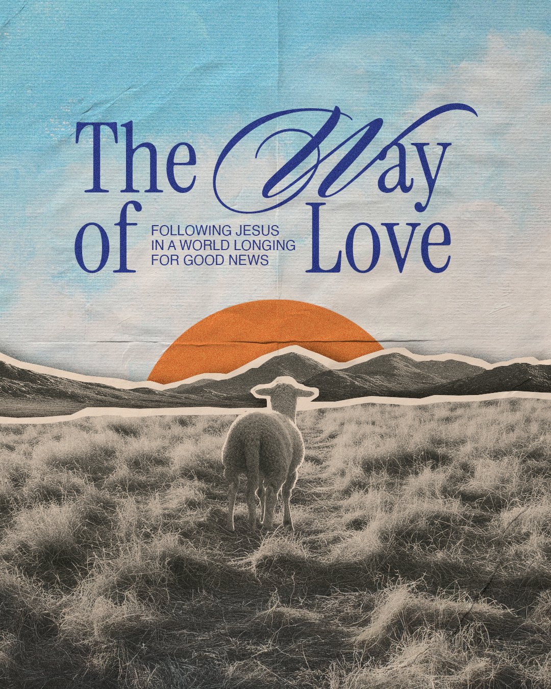
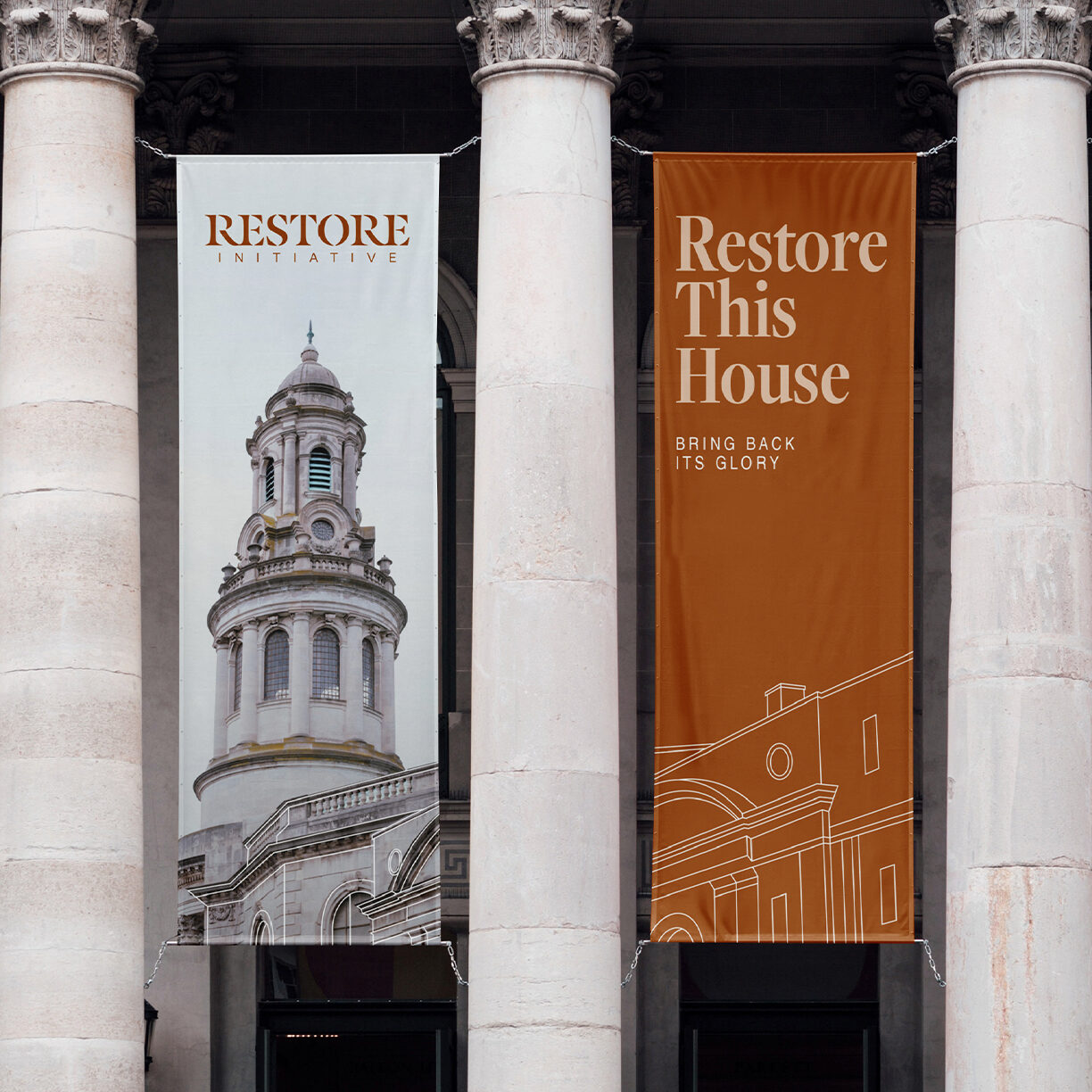
The guide closes with the brand mocked up: a banner on a building, a volunteer badge, a booklet, a run of posts. Each is marked for reference. None were produced.
Research and discovery: the research and strategy deck
Logo and wordmark: the U icon, the full wordmark, and an alternate icon lockup
Visual identity: typefaces, colors, and brand elements
Brand style guide: how to use all of it
Packaged brand files: the logo exports, ready to hand off
Social media design kit: profile icons and covers
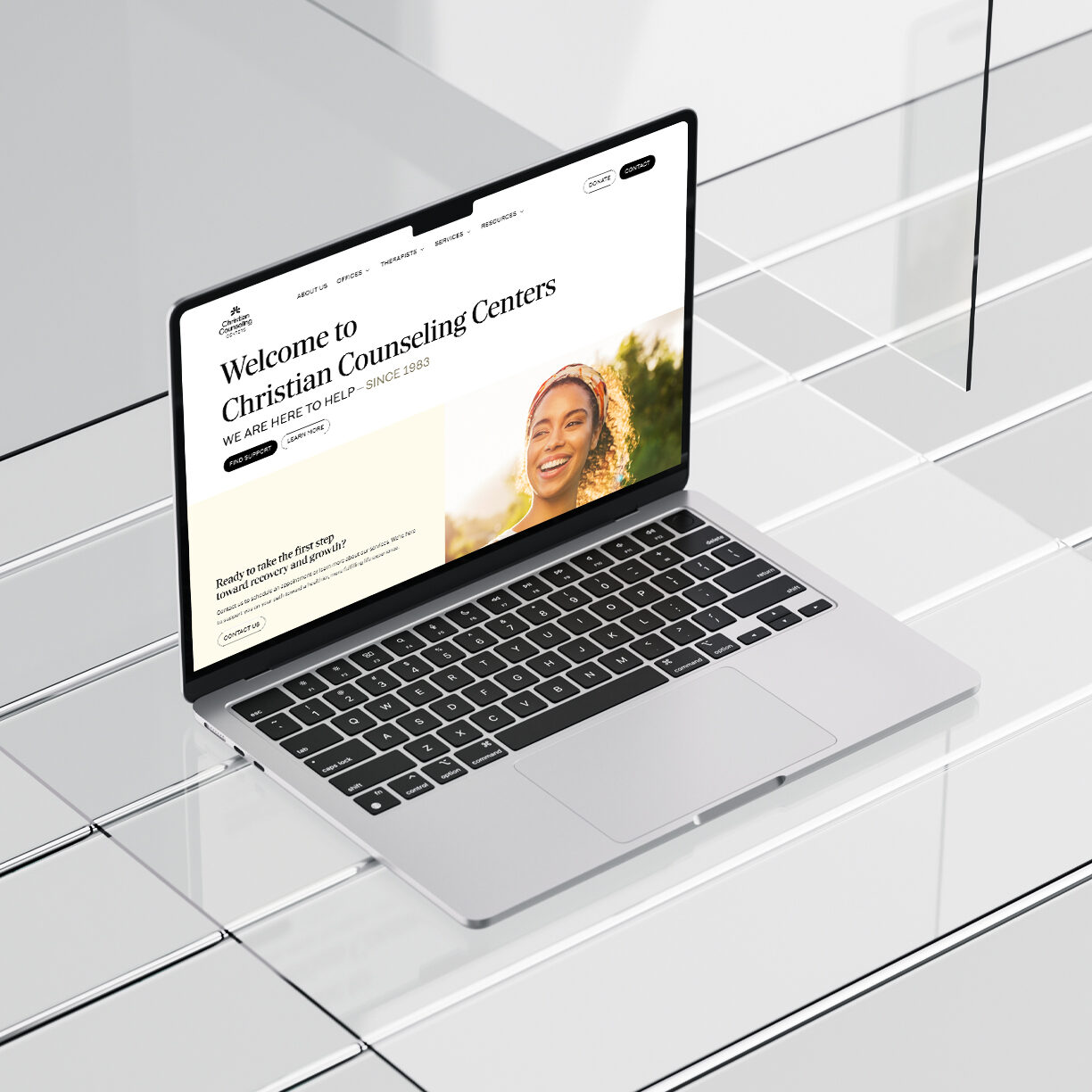
Website: uplift202.com, from sitemap and content through build, launch, and training
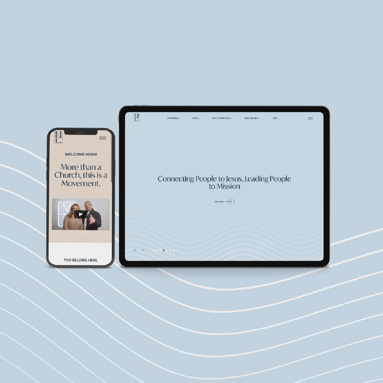
The site picks up the arcs, the palette, and both typefaces. We built it on Webflow.