Trinity Kids needed a visual identity distinct enough to feel like its own ministry brand, without reading as disconnected from the Trinity Dallas church it belongs to.
Trinity Kids needed its own identity inside Trinity Dallas's world—energetic enough for actual kids, without breaking from the church that raised it. We ran multiple moodboard rounds before landing on a direction, then kept refining from there: richer, more saturated colors than the first pastel pass, and a wordmark where KIDS carries more visual weight than Trinity itself.
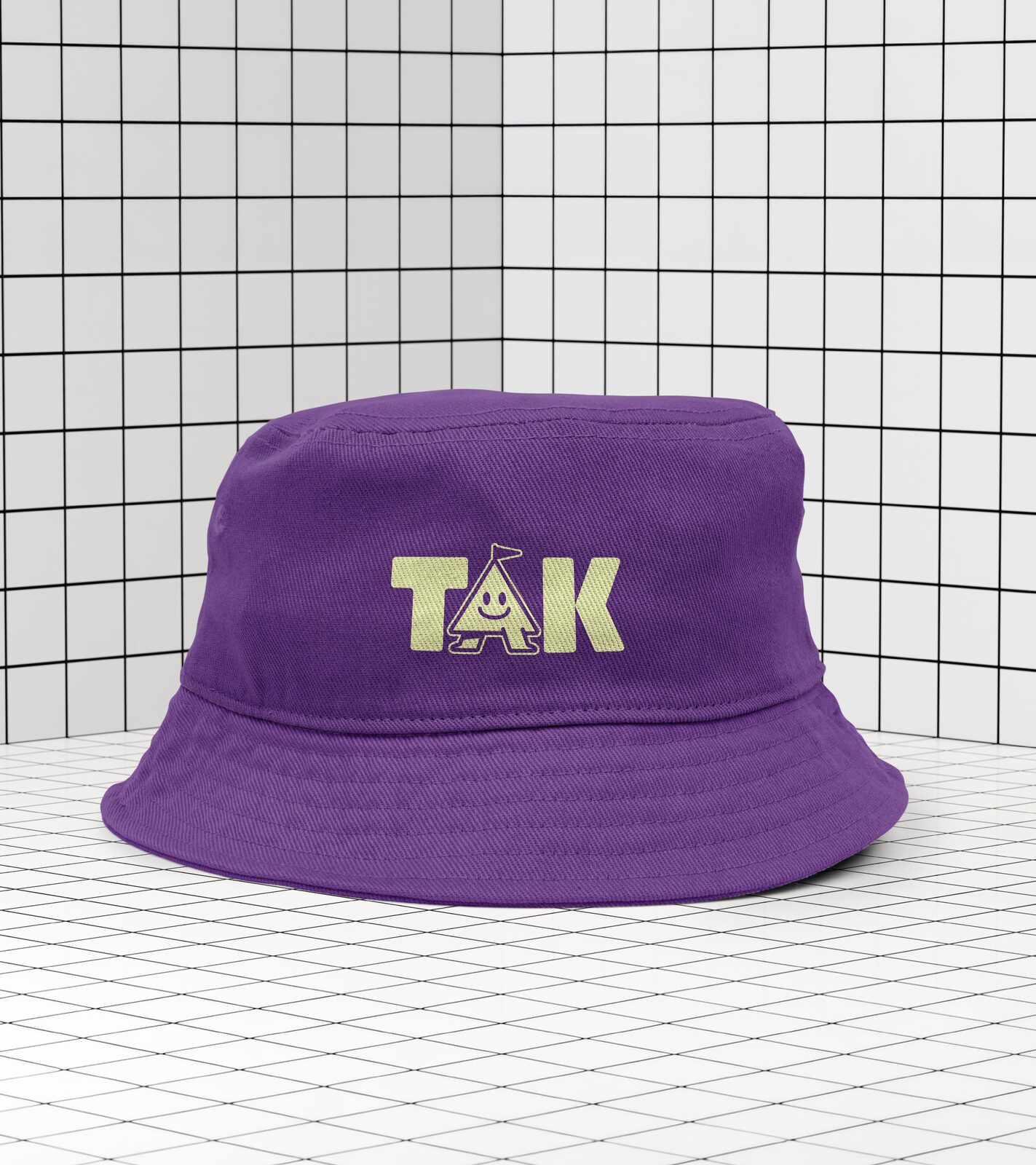
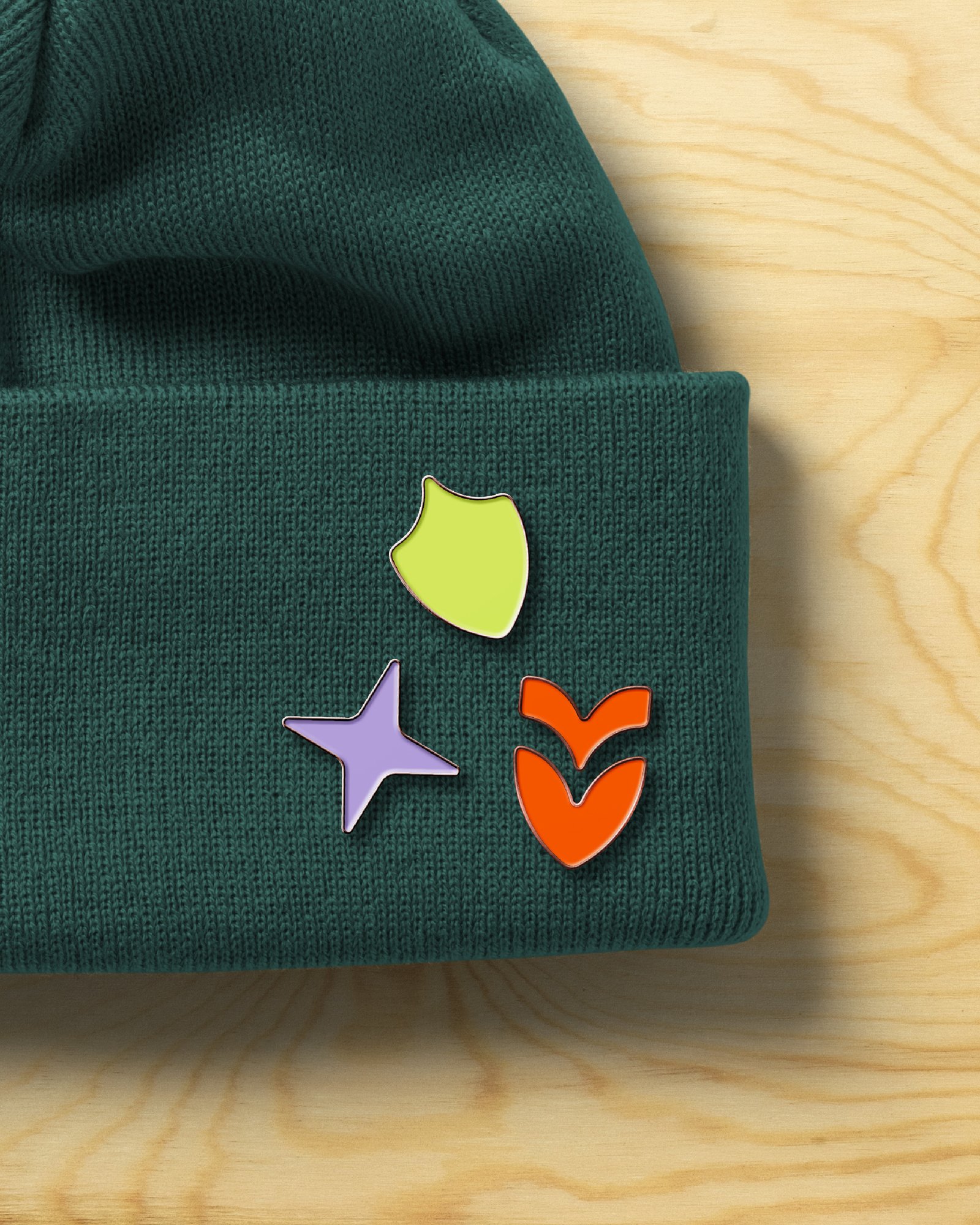
The wordmark pairs a script font with a bold all-caps treatment, putting extra visual weight on KIDS for a playful, dynamic read. The icon carries the same DNA as the main Trinity Dallas mark, redrawn with rounded edges and negative-space details for a more childlike, dynamic feel—shown here in Pine, one of nine candy-colored variants built for the brand.
The client's own note shaped the palette directly: the early moodboard colors "lean a bit pastel," so the direction moved toward something bolder—a candy-colored system spanning shades like Pine, Turquoise, Candy, Lime, and Pumpkin. The wordmark went through its own round of feedback too: the church liked the layout and scale of a reference example where KIDS sat larger than Trinity, but not its fonts, so that hierarchy got kept and the type got rebuilt from scratch.
Moodboards and refinement—multiple rounds of client-directed feedback shaping the direction.
Logo and visual identity—a KIDS-forward wordmark hierarchy.
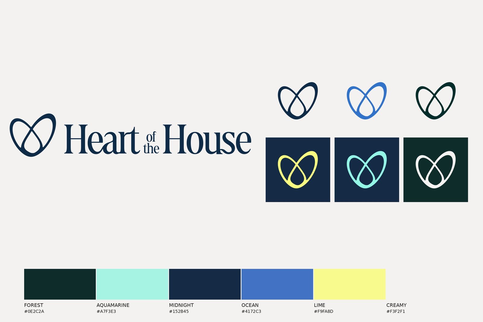
Color system—a candy-colored palette spanning Pine, Turquoise, Candy, Lime, Pumpkin, and more.
Brand style guide.
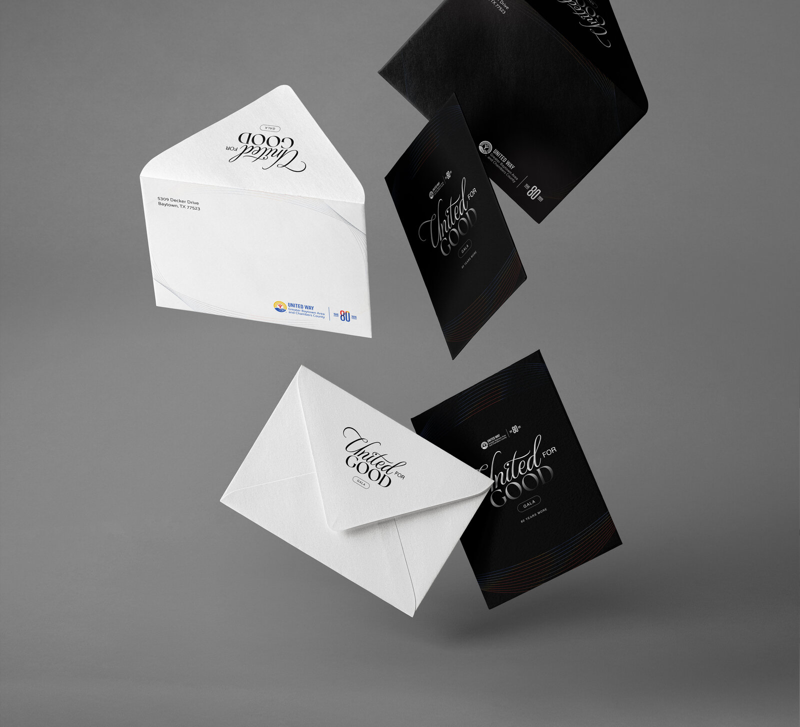
Stationery and business cards.
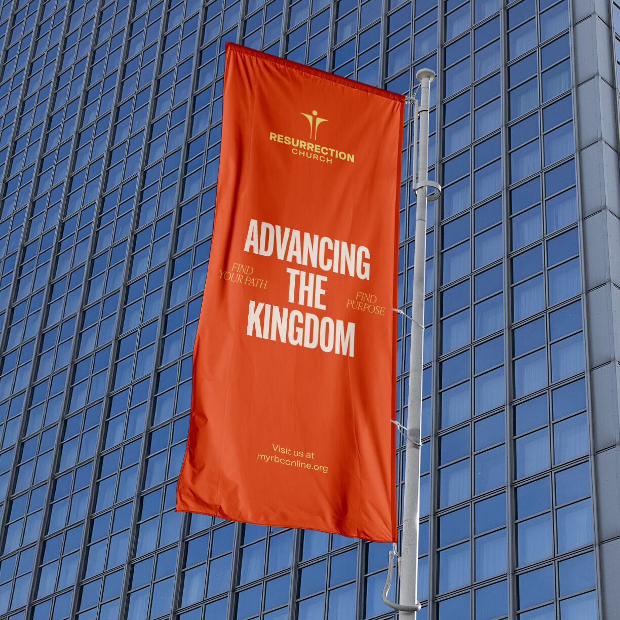
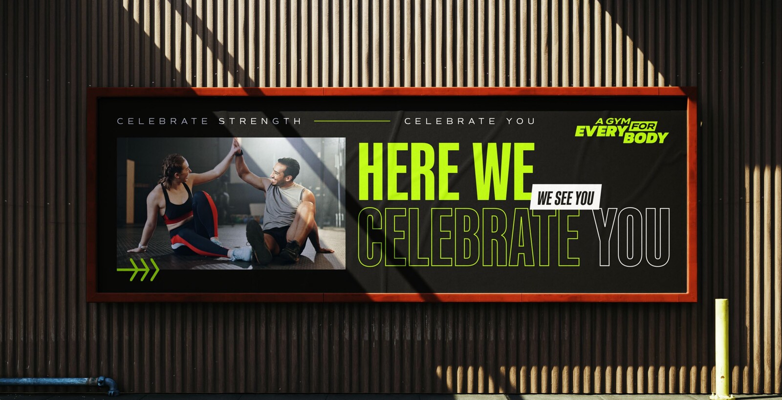
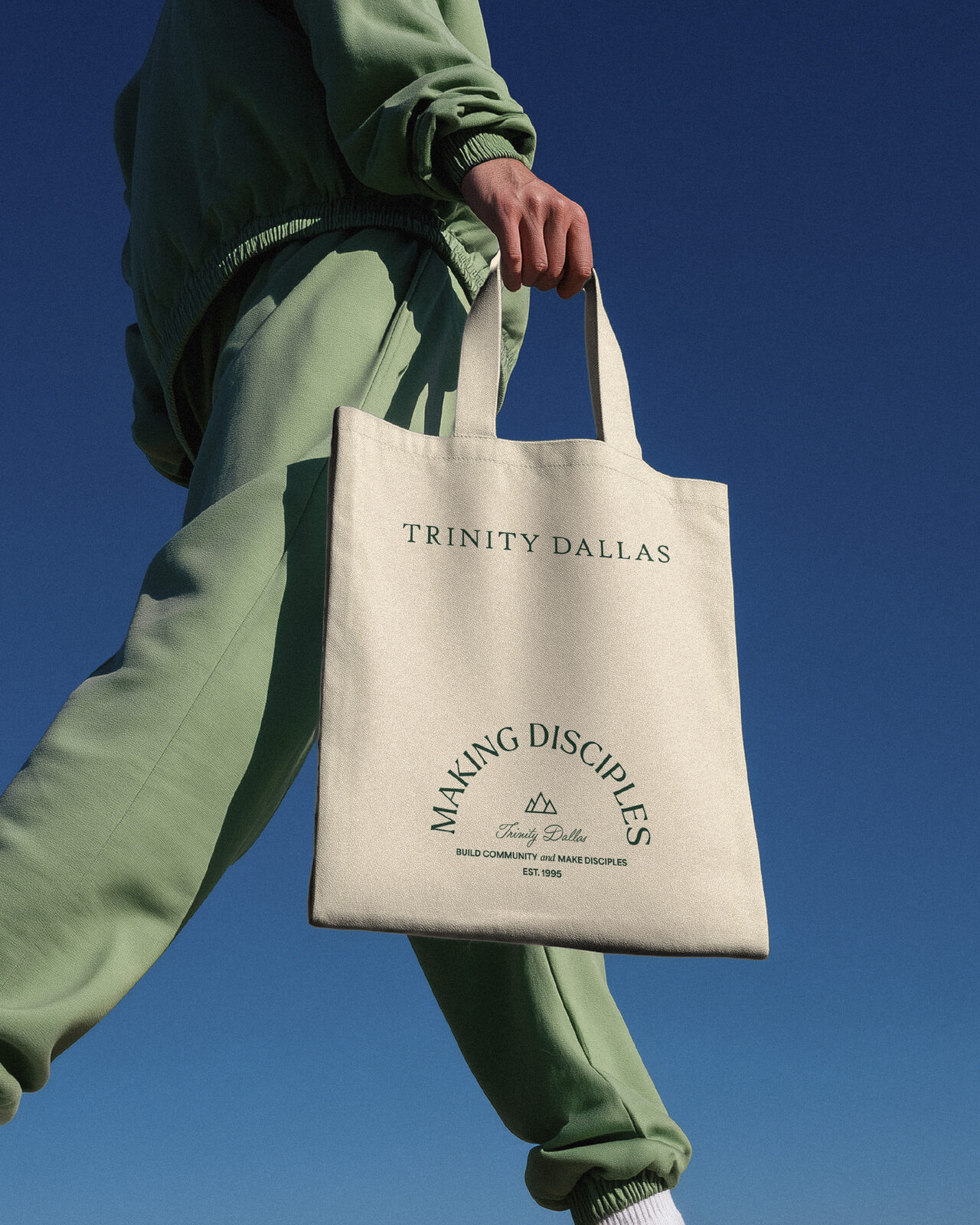
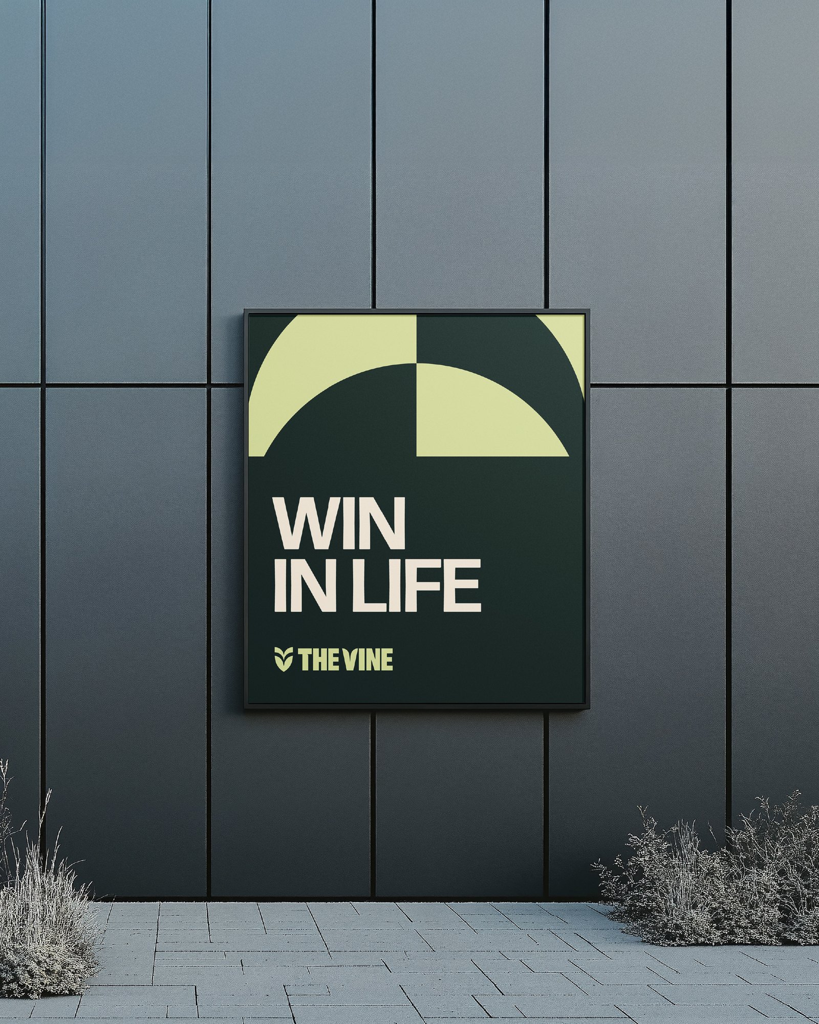
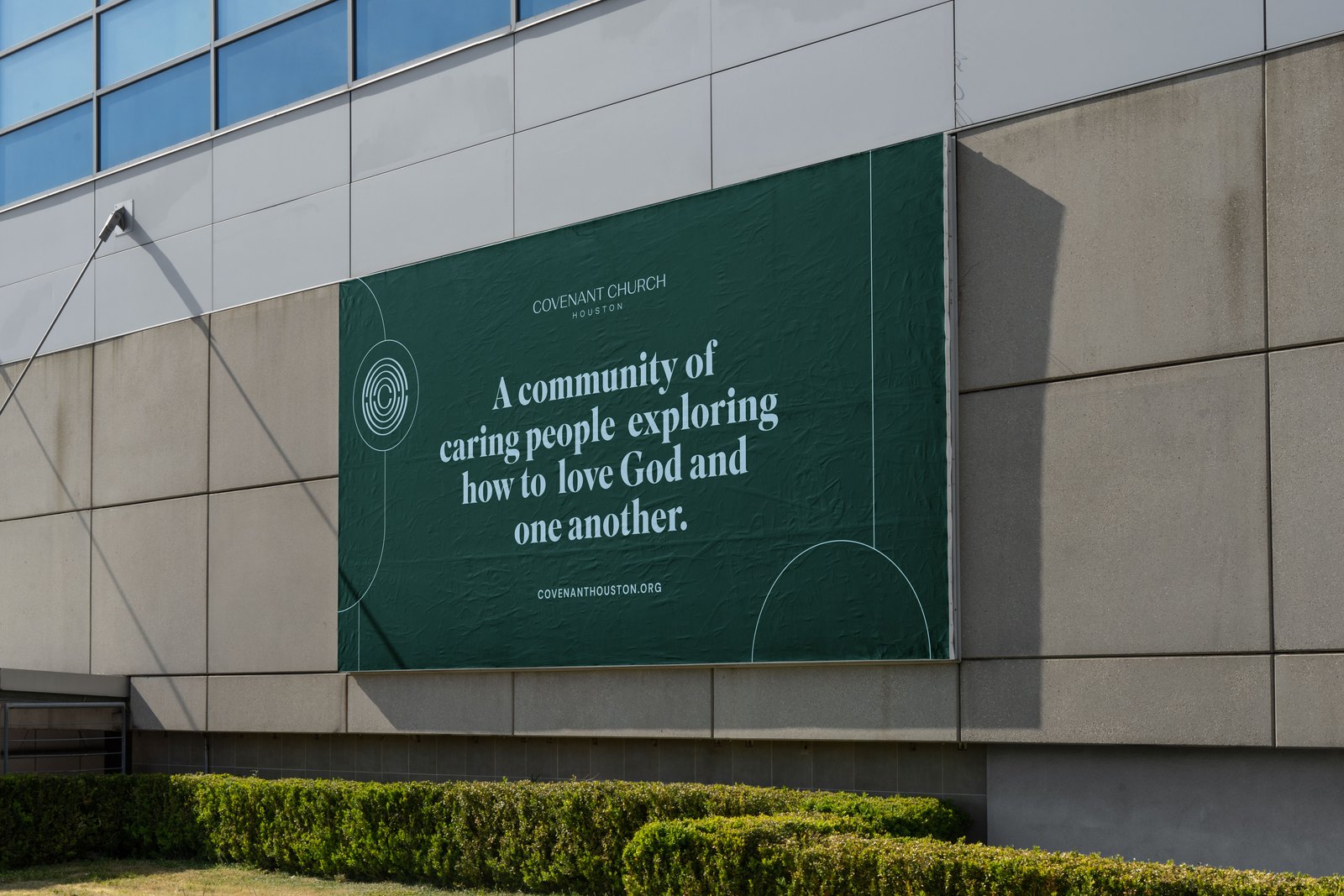
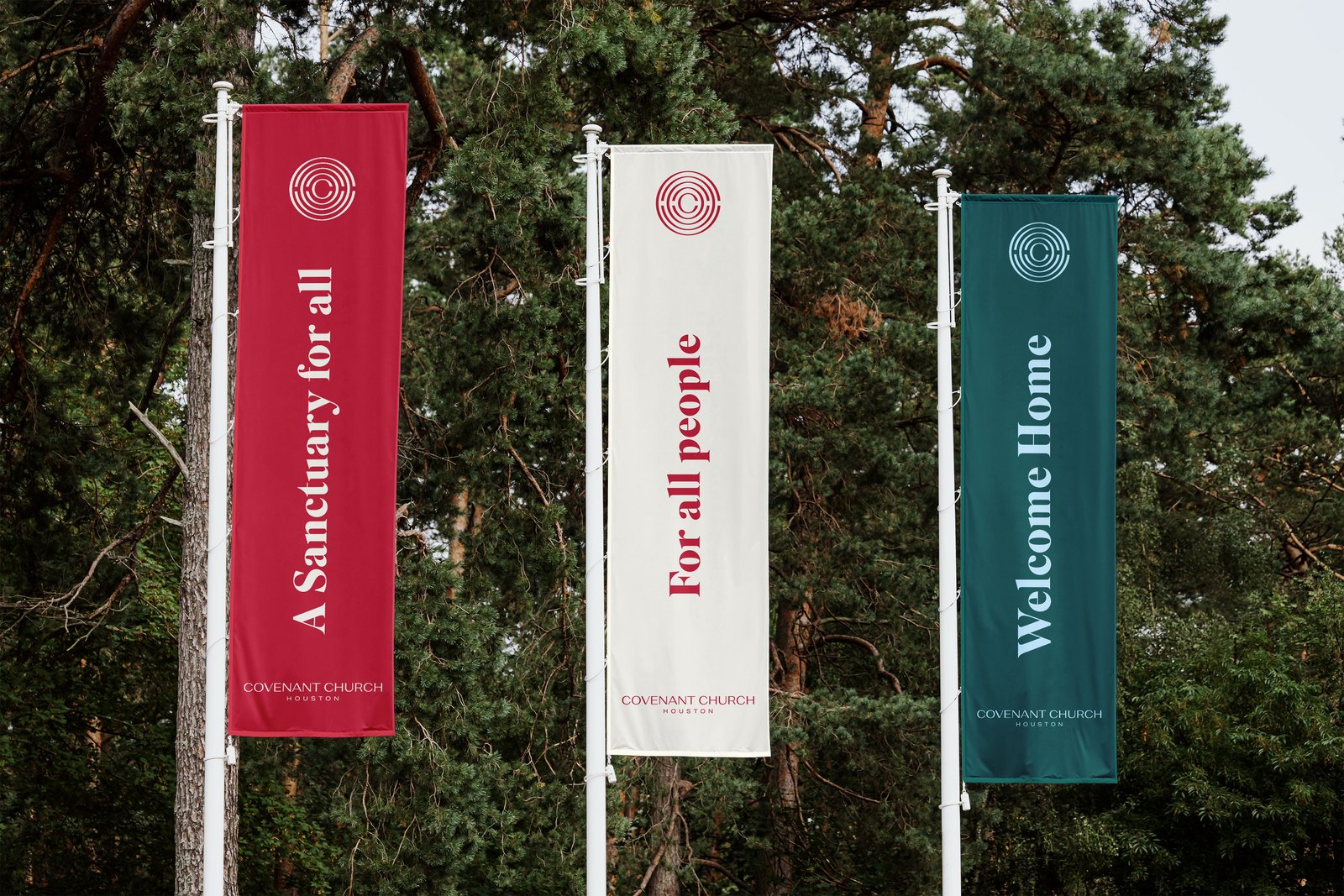
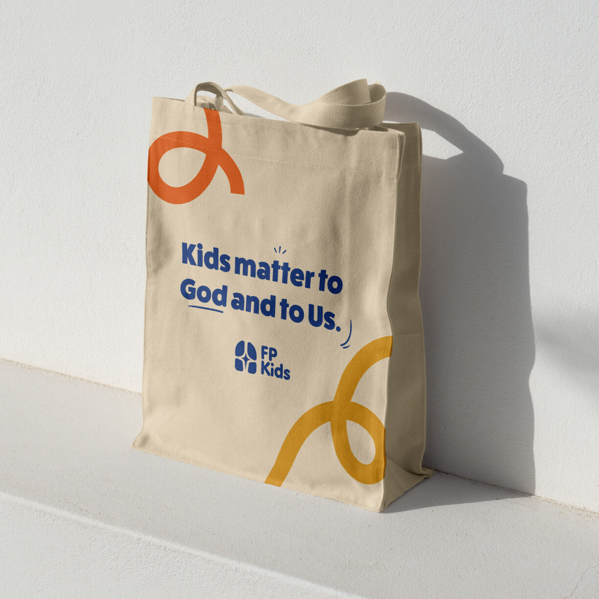
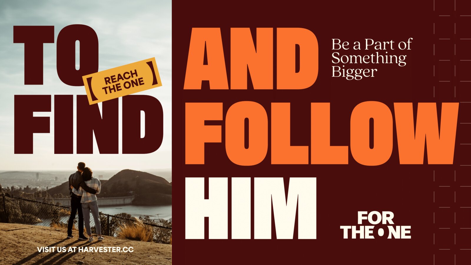
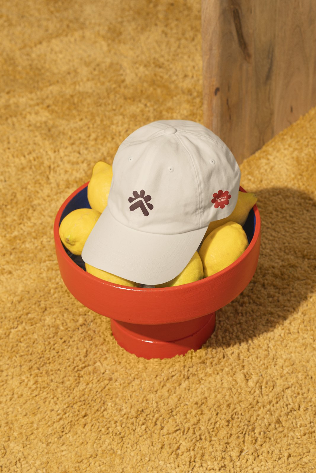
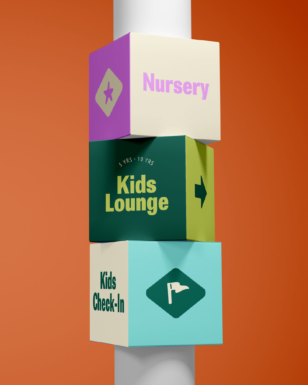
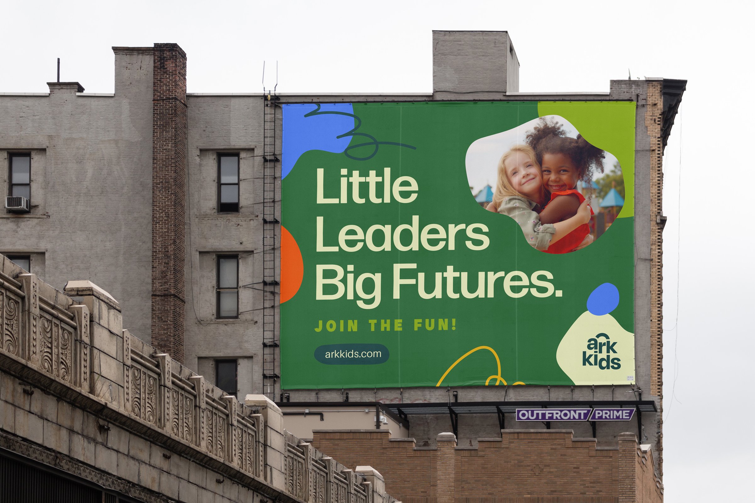
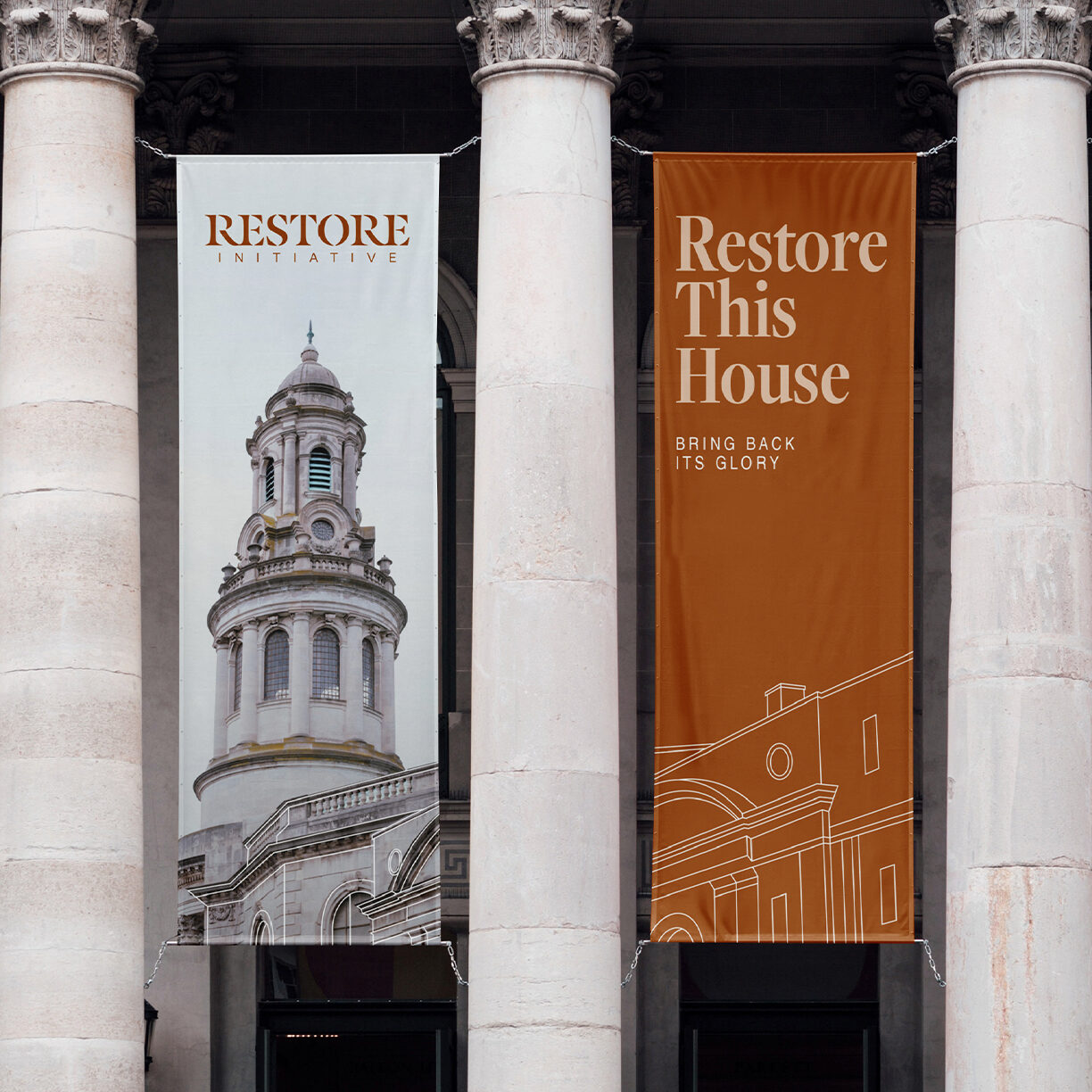
Wayfinding signage, light-pole banners, locker decals, social cards, and animated logo treatments—the identity carried across every touchpoint kids and families actually see.