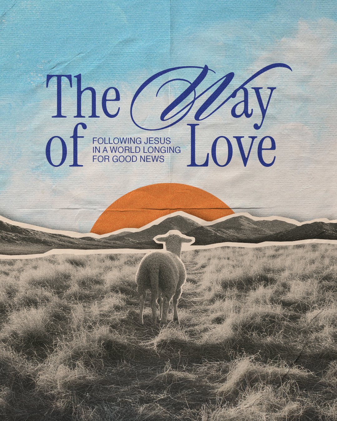
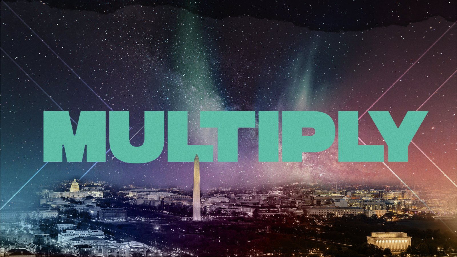
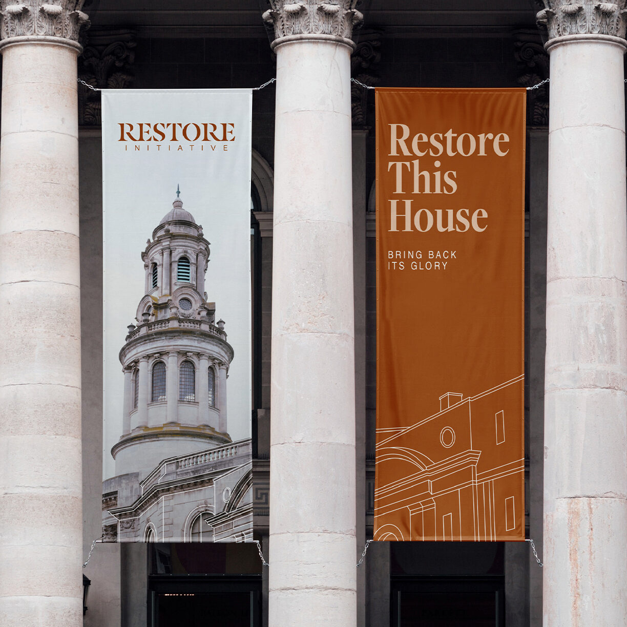
YouthCity was the old name. In July 2023 the church moved the credits from a cancelled website into two brands, and the youth director wanted something that would work on a Sunday night at six as well as on a pop-up wall at a retreat. The survey came back in a week, the moodboards in September, with one correction from Savannah: it's District College, not District University.
One system, two temperatures. Youth and College share the roofline, the seal, and the type, and split on color. Direction 2 won on October 18, 2023, after the client asked us to drop the By TDC Student Ministry line, and a November note that the first palette looked too patriotic sent us to the gradients.
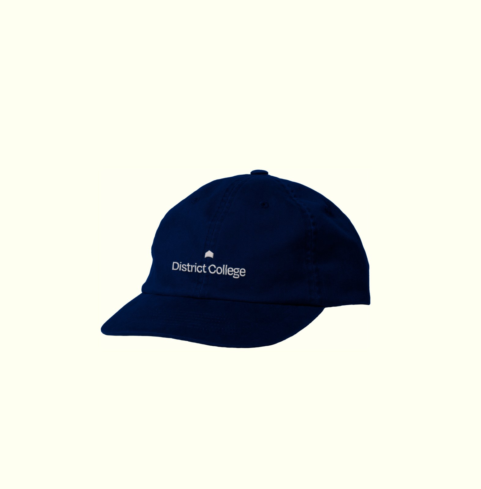
The District arch flattened to a single roofline, a seal that reads District Youth around it, and a wordmark in Degular. Skyline Blue and Shine on Dark Skyline Blue.
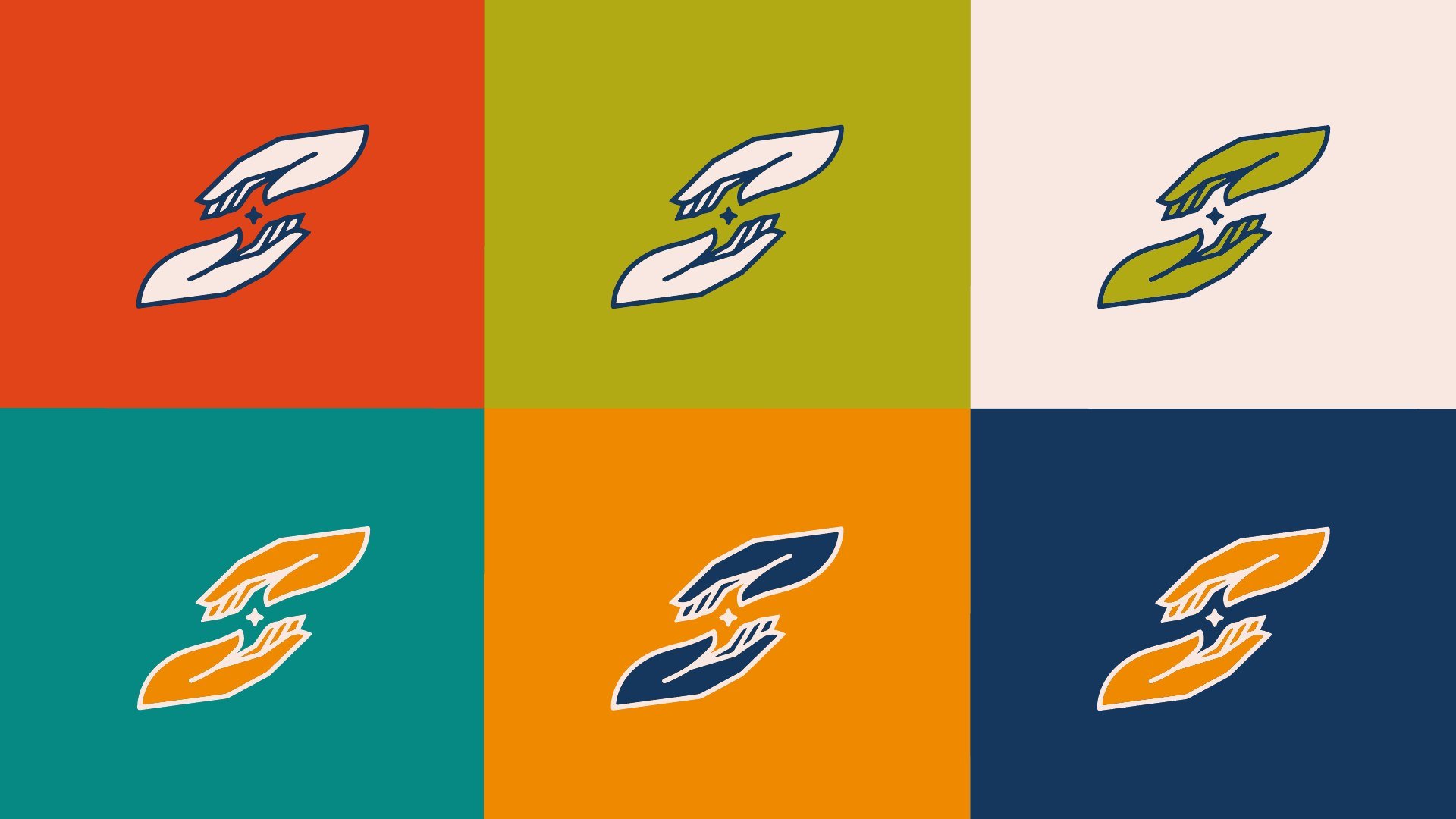
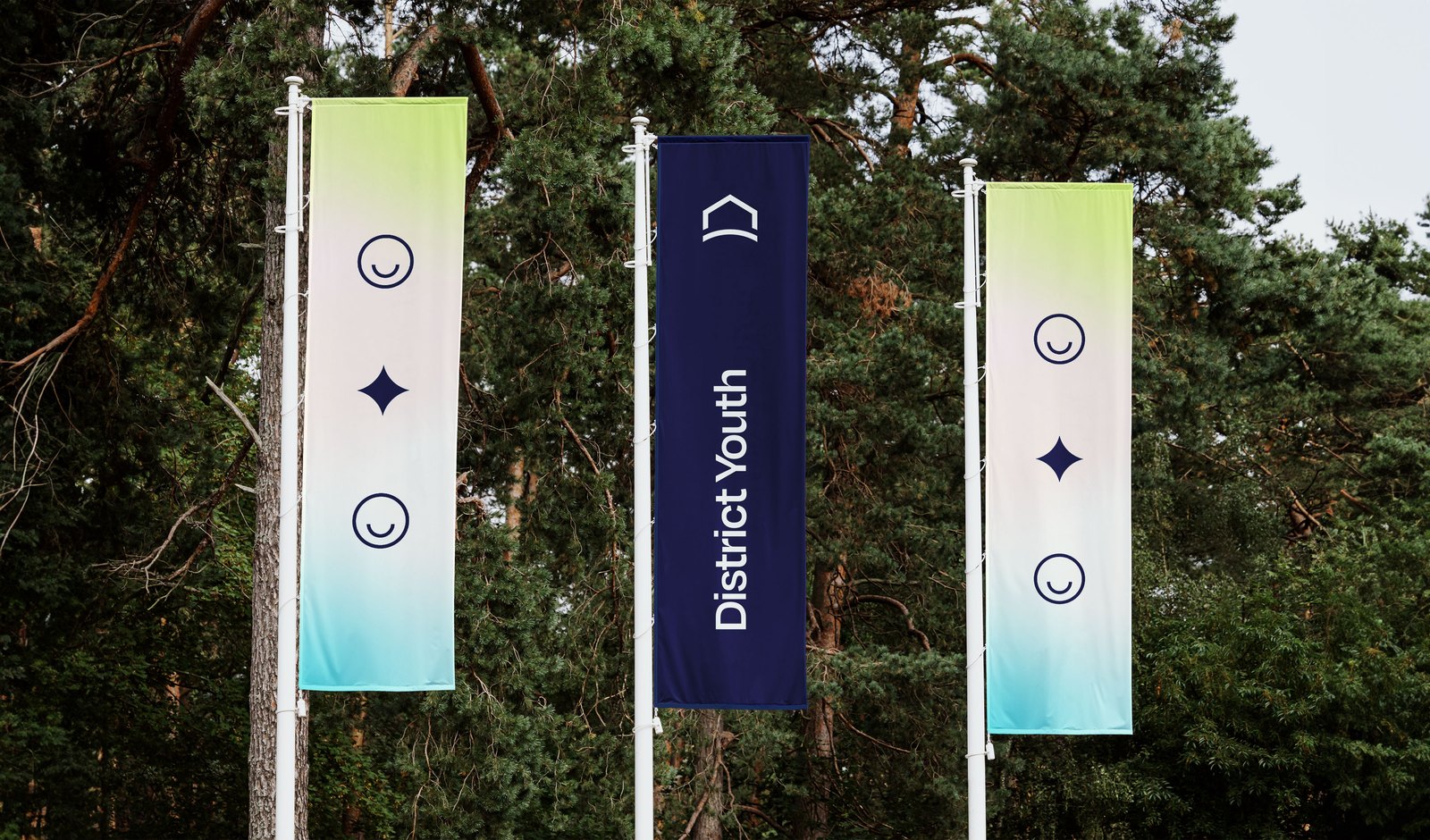
Two smiles and a star, an arrow from D to Y, gradient bars, and the seals. The gradient does the work: green to blue for Youth, and everything from a screen to a flag carries it.


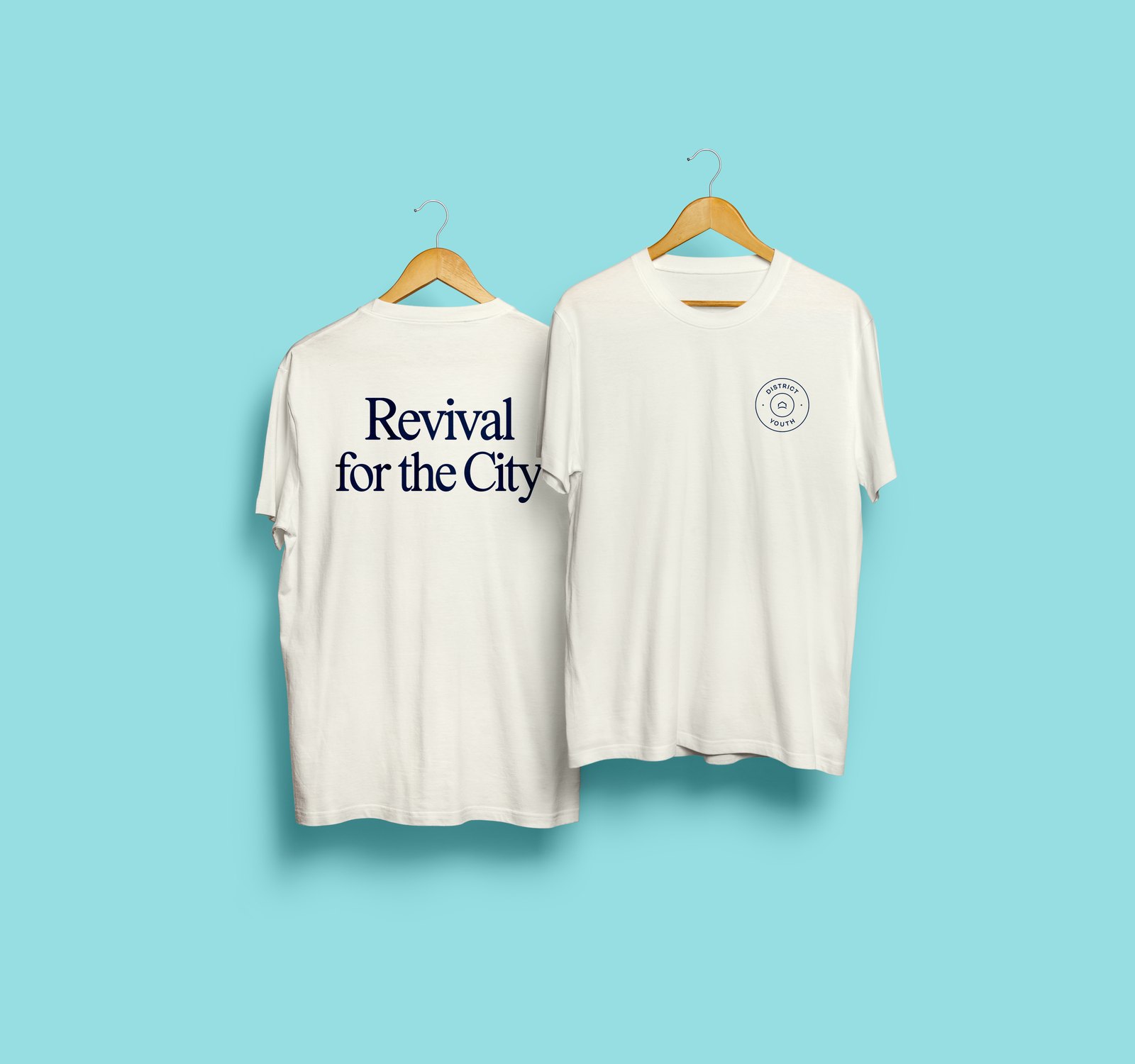
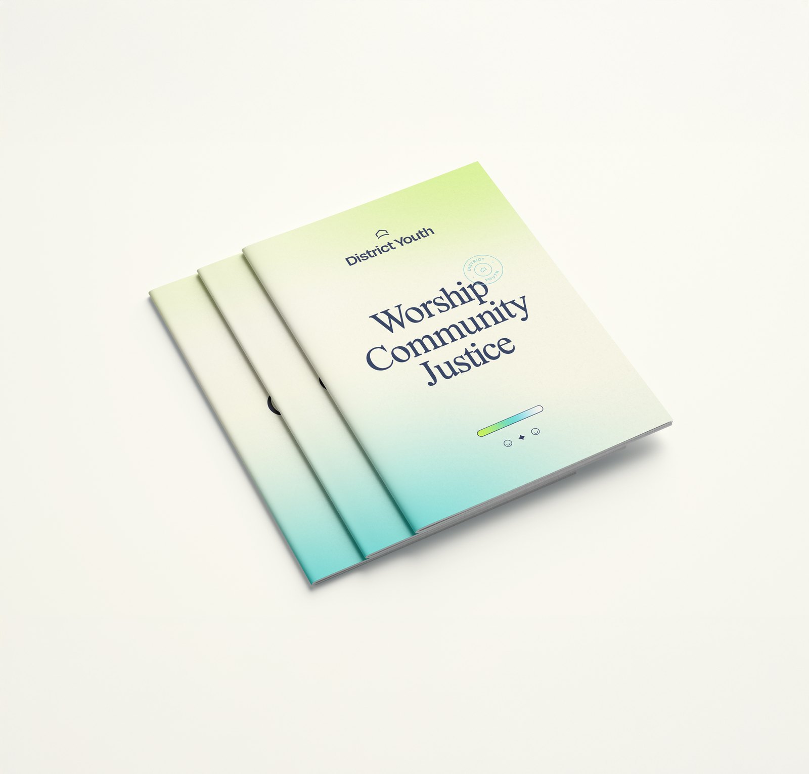
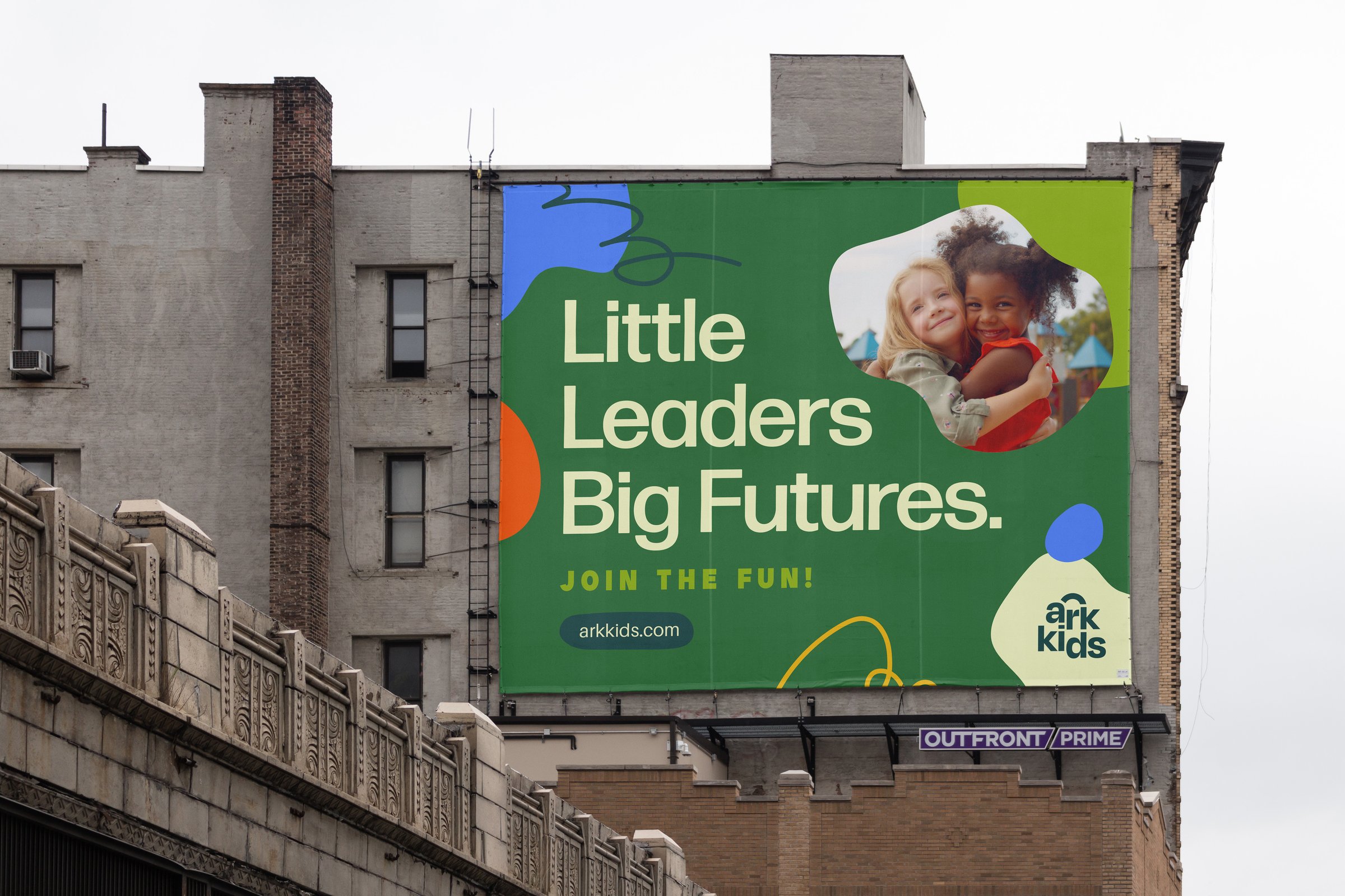
This is the Youth for the City. Worship, Community, Justice. Revival for the City. Are you a Peacemaker? The last one went on a billboard and a phone case.
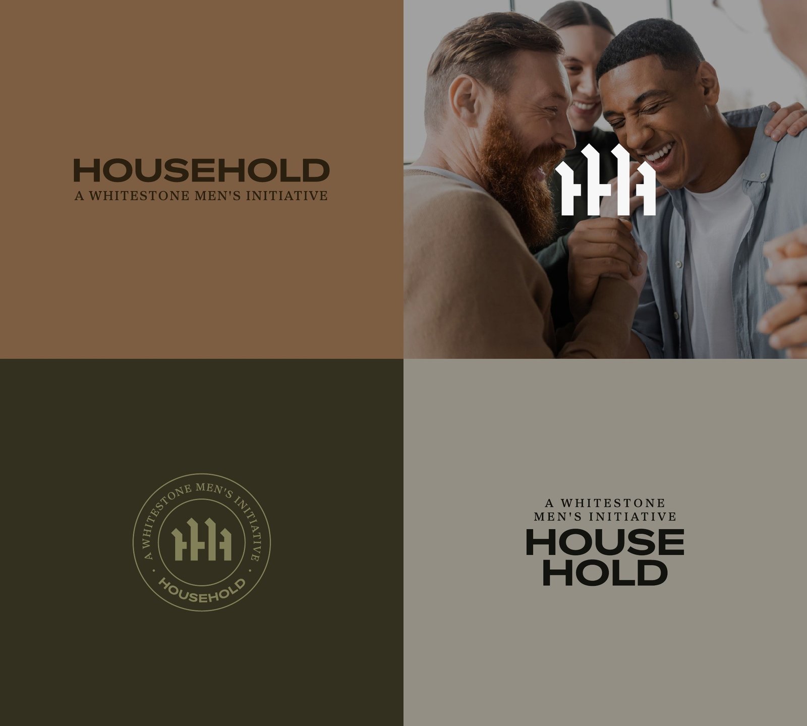
Student Ministry identity: roofline mark, seals, and wordmarks for District Youth and District College; two gradient colorways; Brand Style Guide.
Brand elements: icons, arrow, gradient bars, photo effect.
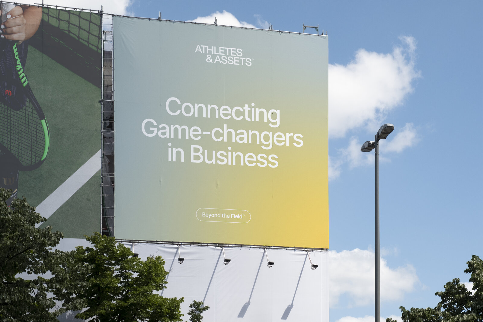
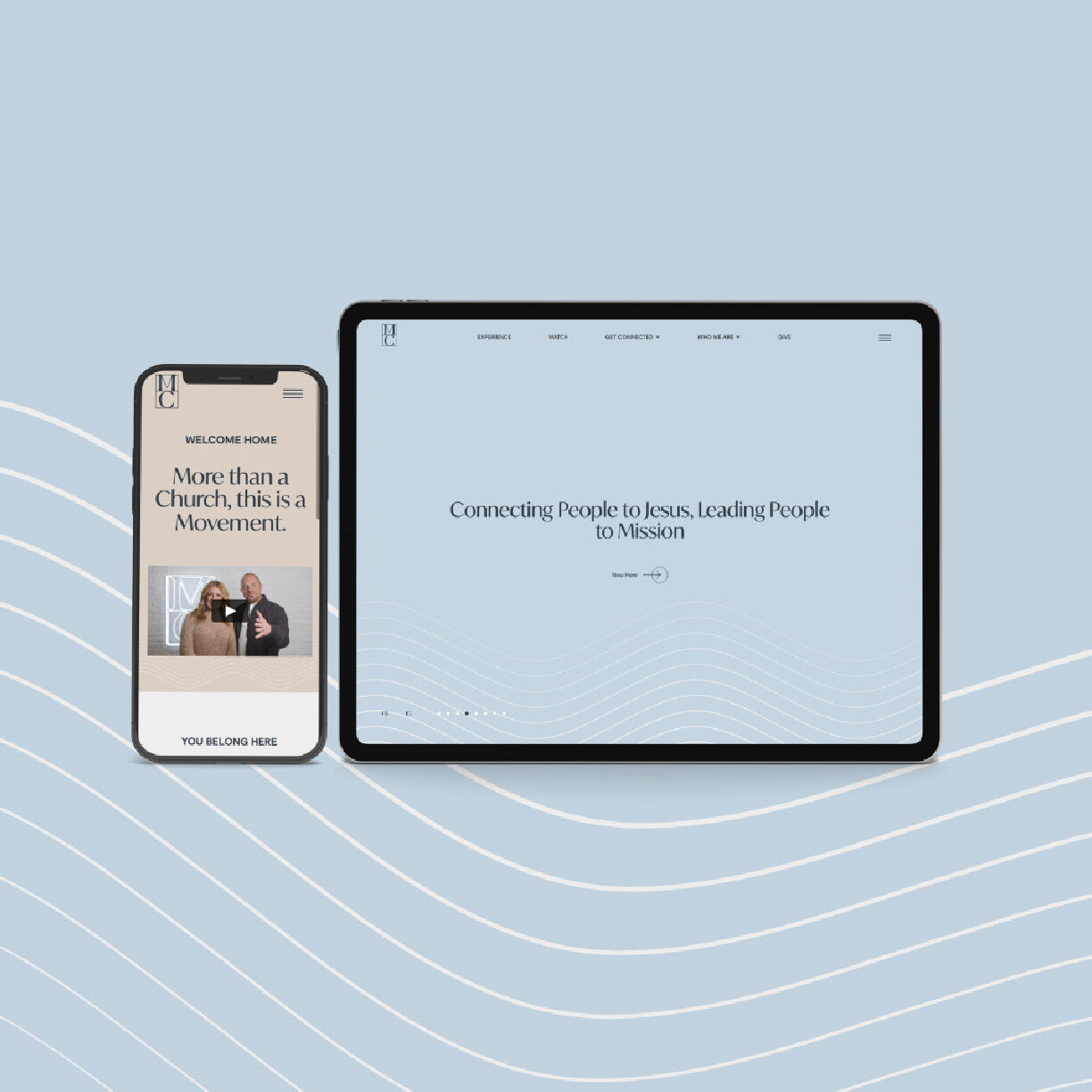
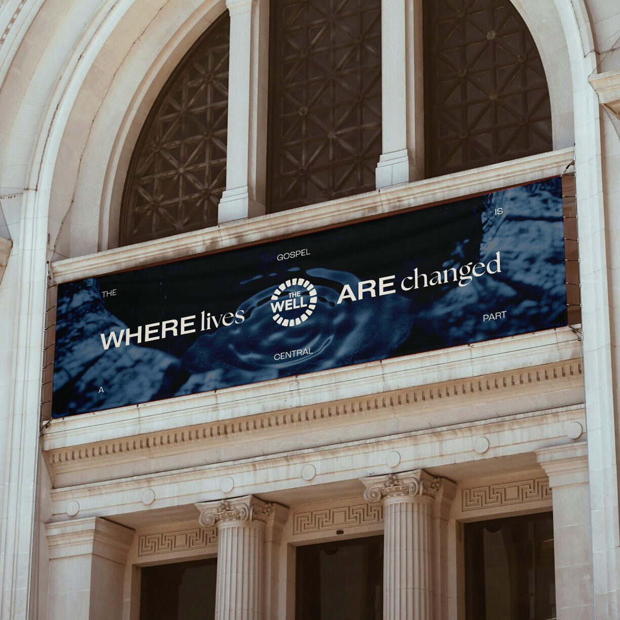
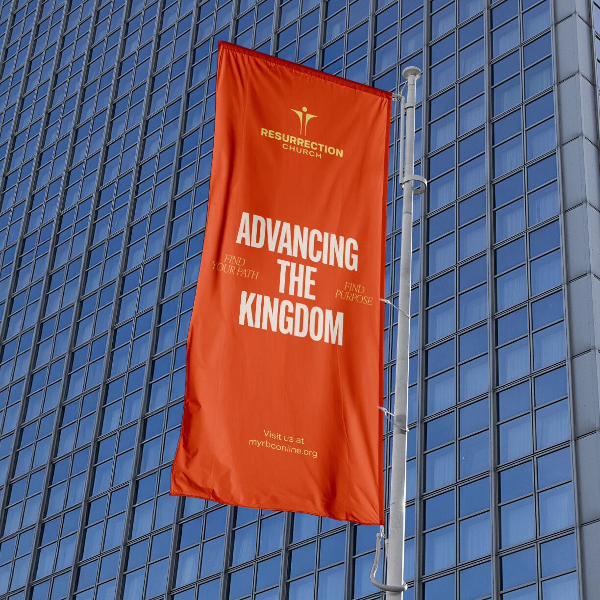
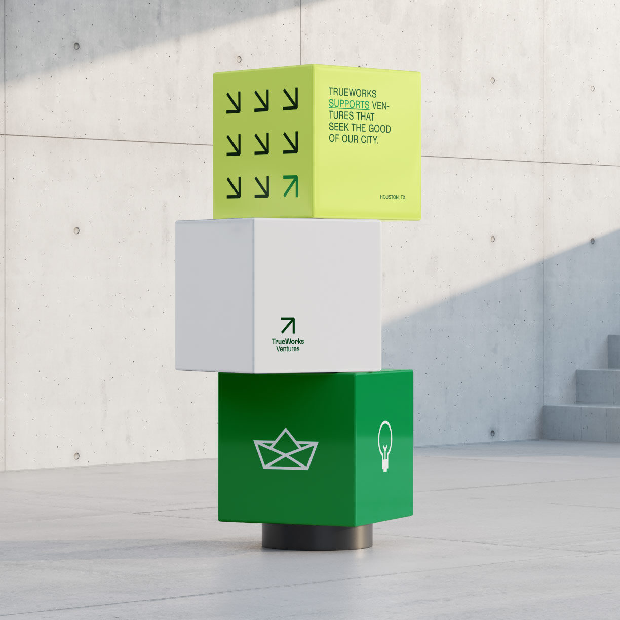
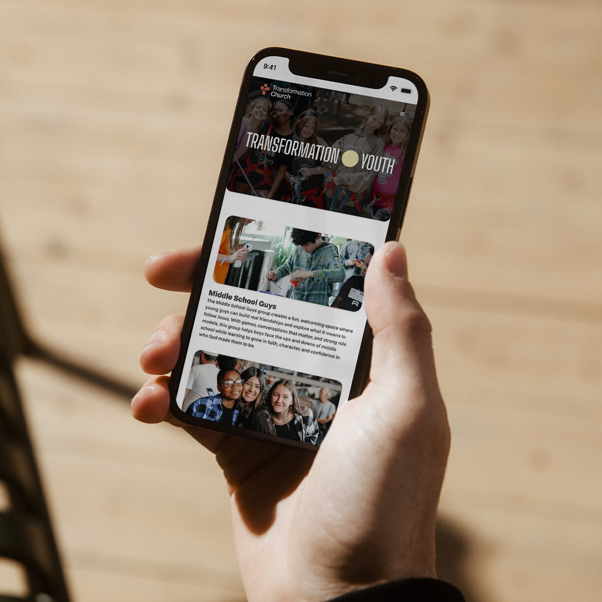
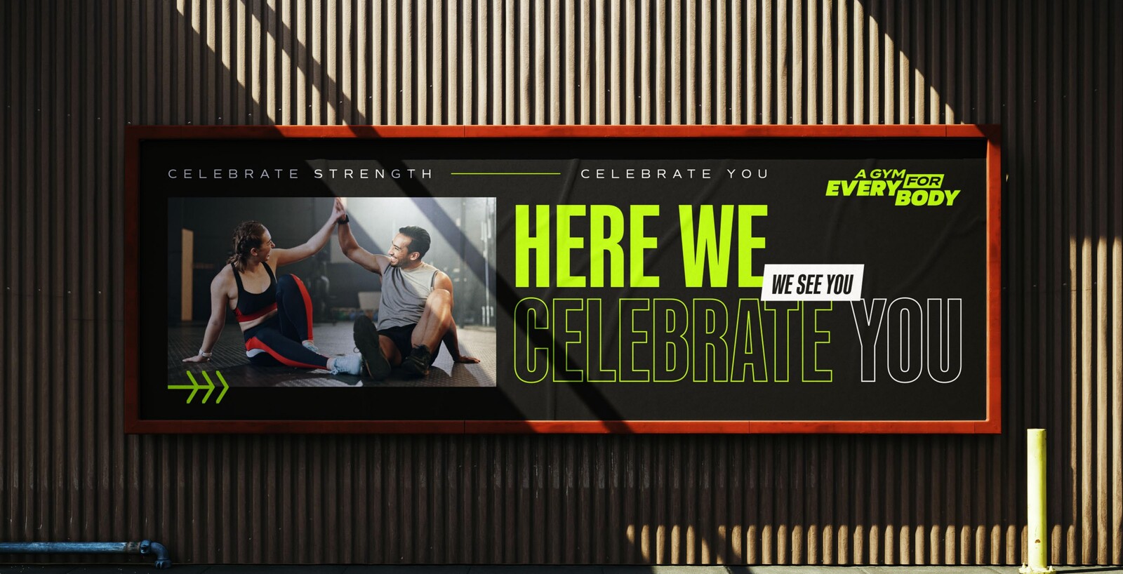
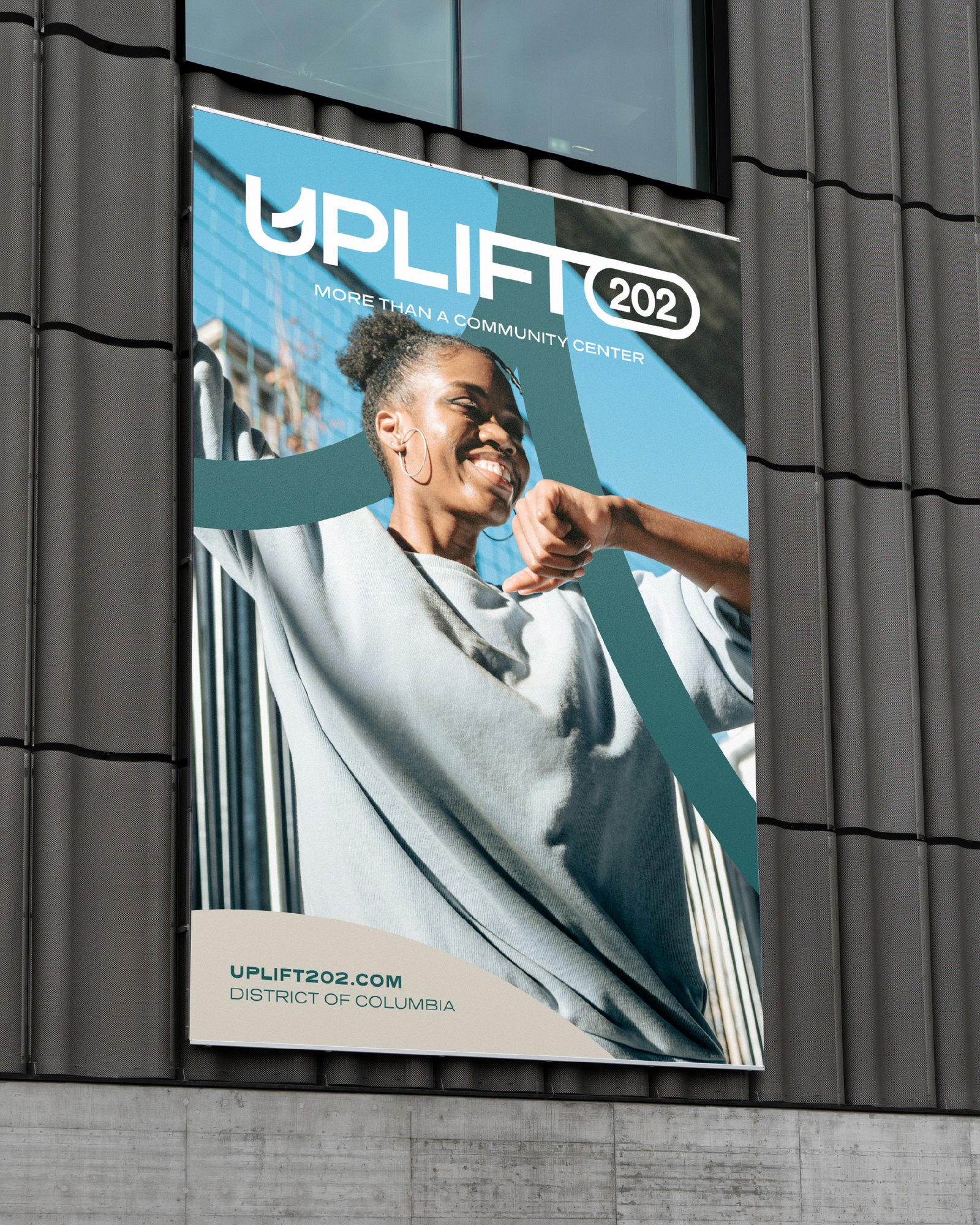
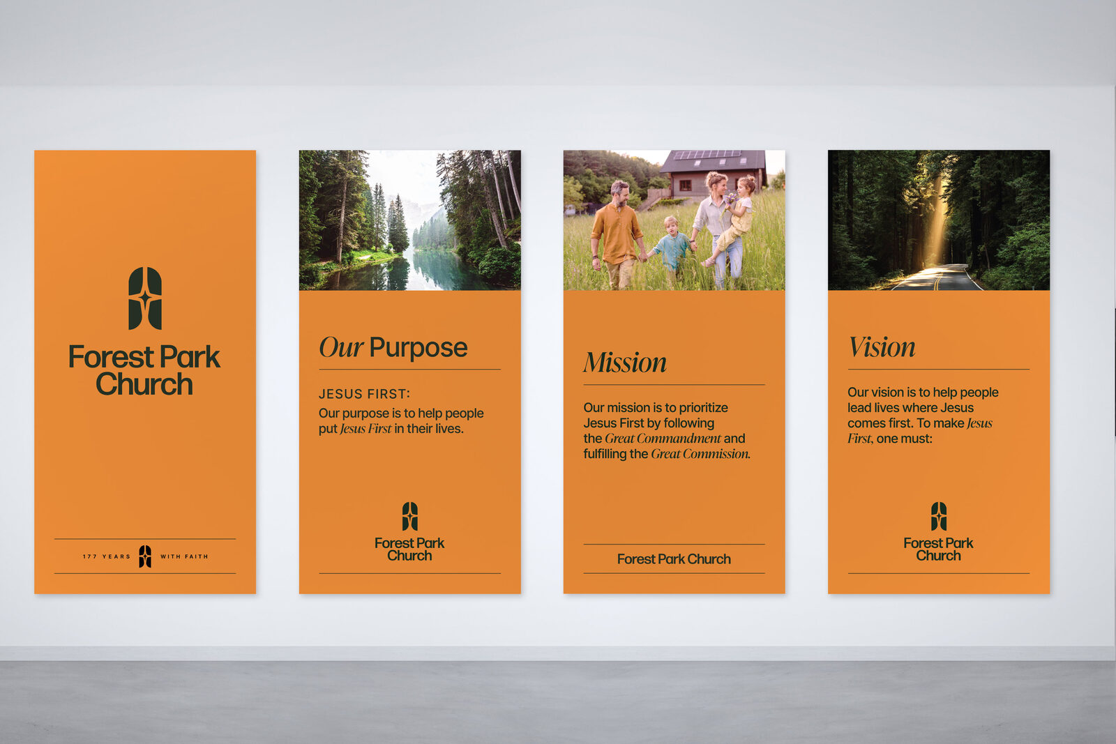
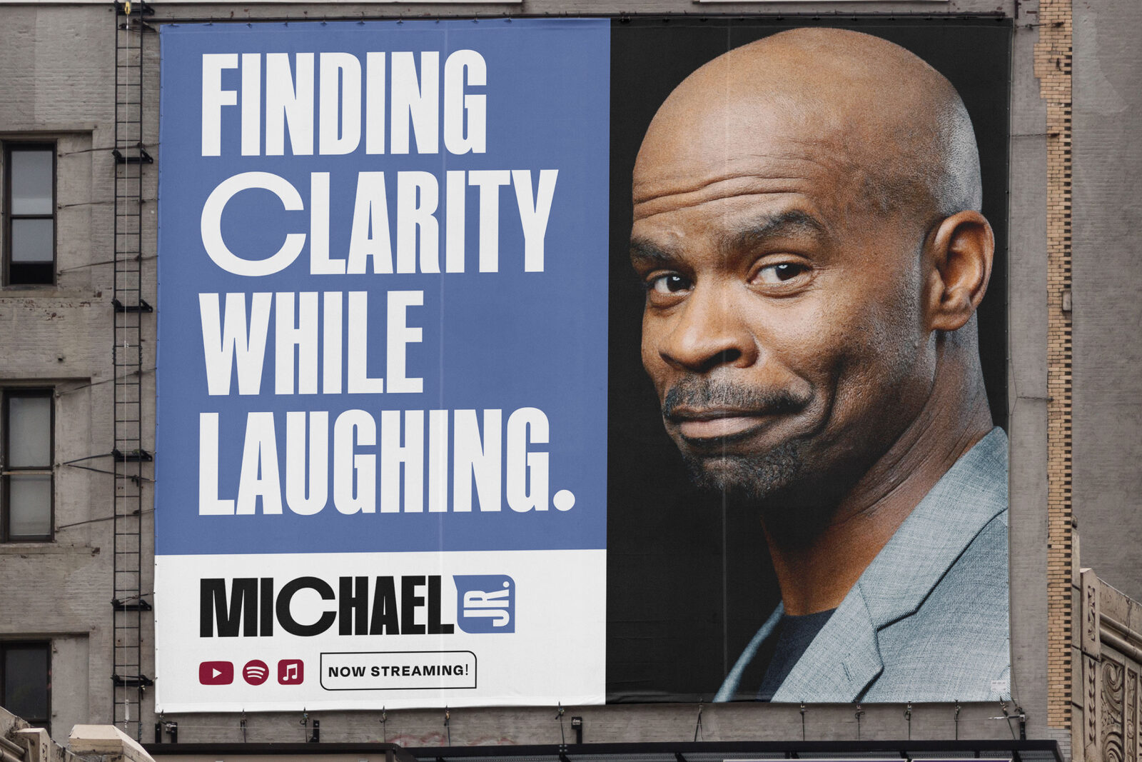
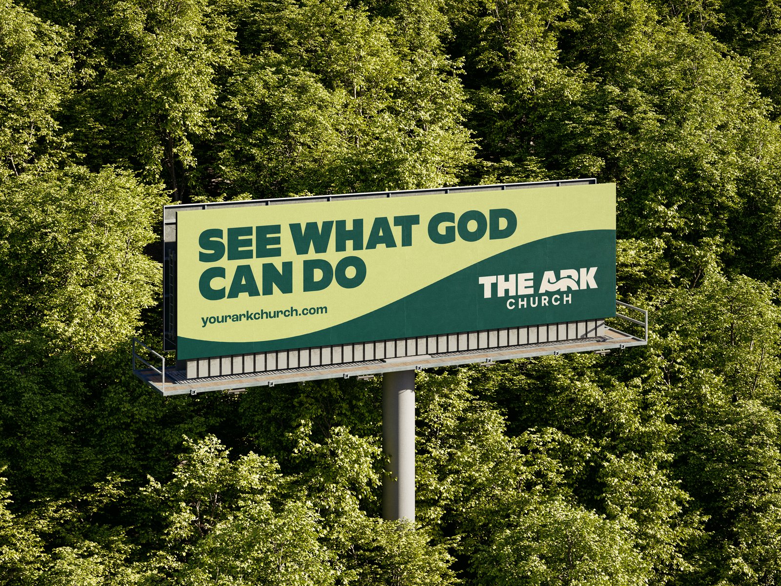
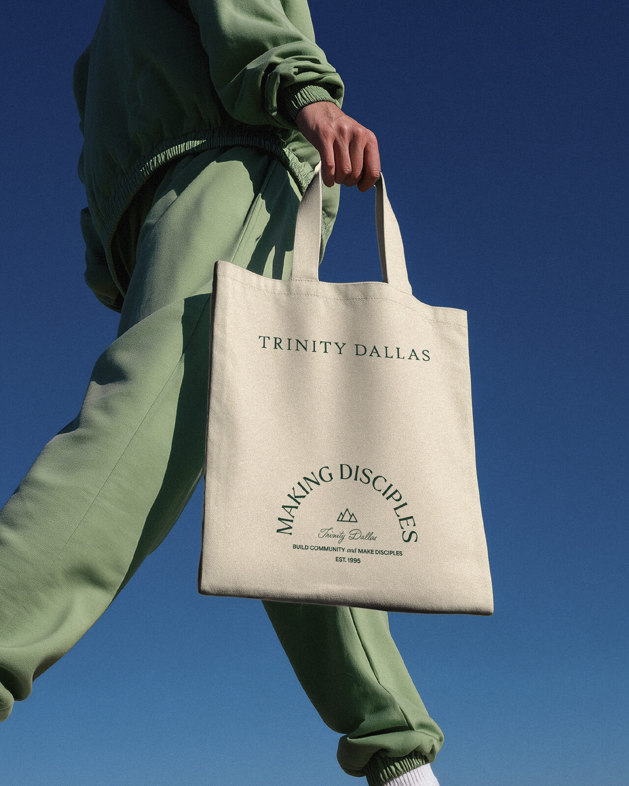
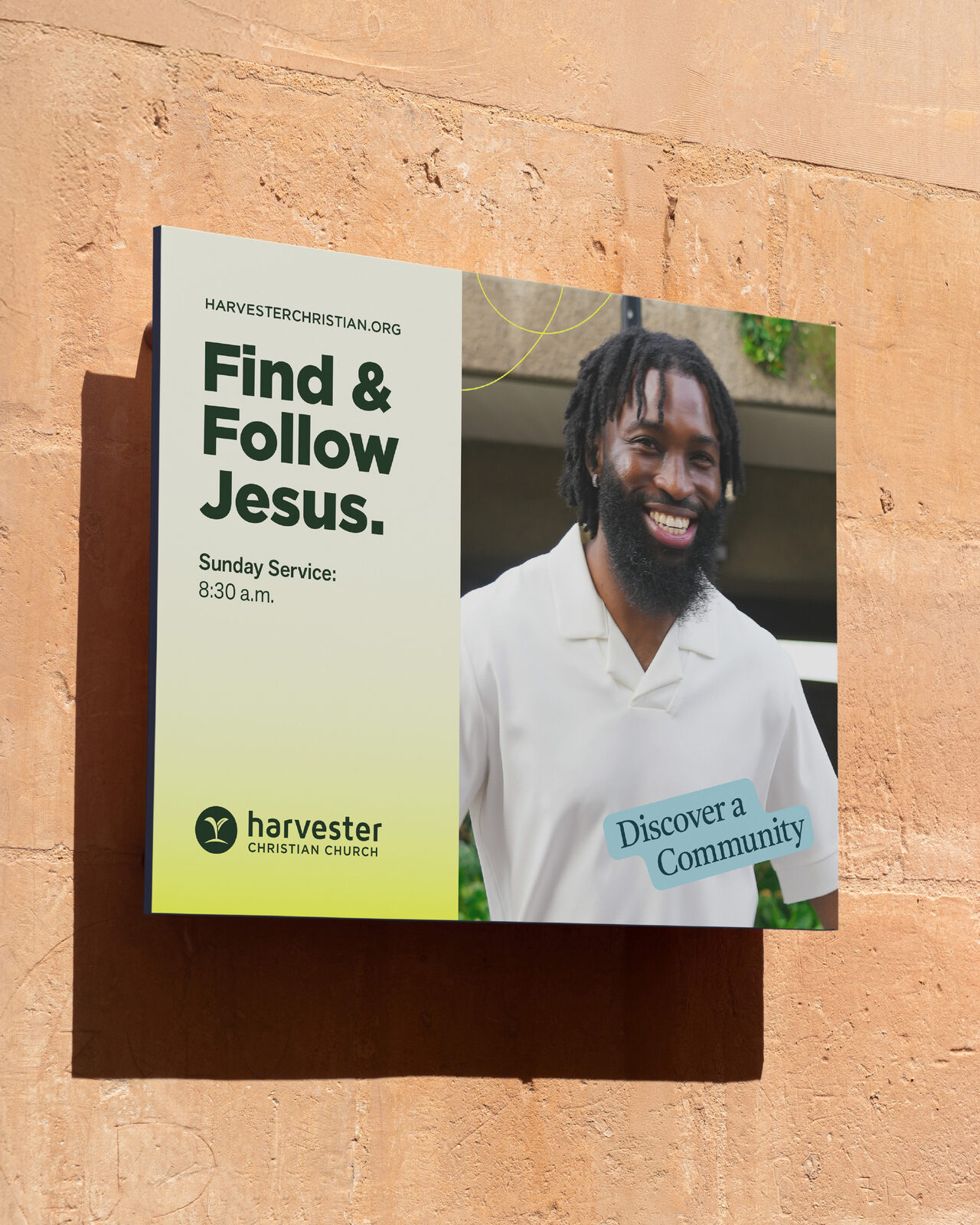
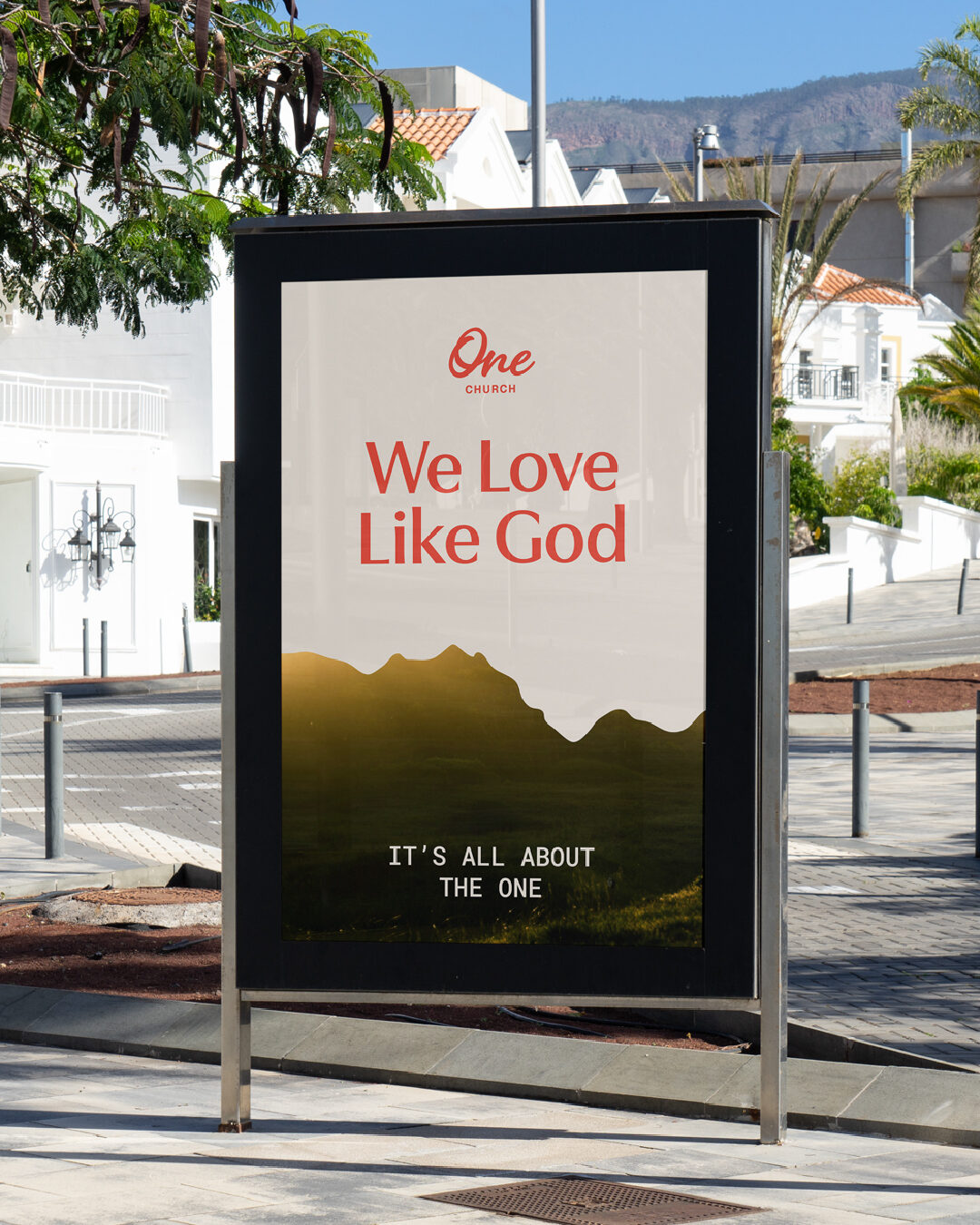
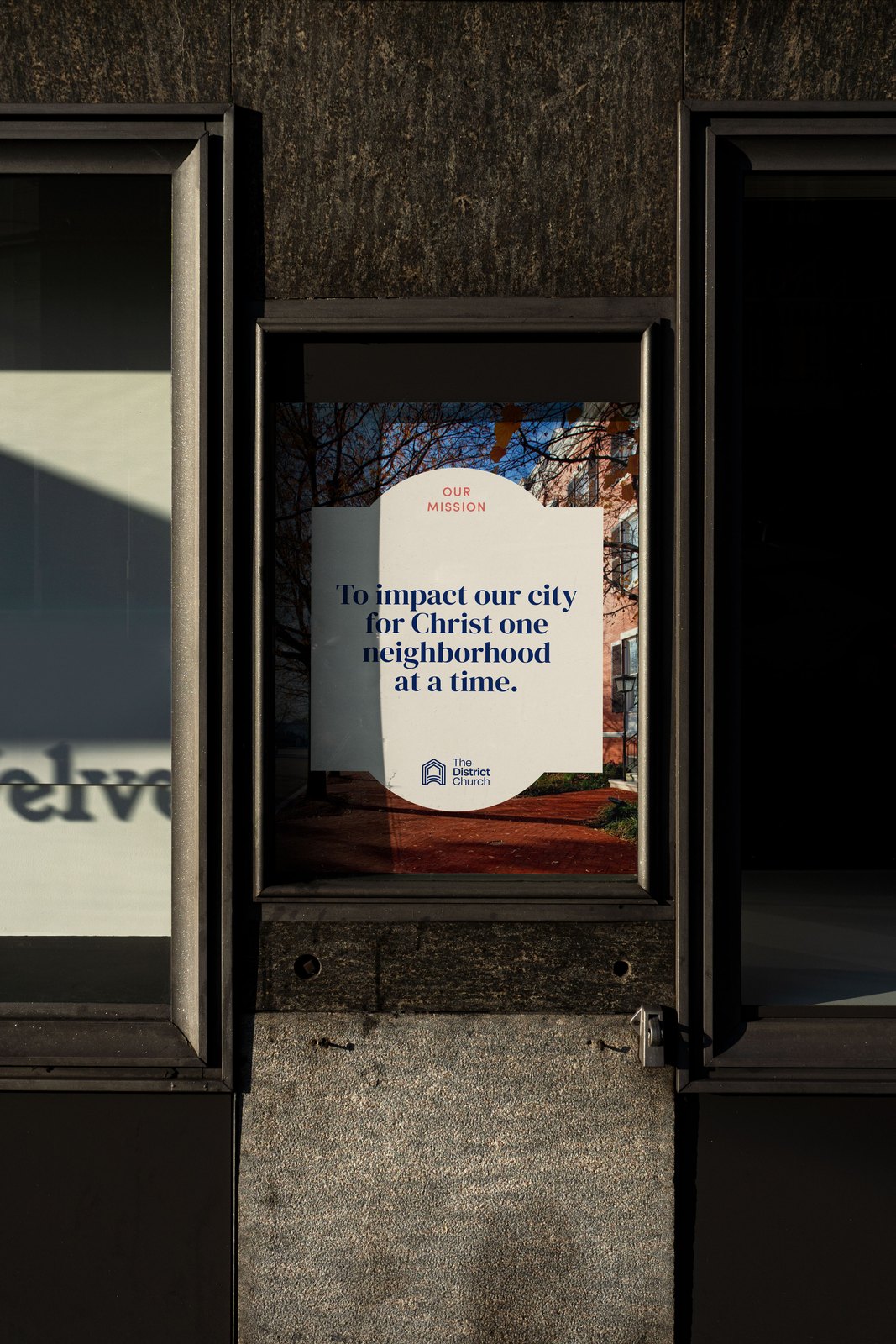
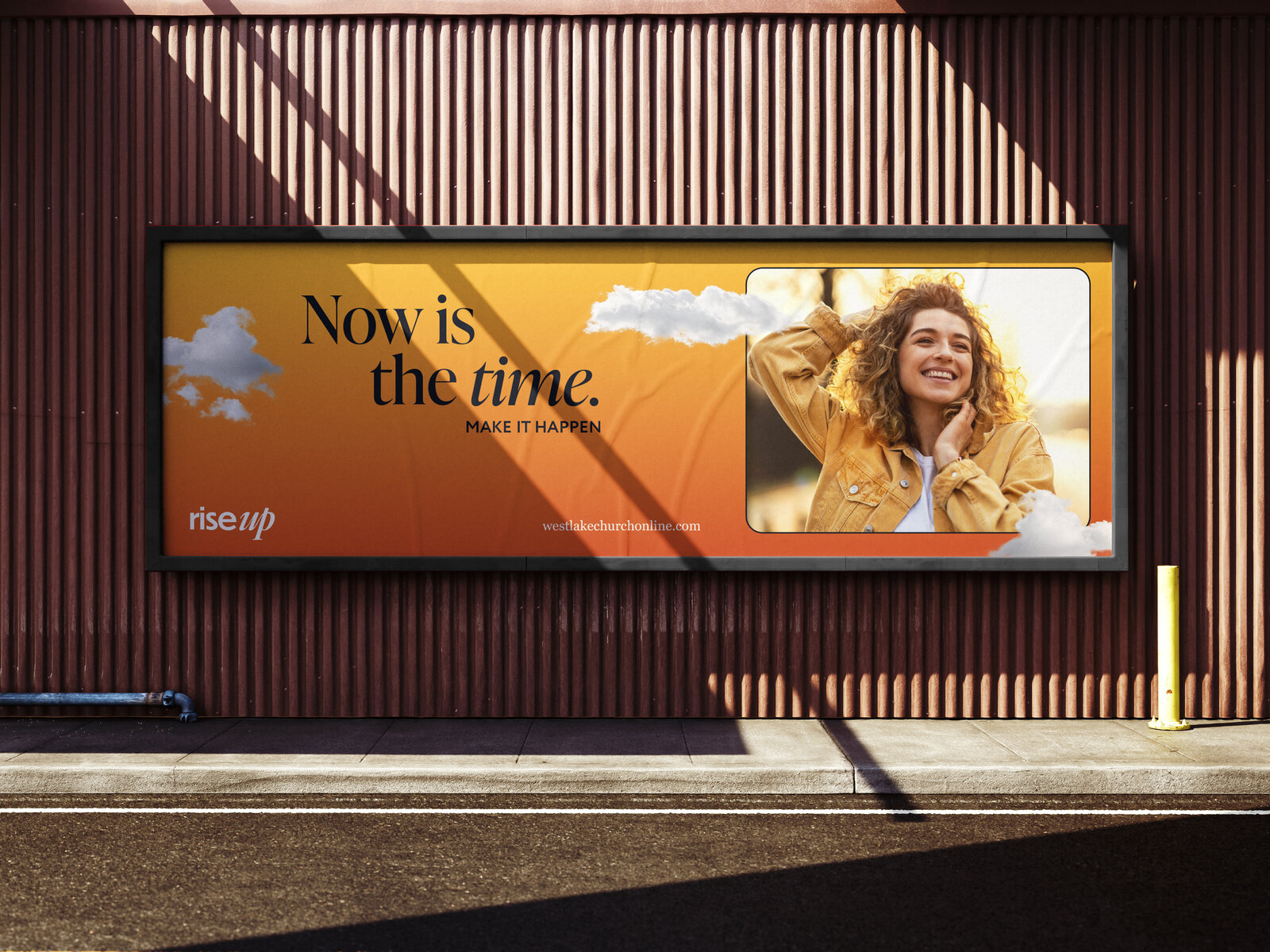
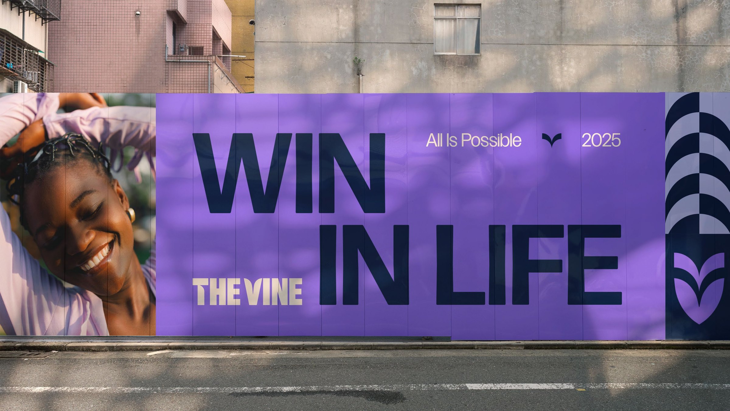
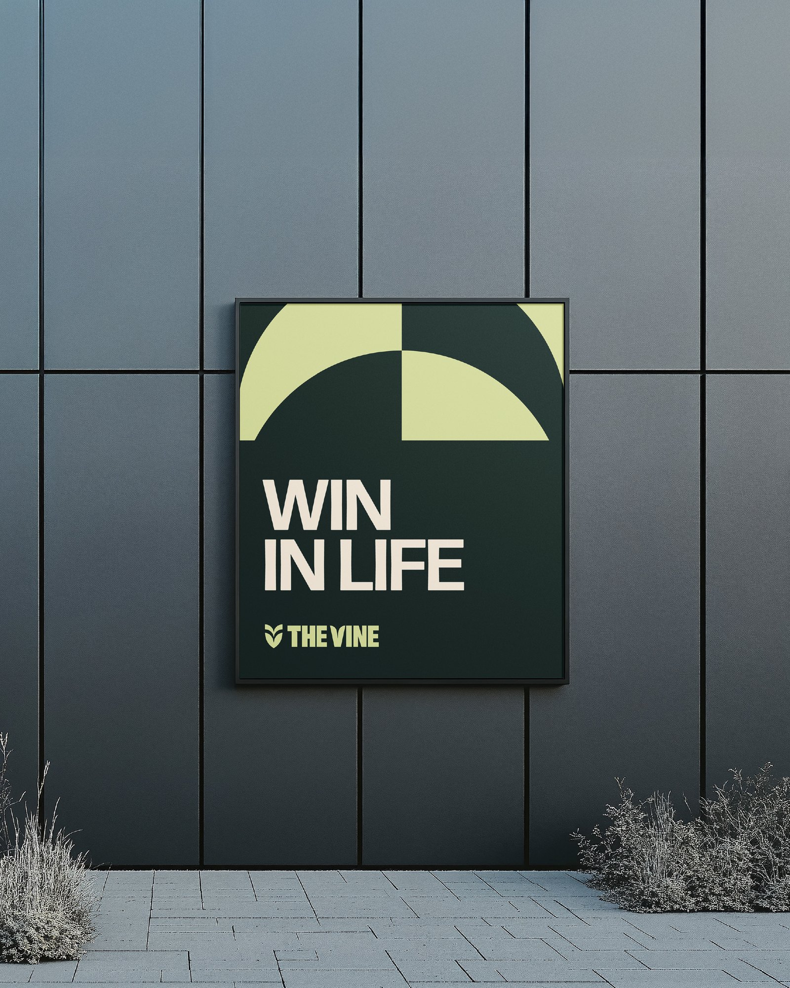
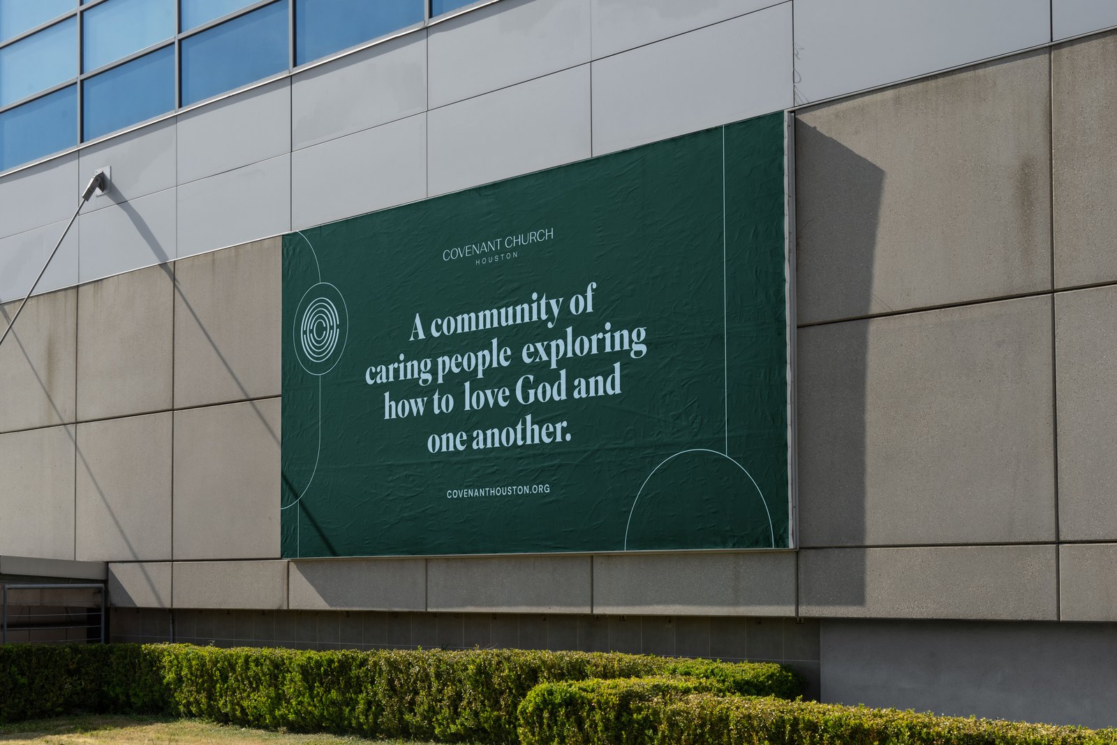
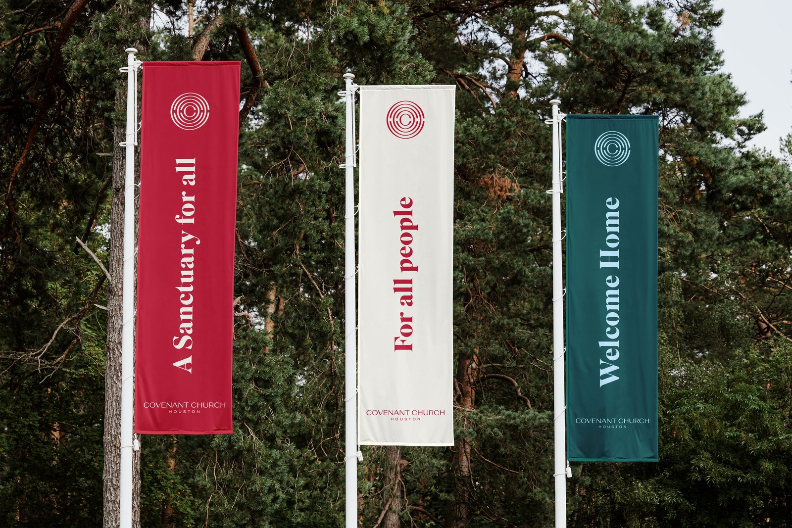
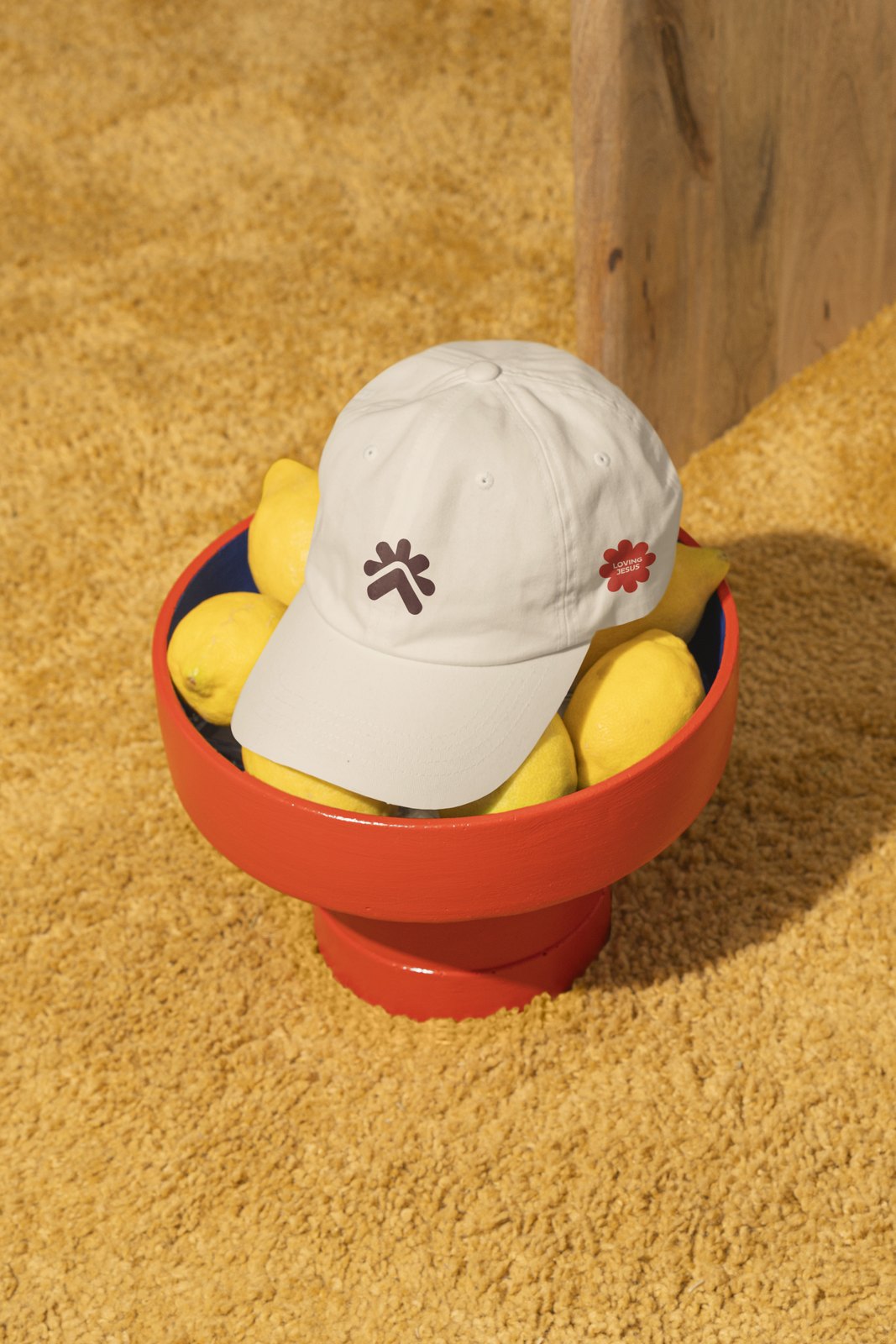
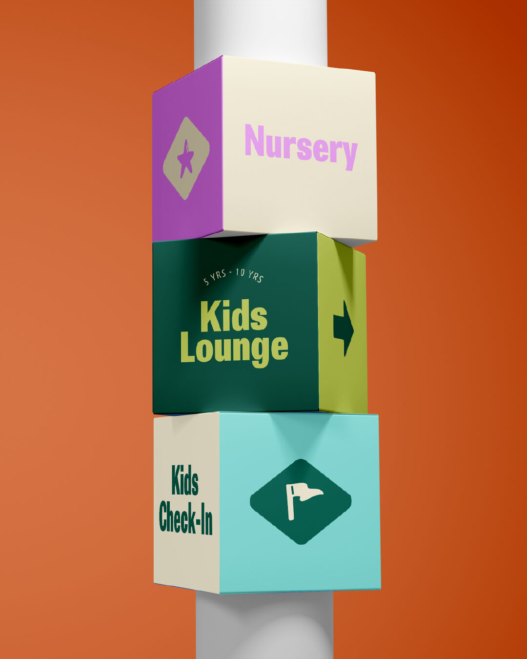
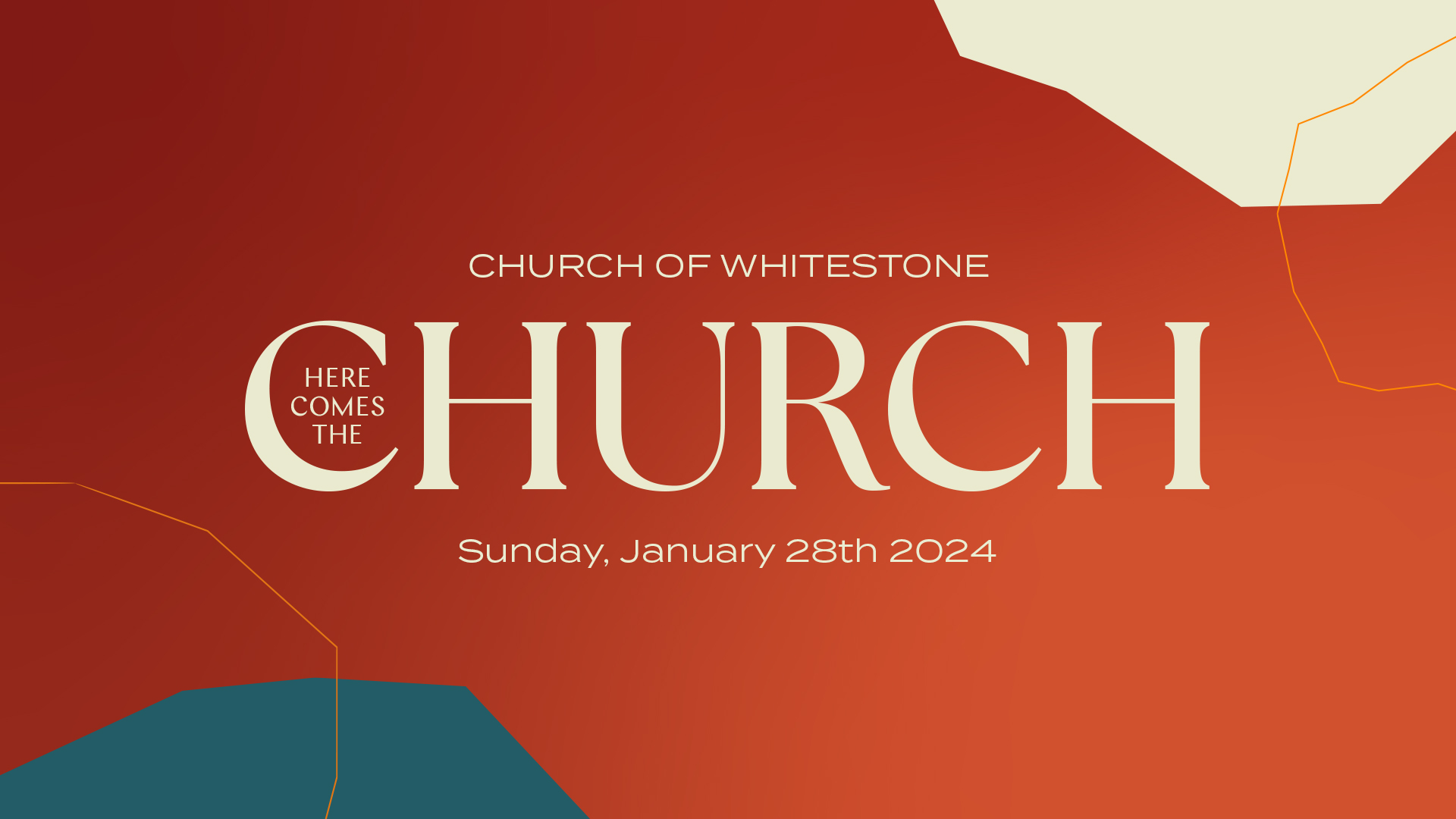
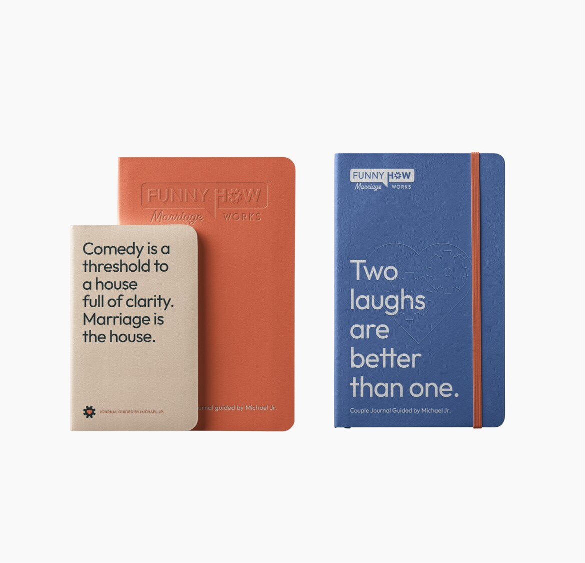
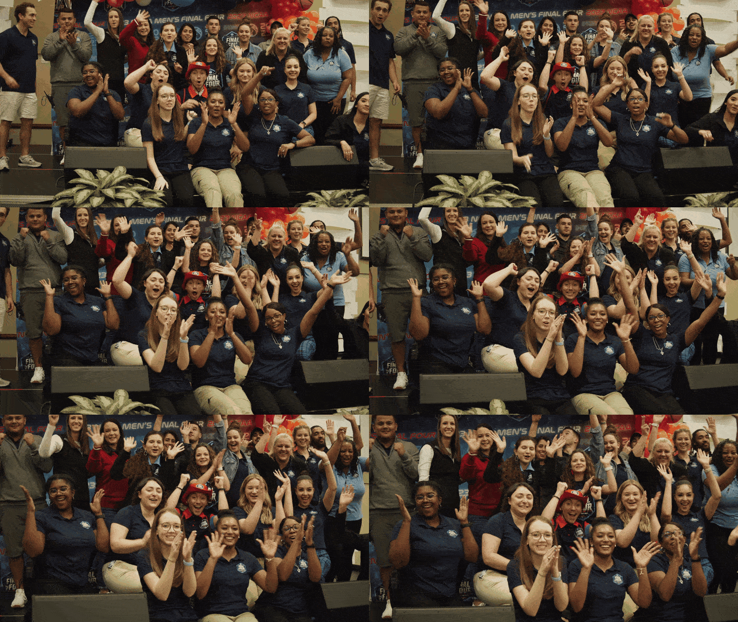
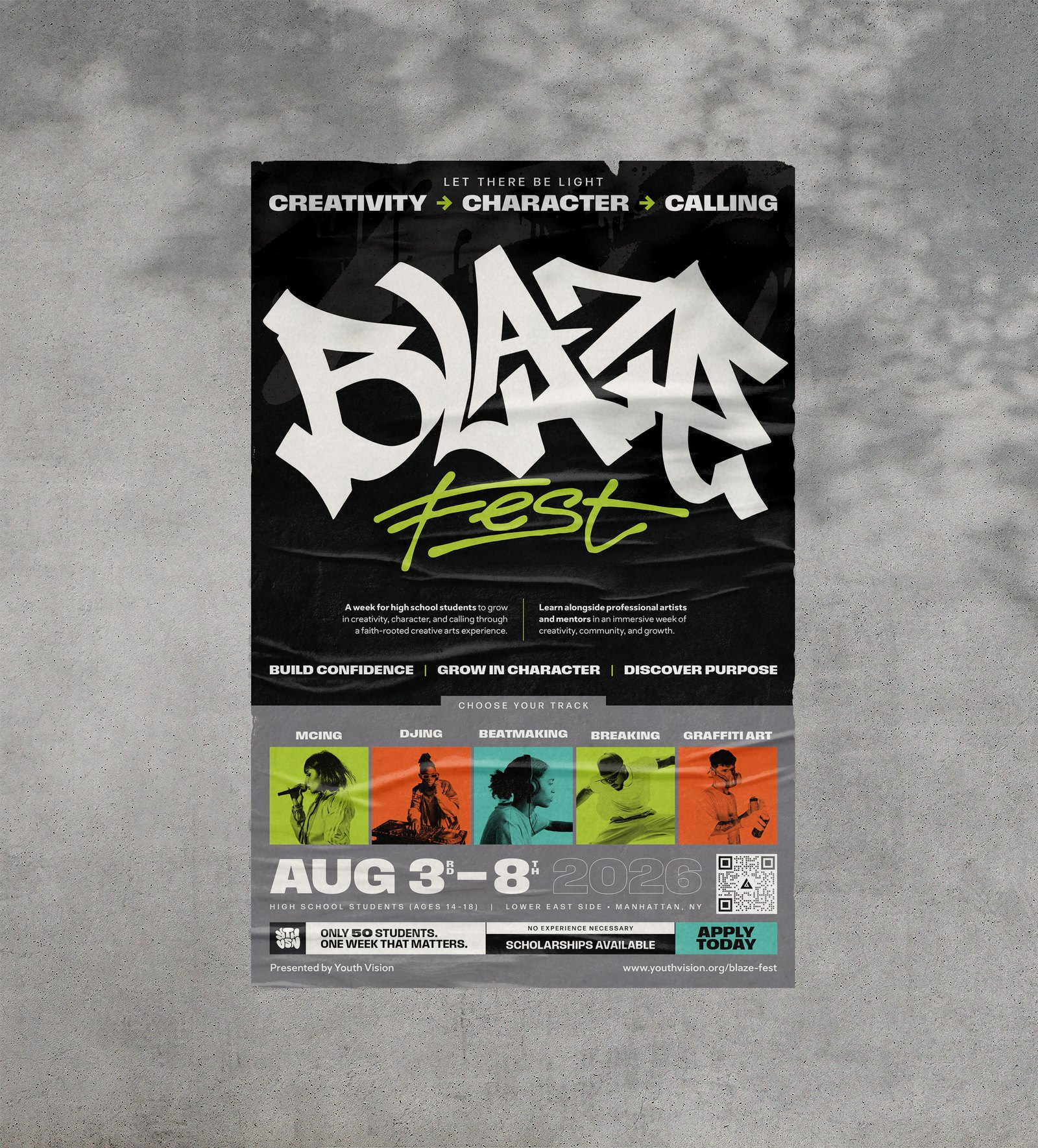
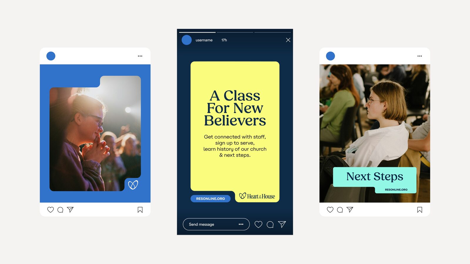
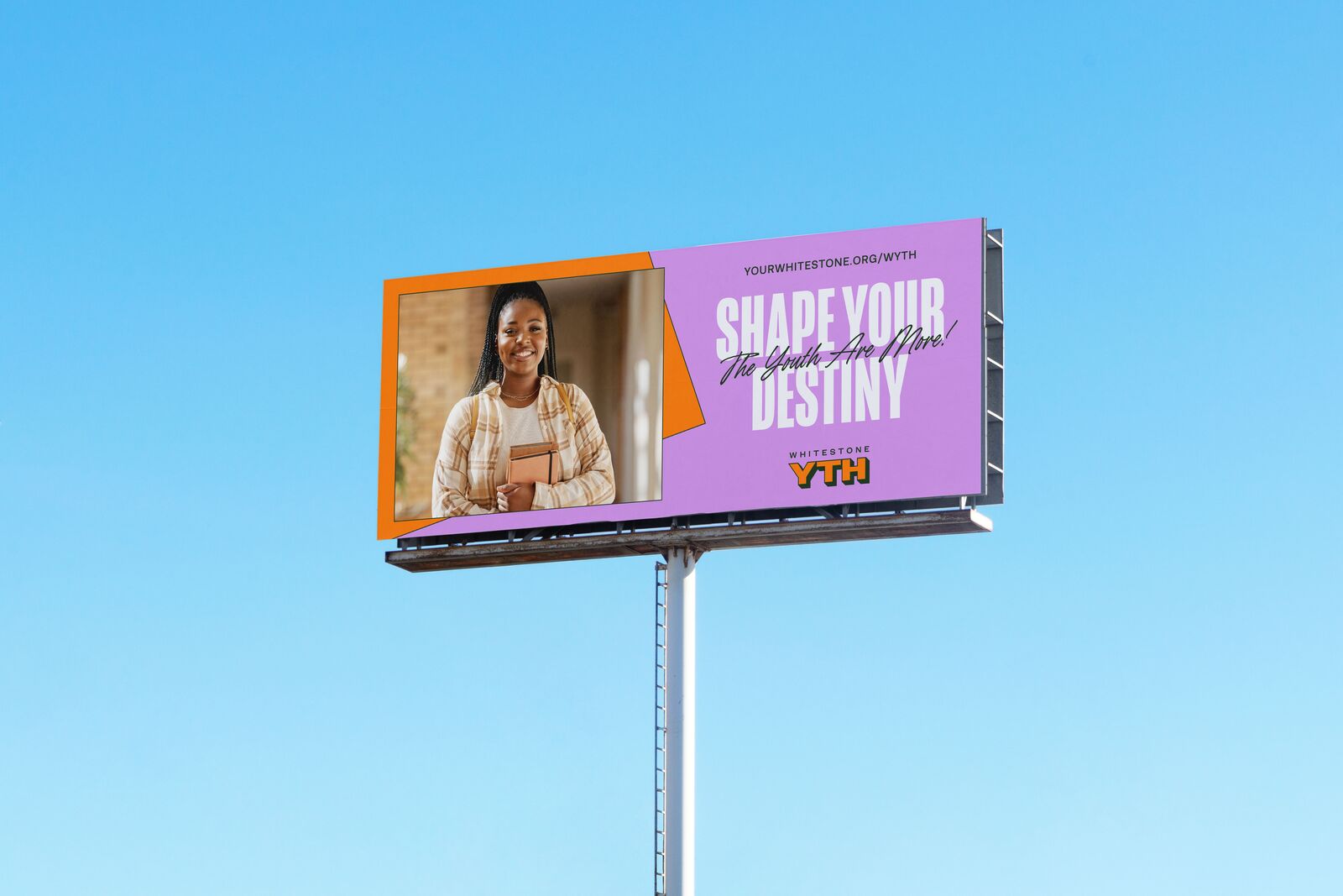
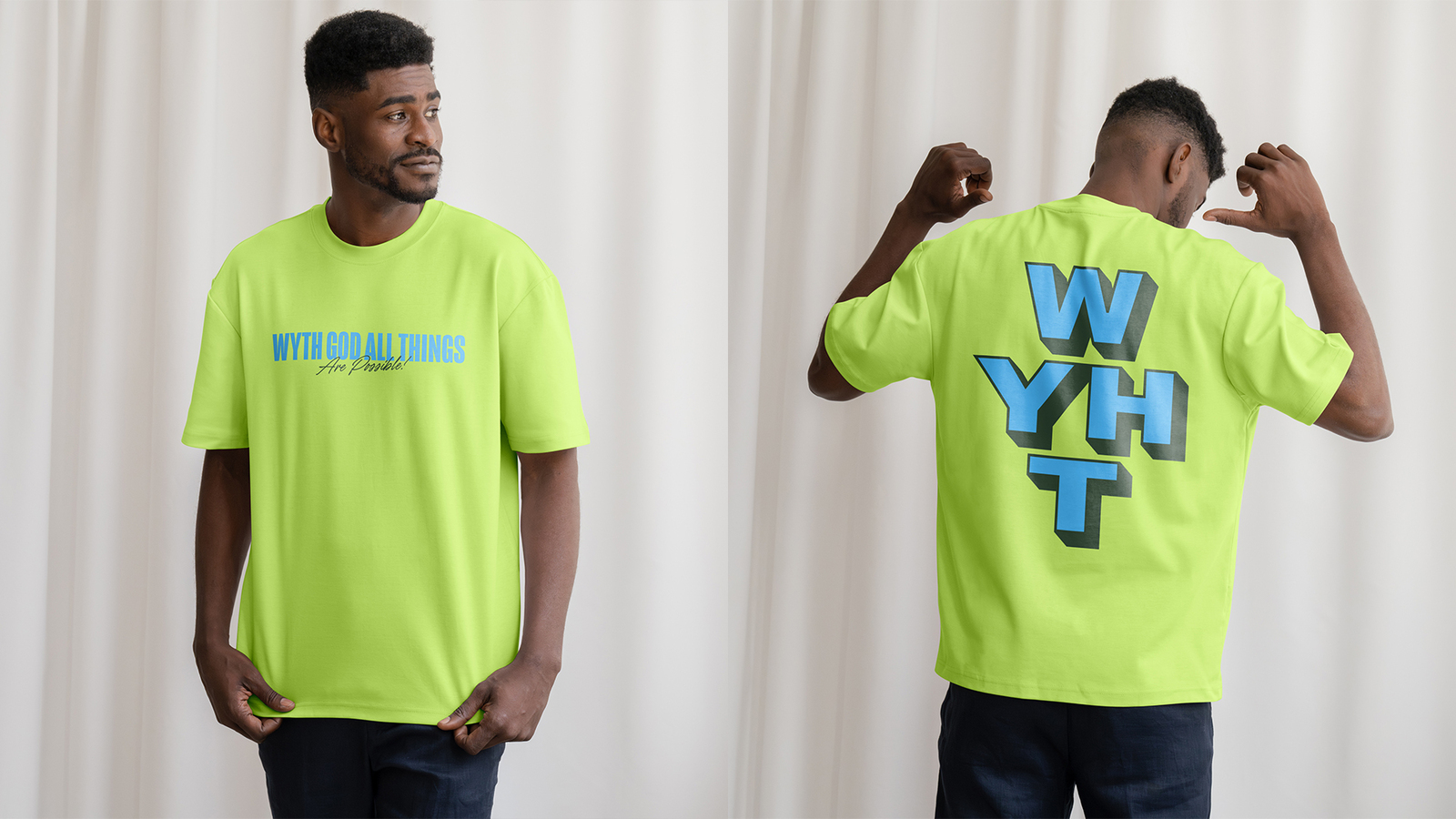
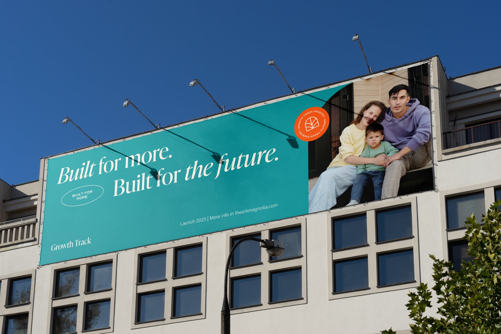
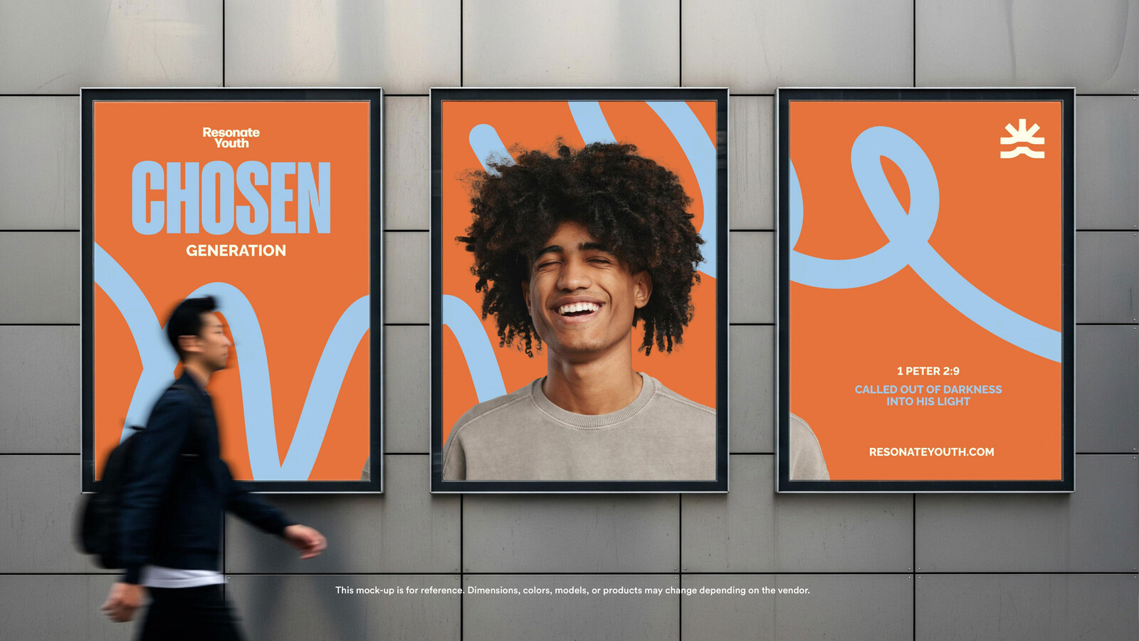
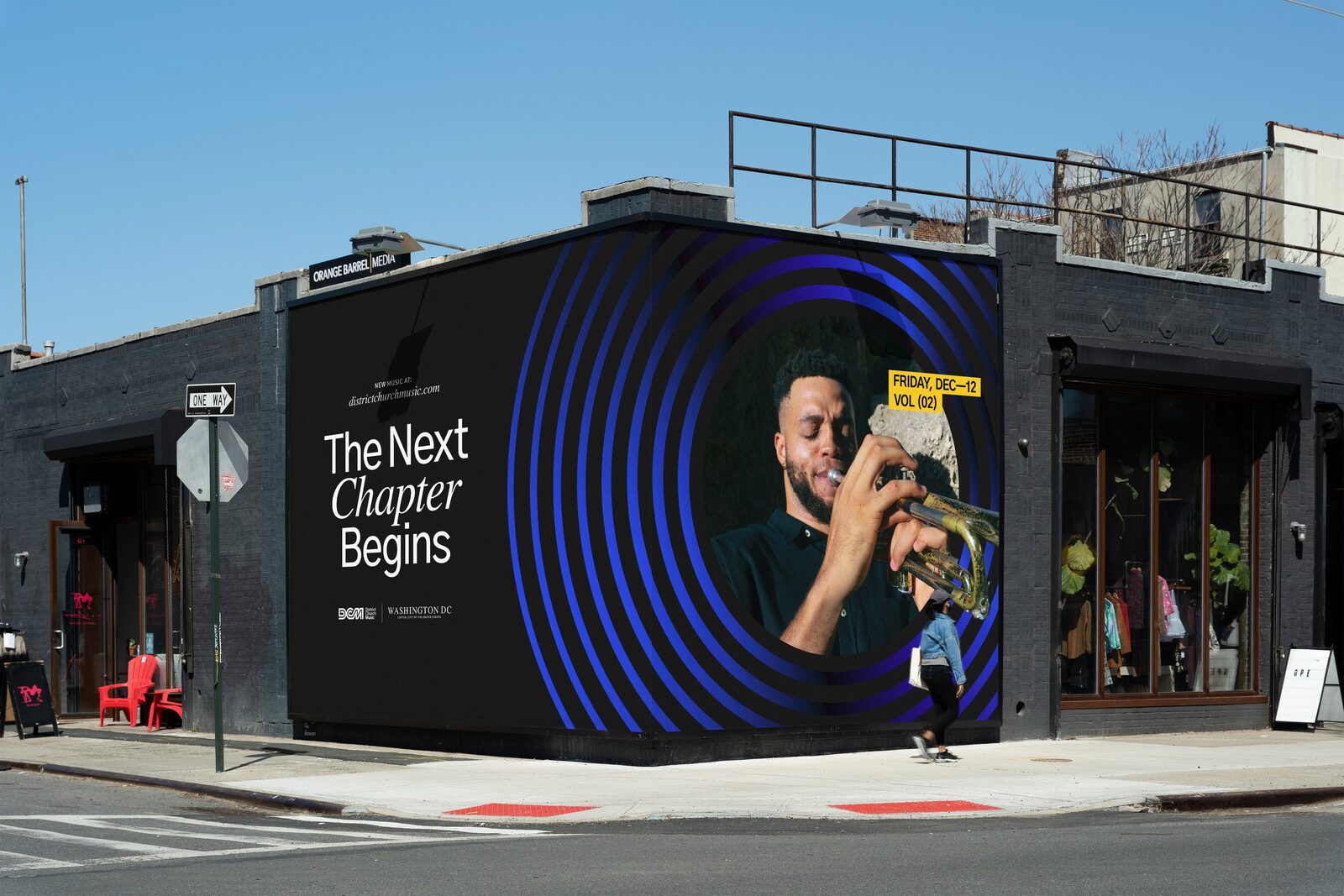
Applications: flags, posters, billboard, bus shelter, pop-up wall, screens, tee, info card, Mailchimp template, Instagram templates.