When the church reached out in April 2025, The Vine was a name, a vision and a launch date on the horizon. The vision was already written: helping people win. What it needed was everything a church shows a city before it opens the doors.
We set the name in a bold, condensed all-caps face and turned the V into the icon. The guide says it plainly: the mark “reflects the brand’s message of being born to win,” and the icon “reflects the church’s mission to live, grow, and thrive.” Every piece after that is the same two shapes, the V and the arc, at a different size.
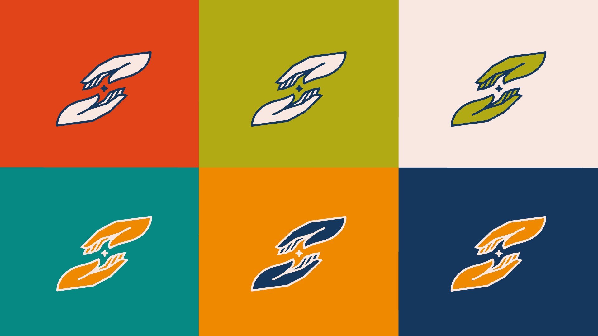
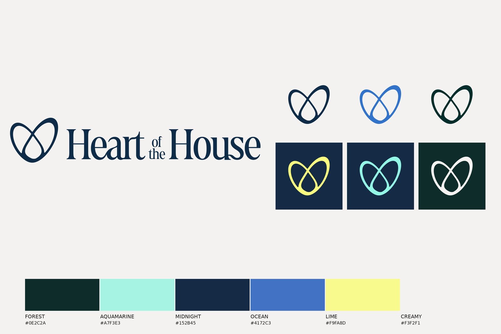
The lockup in the colourways the guide allows, and the icon cycling through all of them.
The palette and the two display faces, and the arc that shows up on almost everything.
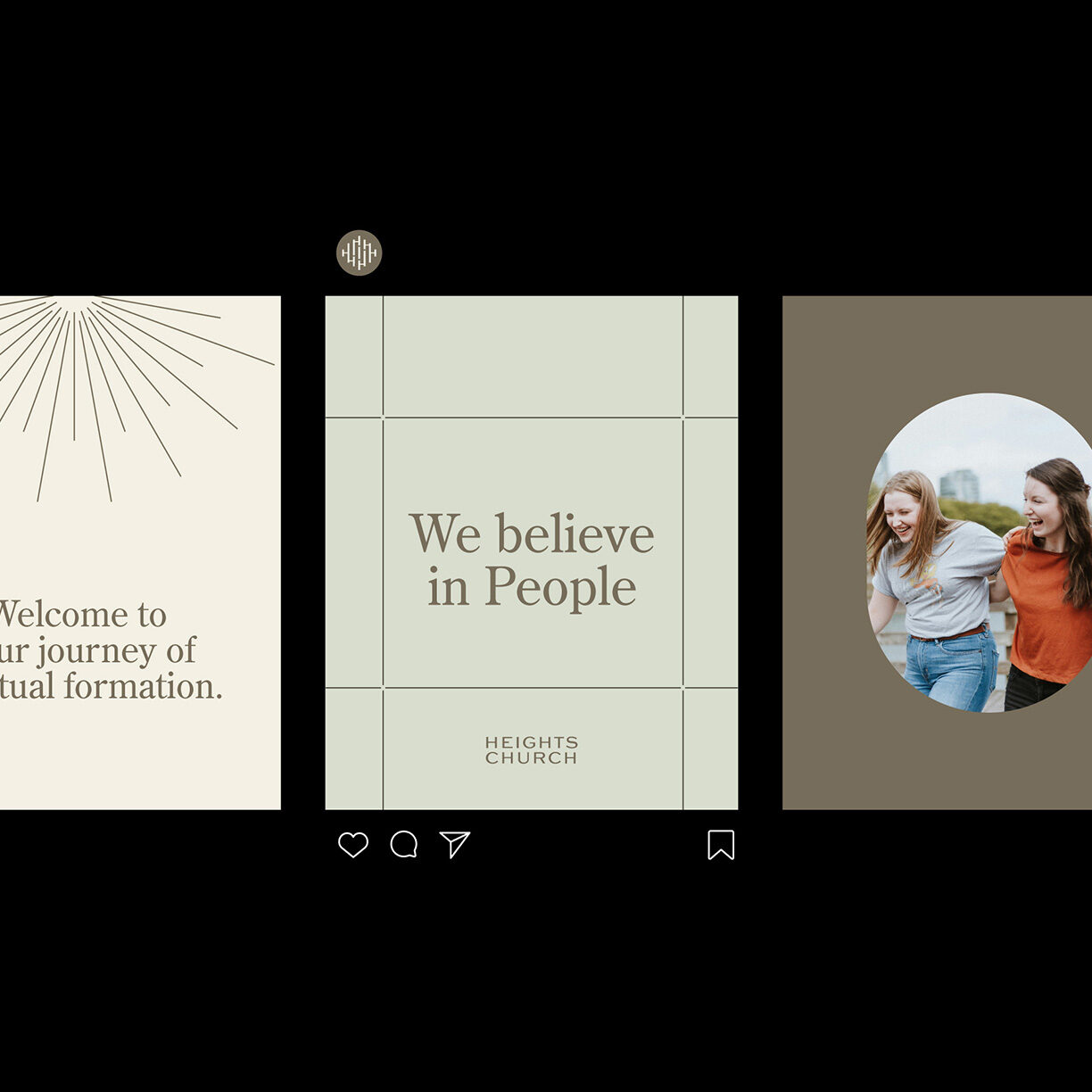
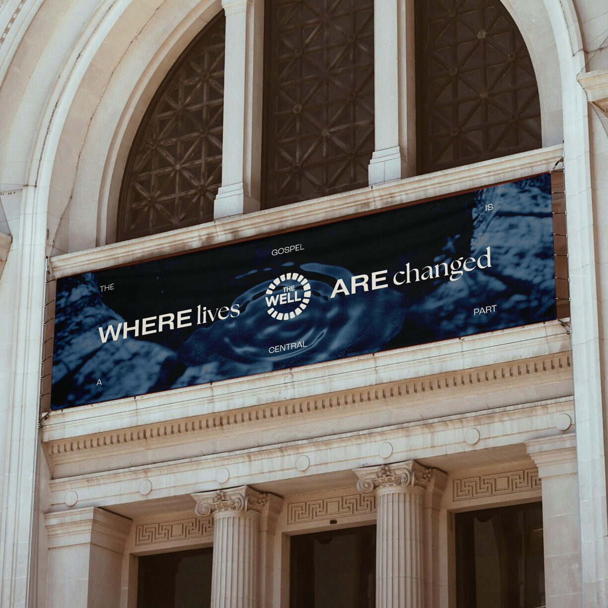
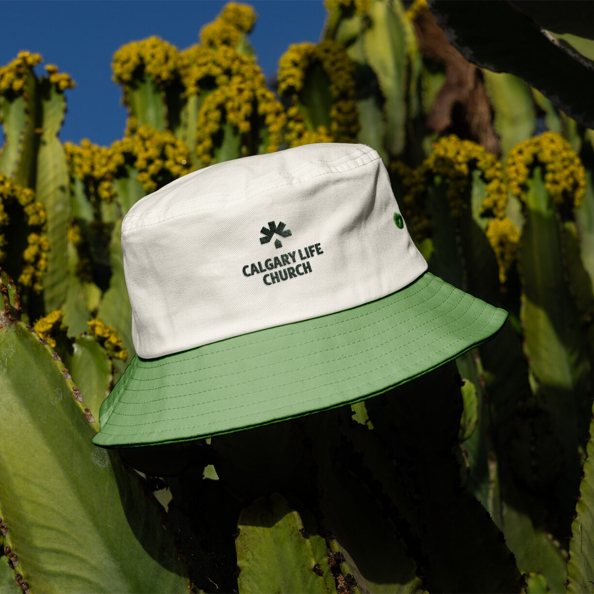
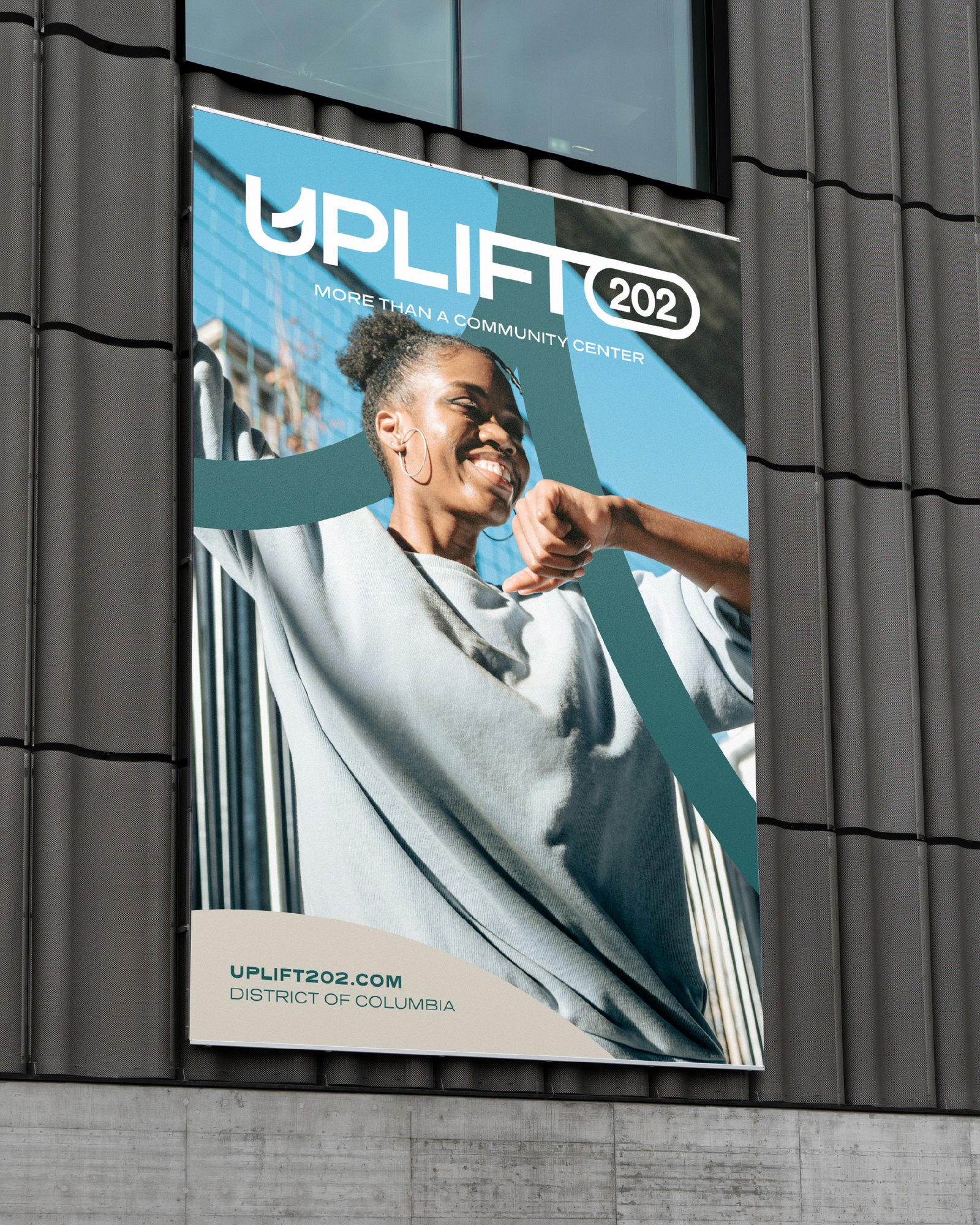
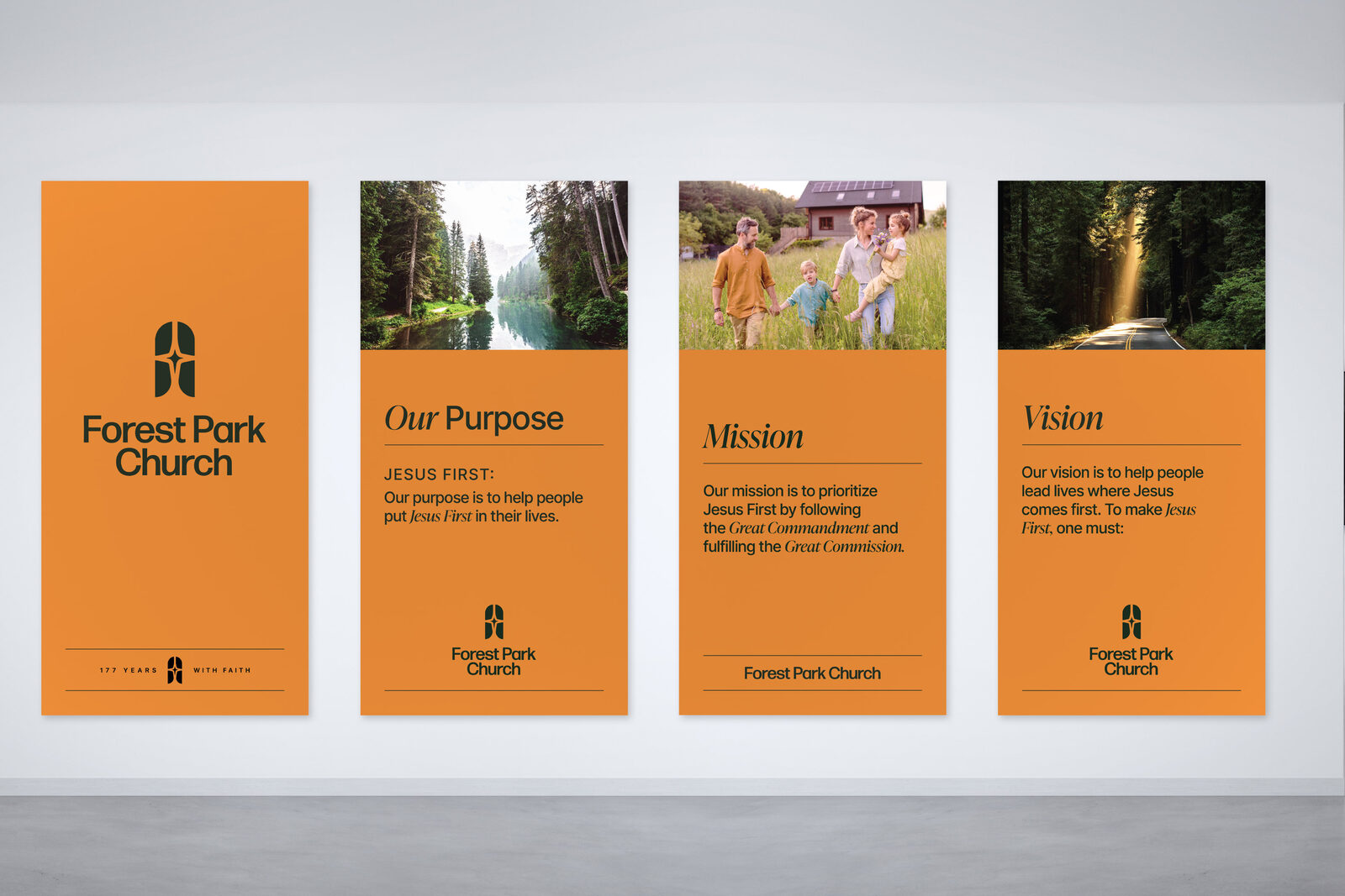
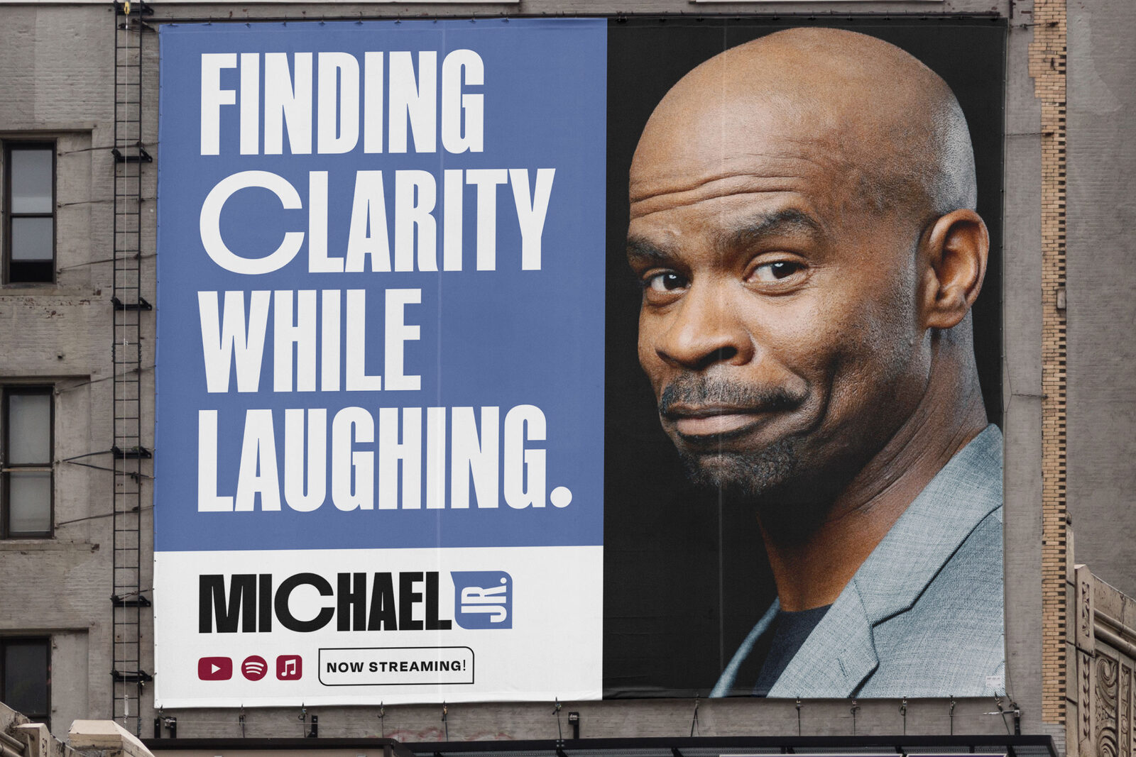
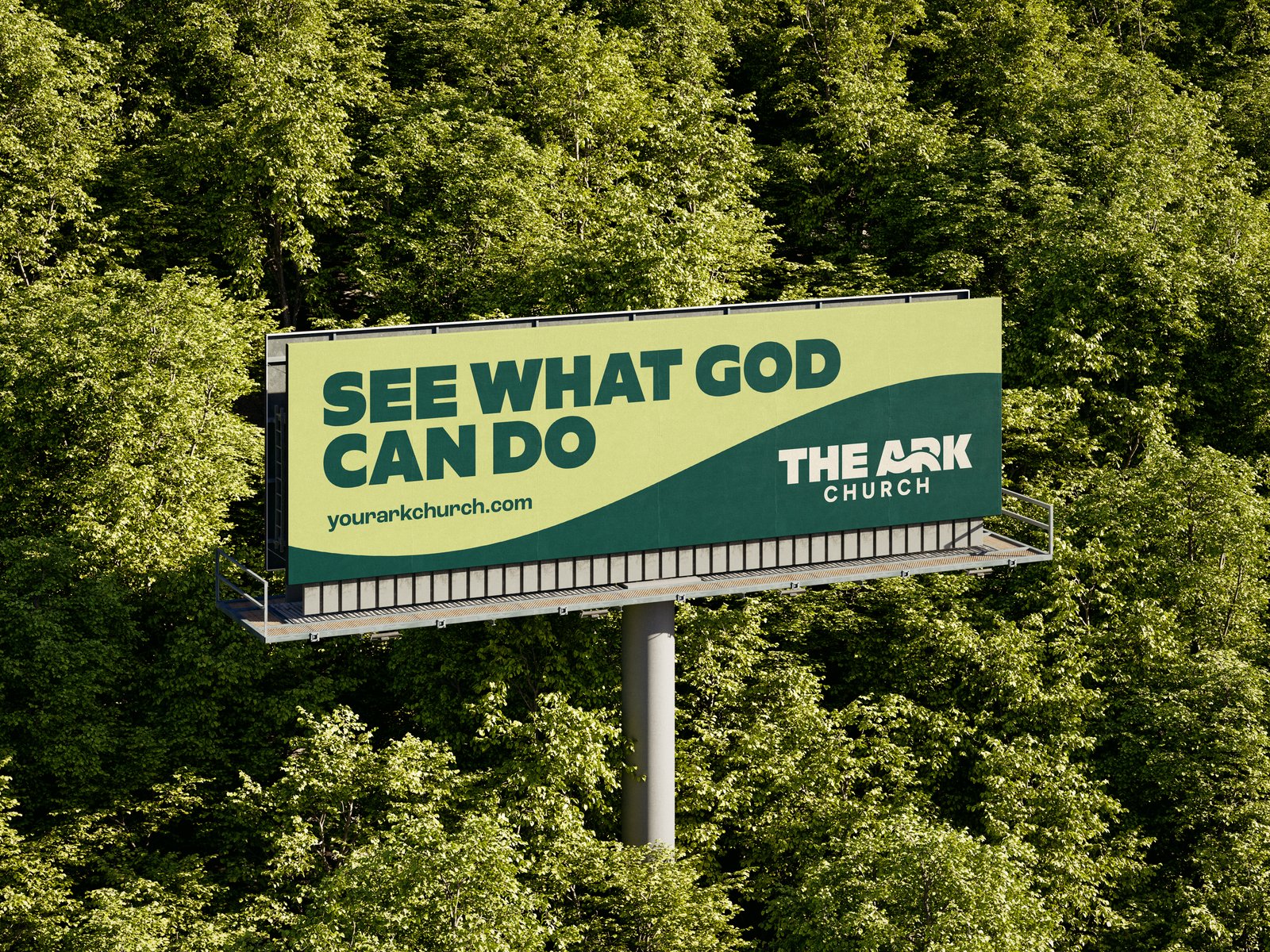
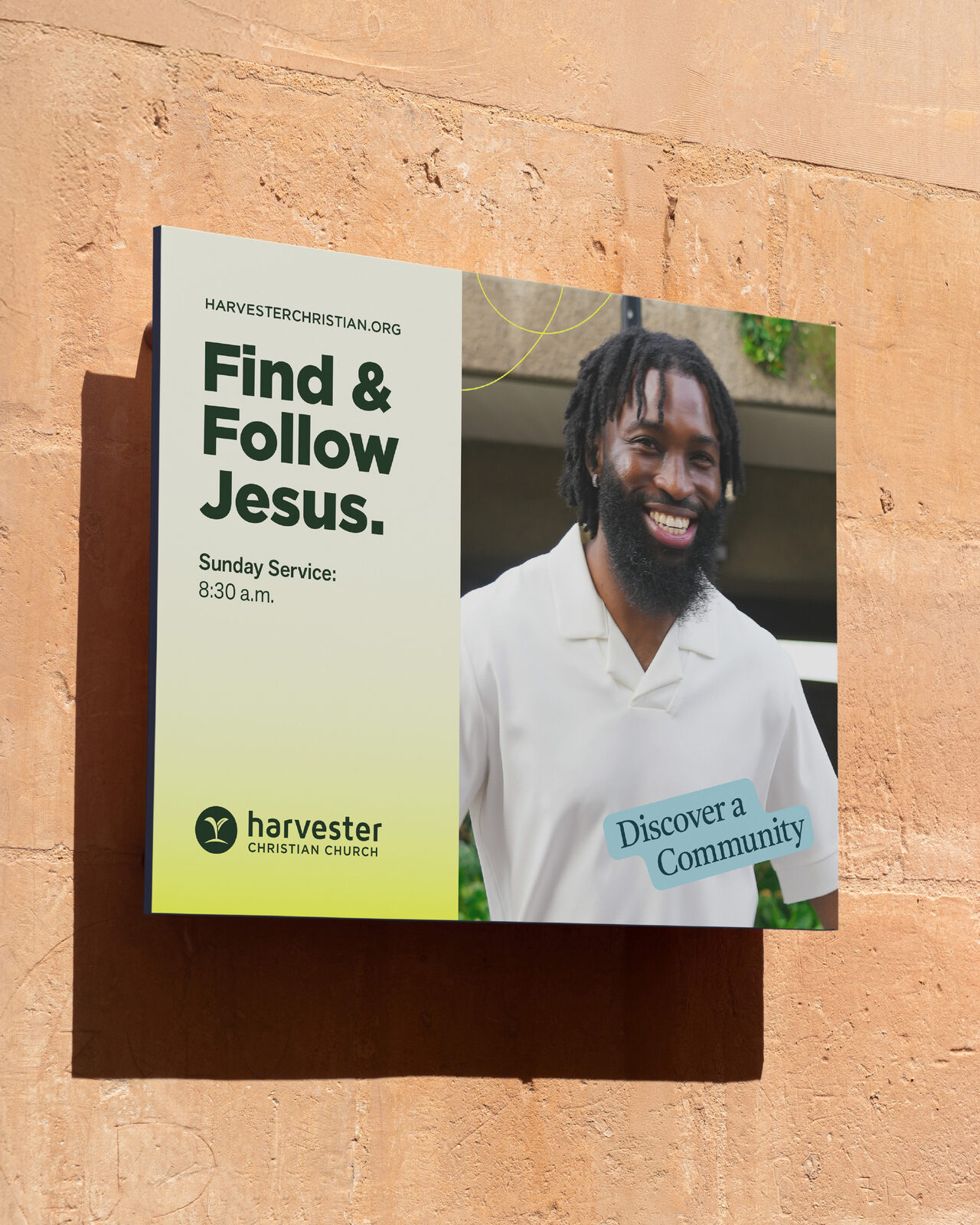
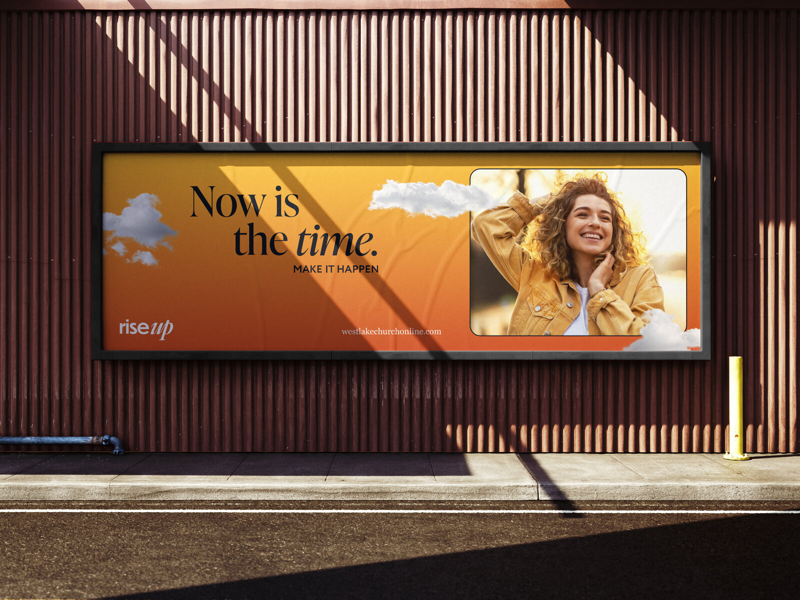
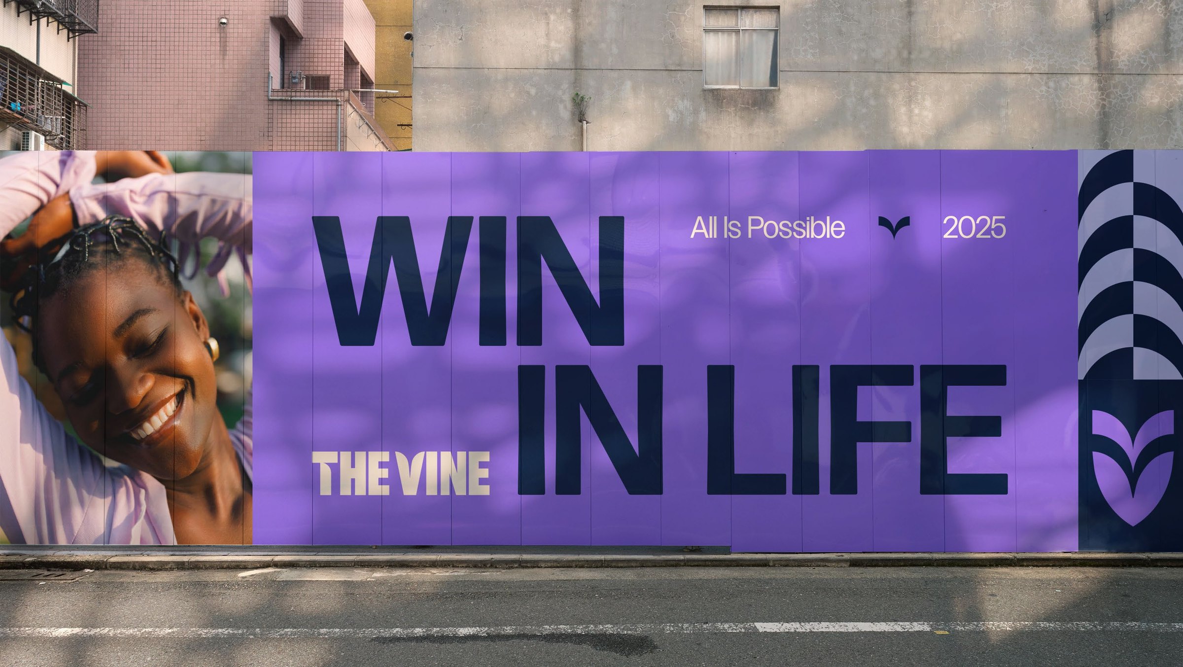
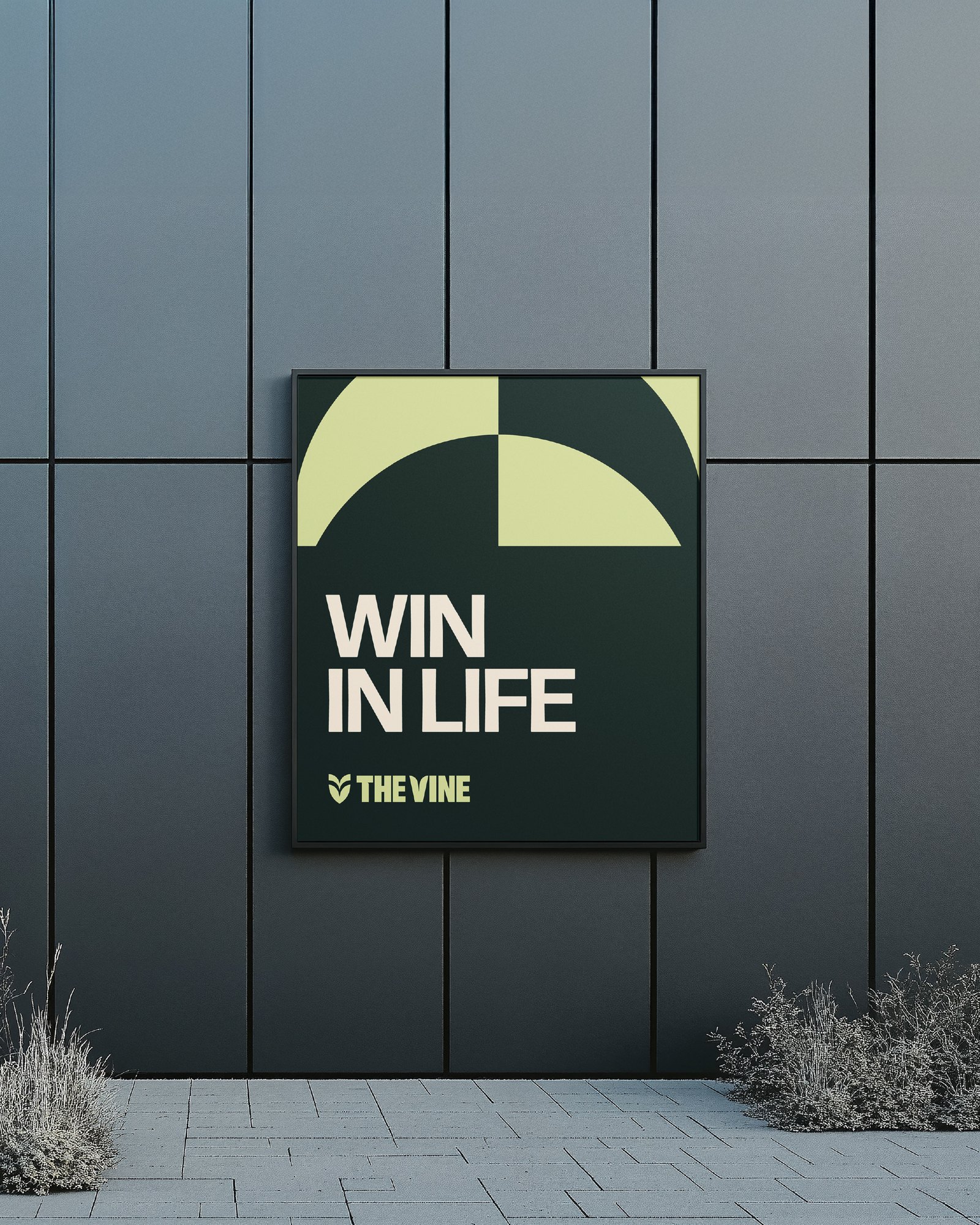
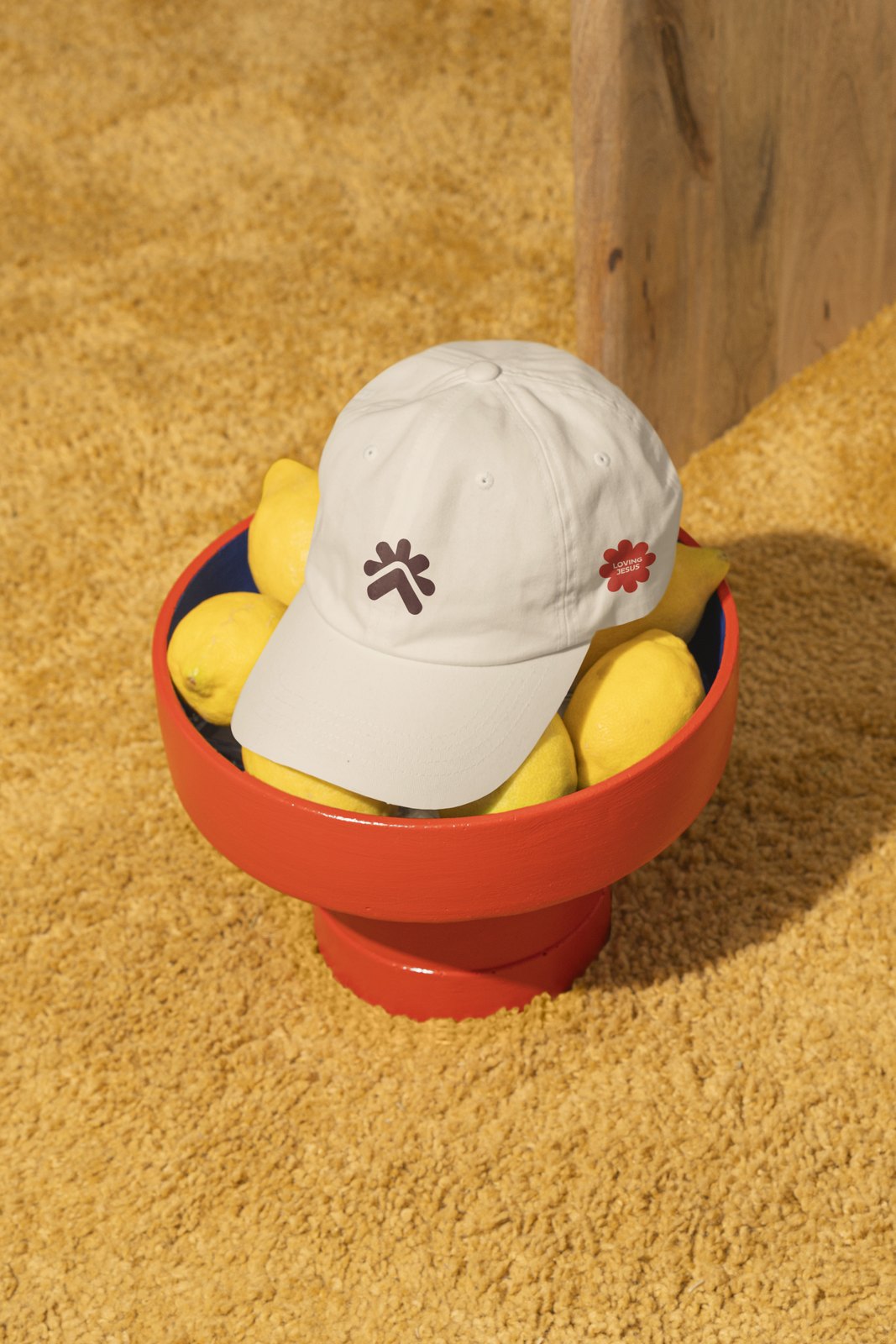
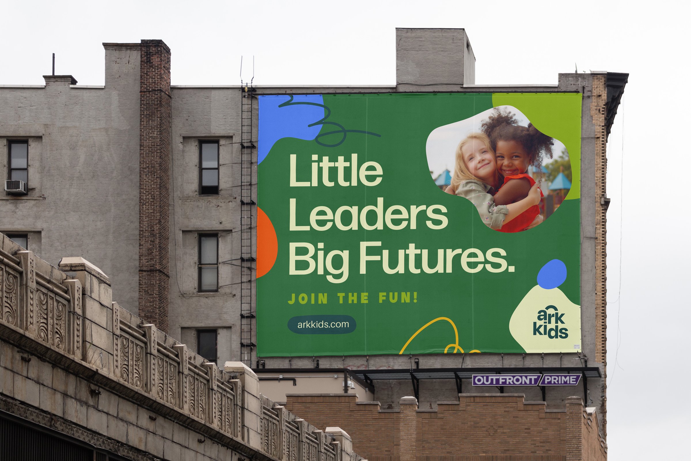
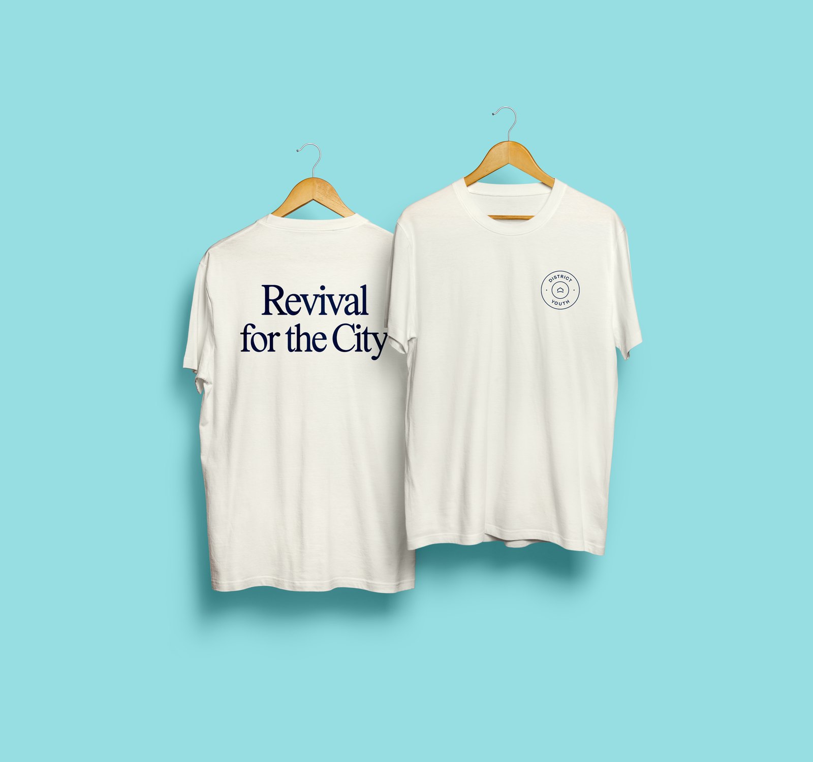
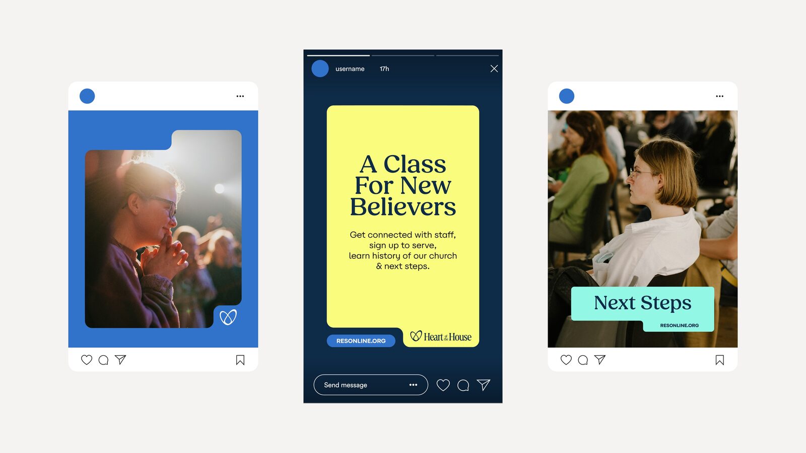
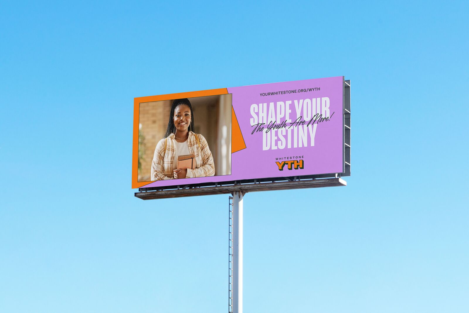
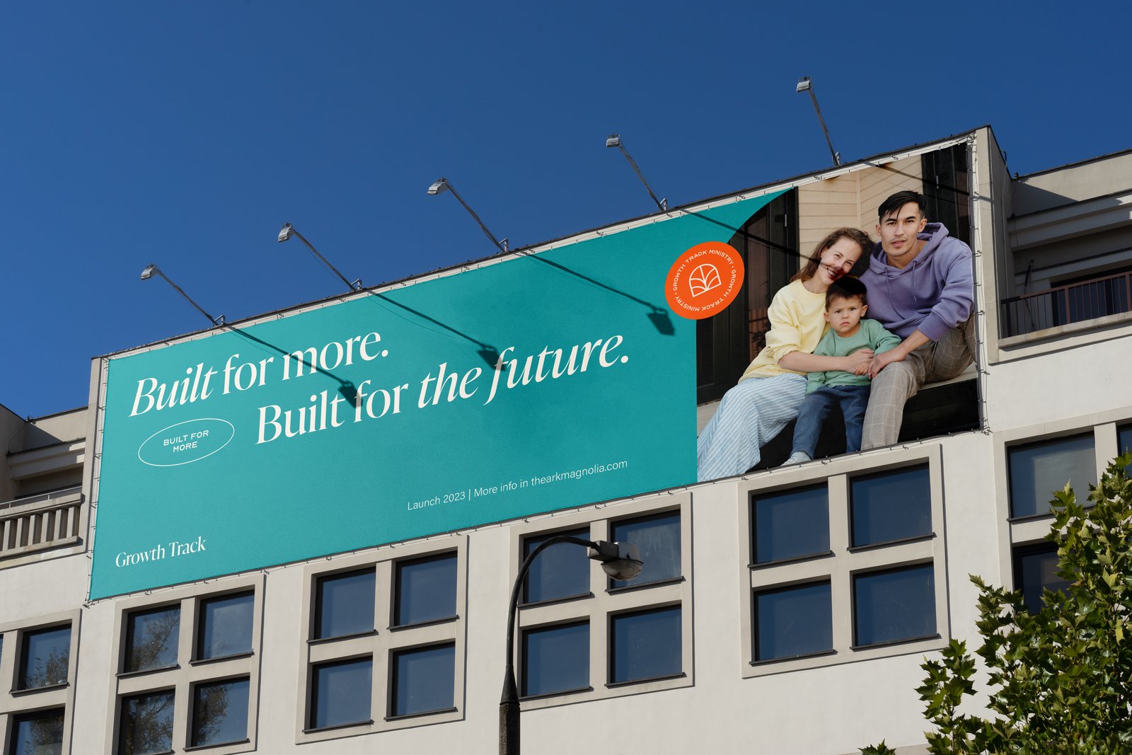
The brand applications from the style guide and from our January 2026 post. All are concept mockups.
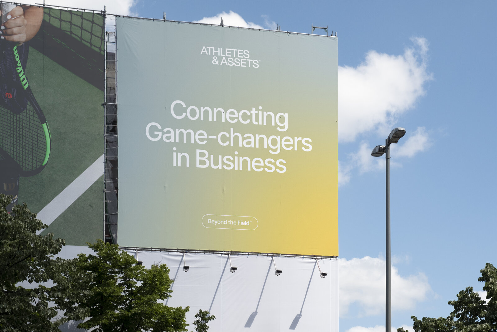
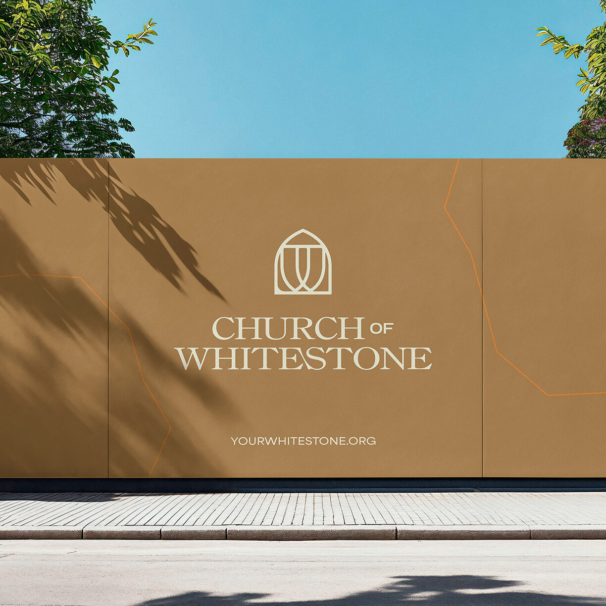
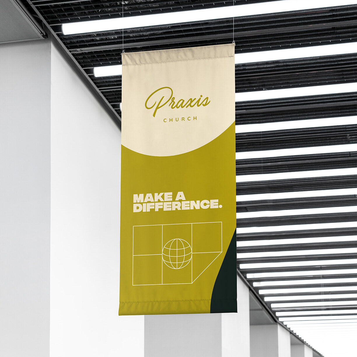
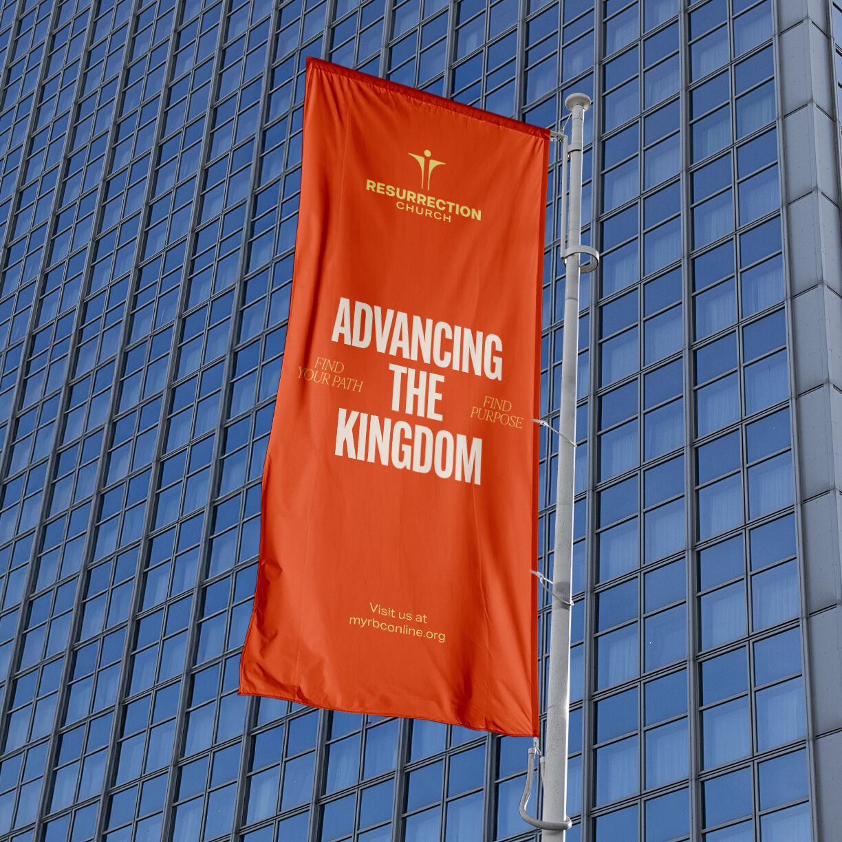
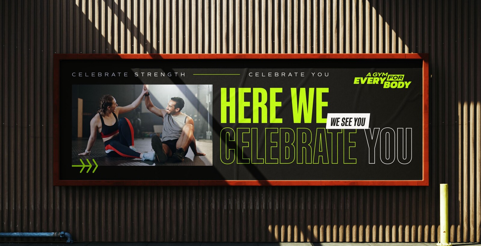
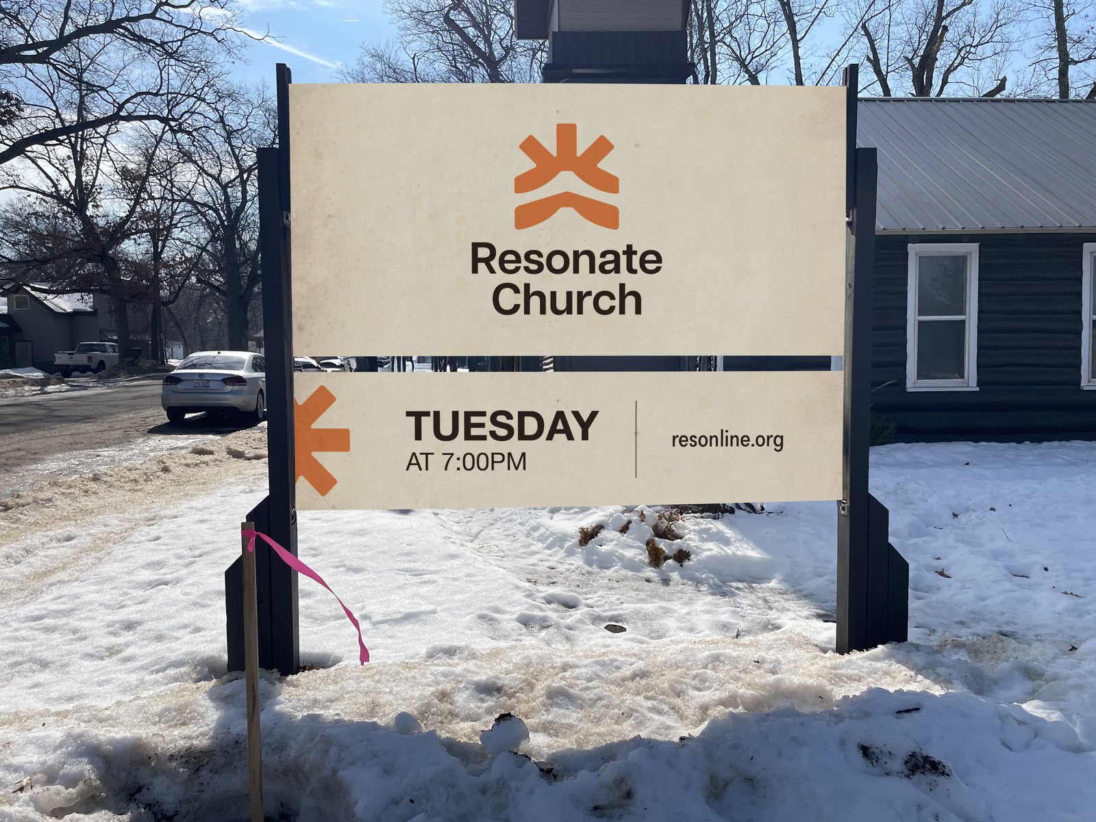
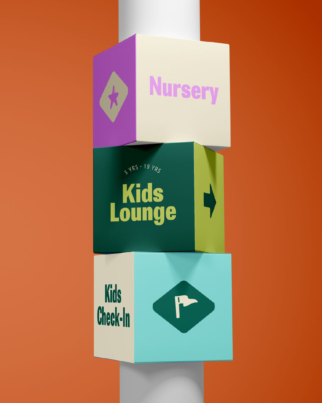
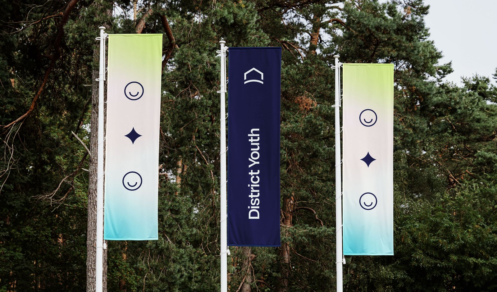
The signage package came in November 2025, two months before the launch: feather flags for the parking lot and the entrance, backdrops, A-frames, pull-ups and poster stands. Shown as the mockups from the package.
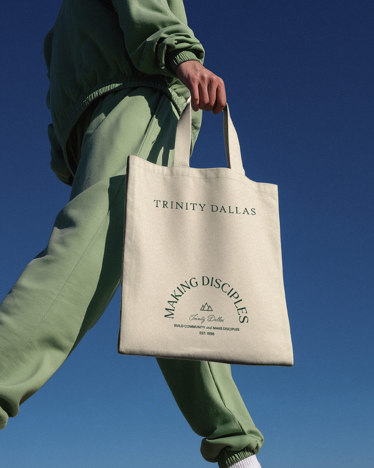
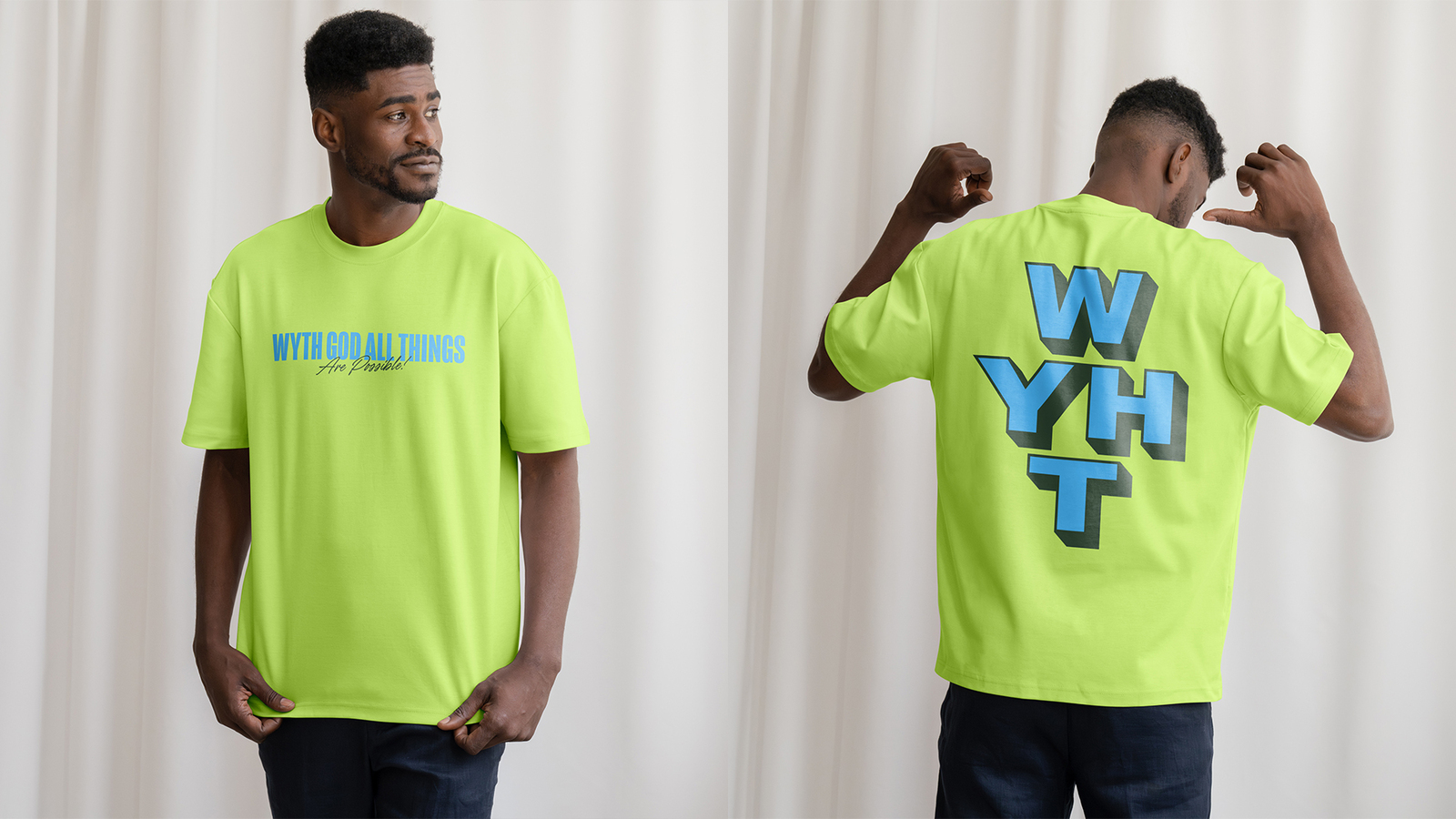
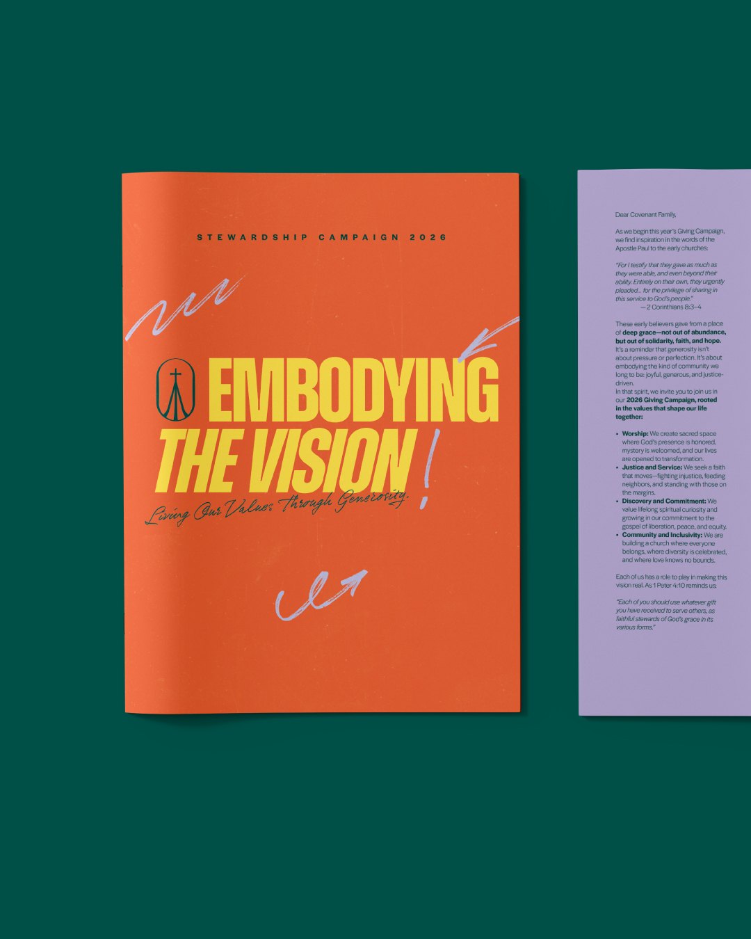
What went in the mail, on the table and on people between July 2025 and the summer after launch.
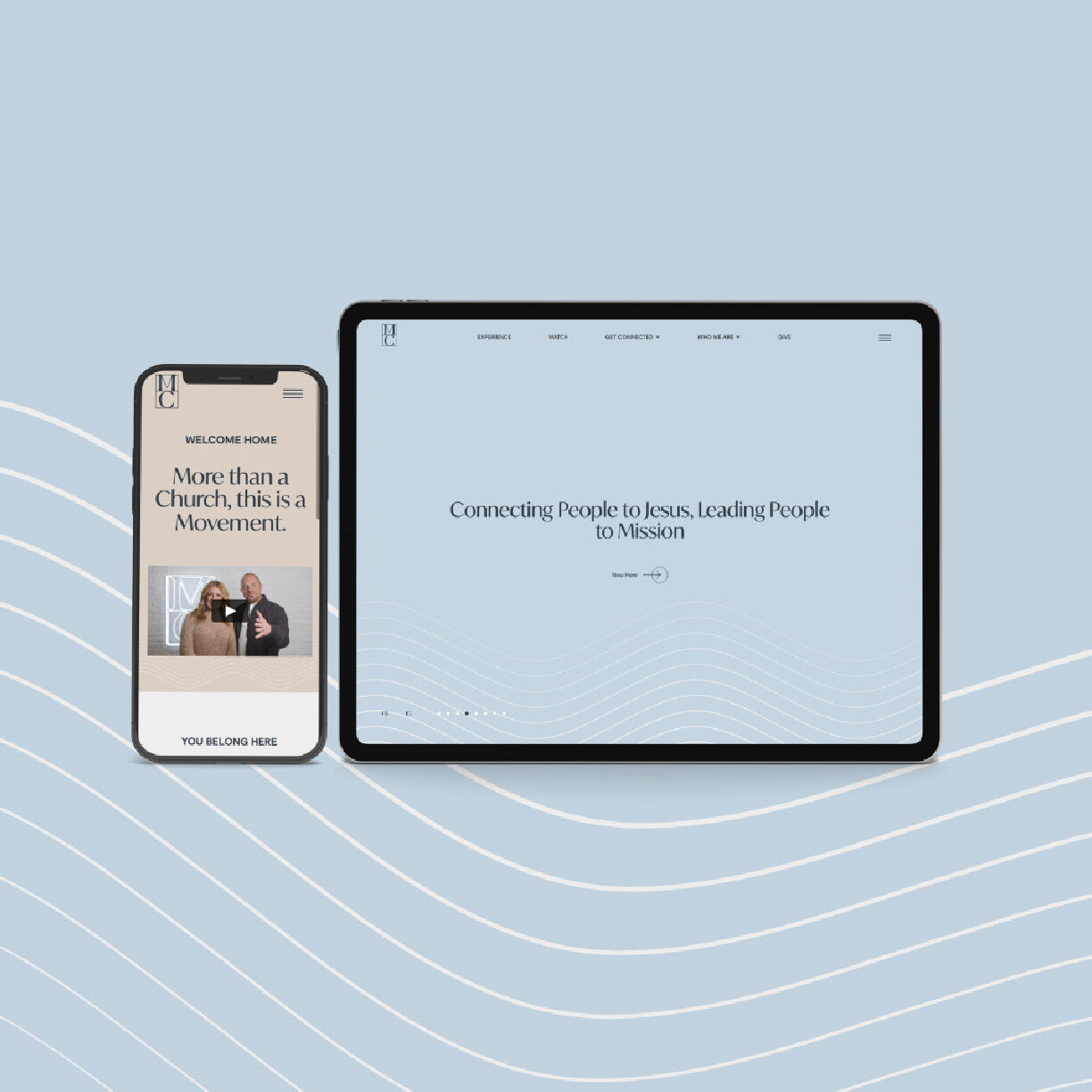
Designed and built on Webflow. The church’s team runs it; our support desk handles the changes they send in.
Identity: logo, icon, colour palette, type system, brand elements and a brand style guide.
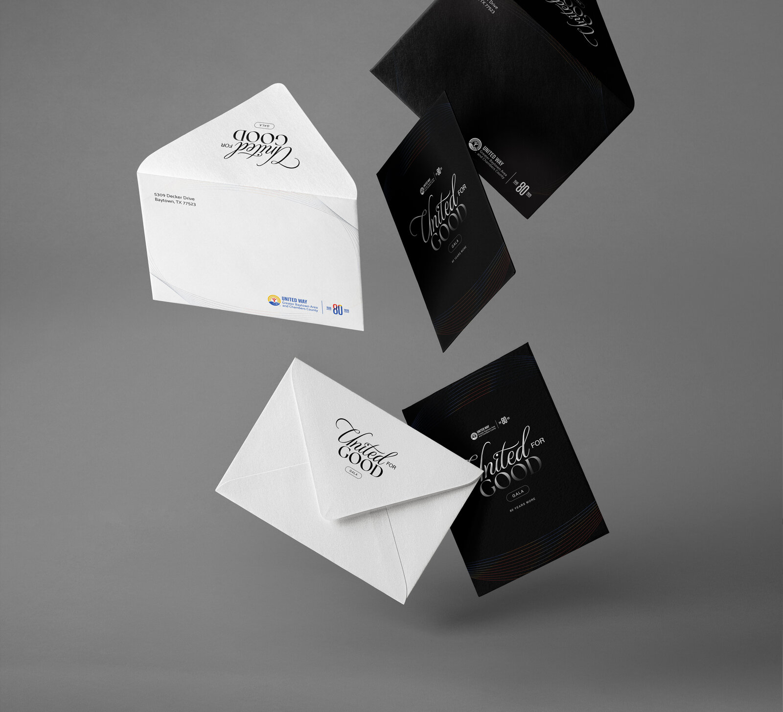
Stationery: letterhead, envelope and business cards.
Collateral: hats, badges and lanyards, connect cards, the launch mailer, a welcome booklet, flyers, board signs, a pop-up sign and a pop-up table, the trailer logo.
Signage: exterior and interior feather flags, backdrops, pillowcase signs, windmaster and table-top signs.
Website: vineamarillo.com, designed and built on Webflow.
Vine Kids: the children’s ministry sub-brand, on its own page.