The Remedy is the monthly-giving community of The Jonah Inheritance: people who give each month to keep African doctors doing the work. It needed an identity that felt personal rather than institutional, and a toolkit a small team could use on its own.
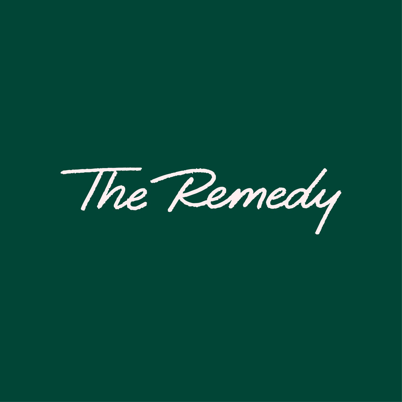
The logo is a hand-made script wordmark inspired by a doctor's signature on a prescription. It reads as a person, not a department. Illustrations, colour and a short set of rules do the rest.
The wordmark in Dark Green and Pearl, with Coral and Teal for emphasis.
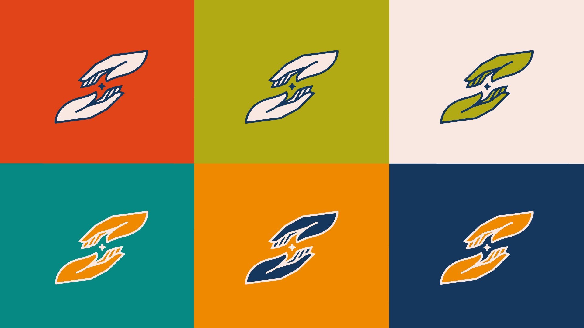
A set of four illustrations, each drawn in four colourways, plus a toolkit of icons and shapes.
How the system looks on a billboard, roll-up banners, social posts, a tote and screens. All are concept mockups.
The Remedy's page on the website we built, where a monthly gift starts. Shown as a screen from our archived build.
Logo suite: the script wordmark in four colours.
Brand illustration set: four illustrations in four colourways.
Brand style guide.
Social outlets: profile and cover sets for Facebook, Instagram and Twitter.