Trinity Dallas, celebrating 30 years, needed a visual identity that felt consistent and elevated across every campus and platform—without touching the existing logo their congregation held as sacred.
The discovery journey defined it early: the existing logo was sacred and wasn't up for debate. Every recommendation had to earn its place around that mark, not replace it.
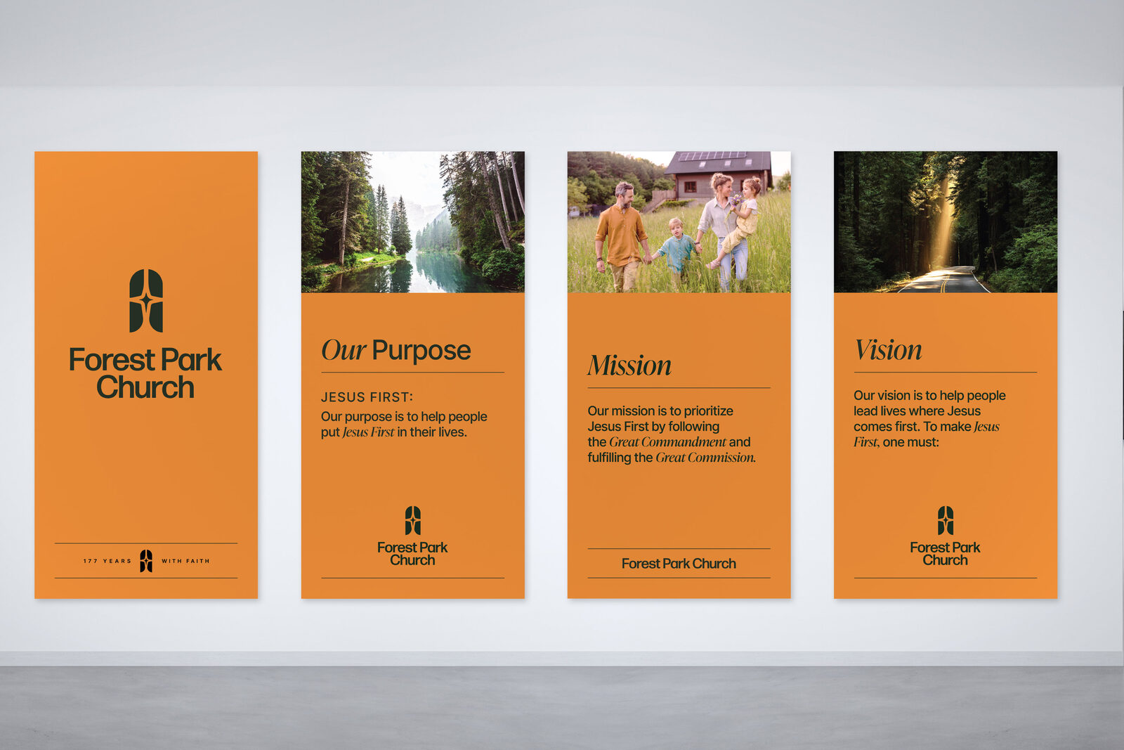
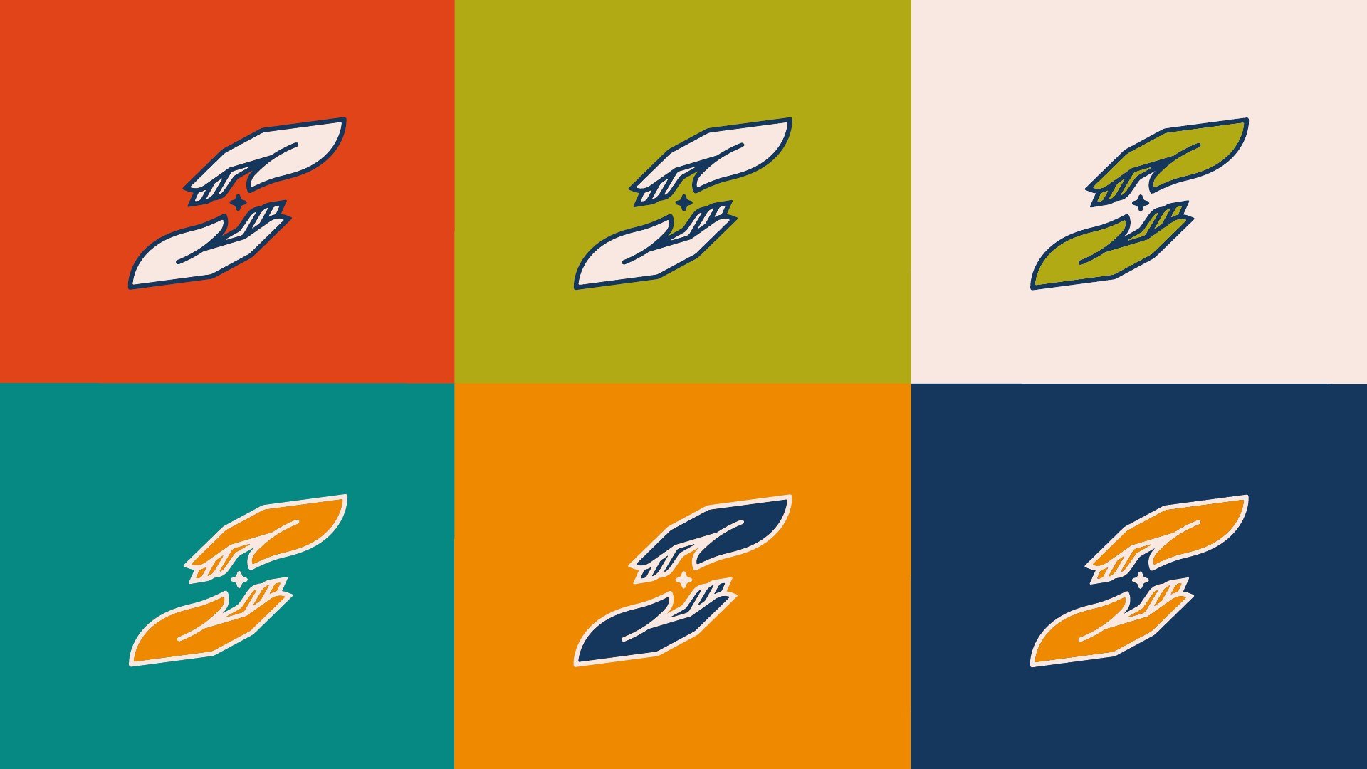
A more organic, handcrafted icon—uncircled triangles, redrawn with a grassroots feel—paired with cleaner lockups of mark, wordmark, and tagline built to hold up across every campus. Emerald, Terrain, Antique, Khaki, Sage, and Steel Blue carry the palette against a stark white, for an elevated, classic feel over trendy.
Discovery pointed back to the church's own name. Dallas was built near the Trinity River, but the deeper meaning is the Trinity itself: Father, Son, and Holy Spirit, one God in three persons. The tagline evolved through the process too, landing on: Building Community. Seeking God.
A consistent visual identity that reflects their strong theology and legacy across all platforms and campuses.
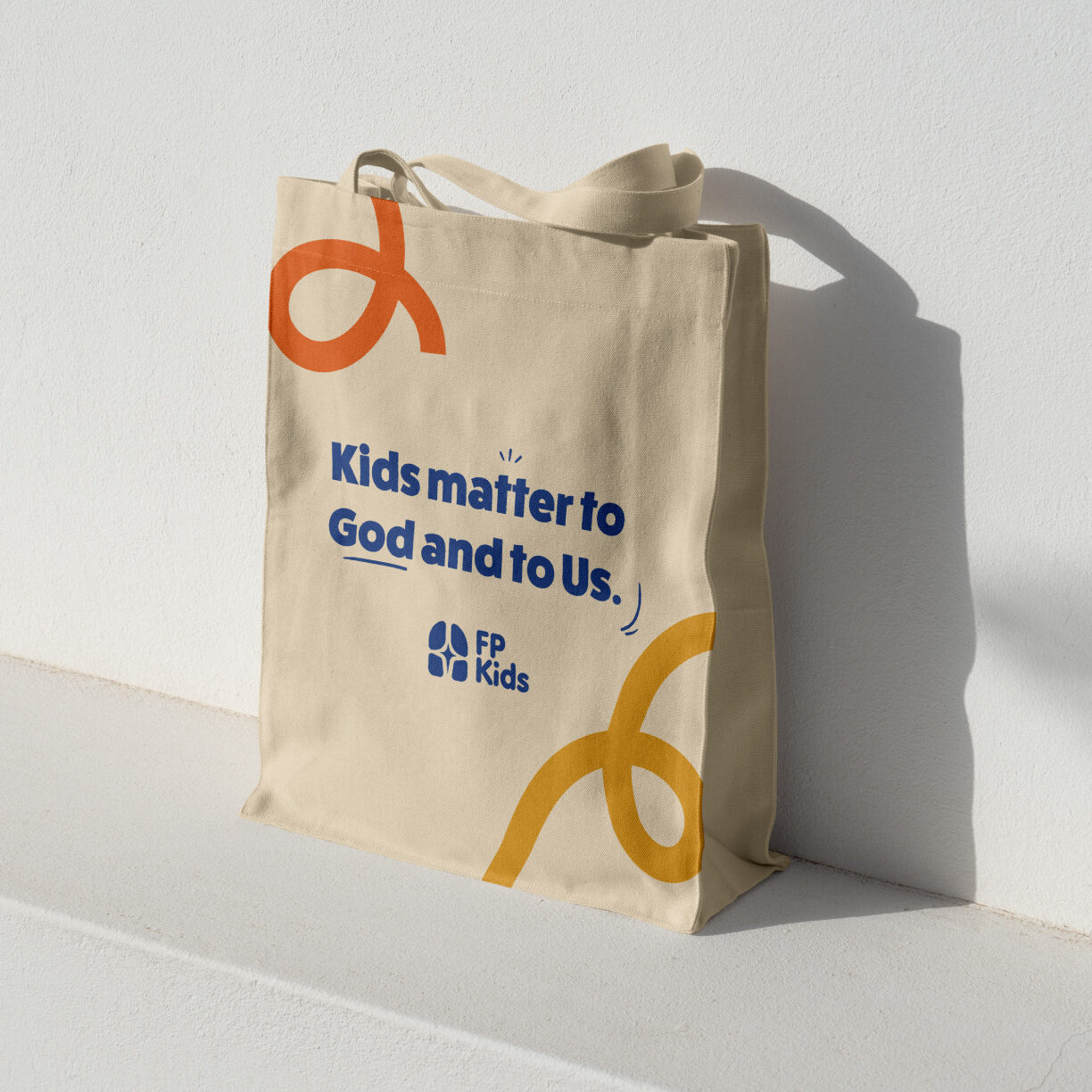
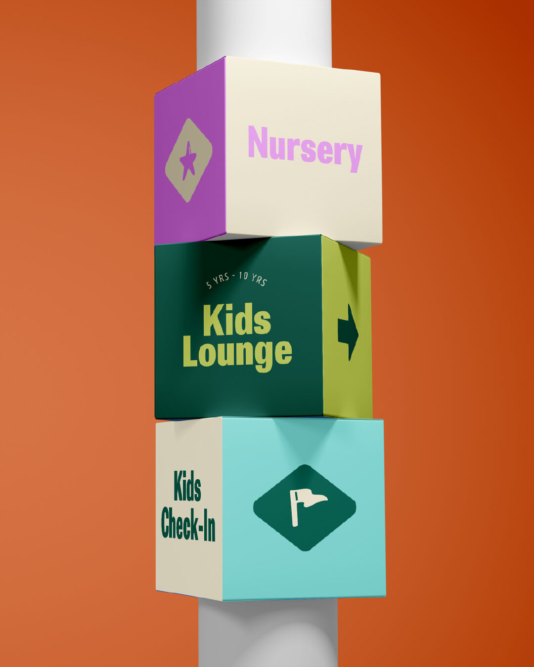
Trinity Kids is the first sub-brand to open under Trinity Dallas's roof—its own energetic identity for children's ministry, built to read as part of the same church rather than a spinoff. More rooms are underway.
Logo guidelines: usage rules that kept the existing mark untouched while standardizing how it's applied.
Cleaner lockups: refined pairings of mark, wordmark, and tagline for cross-campus consistency.
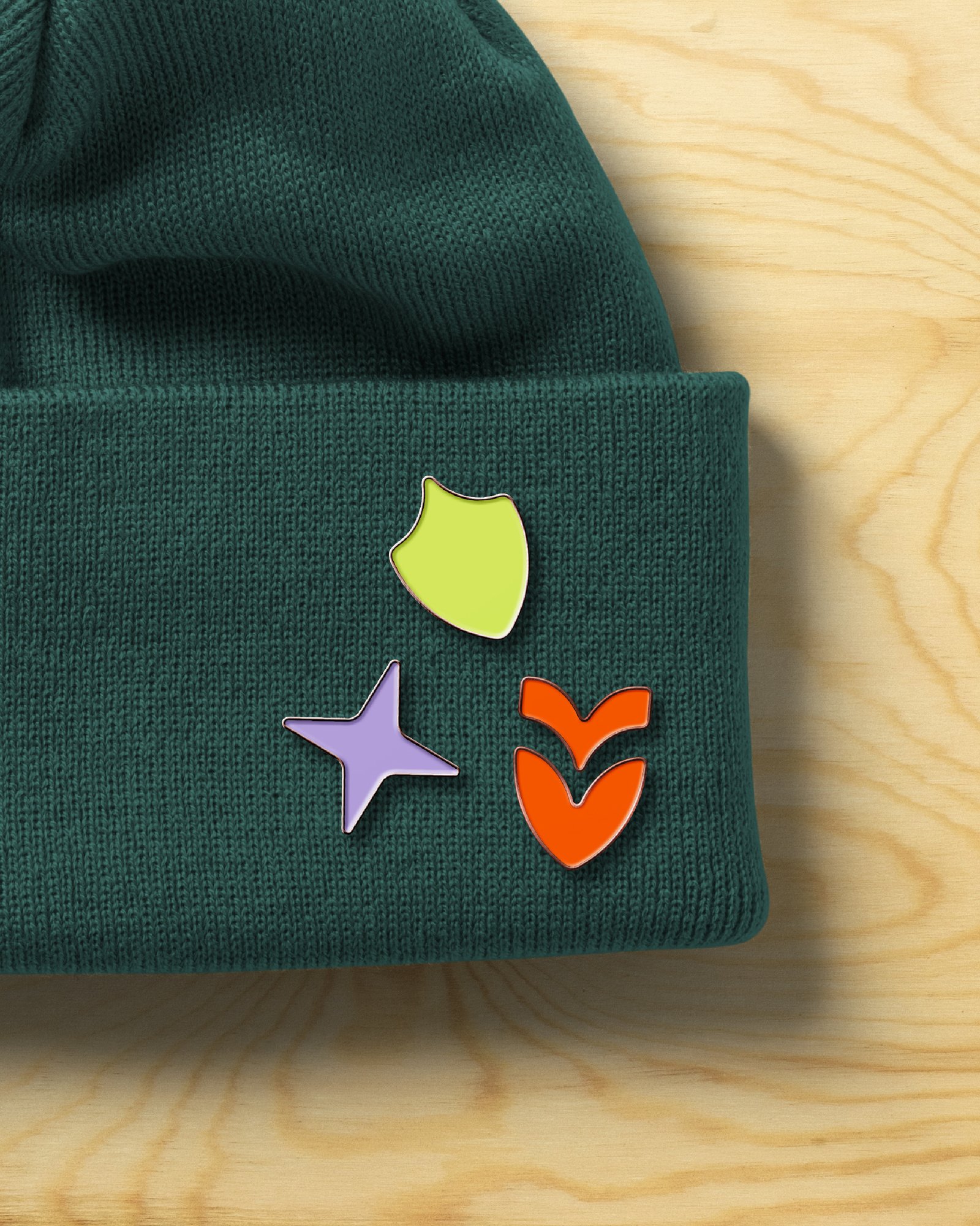
Icon redesign: a more organic, handcrafted uncircled triangle motif.
Color system: Emerald, Terrain, Antique, Khaki, Sage, and Steel Blue against a stark white, for an elevated, classic feel.
Tagline: finalized on Building Community. Seeking God.
One sub-brand and counting: Trinity Kids, with more studies underway.
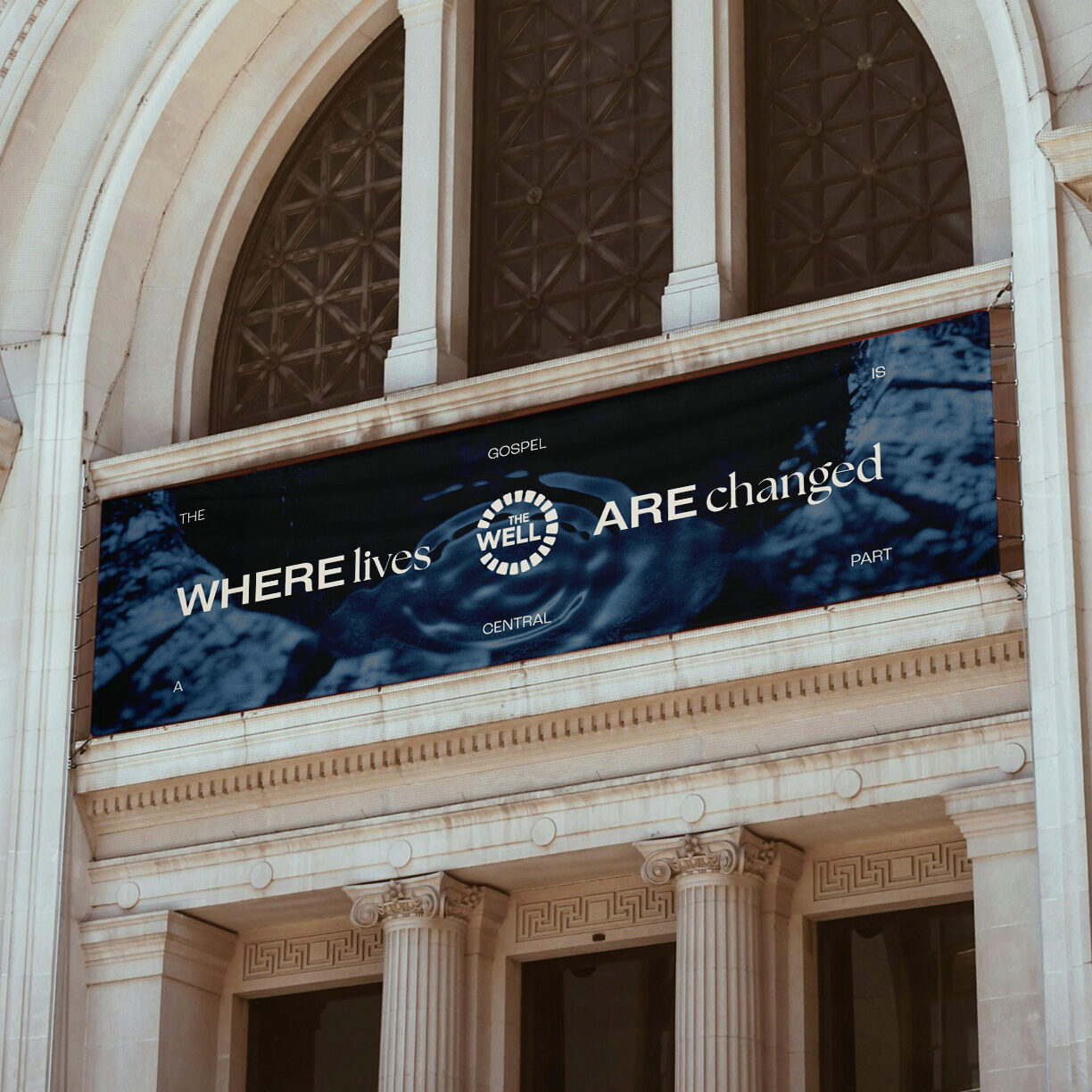
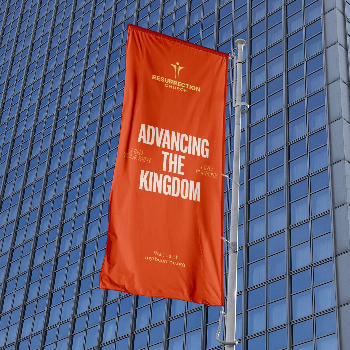
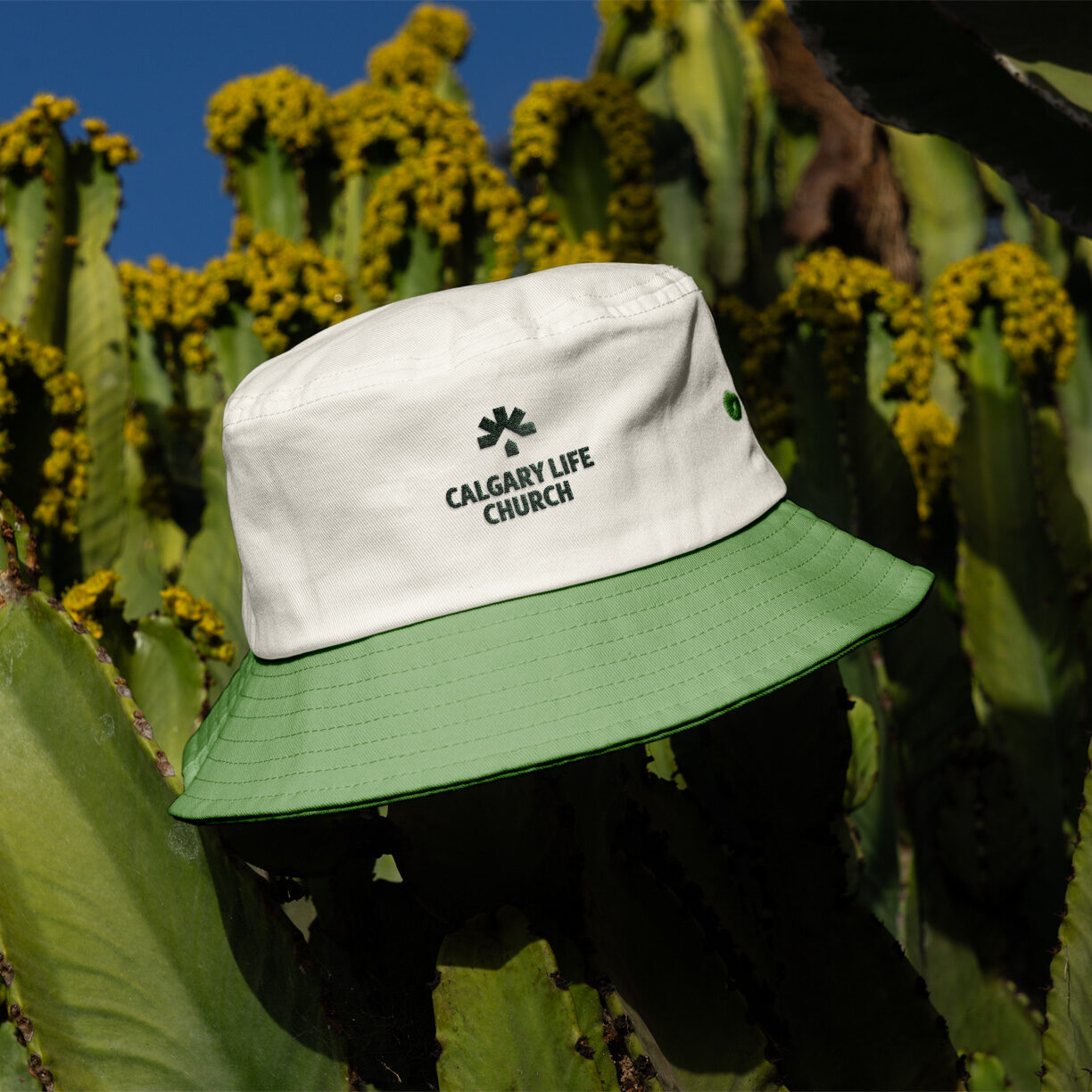
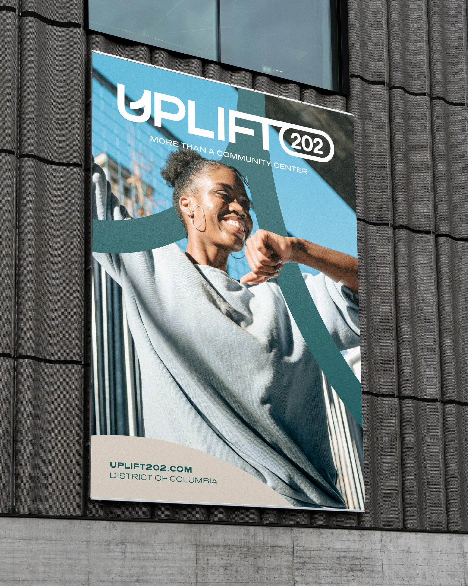
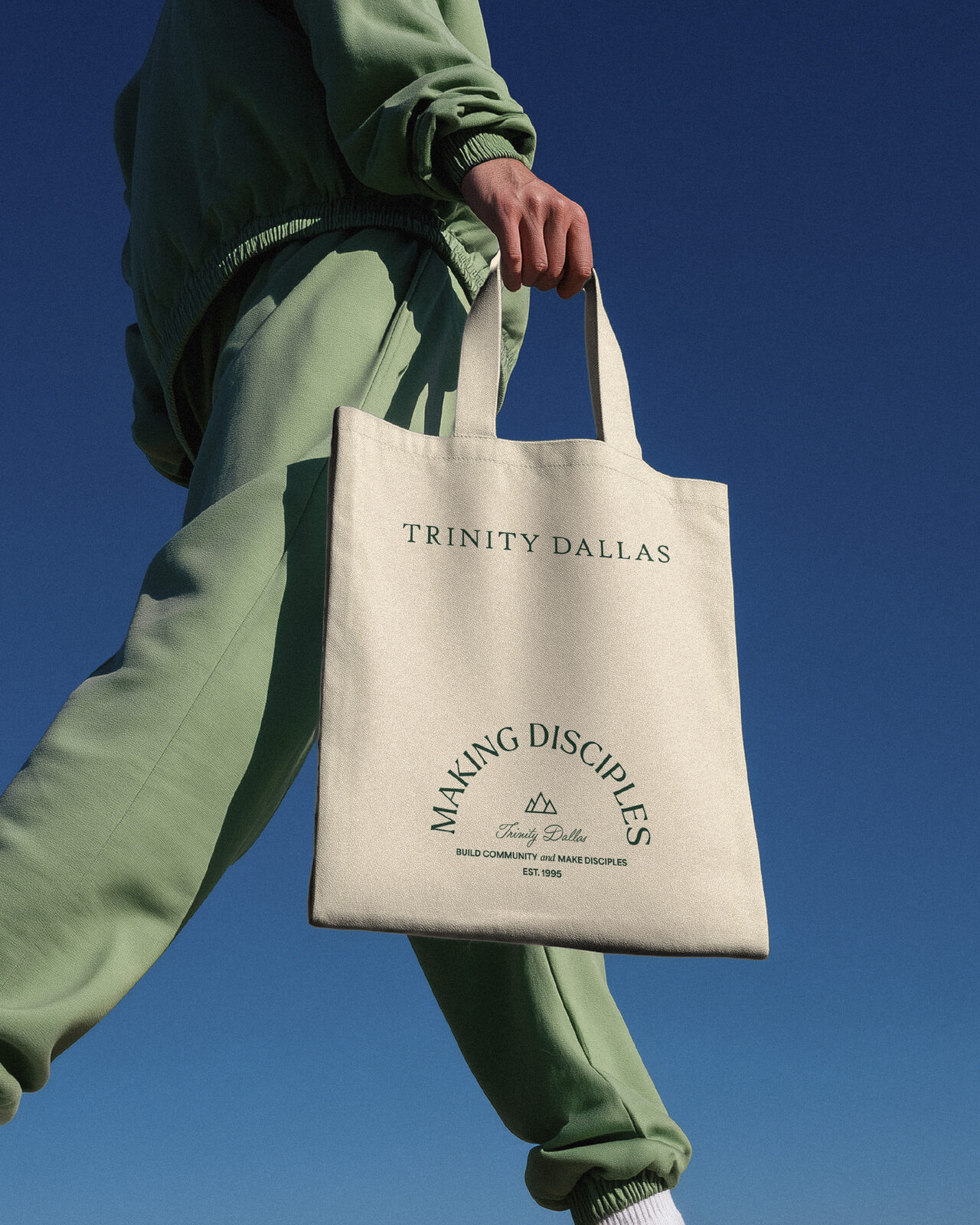
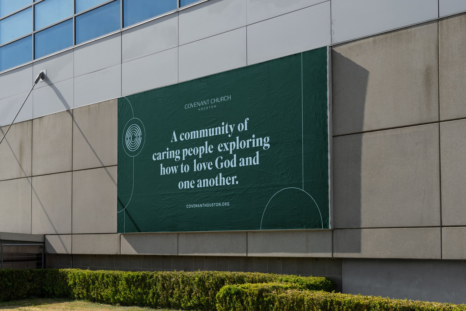
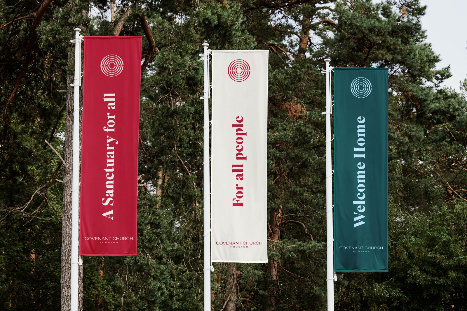
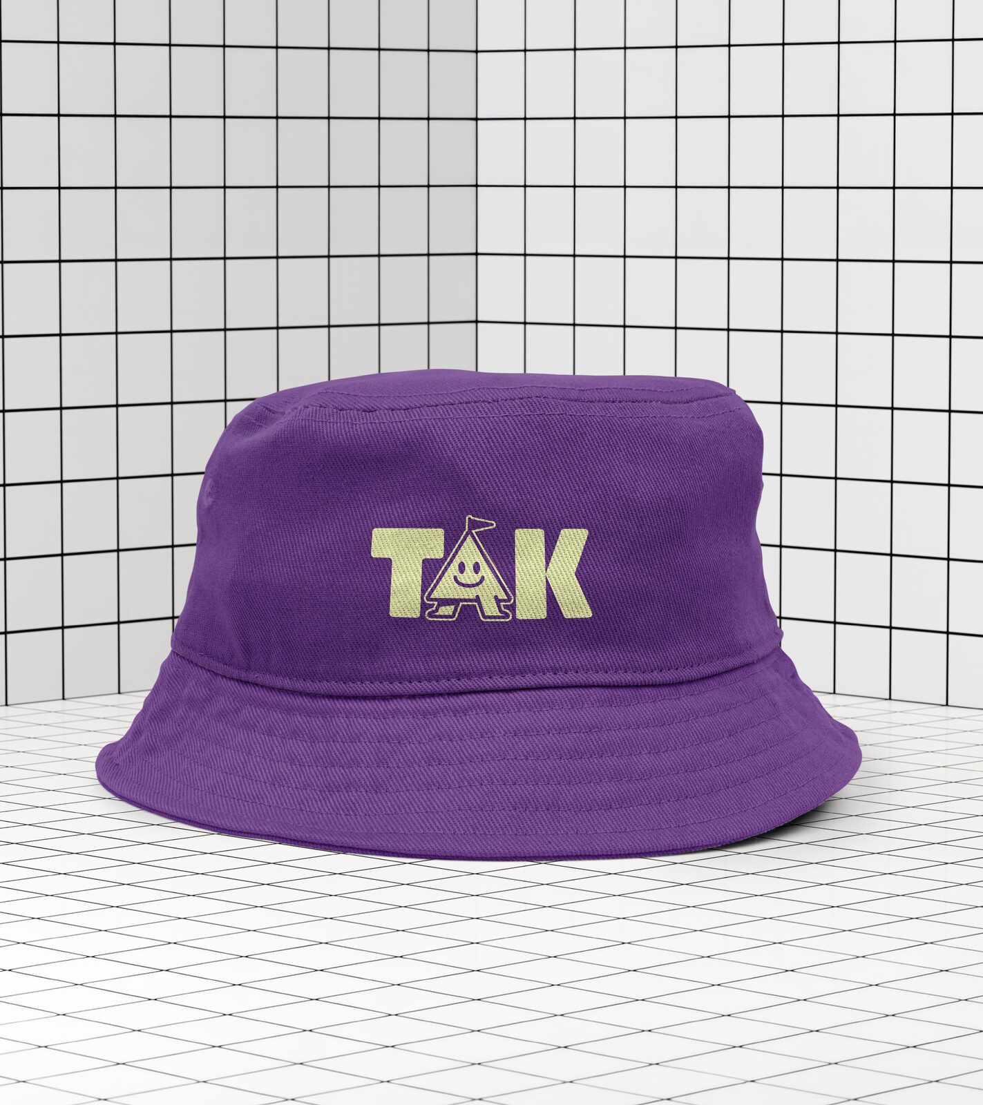
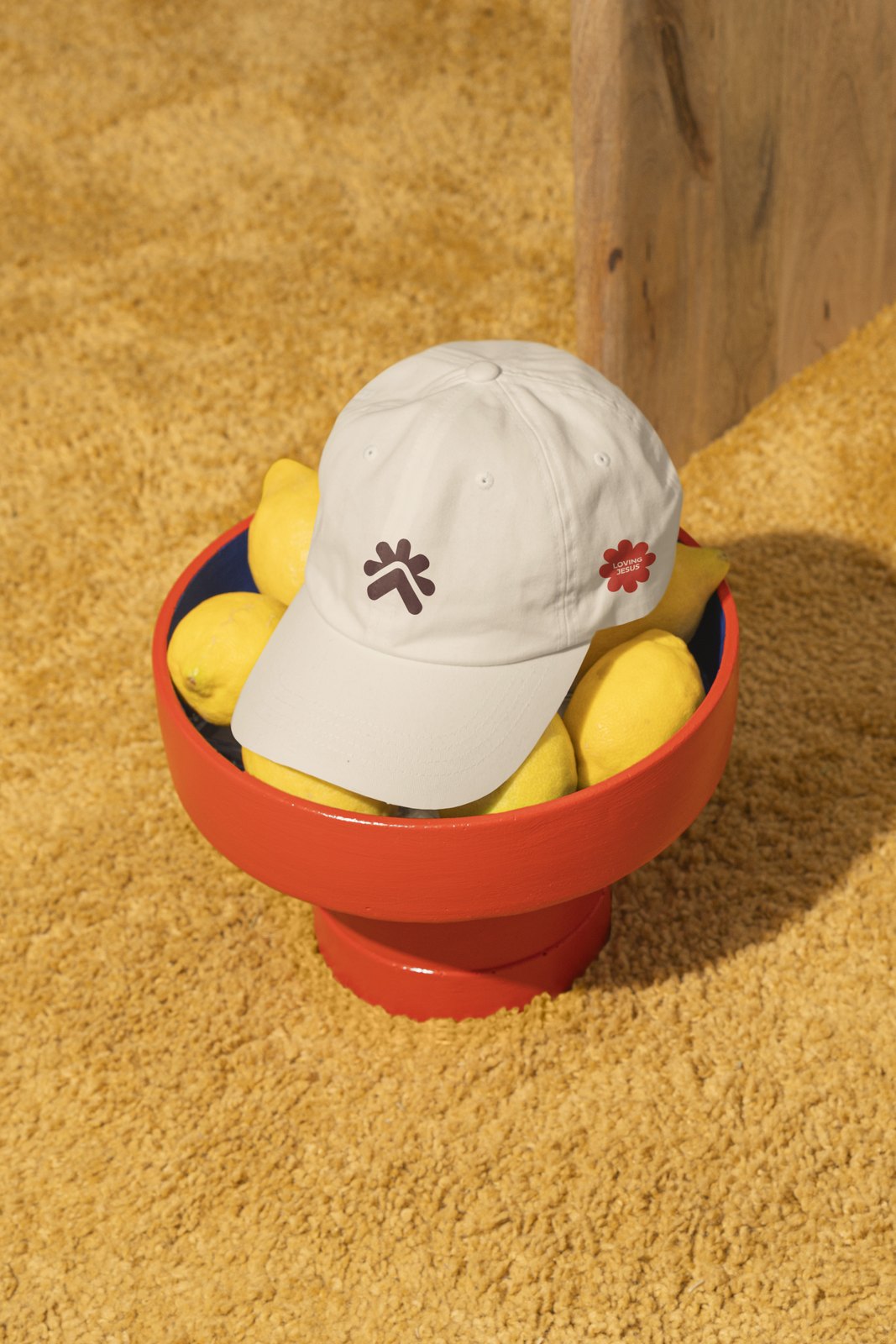
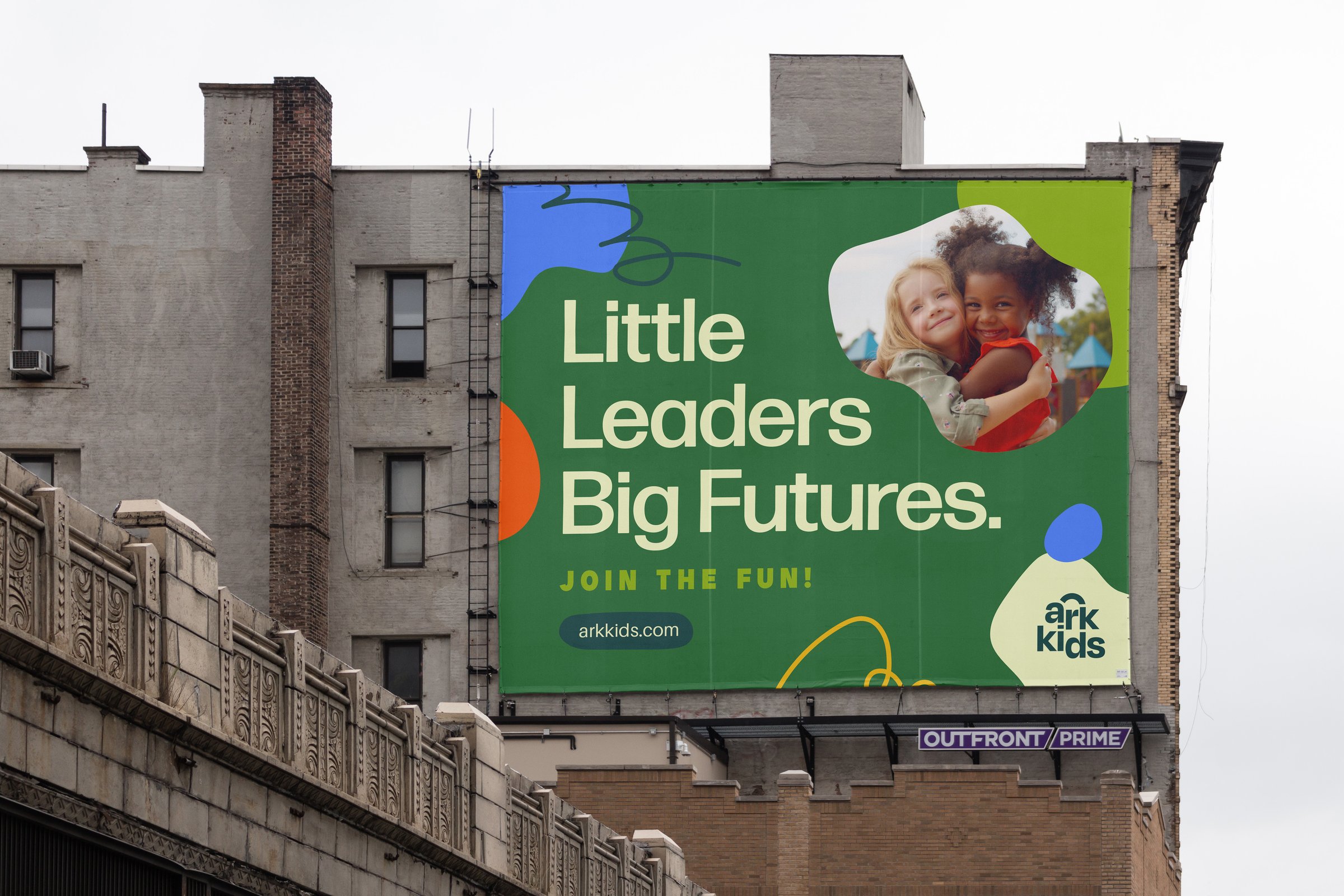
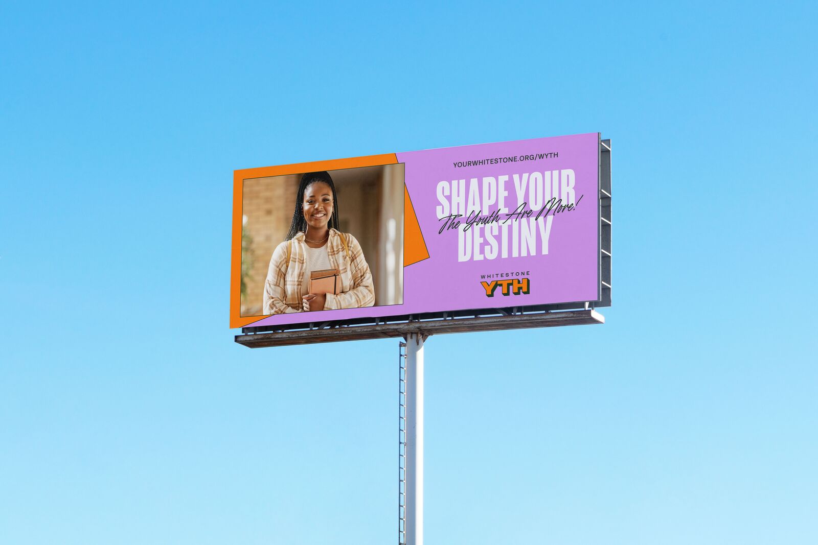
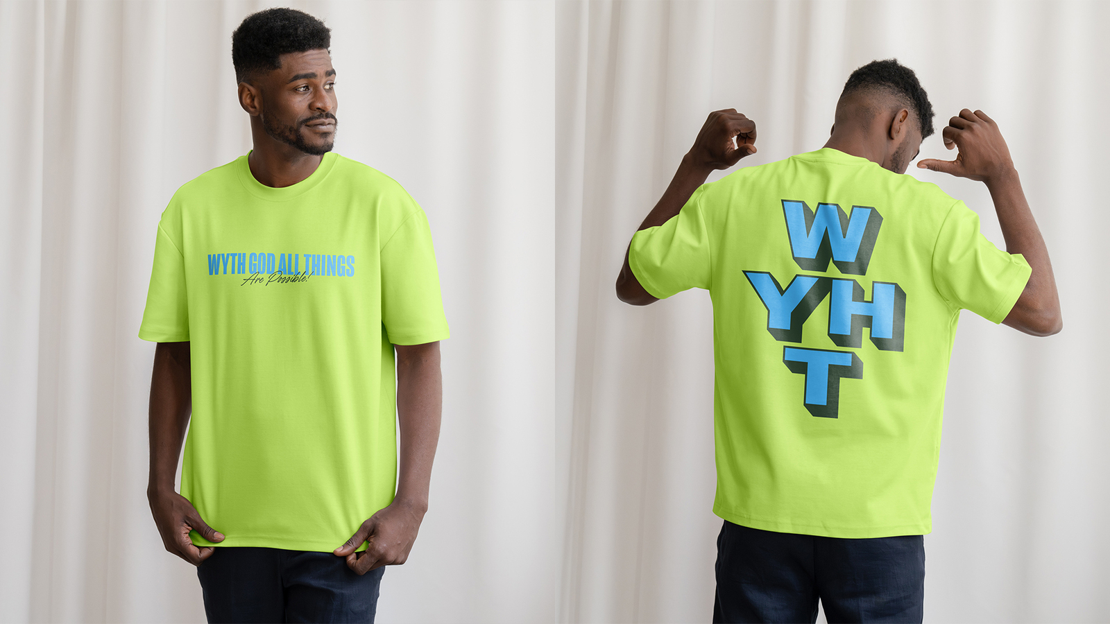
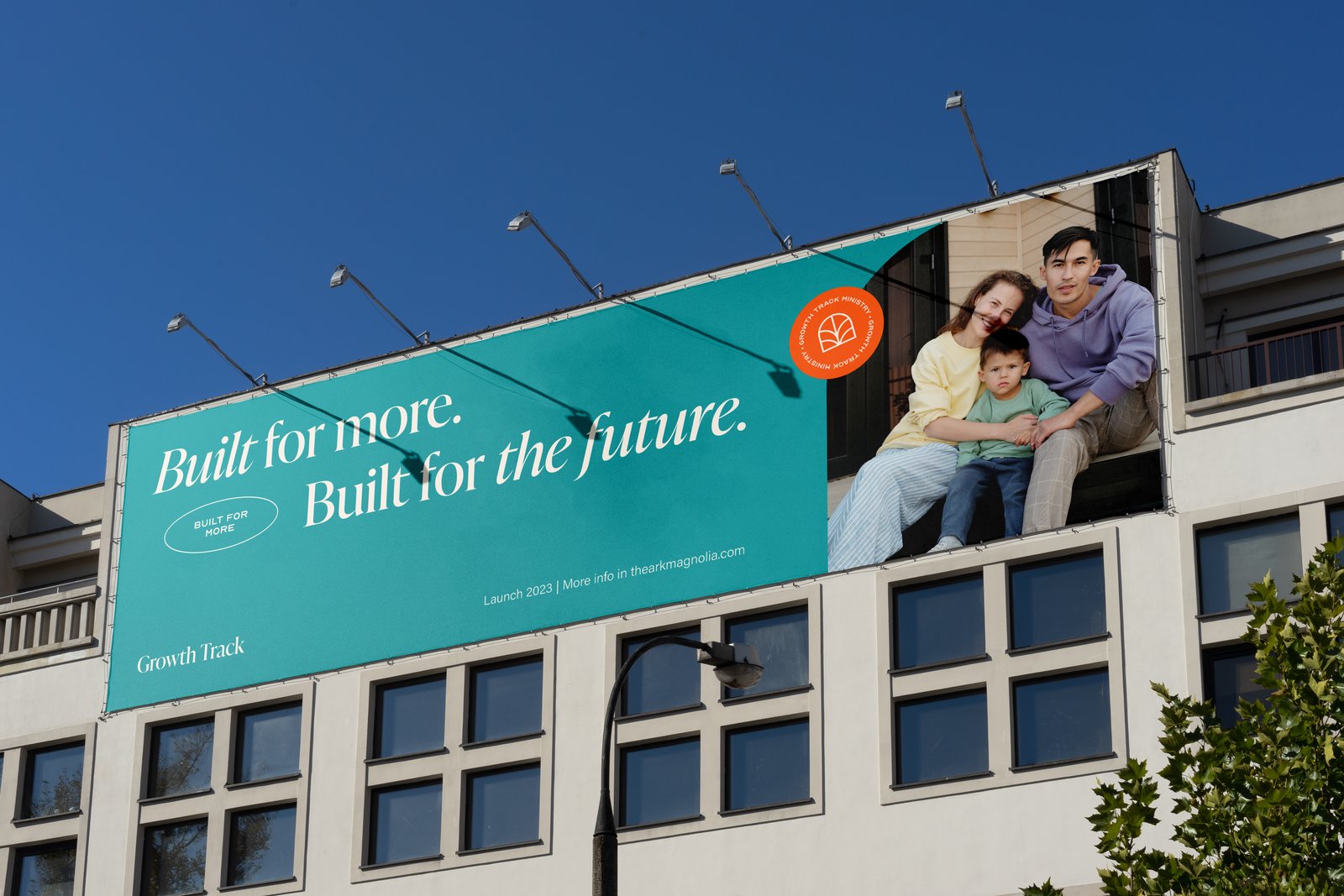
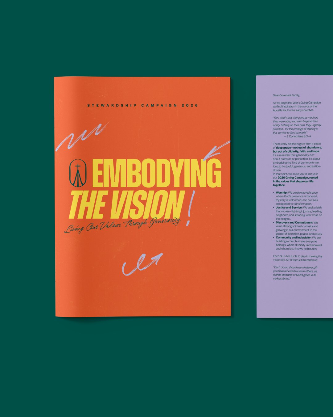
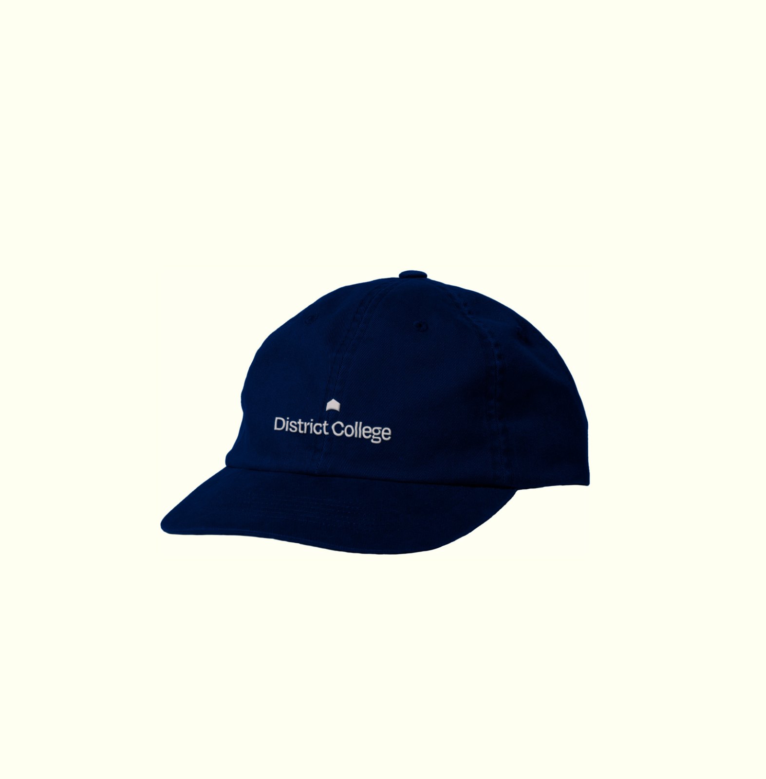
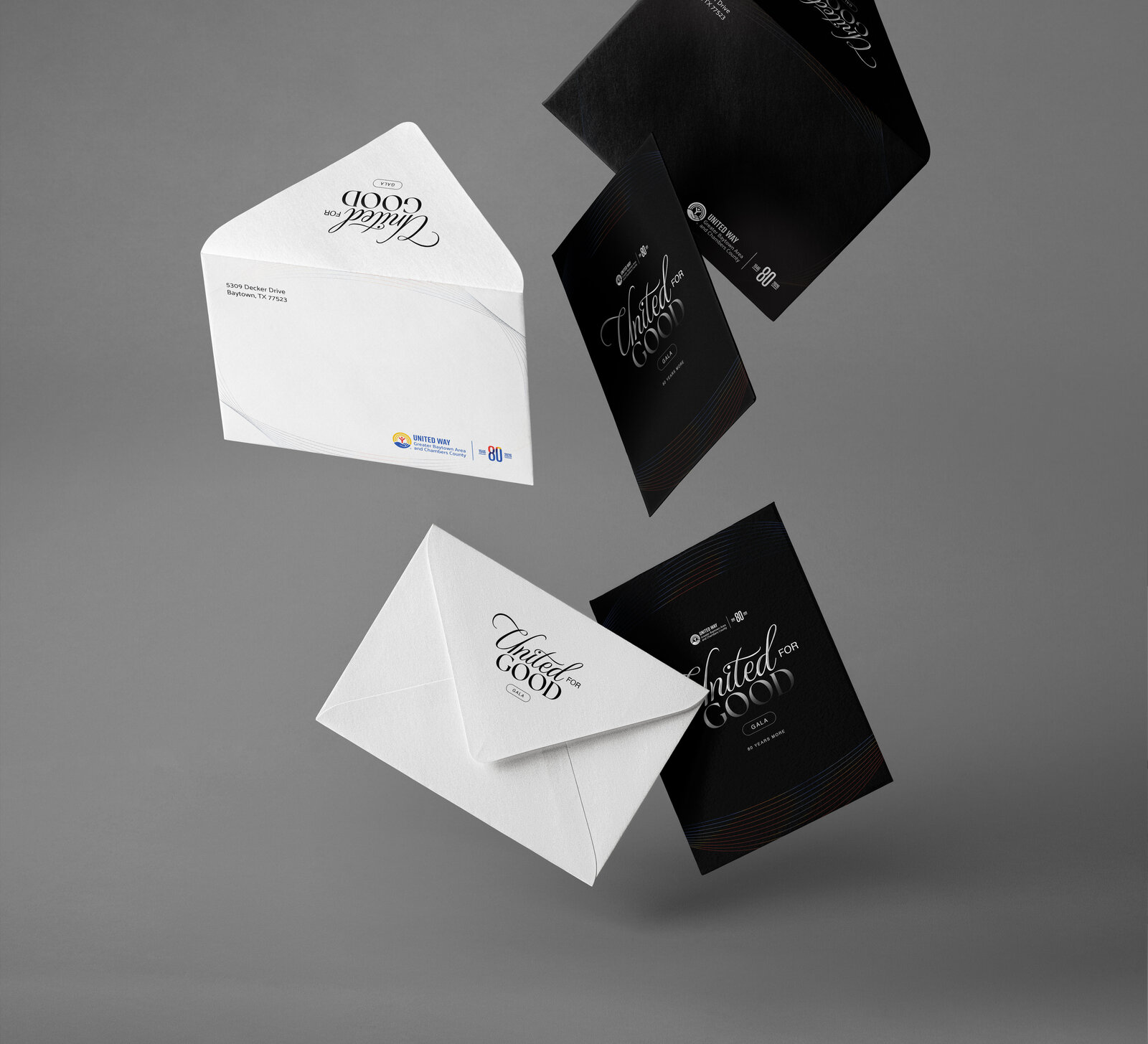
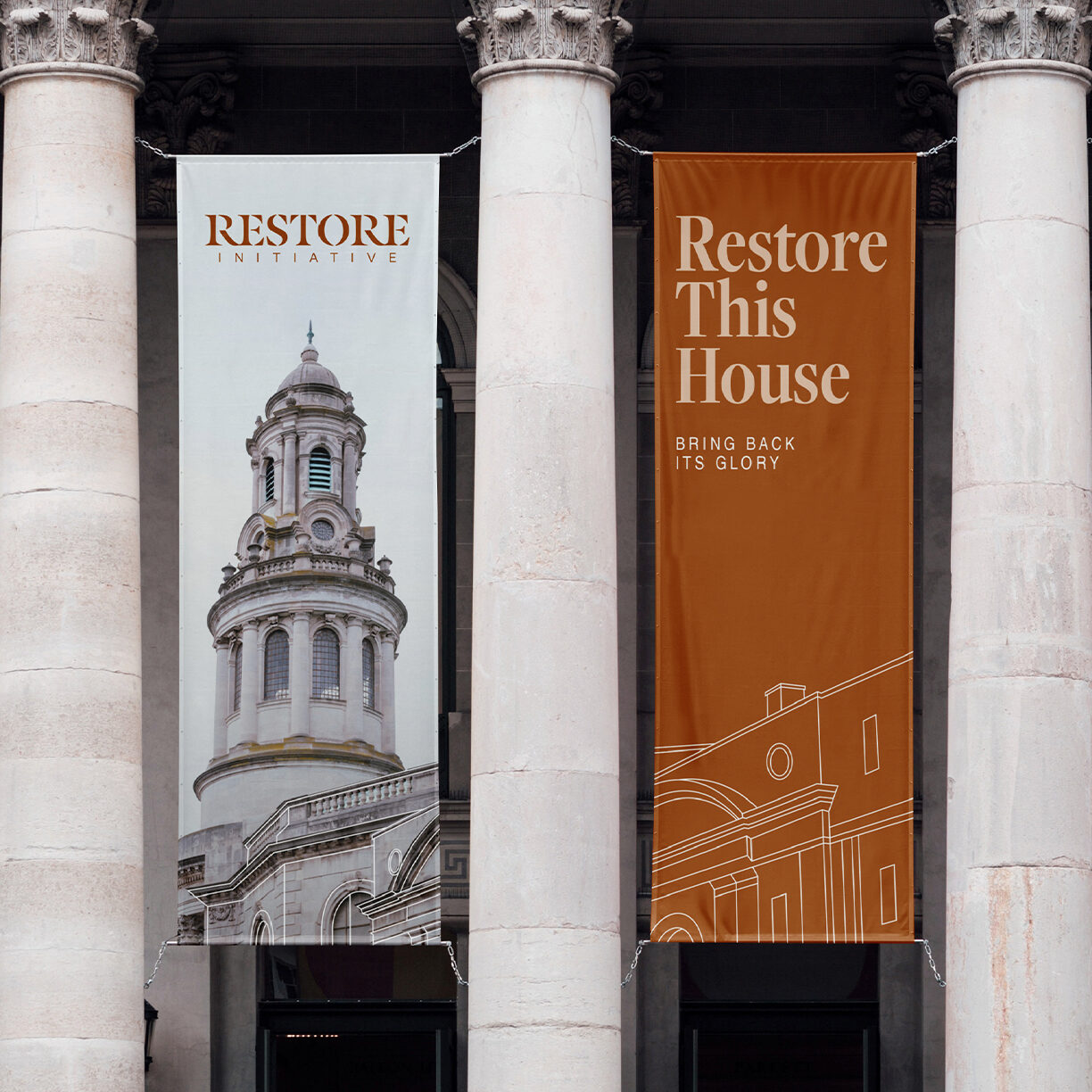
Building wraps, apparel, and event collateral carrying the refreshed identity into the spaces the congregation actually moves through.