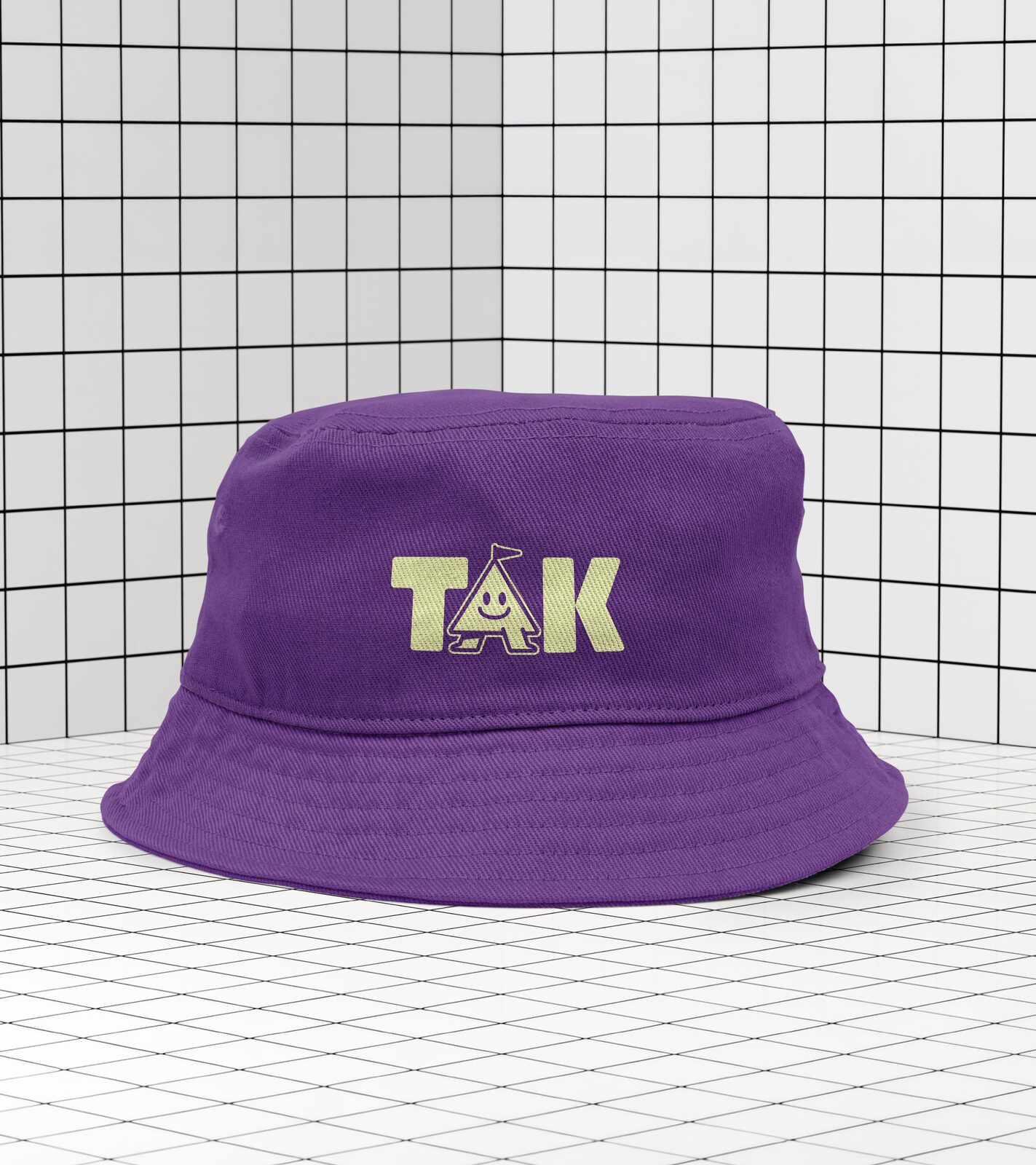
The day the main brand’s assets landed, Corey asked whether the kit came with branding for “our kids department.” It didn’t, and he wanted it before anything went to print for the September launch. In July the church picked a moodboard: “We love the color palette of the purple and neon green.”
Keep the icon. The KM mark redraws the main brand’s M “in a kid-friendly form with round soft letters while maintaining its sense of forward movement,” in the guide’s words. Seven colours, six soft shapes and a hand-lettered accent do the rest.
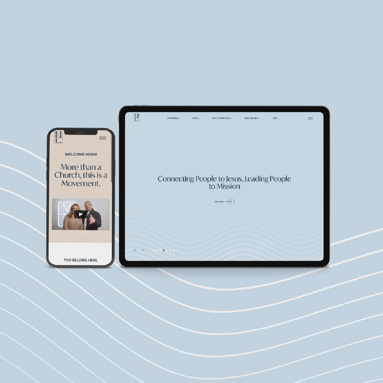
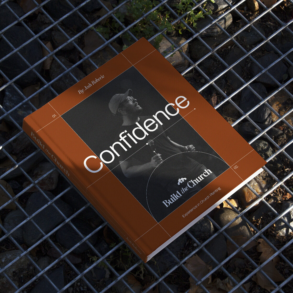
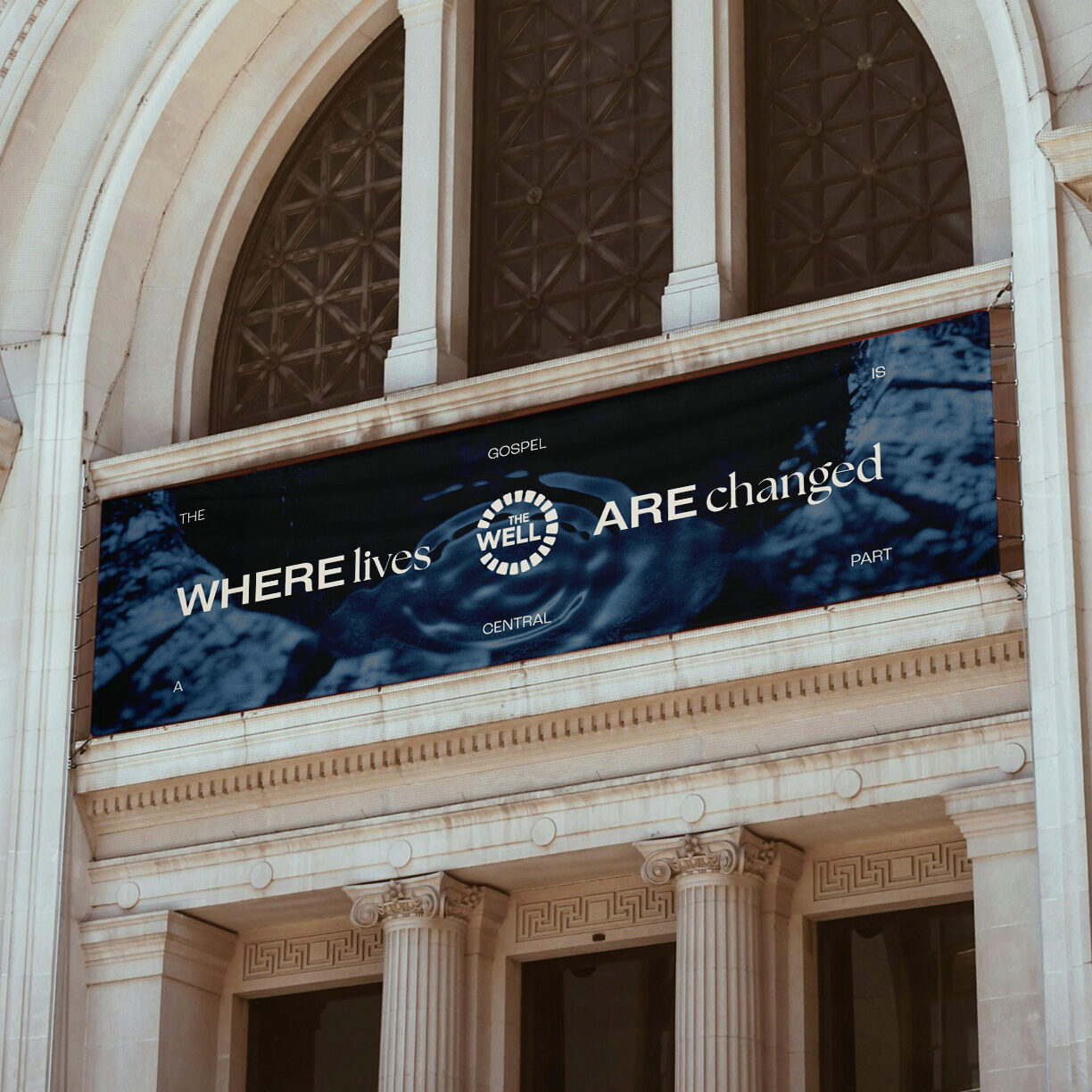
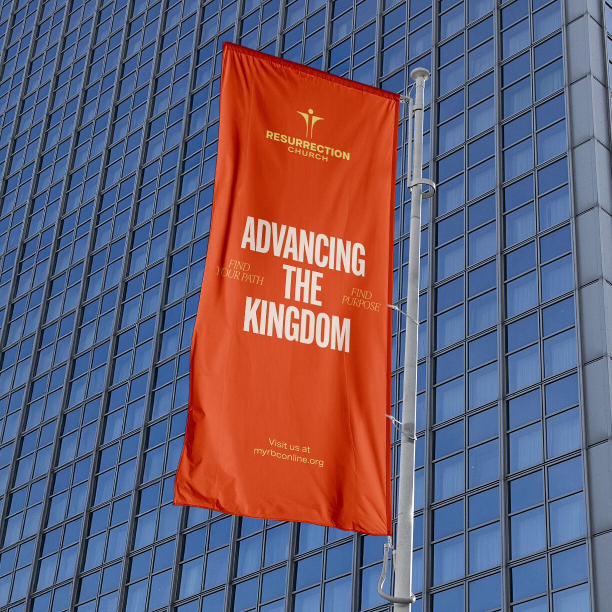
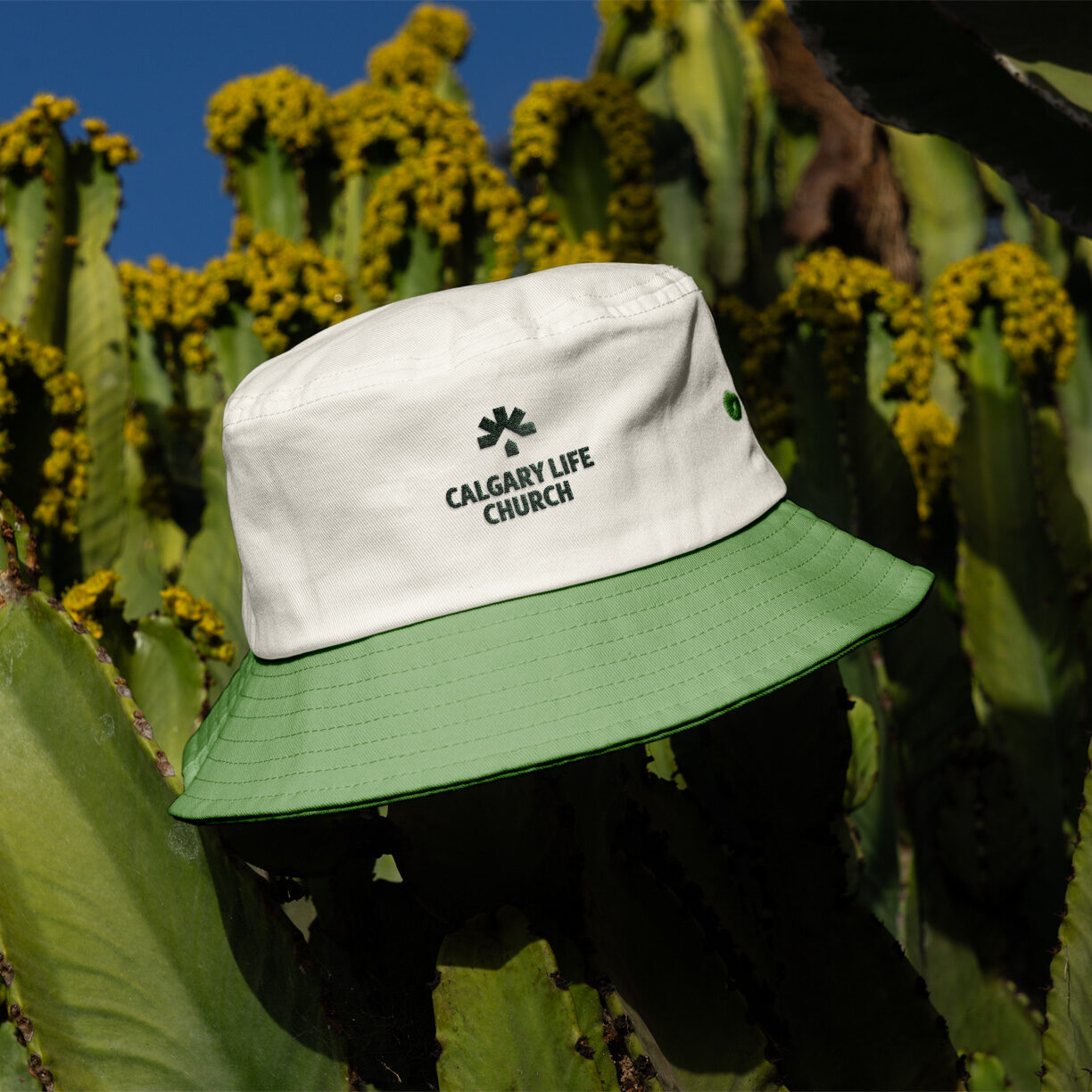
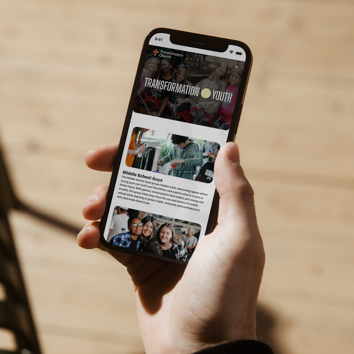
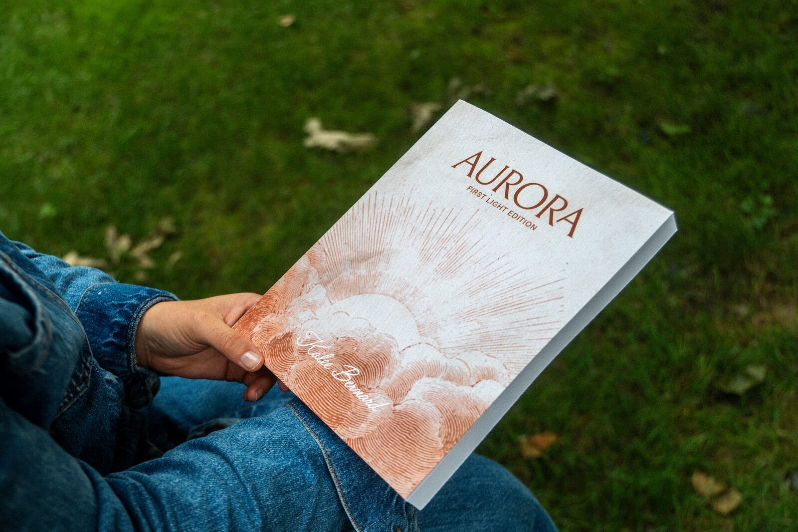
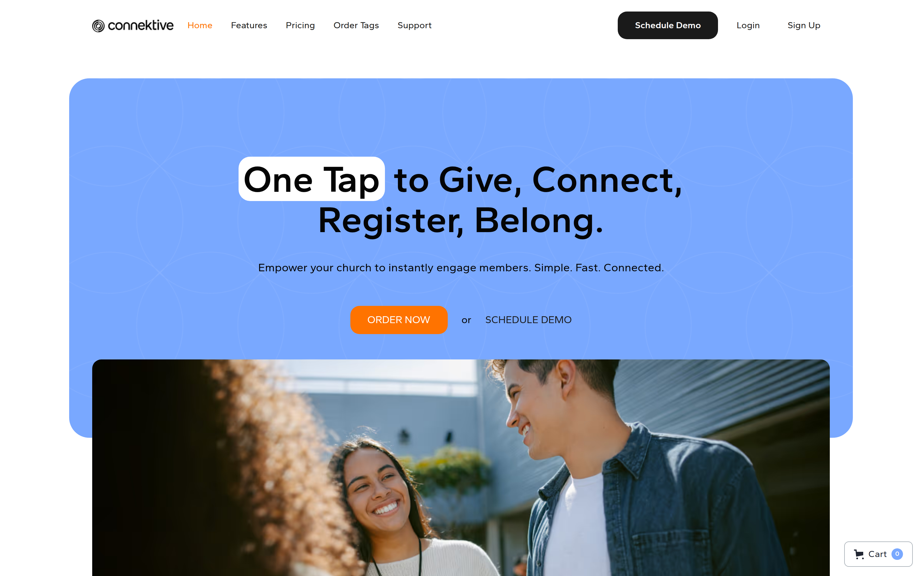
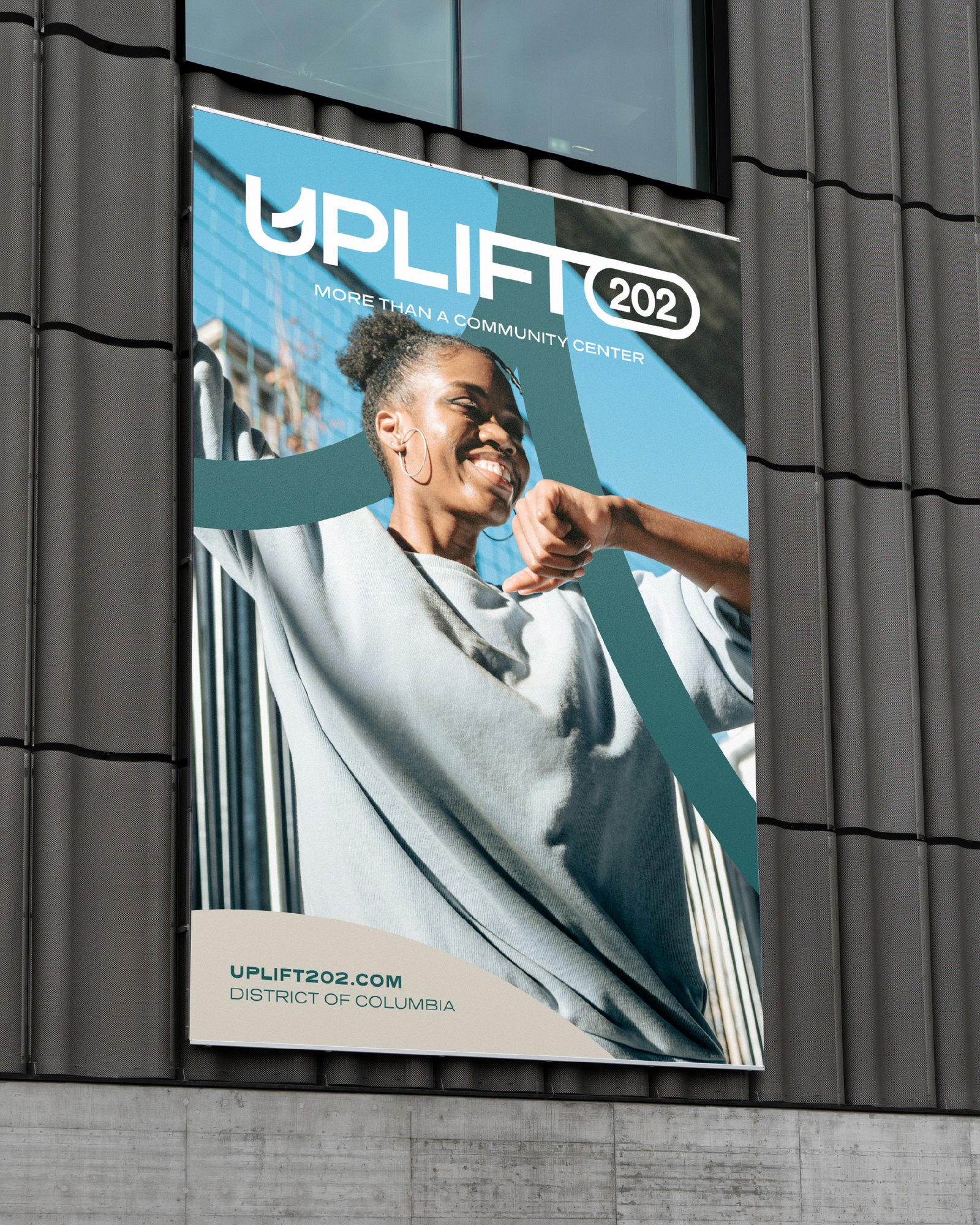
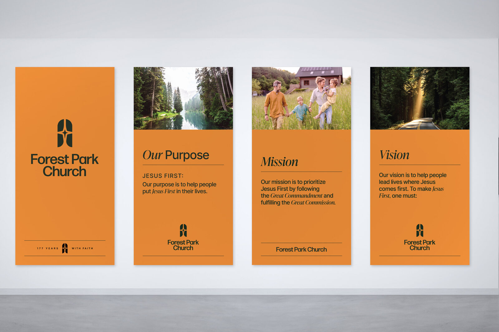
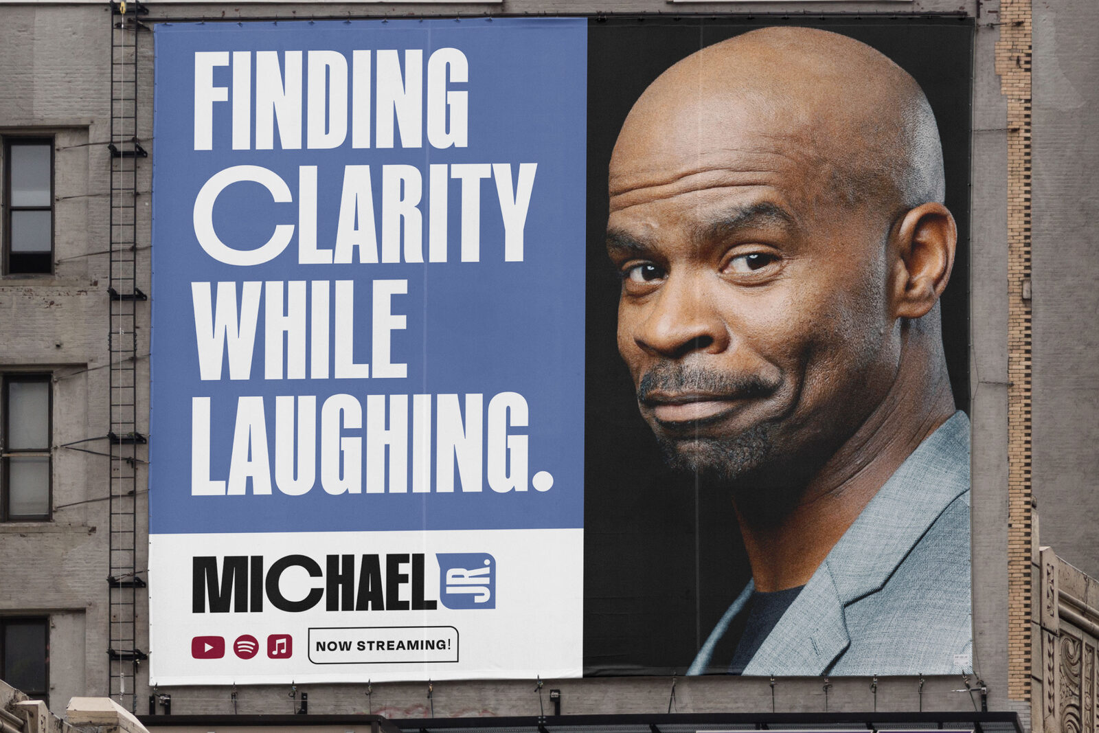
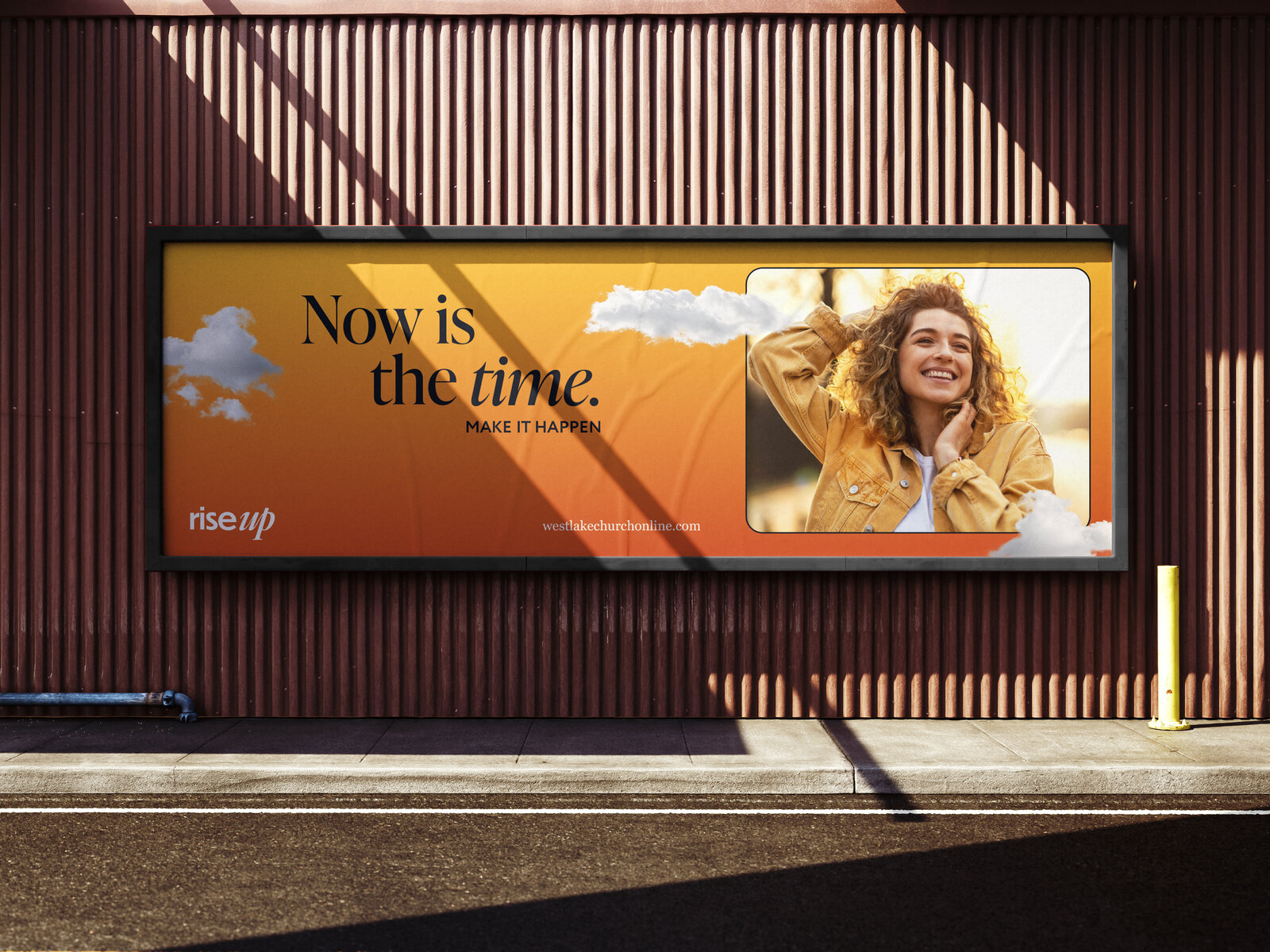
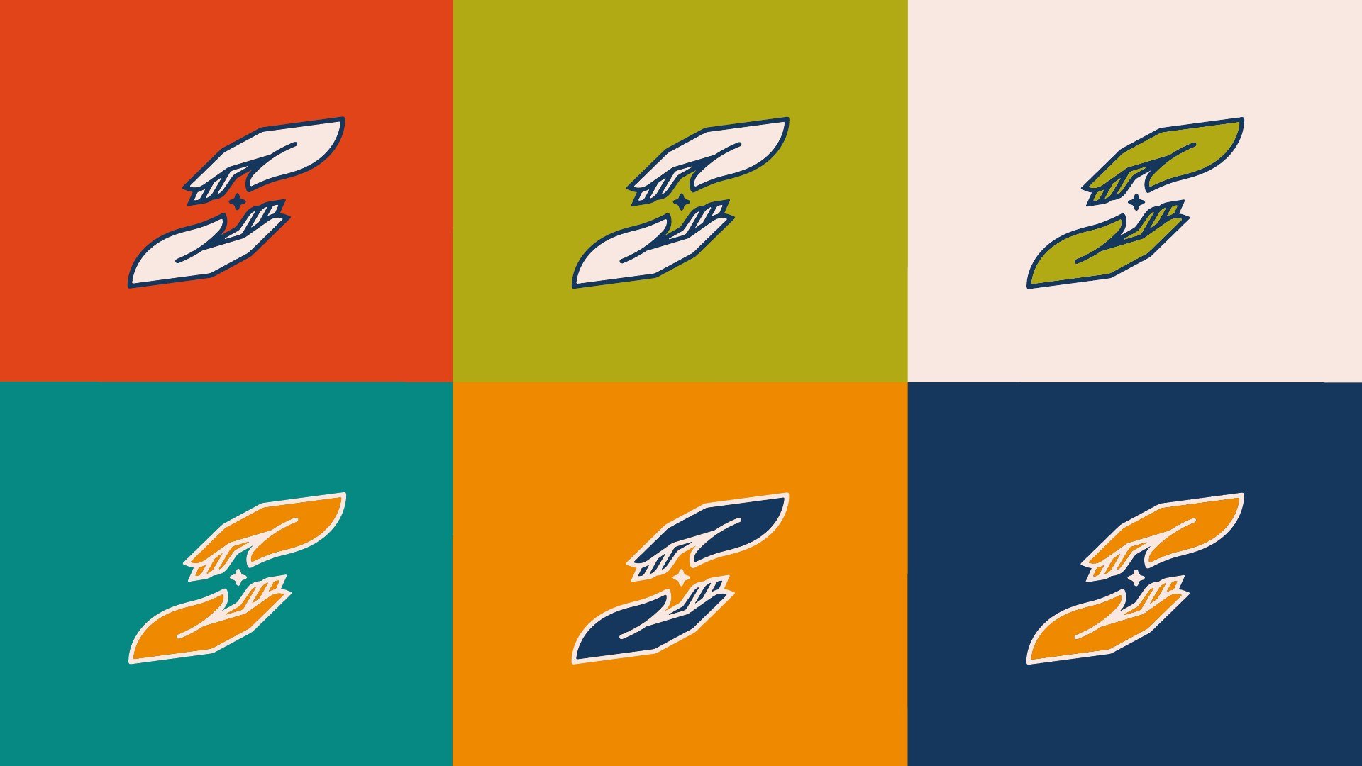
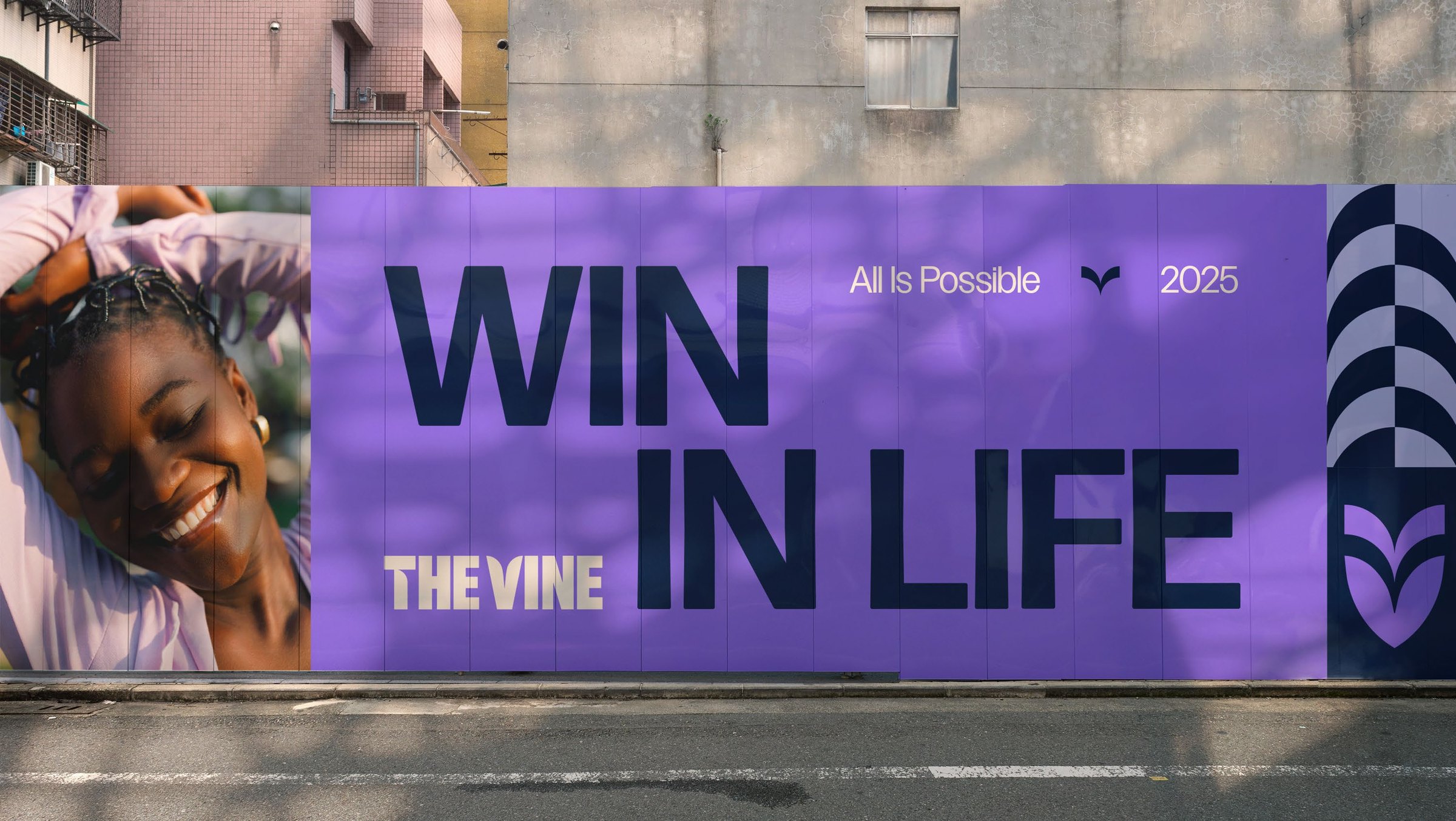
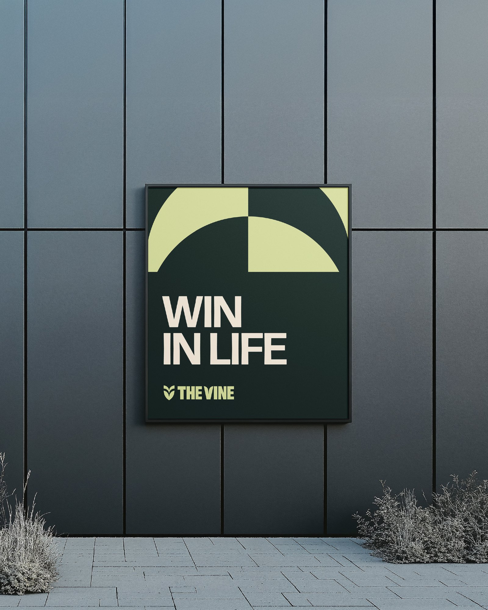
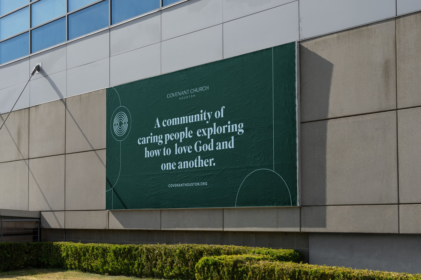
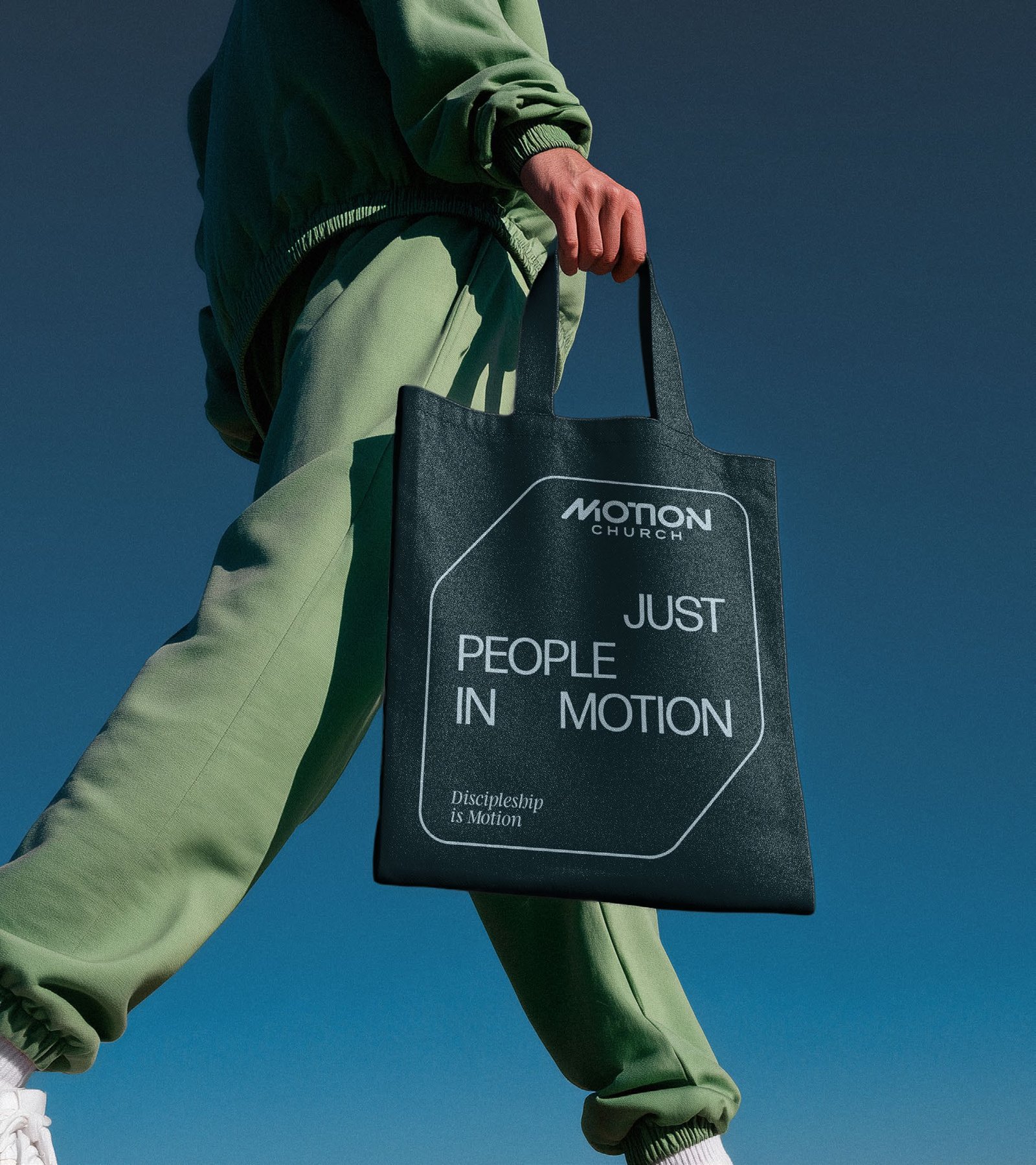
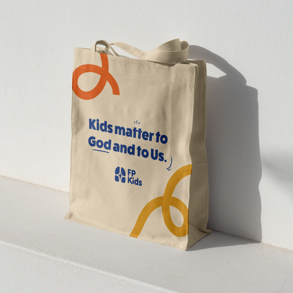
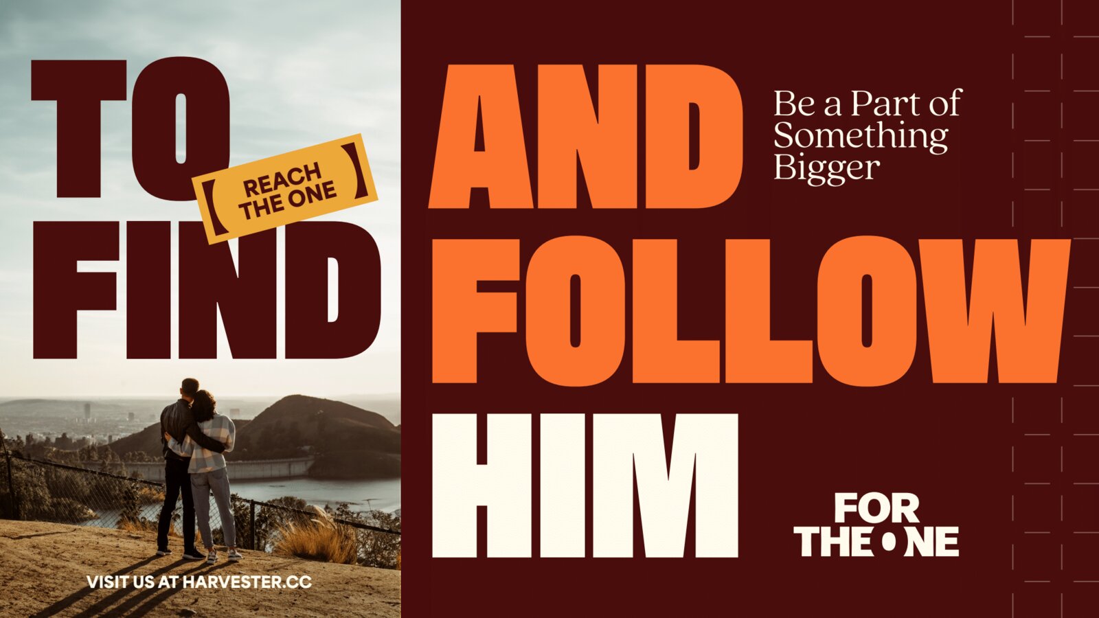
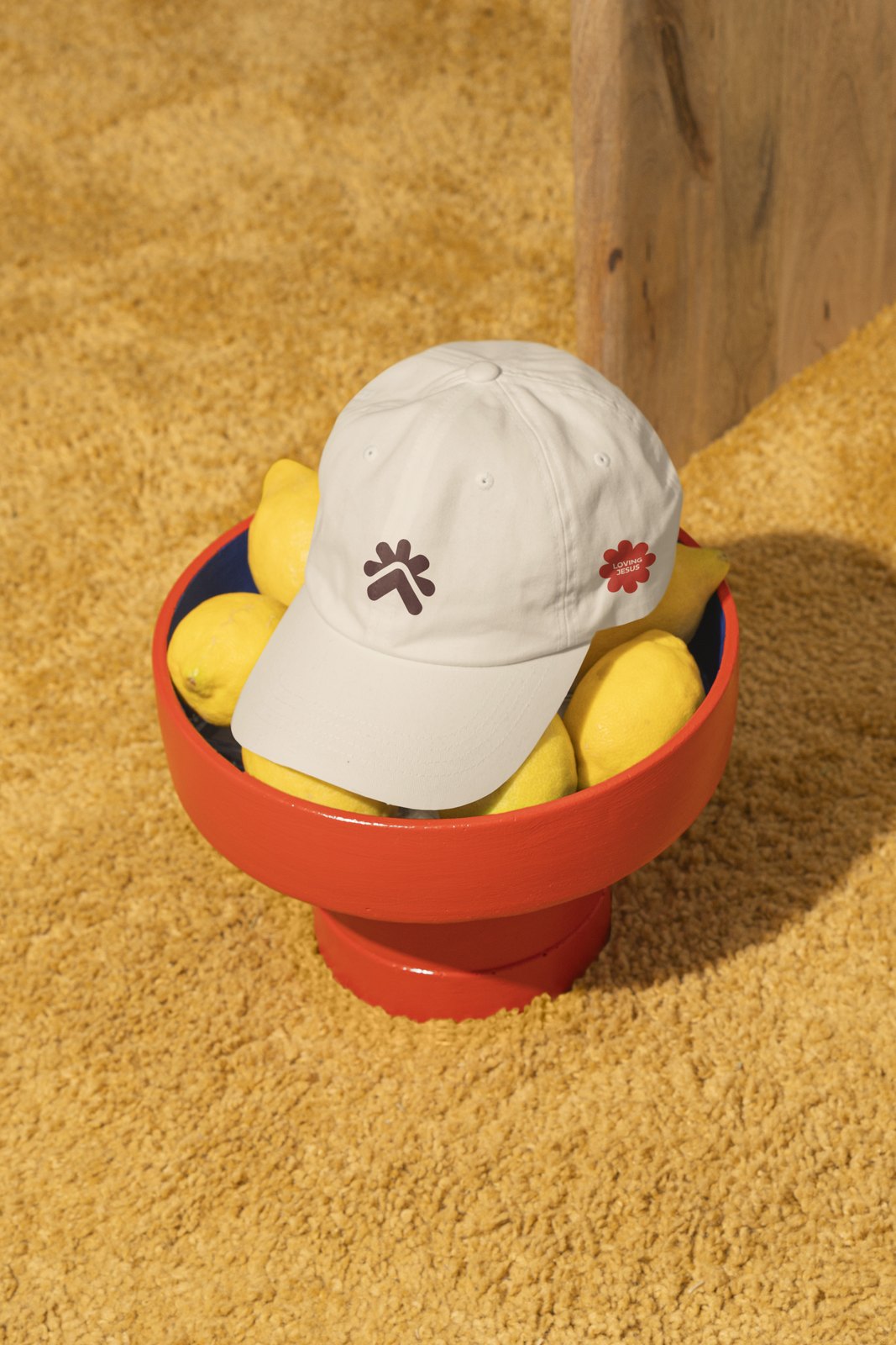
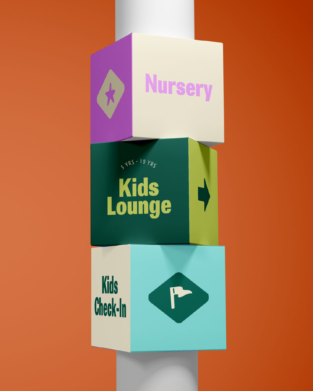
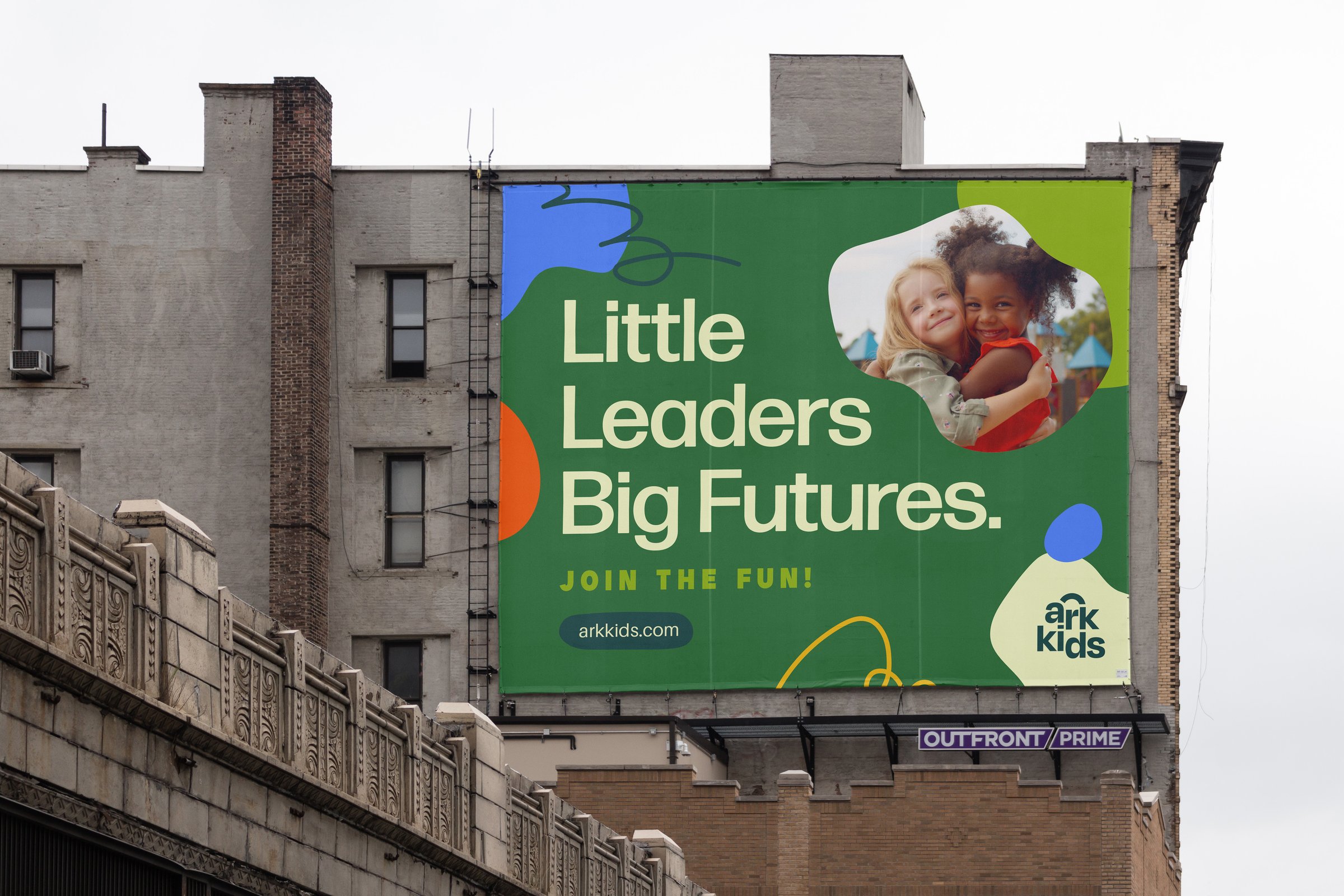
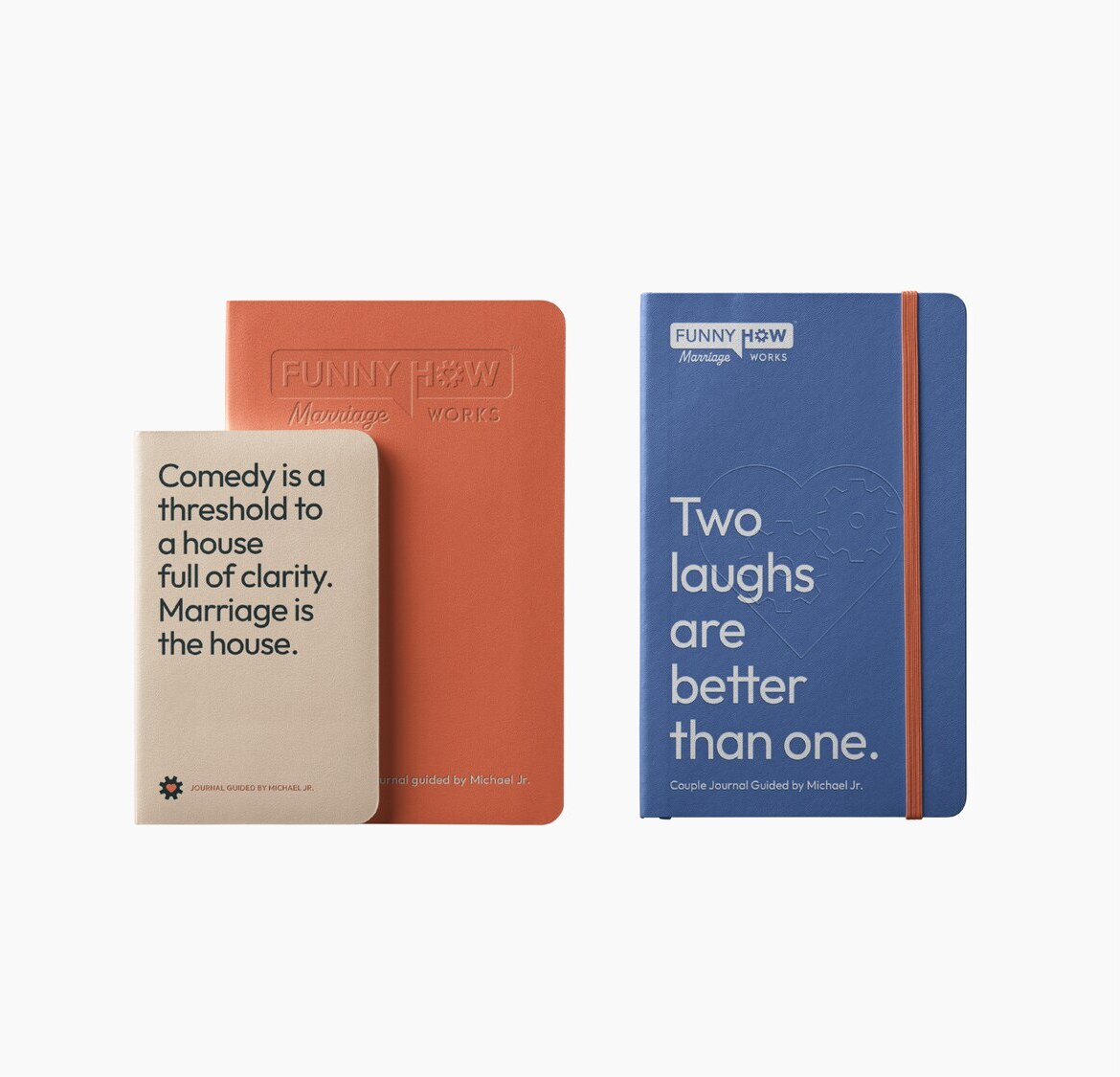
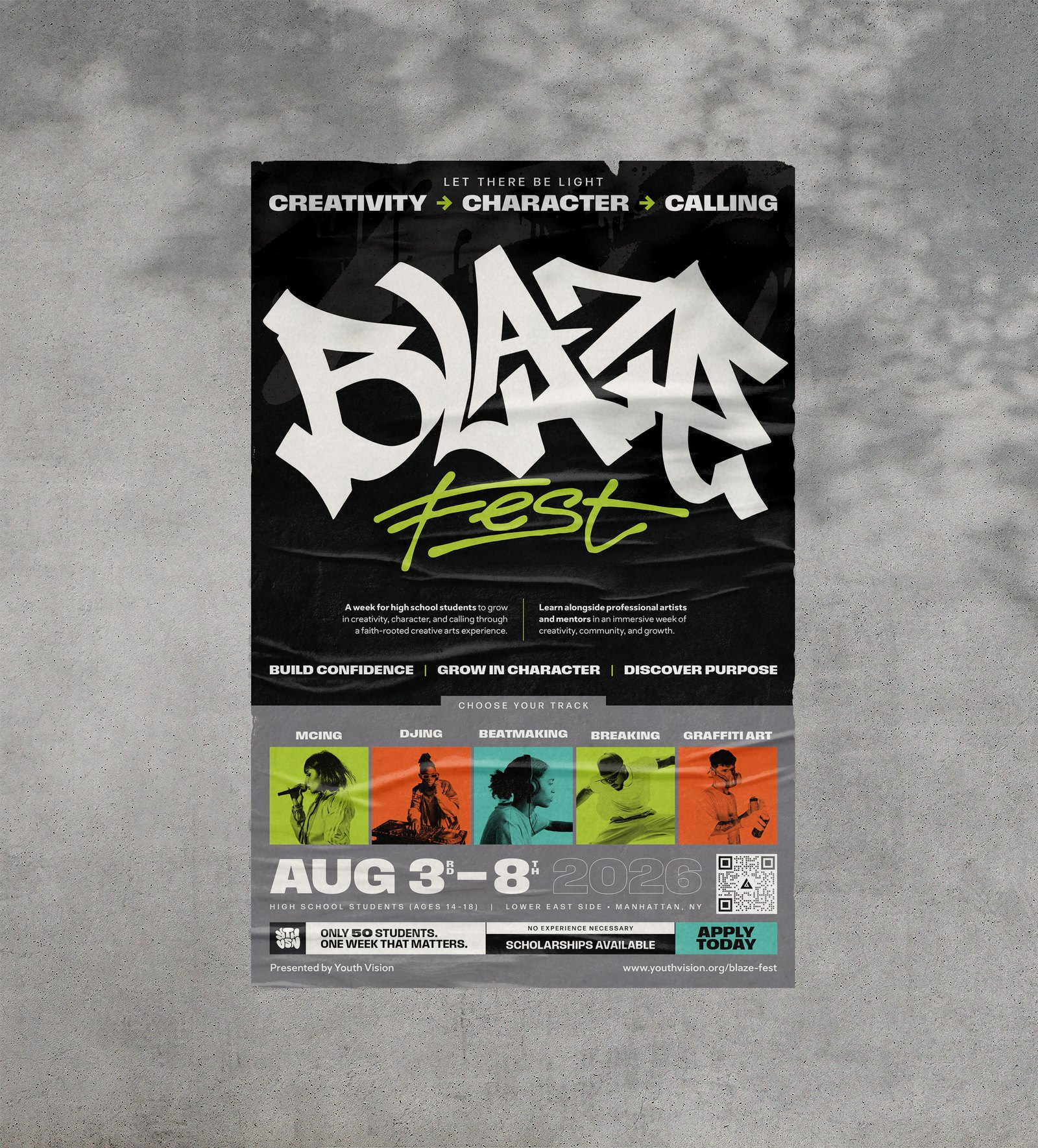
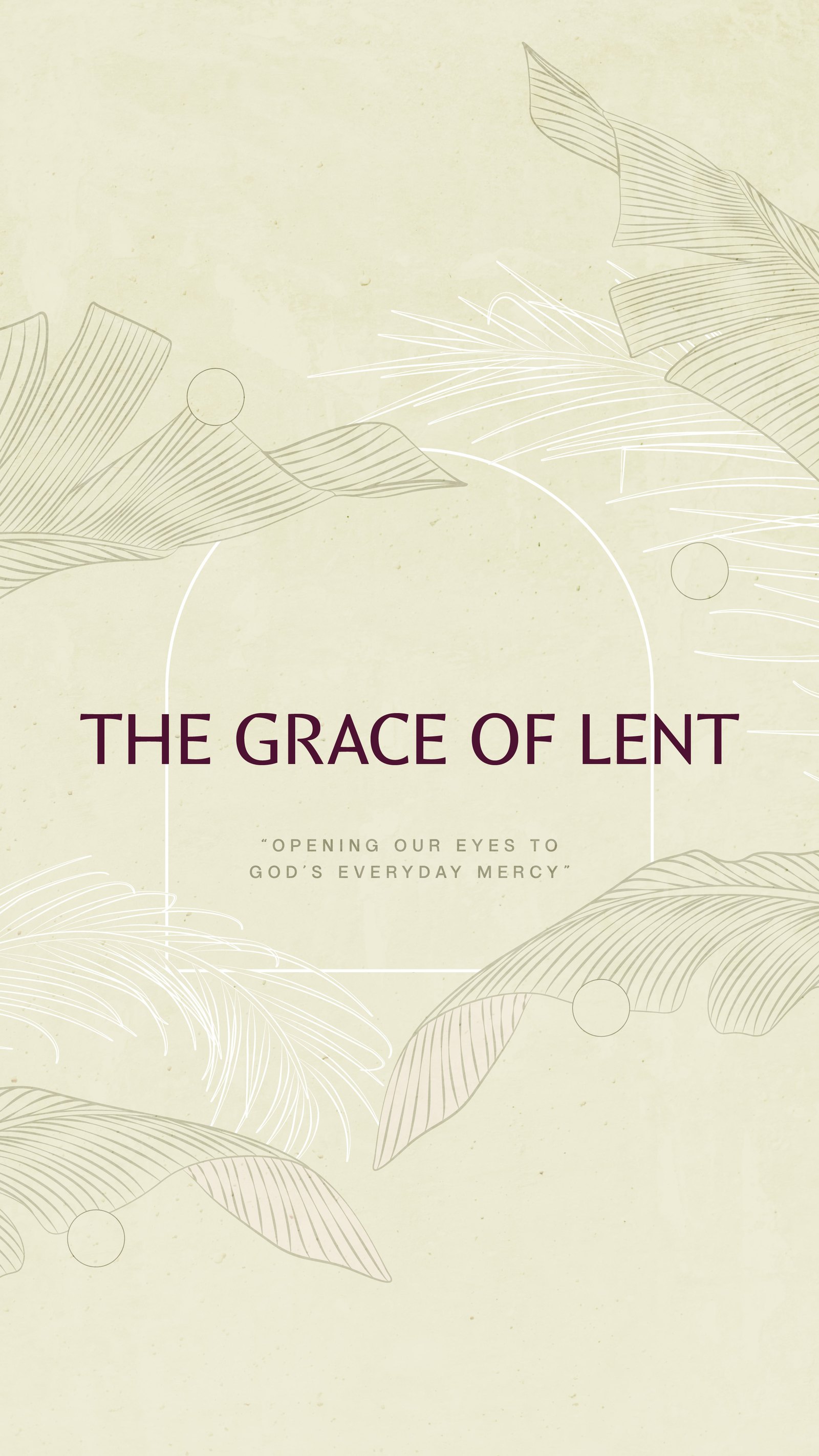
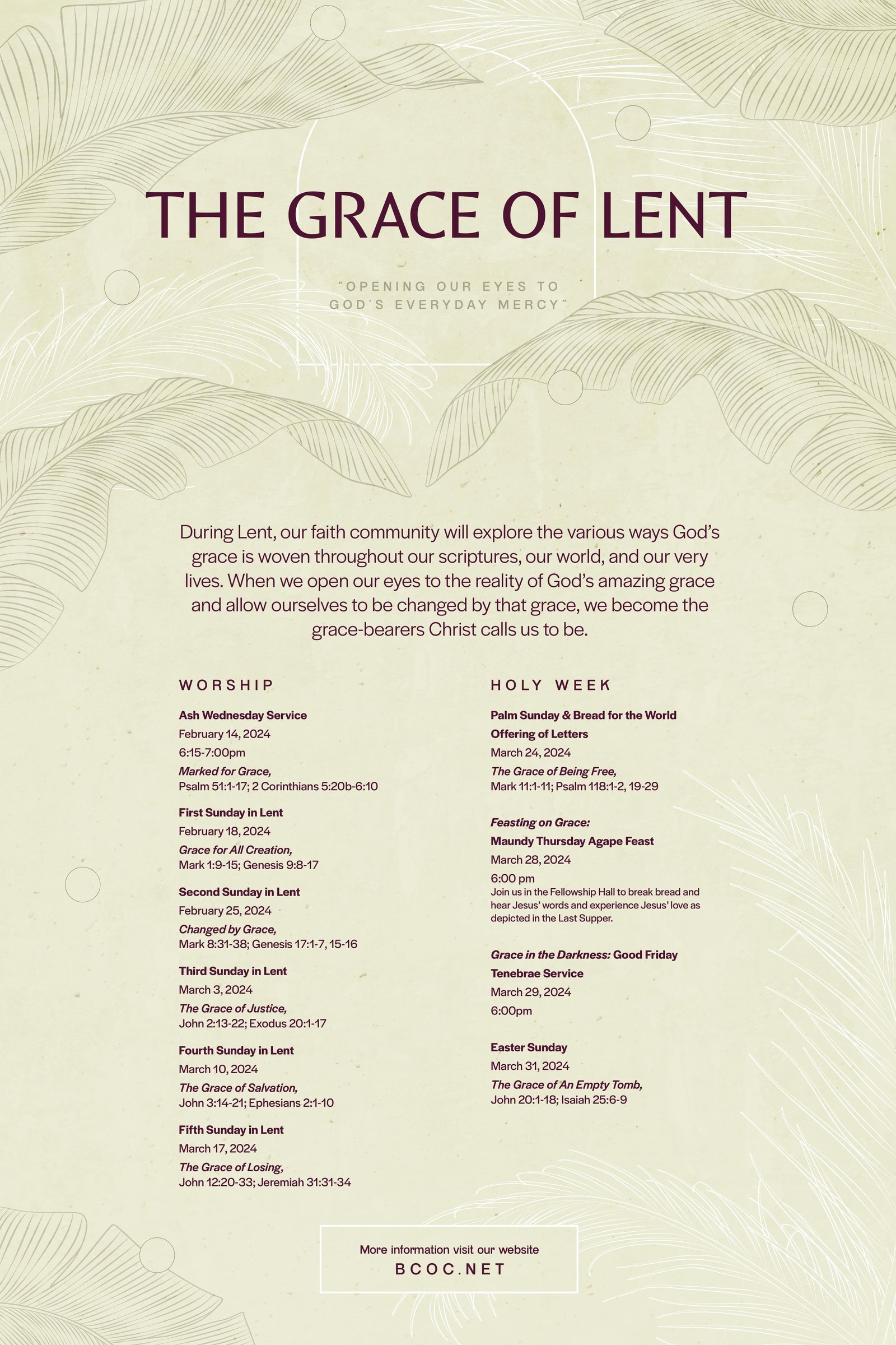
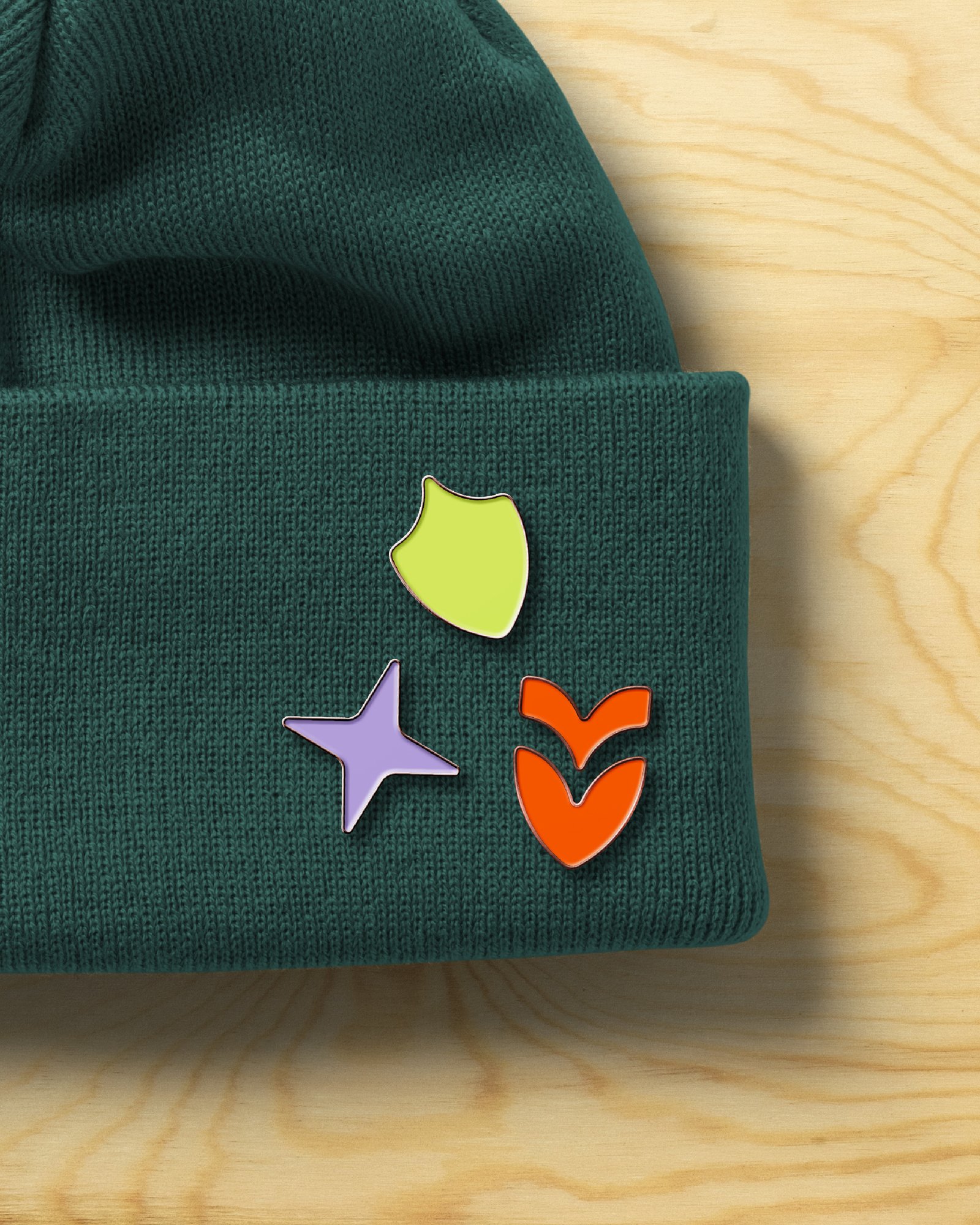
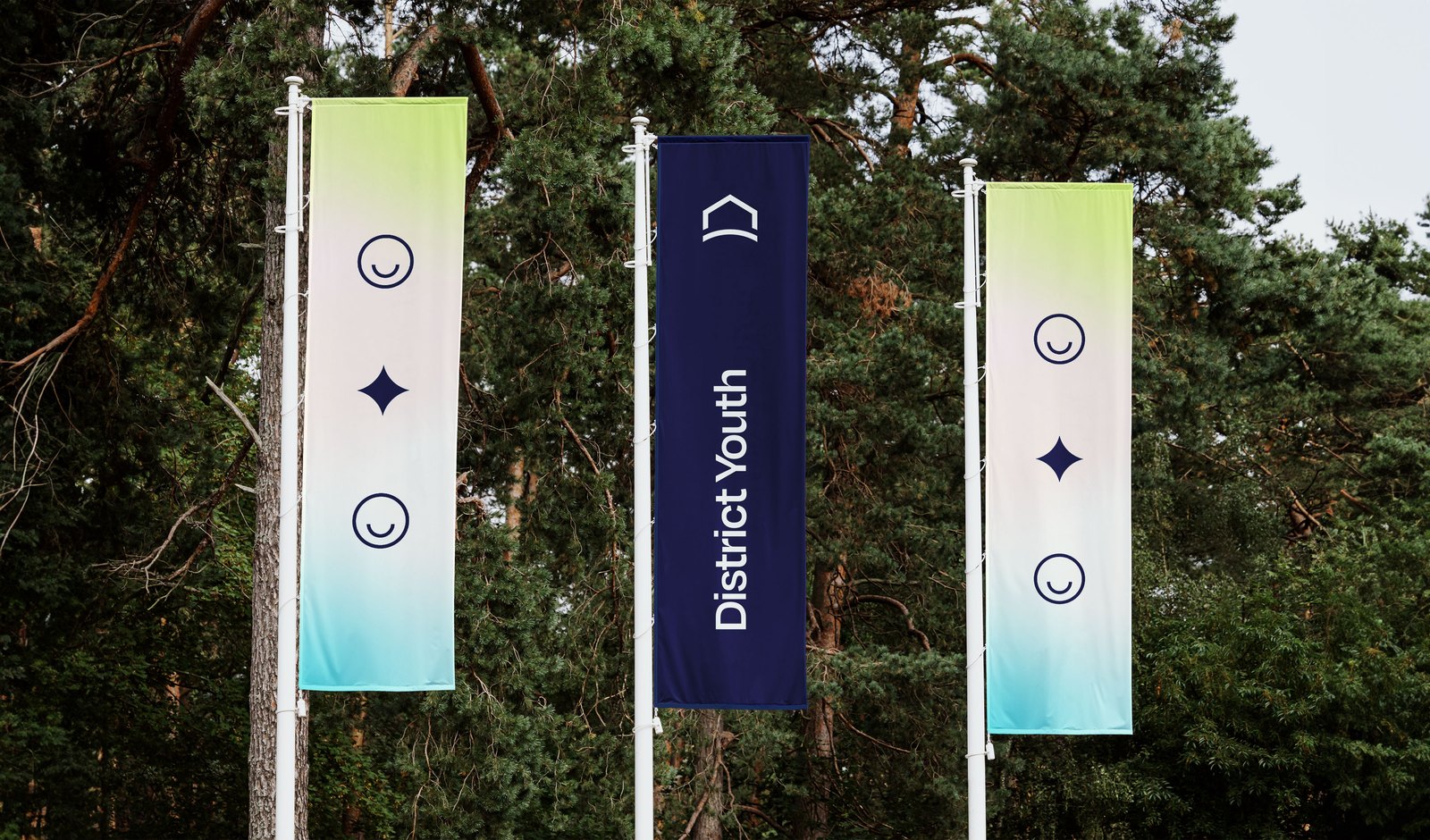
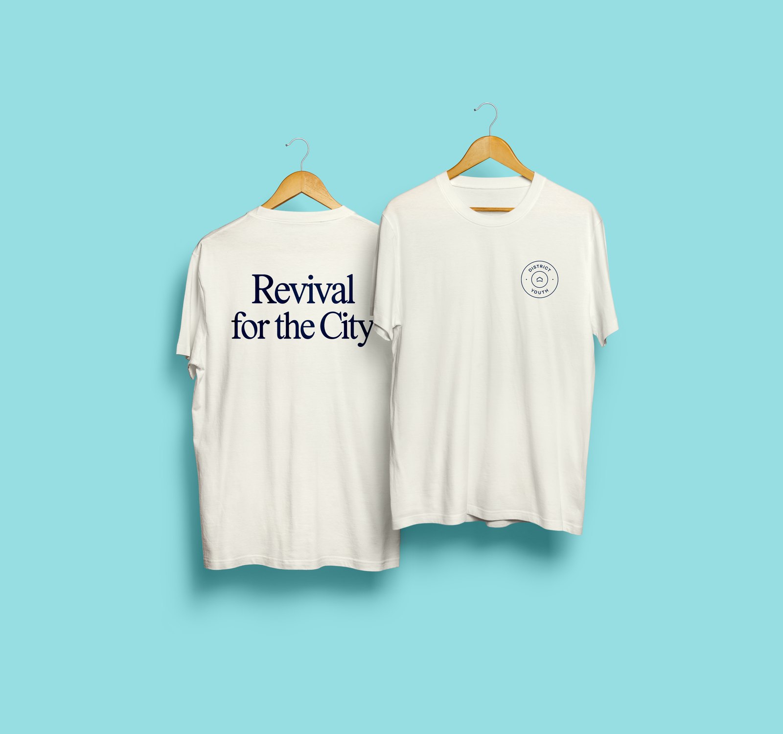
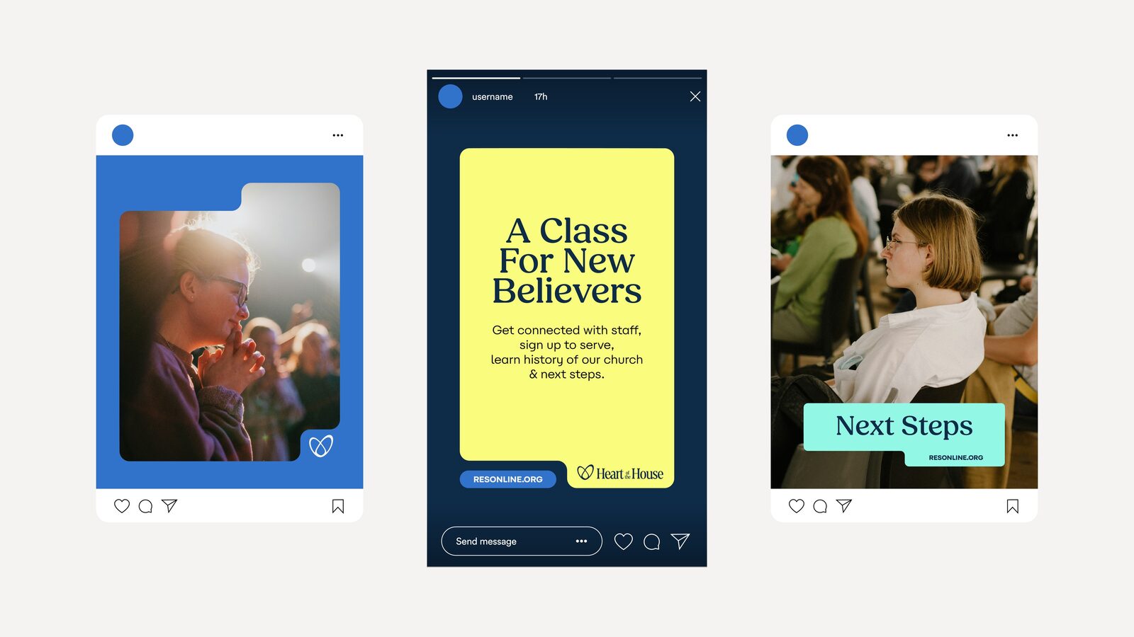
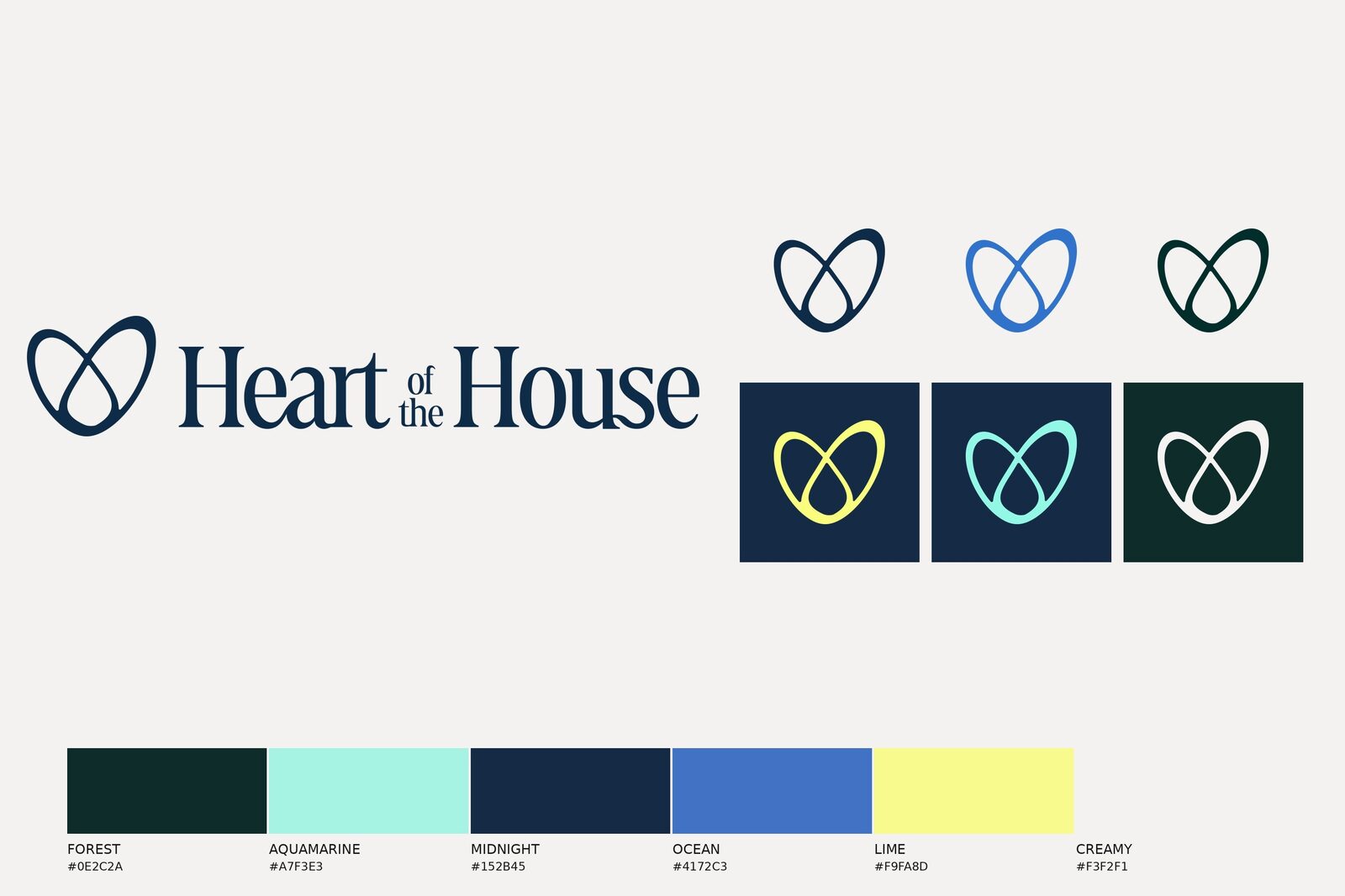
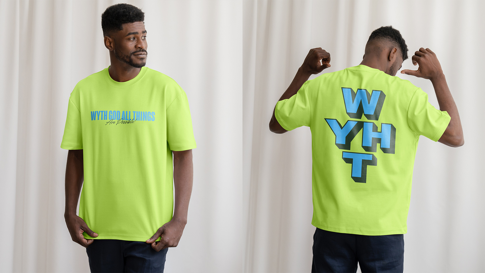
Concept mockups from the identity deck and the brand guide.
Sub-brand identity: icon, wordmark and lockups, seven-colour palette, type system, brand elements and a brand style guide.
Brand assets: logo formats in every colourway, favicons and social profile assets.