Trinity Church is seventy-five years old. City Life Church is ten. They had been on a path toward each other for years, and the decision to merge wasn’t about preserving buildings or protecting preferences. It was about alignment: around Jesus, around mission, and around the belief that one person who feels overlooked or far from God matters as much to heaven as a full room. What they didn’t have was a name for it, or a way to say it on a street sign.
What struck us when we sat with them wasn’t what they were missing. It was how clearly they already knew what they believed. Nothing felt forced. The people believe what they are saying, and that’s rare. One Church already had the hardest thing in place. Our job was to help the structure move at the same speed as the spirit.
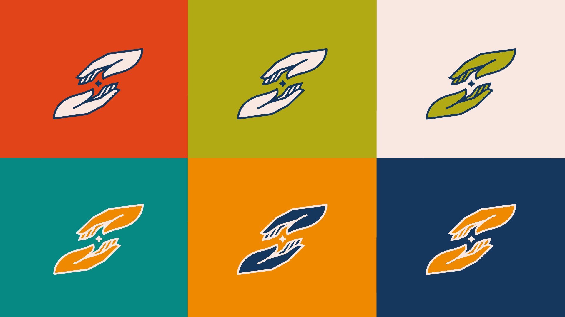
The name came first, and it does most of the work: One, as in one church, and as in one person. A custom script for the One, an all-caps sans for Church, and an icon that is nothing but the initial. Seven colors: Midnight, Terracotta, Oats, Limestone, Gold, Eucalyptus, Forest.
Luke 15 is the one who wanders and the one who goes after him. John 17 is the prayer that they would be one. Put them together and you have the whole brand: a church that is one, for the one. Every decision after that, the name, the wave, the tone, the type, has to trace back to those two chapters or it doesn’t ship.
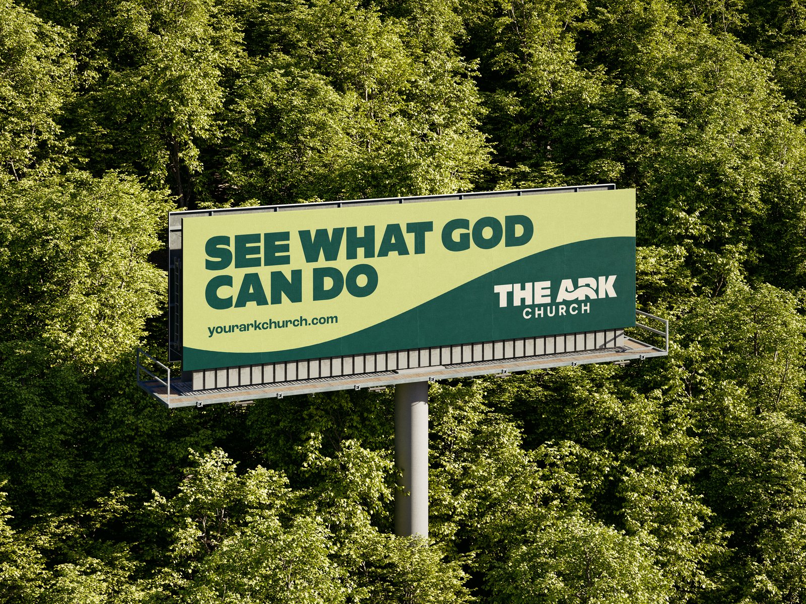
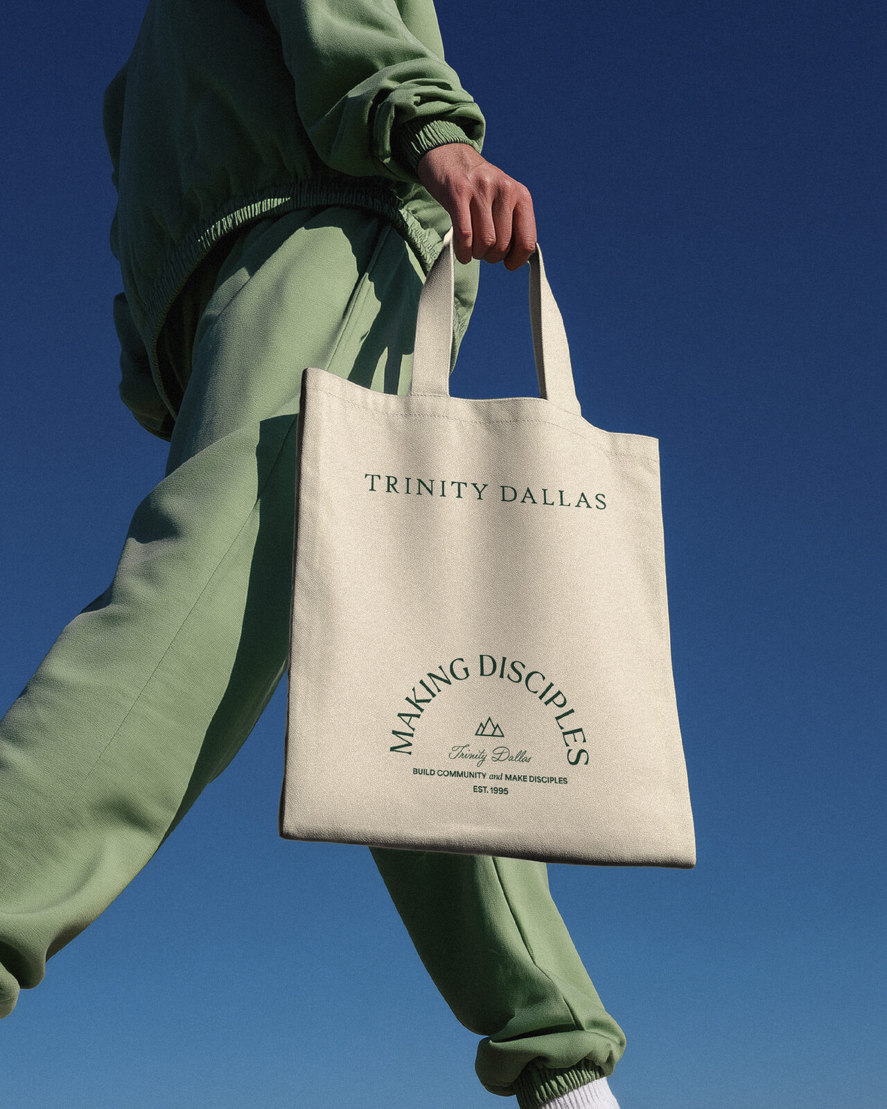
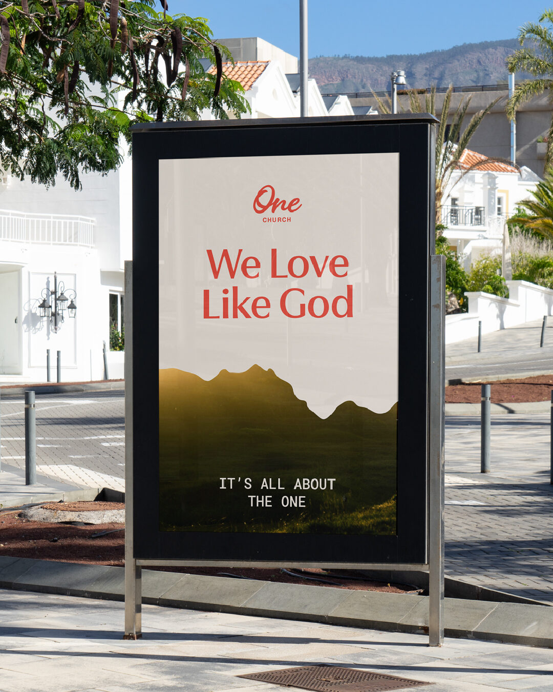
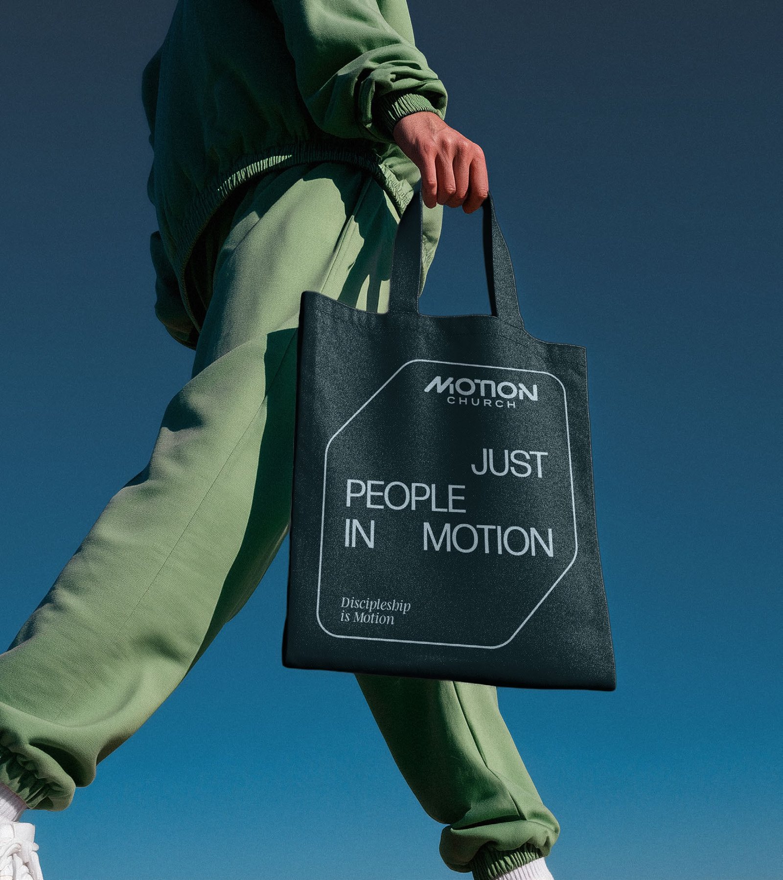
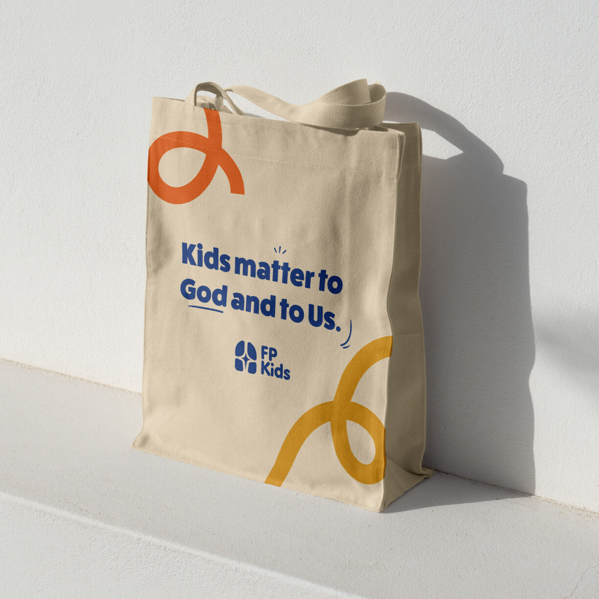
The mountain wave is the system. It’s on the awning, the wall, the business cards, the stories, and a tote bag with nothing else on it but the name. The wave isn’t decorative. It carries what this church believes about the one who wanders: Jesus left the ninety-nine to go after the one.
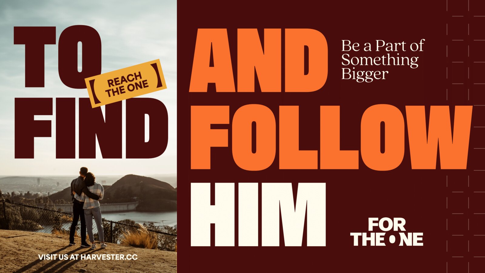
Three lines carry it. We love like God. It’s all about the one. We are one, for the one. On the wall, the poster, and the awning they run with the logo doing none of the work.
The brand went public on September 9, 2026 as a collab post, @helloyellowbox with @onechurch.mi: eight images, the same set carried across Facebook, Threads, LinkedIn, and Google Business. The caption ended: You are loved by God. And we love like God.
Brand name: One Church.
Full identity system: logo, icon, and wordmark in seven colors; Brand Style Guide with typography, palette, photography, and social guides.
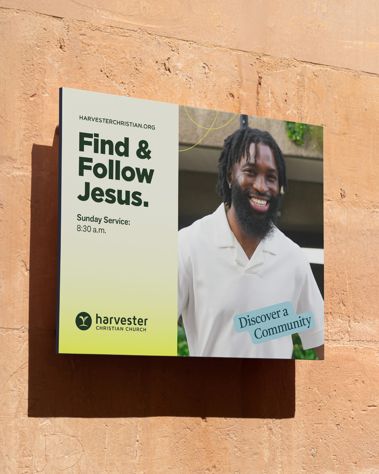
The mountain wave as the signature element across street signage, environmental, print, and social.
Social outlets for Facebook, Instagram, and X.
Launch campaign: eight-image collab carousel across Instagram, Facebook, Threads, LinkedIn, and Google Business.