Resonate was starting a monthly class for people new to the church and needed it to read as the first step of something. The path after it has six steps, and a person had to be able to follow all of them.
We treated the first class as the start of a path, not a one-off handout. Heart of the House got its own mark and its own palette inside Resonate's branded house, and a booklet people follow along in during the class and take home.
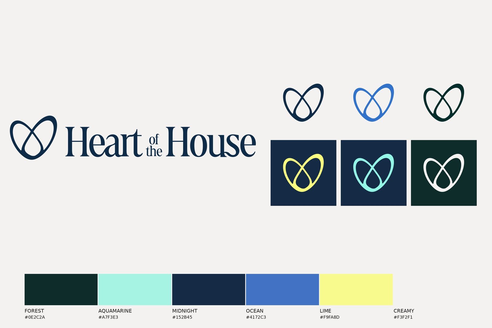
Two loops that make a heart, a serif wordmark in Fields, and a lockup that sits in Midnight. Six colors: Forest, Aquamarine, Midnight, Ocean, Lime, Creamy.
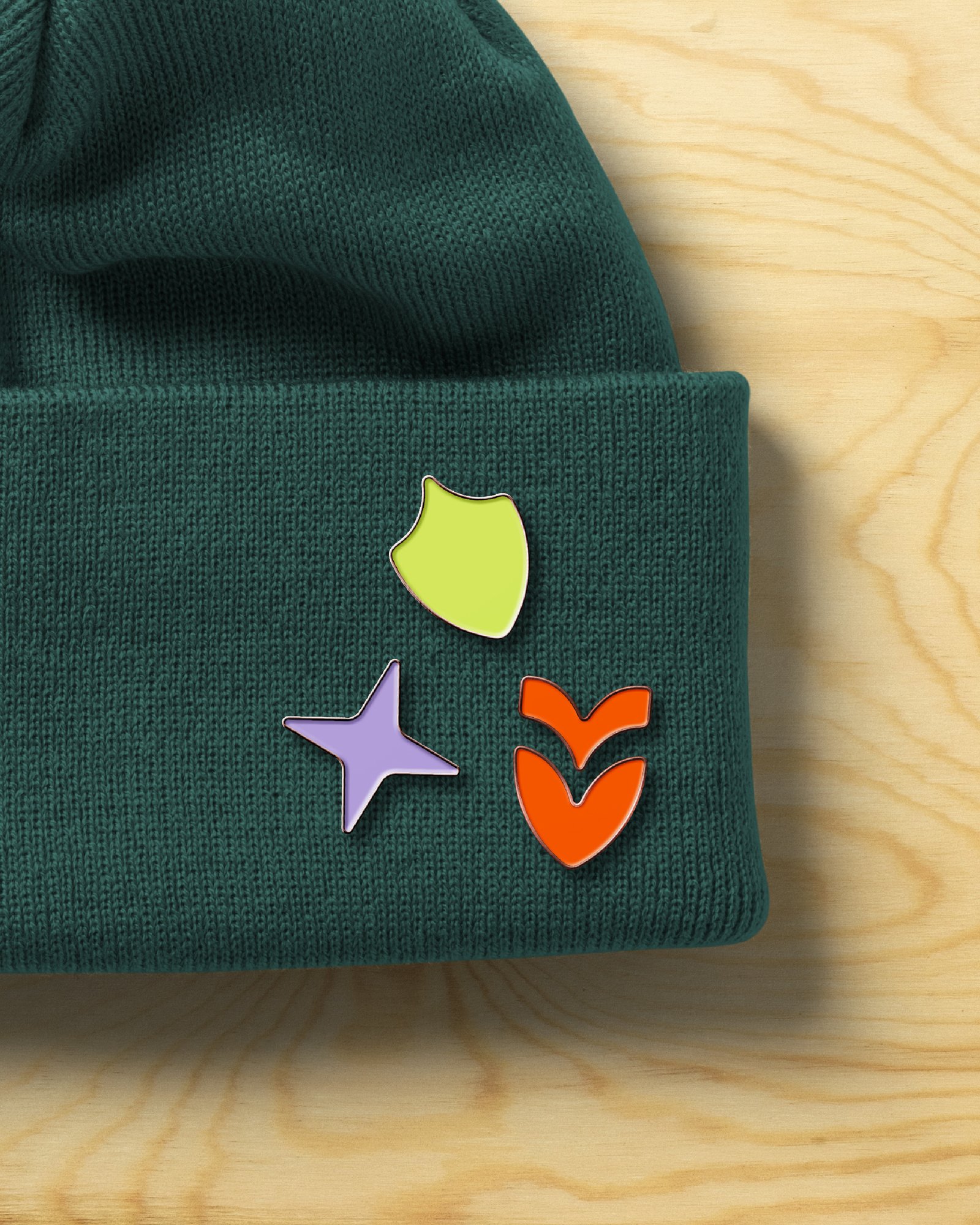
Three frames with a notch cut out of one corner, and a layout system that puts Lime against Forest, shown here with the Sharing Our History layout.


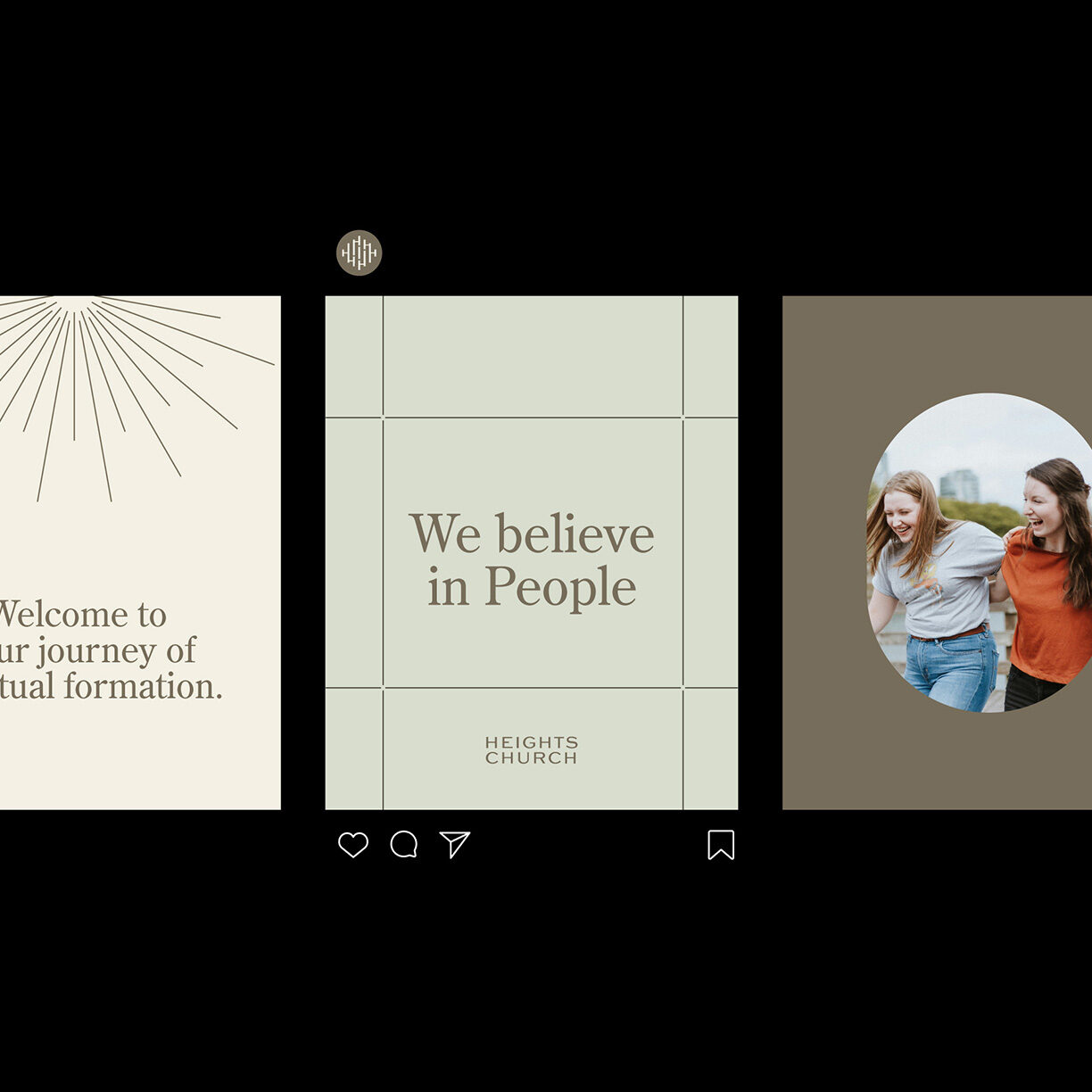
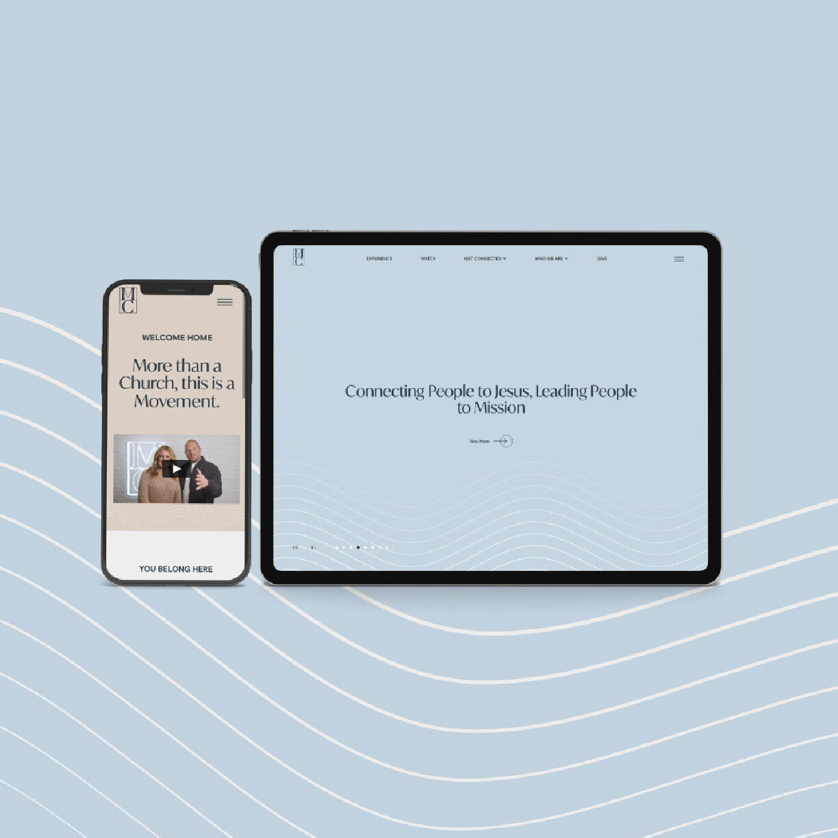
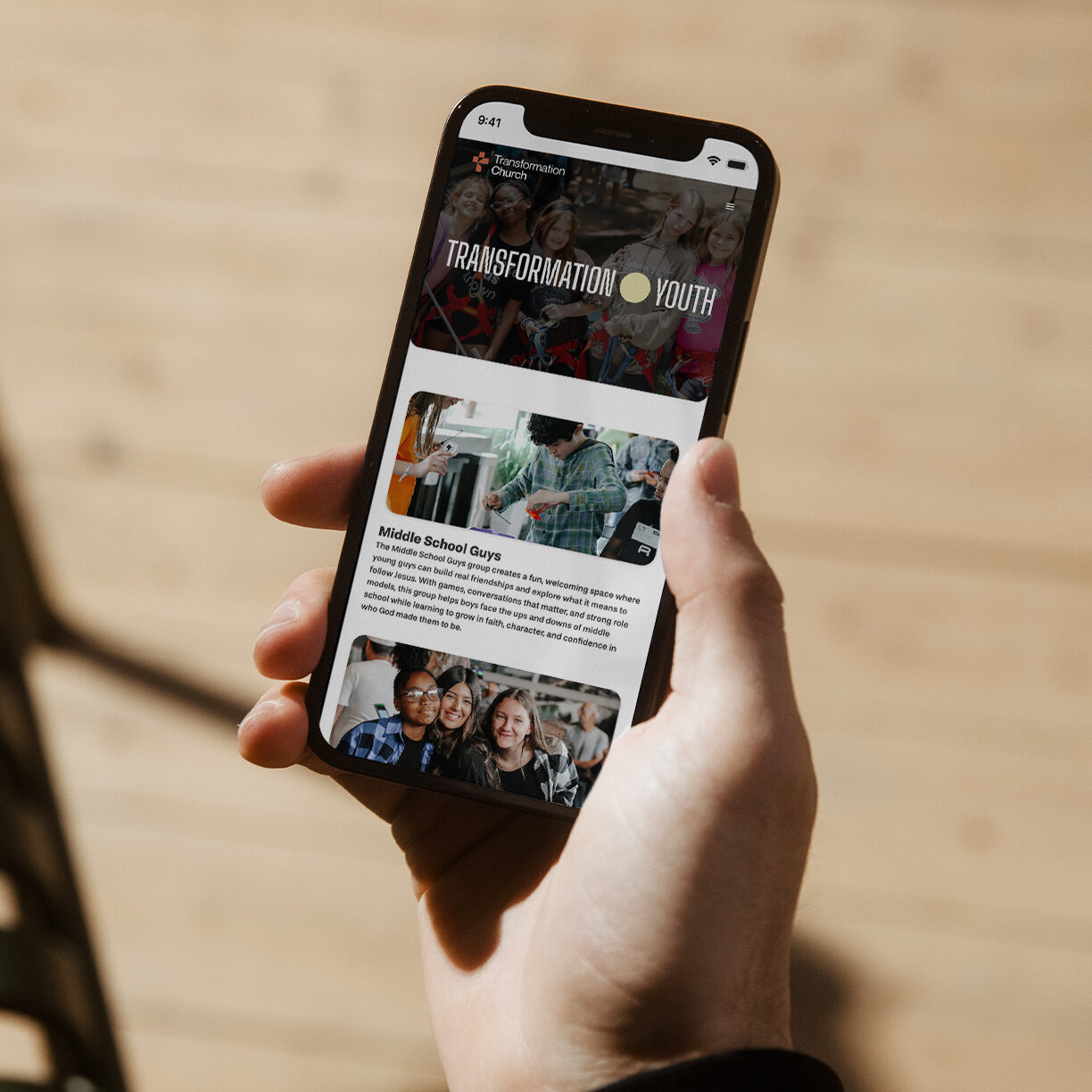
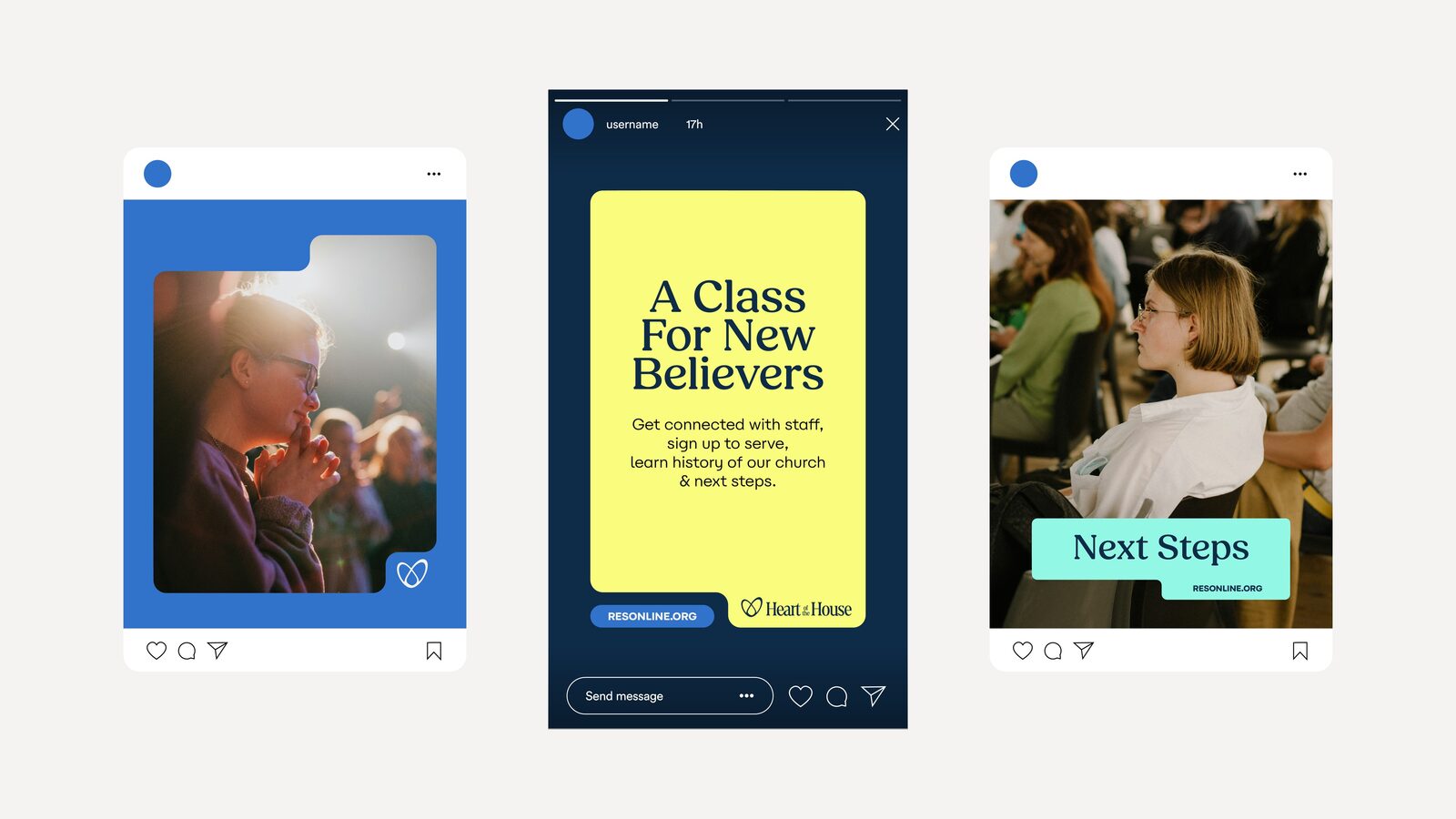
The class on a phone, and the social set that announces it.
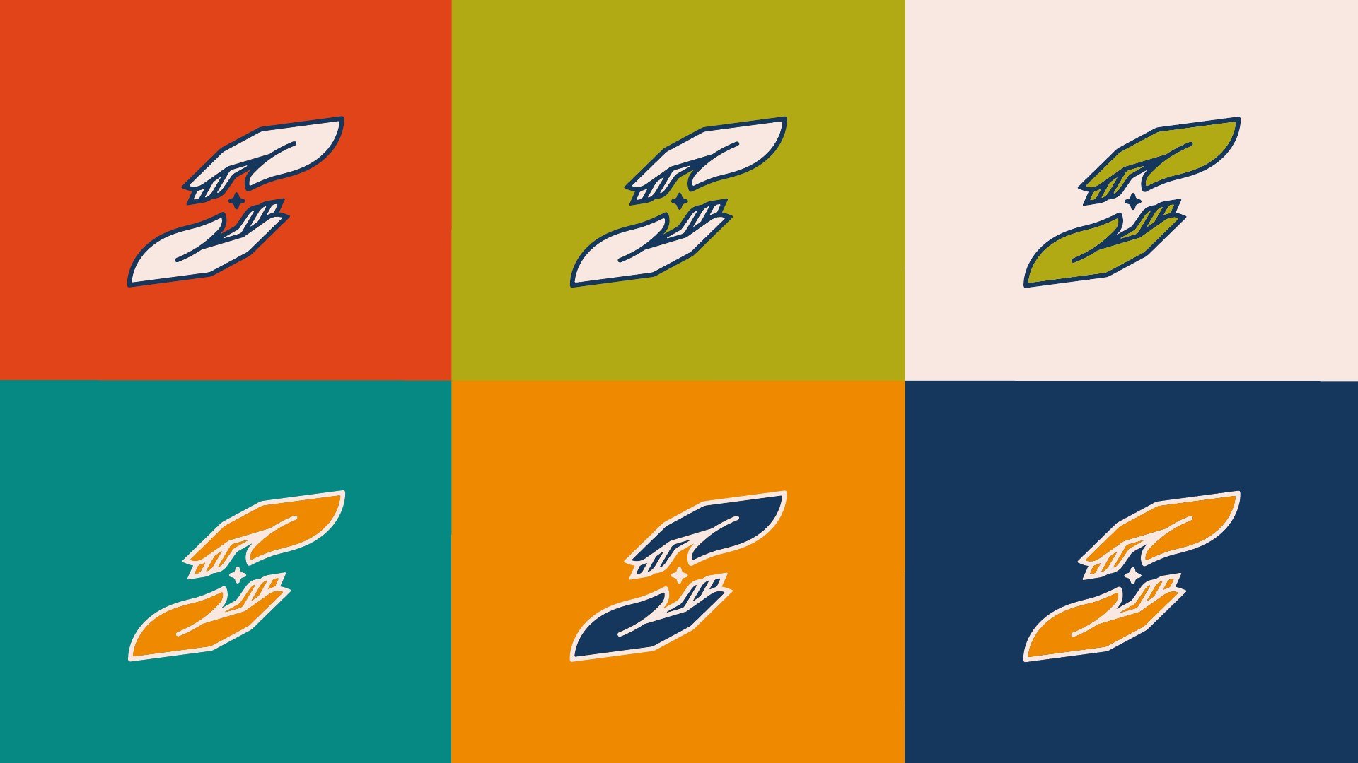
Campaign identity: icon, wordmark, lockups in six colors; brand style guide (25 pp).
Brand elements: the three frames and the layout system.
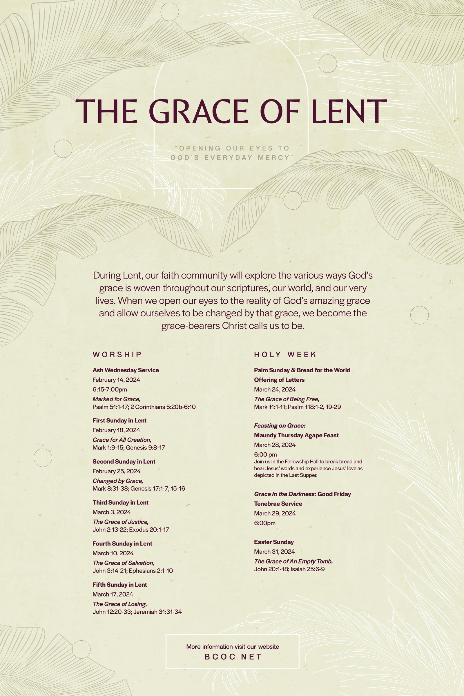
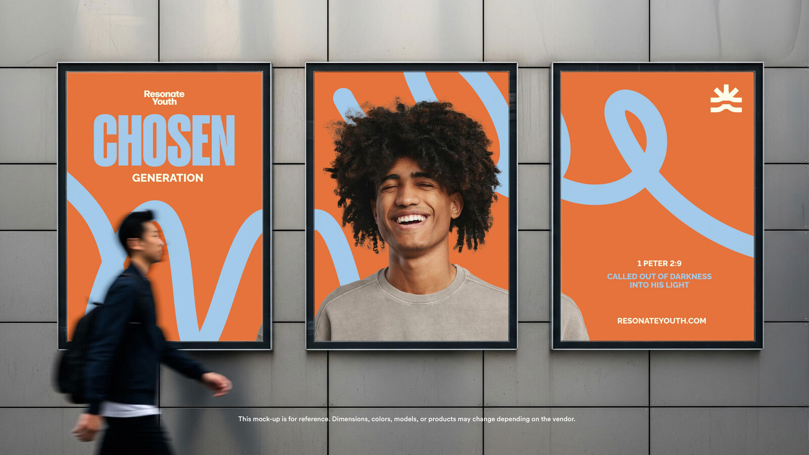
Applications: 11x17 poster, 5.5x8.5 booklet, social templates.