Kids' City had been the name under the old brand. With the new identity twelve months old, the children's ministry needed something a five-year-old would recognize and a parent would trust, and it had to sit next to the parent brand without shouting over it. The credits came from the website the church decided not to build.
We kept the house. The District arch became a smaller house with a heart-shaped opening, and the playfulness went into the shapes and the colors instead of the logo. The deck went out on February 22, 2024, and Savannah wrote back five days later: let's move forward with this and get the assets and style guide.
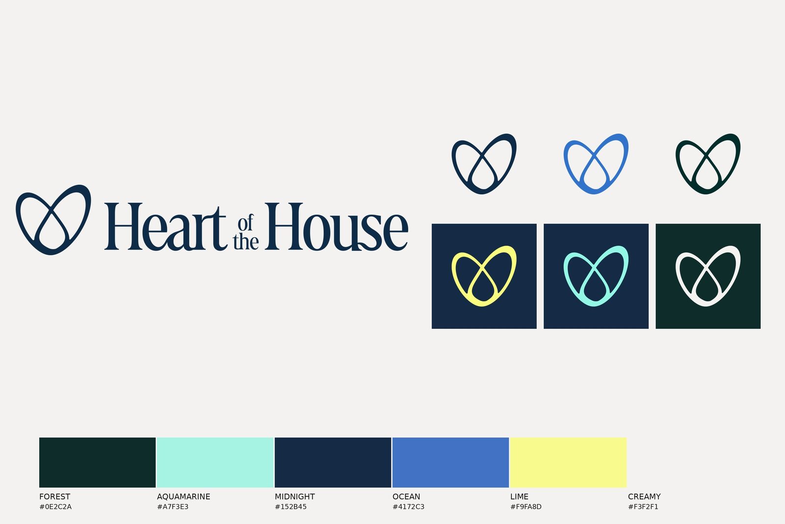
The arch with a heart inside. Stacked and horizontal lockups, an icon that works alone, and seven colors named for the city: Night Skyline, Pines, Vibrant Sun, Soft Pink, Carmine Light, Light Skyline, Ivory.
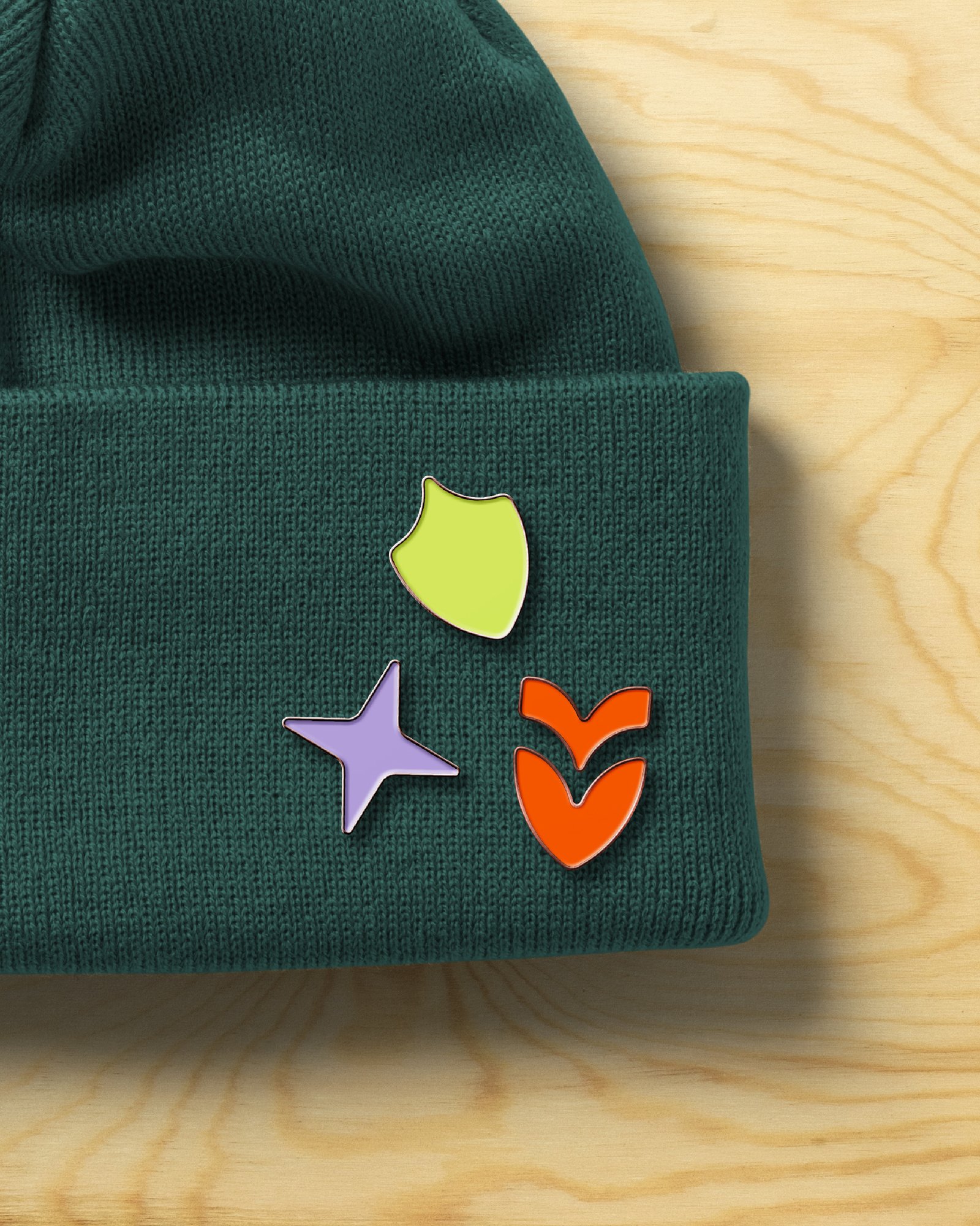
Four shapes: a clover, a scallop, a bow, and a bite. They are the parent's frames redrawn for kids, and they scale from a sticker to a twenty-foot stage backdrop without changing.
Love, Think, and Act Like Jesus. This is Your Home. The first is the ministry's own line; the second is the parent's, handed down.
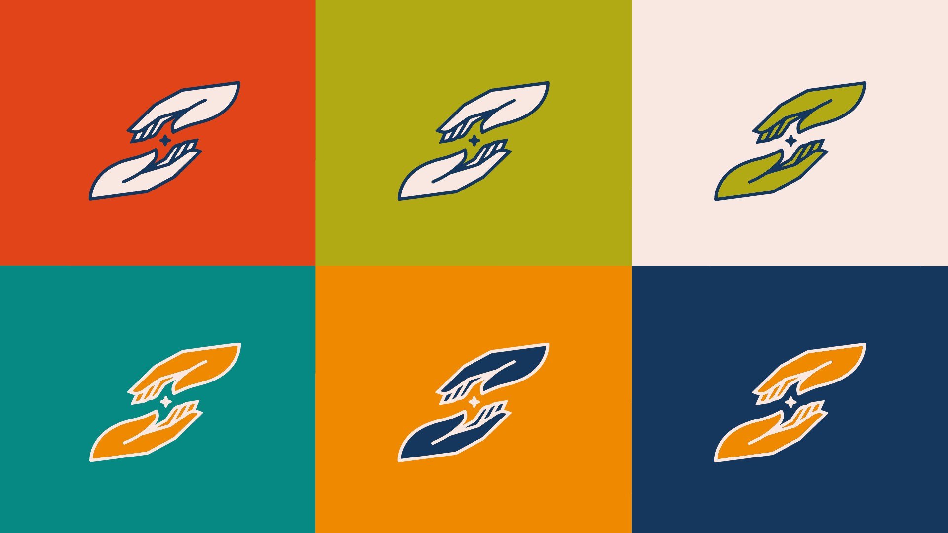
Sub-brand identity: icon, stacked and horizontal lockups in seven colors; Brand Style Guide; color palette.
Brand elements: the four shapes.
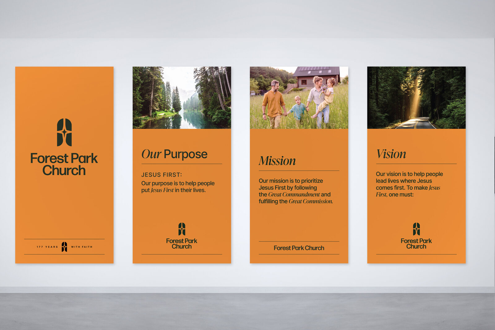
Stage backdrops in four sizes, print-ready.
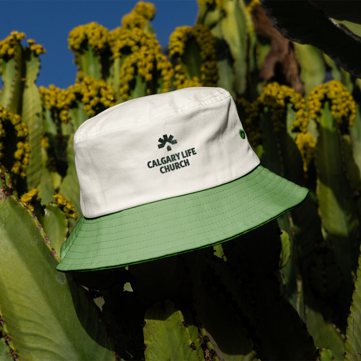
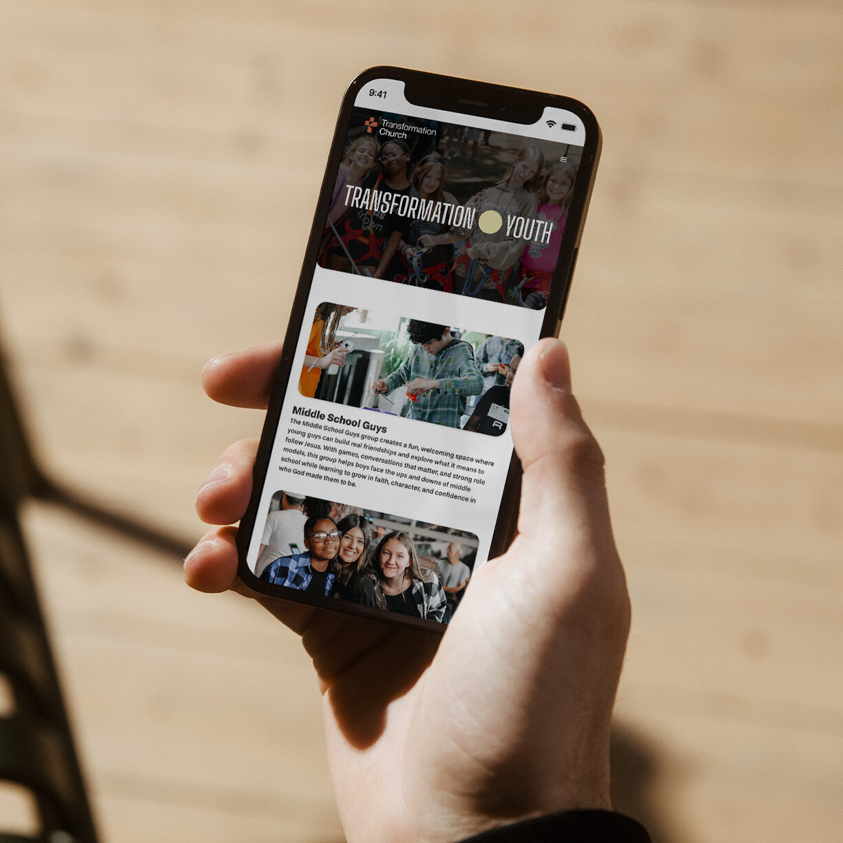
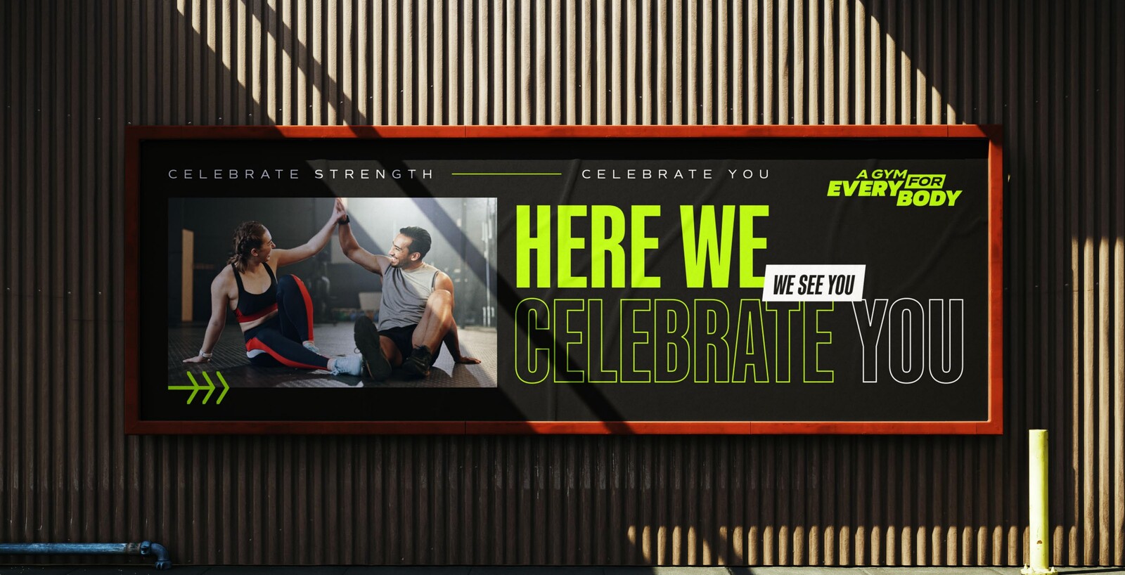
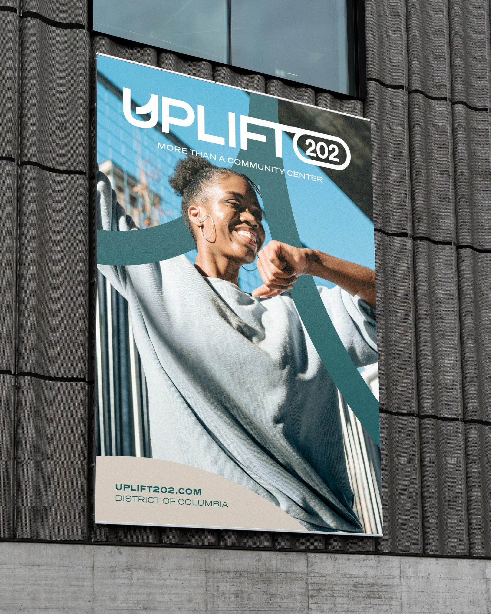
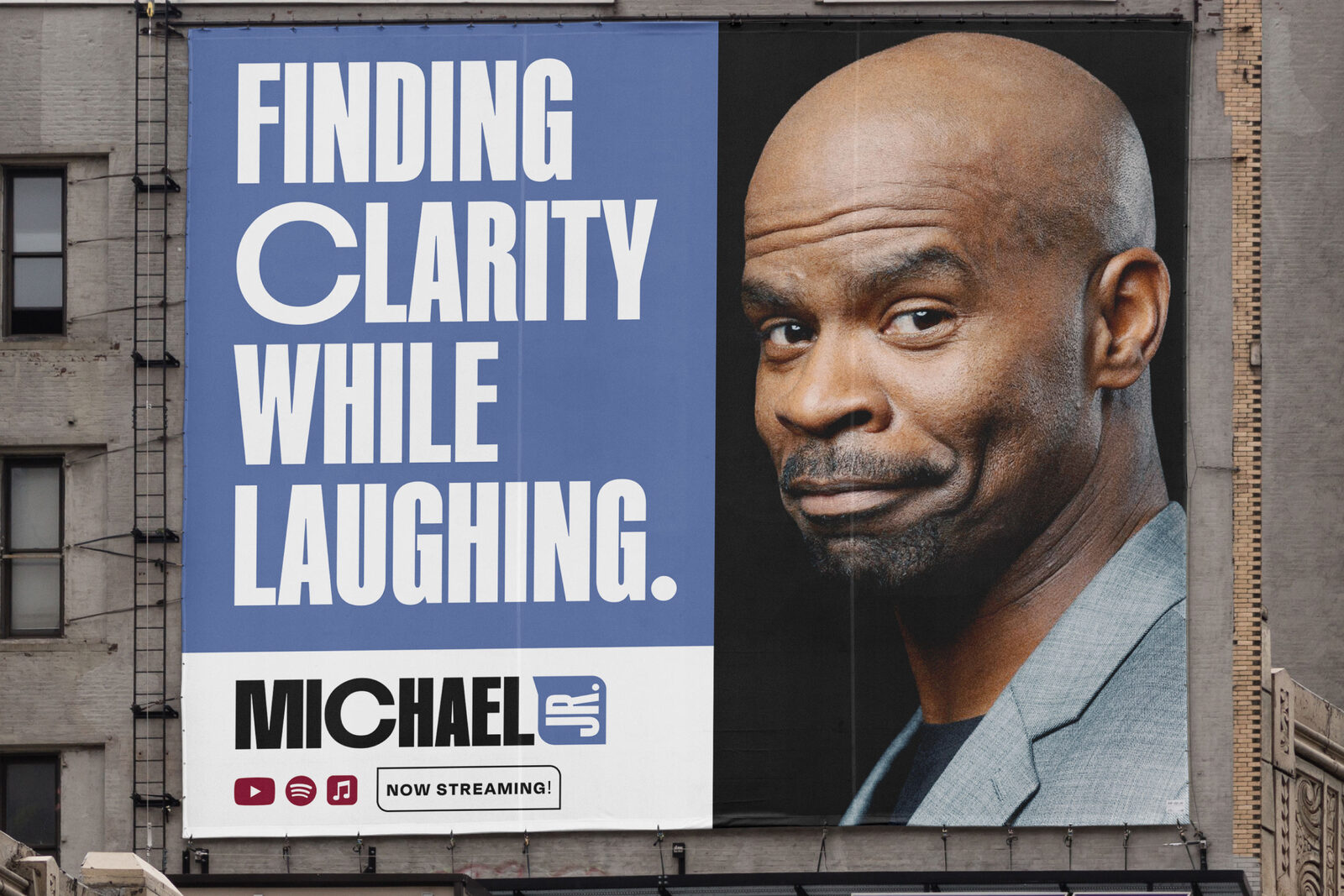
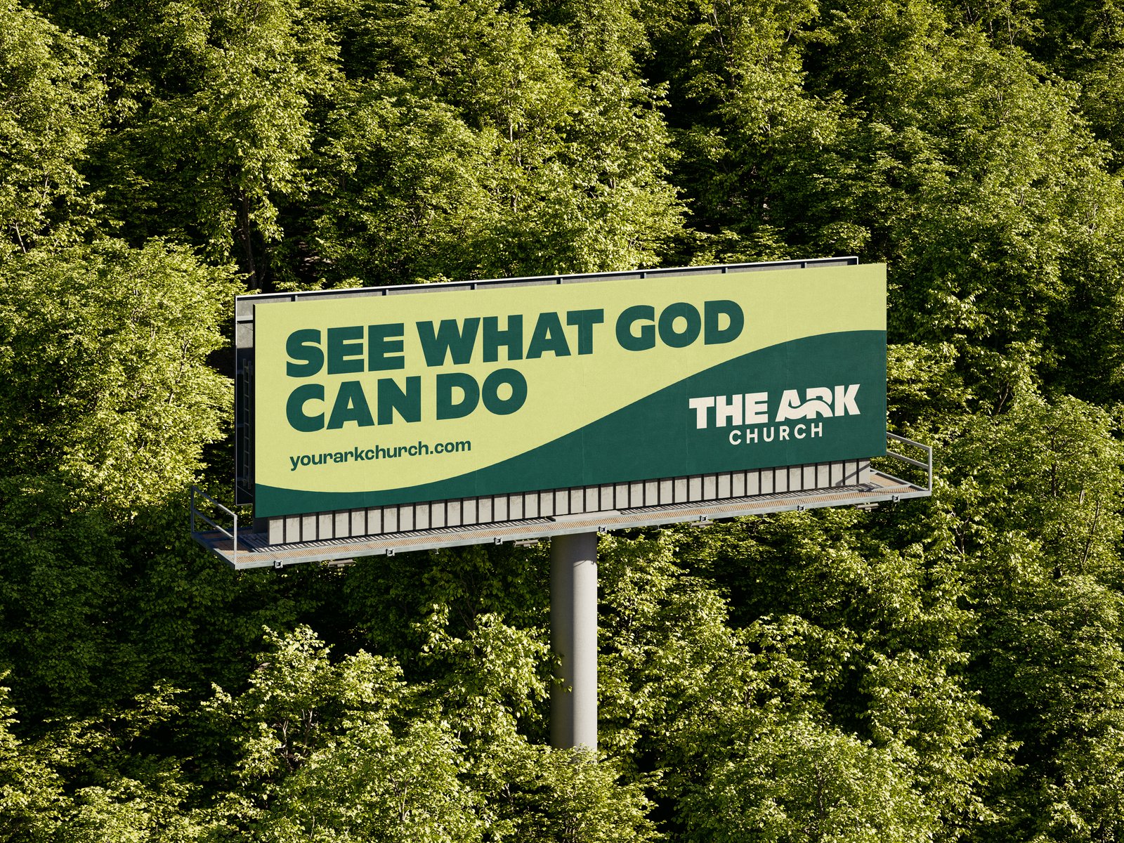
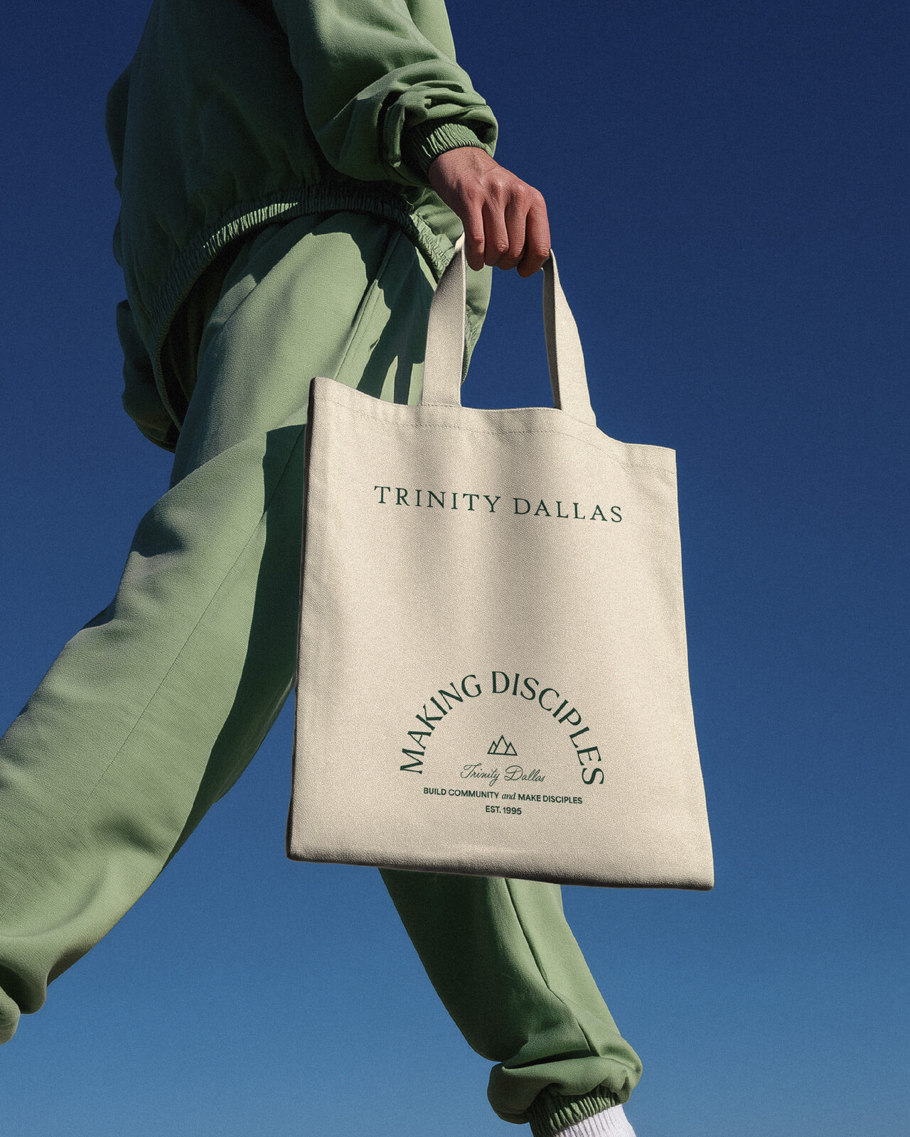
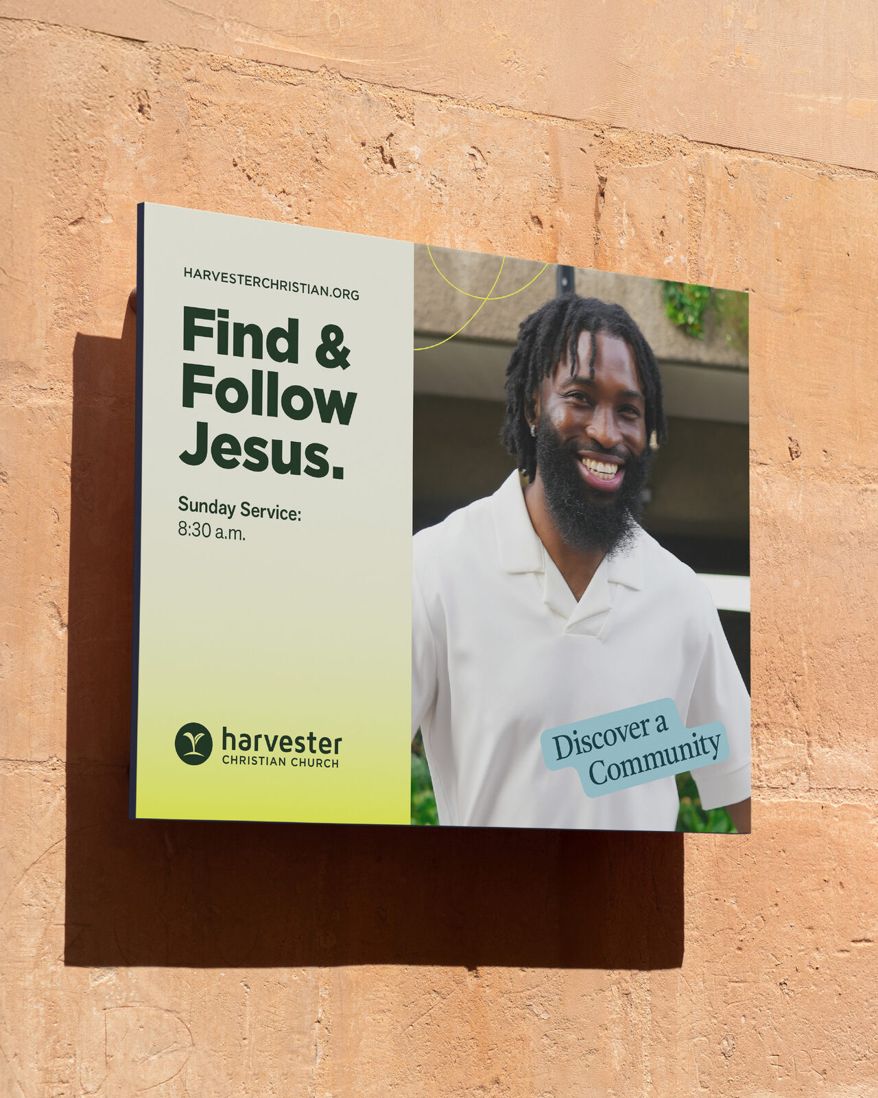
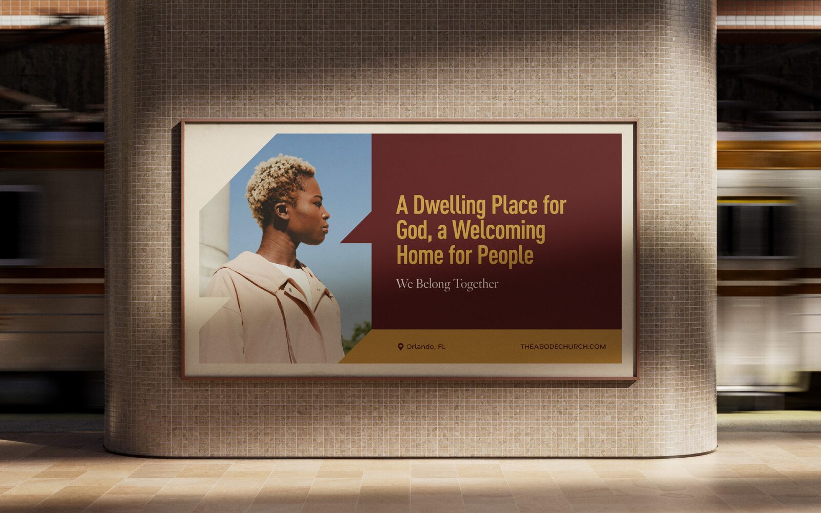
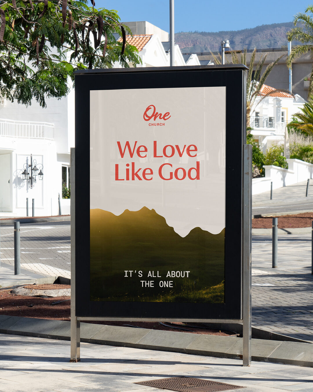
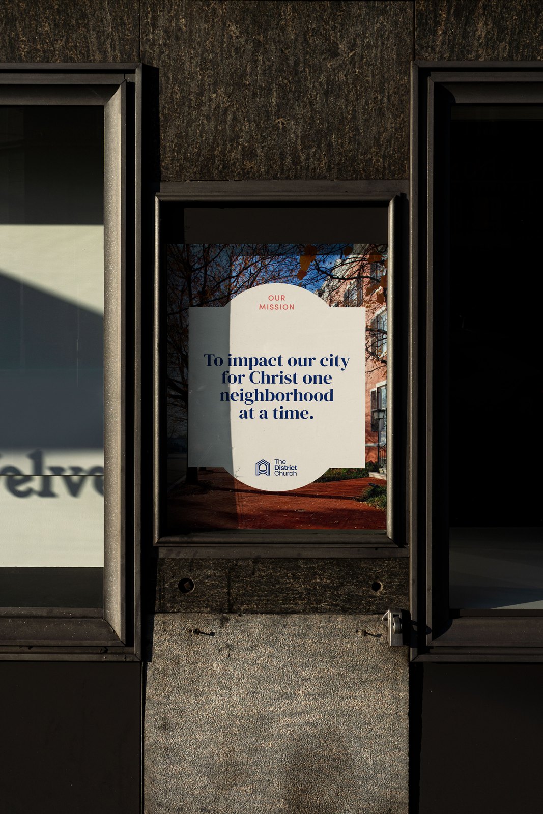
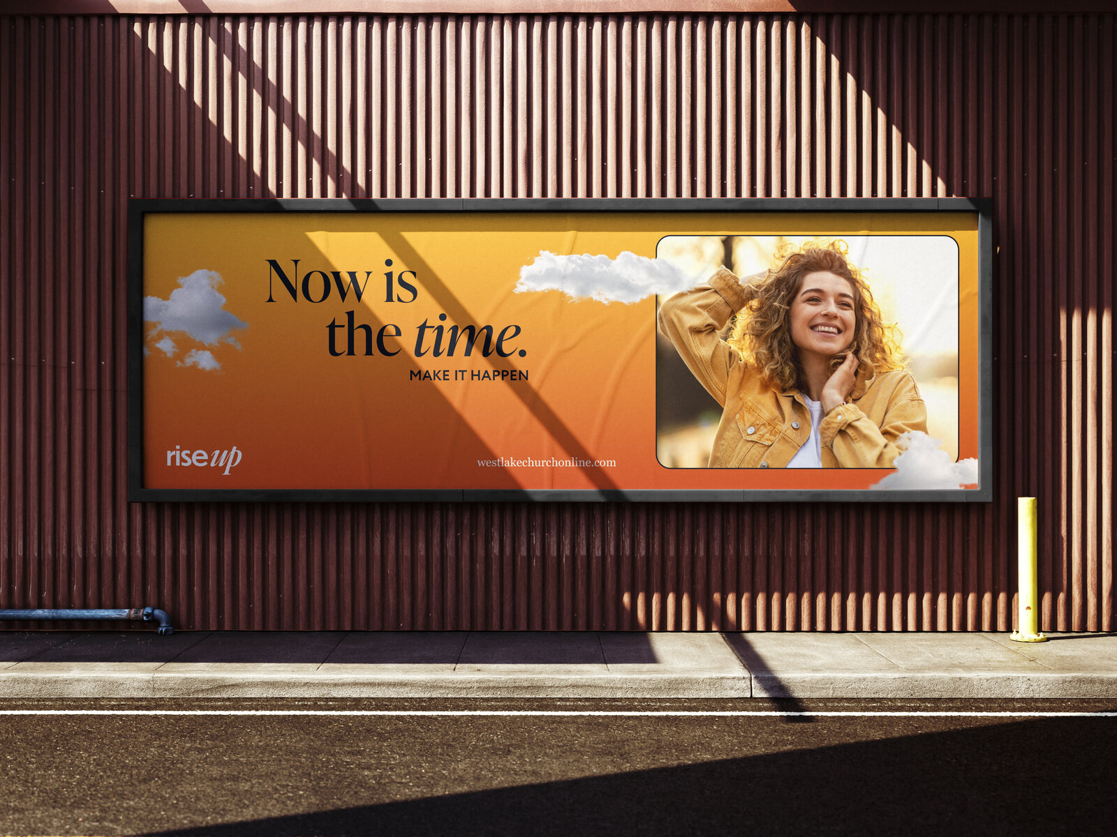
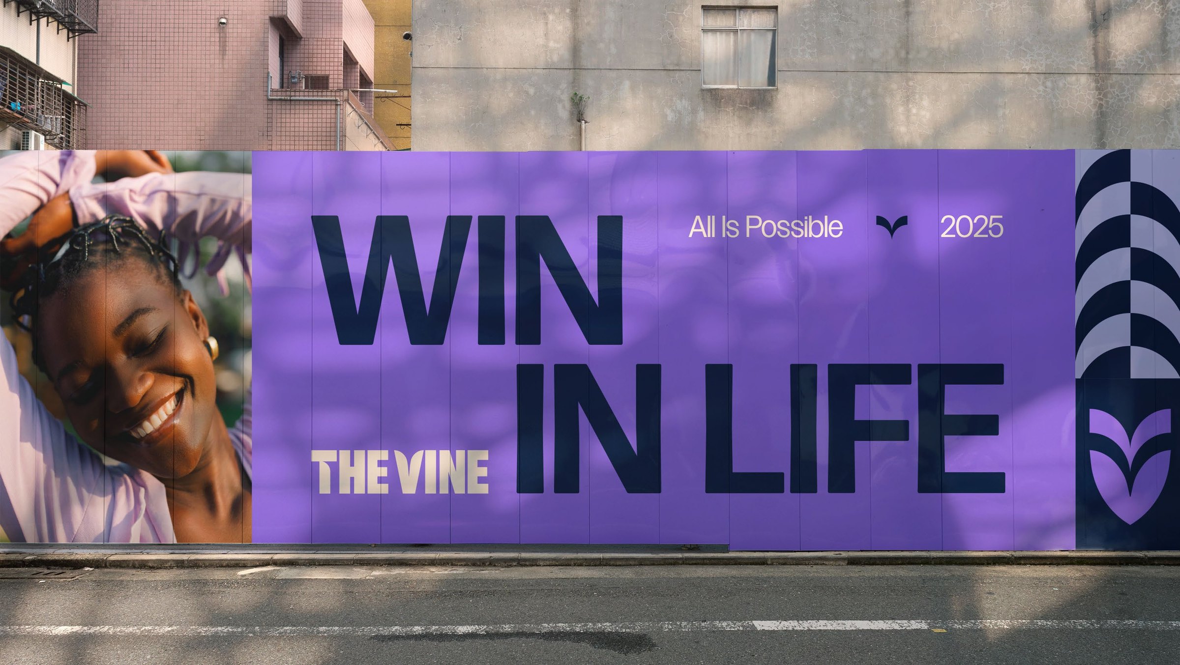
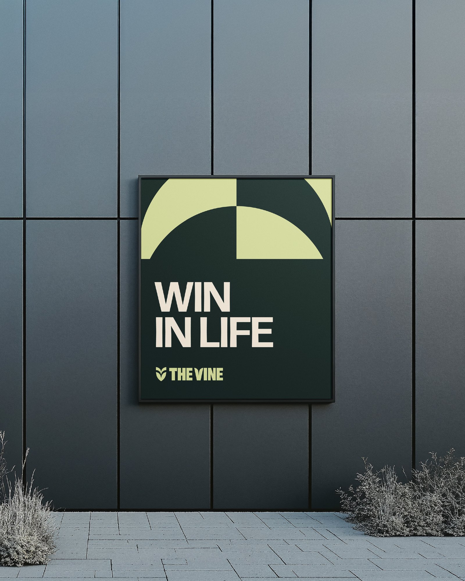
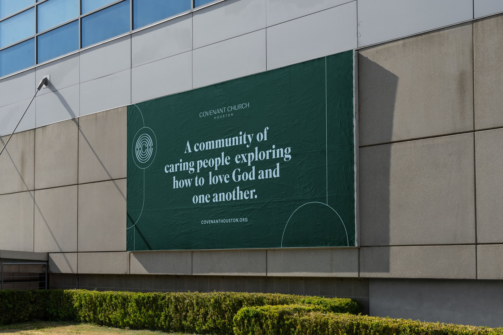
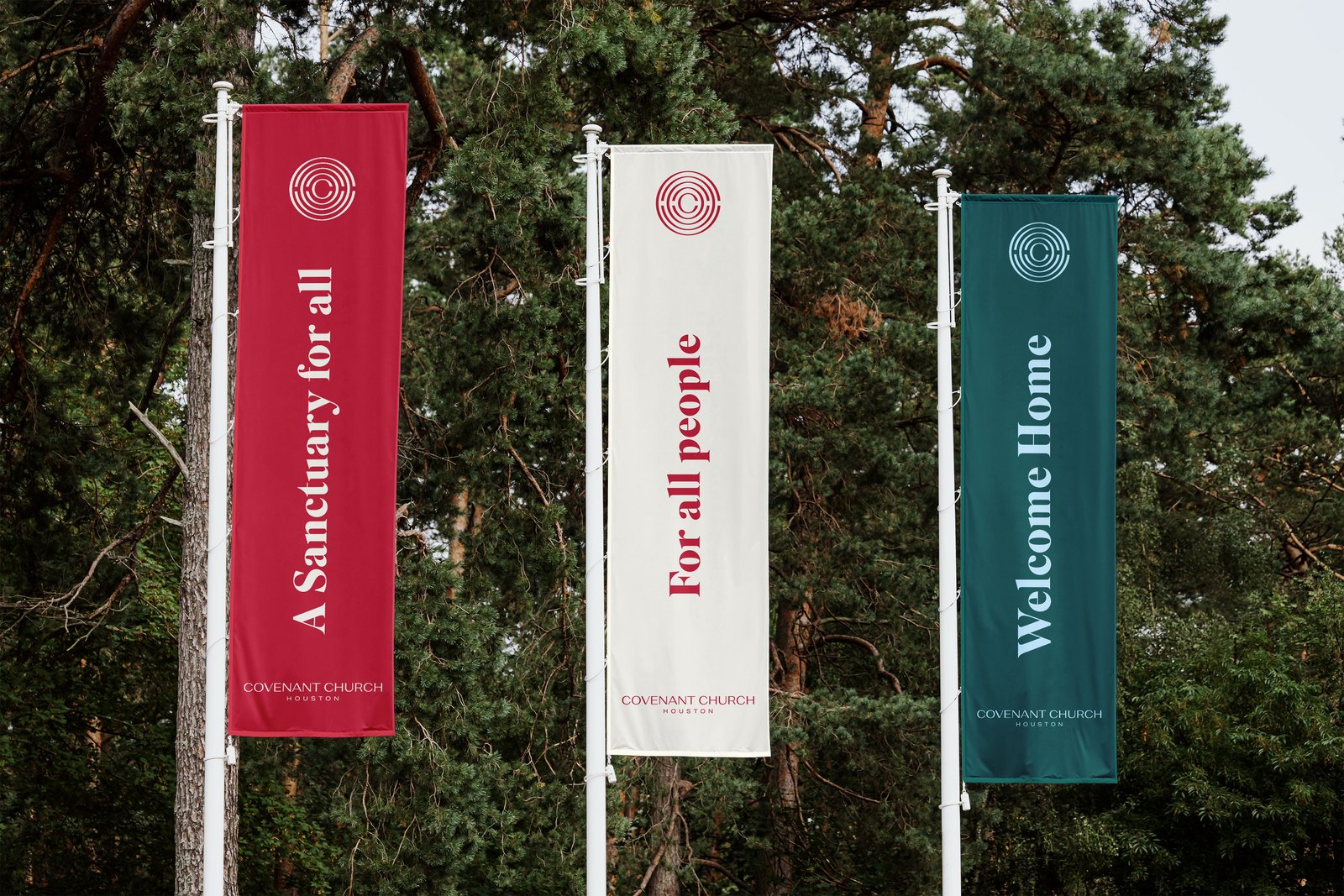
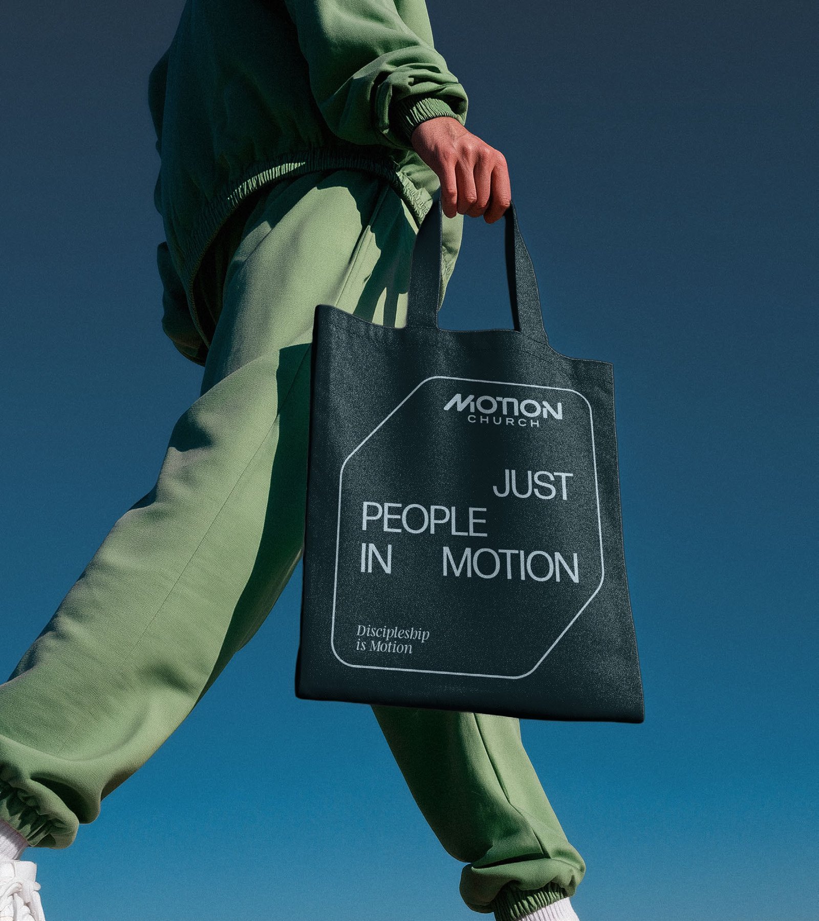
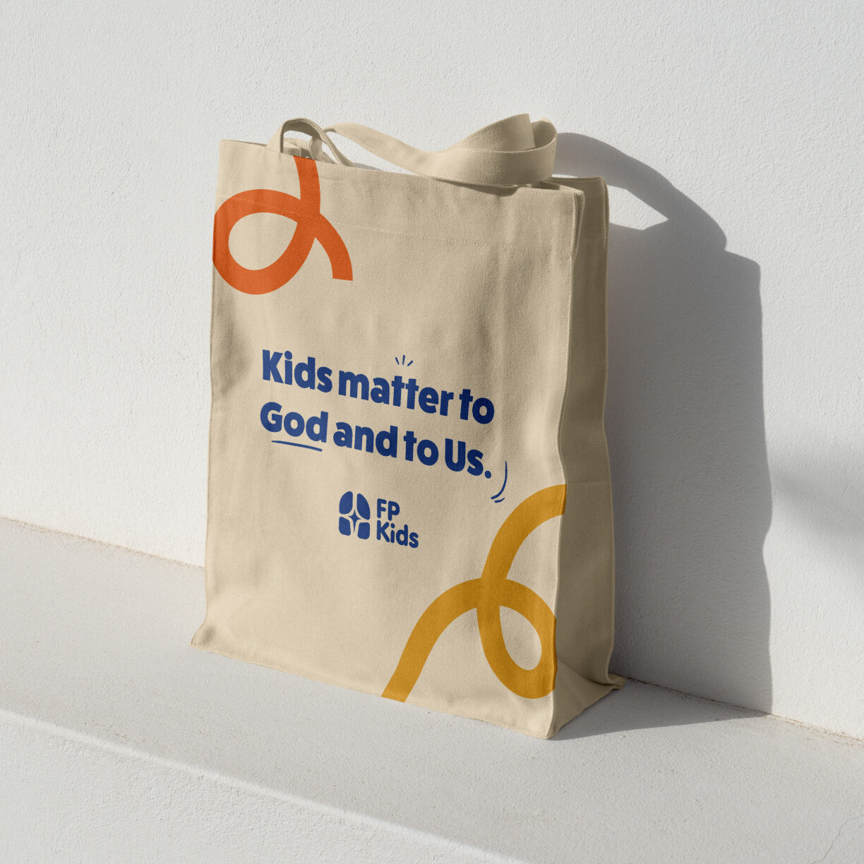
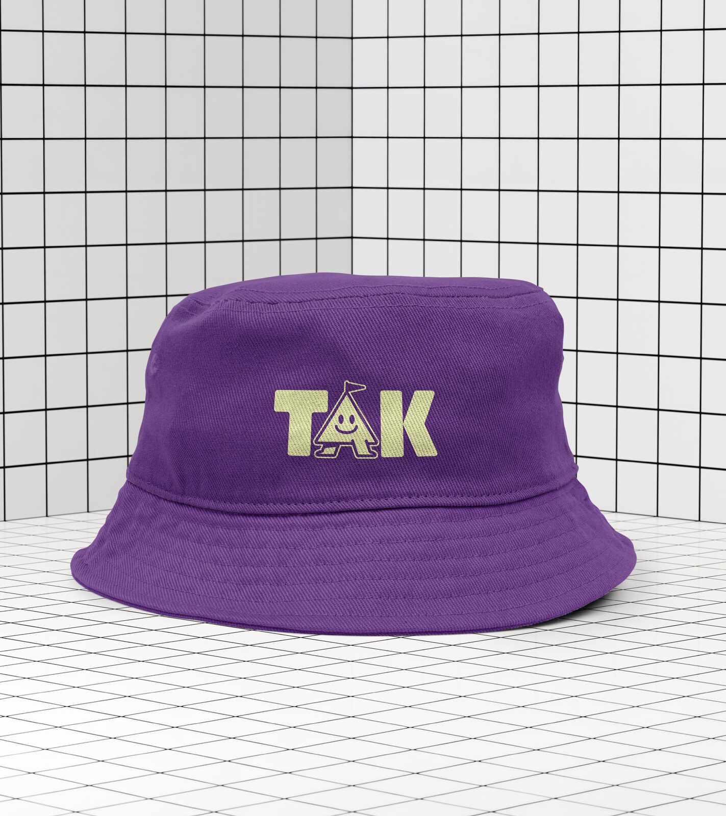
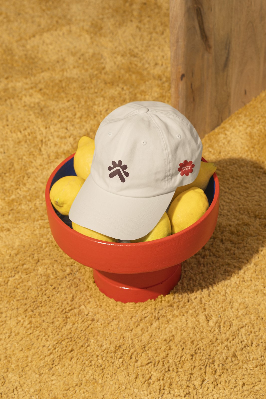
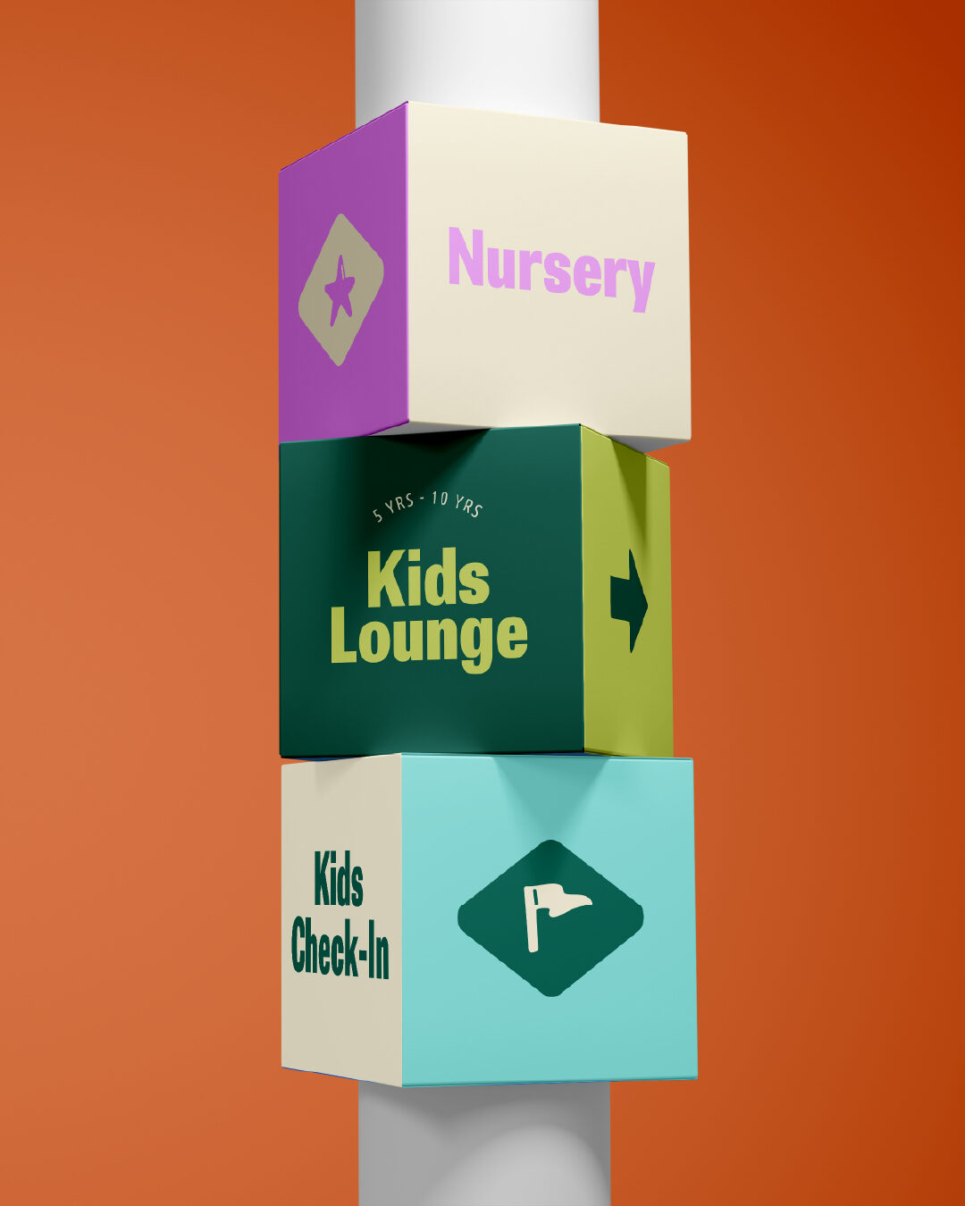
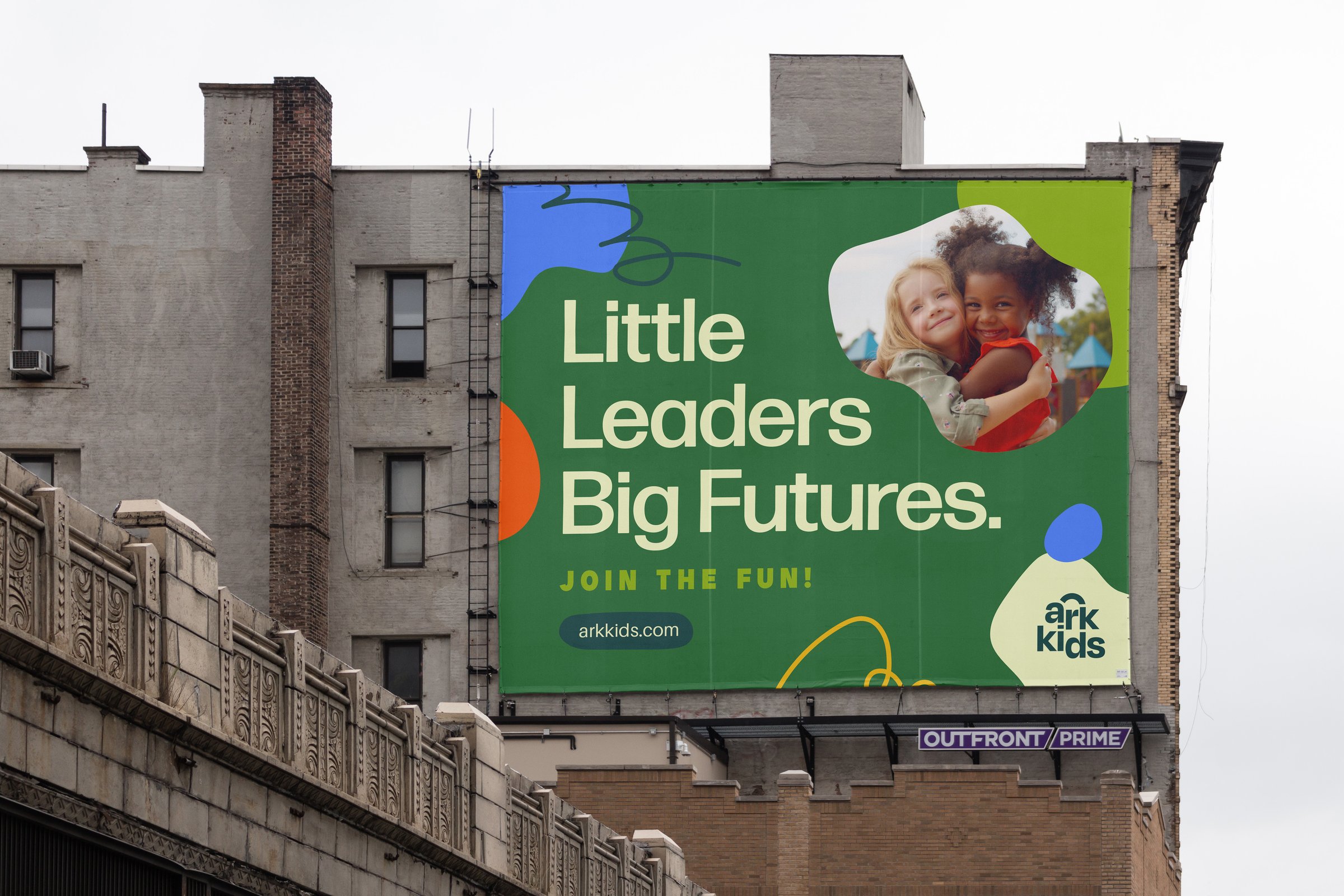
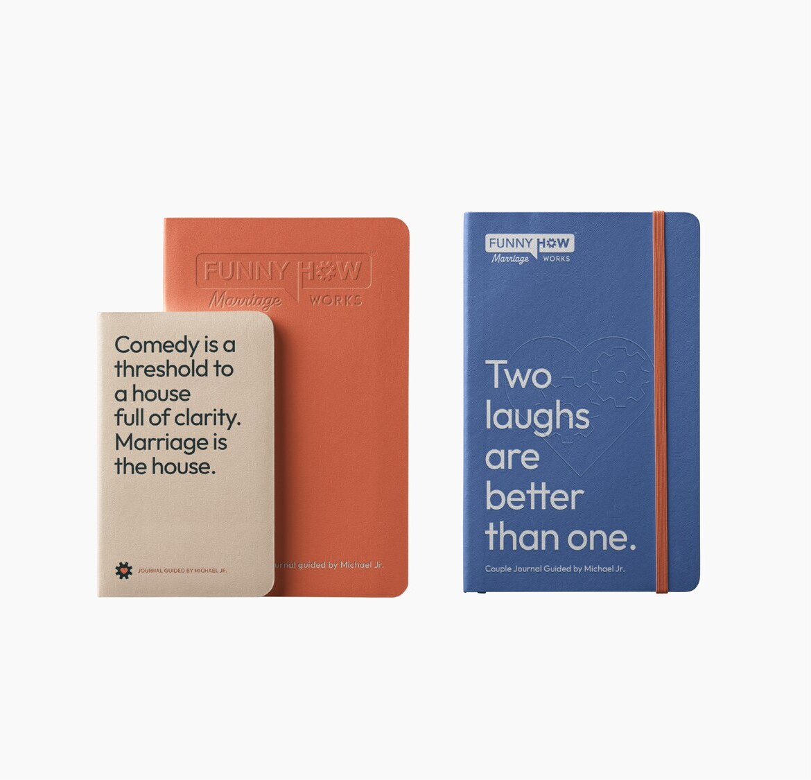
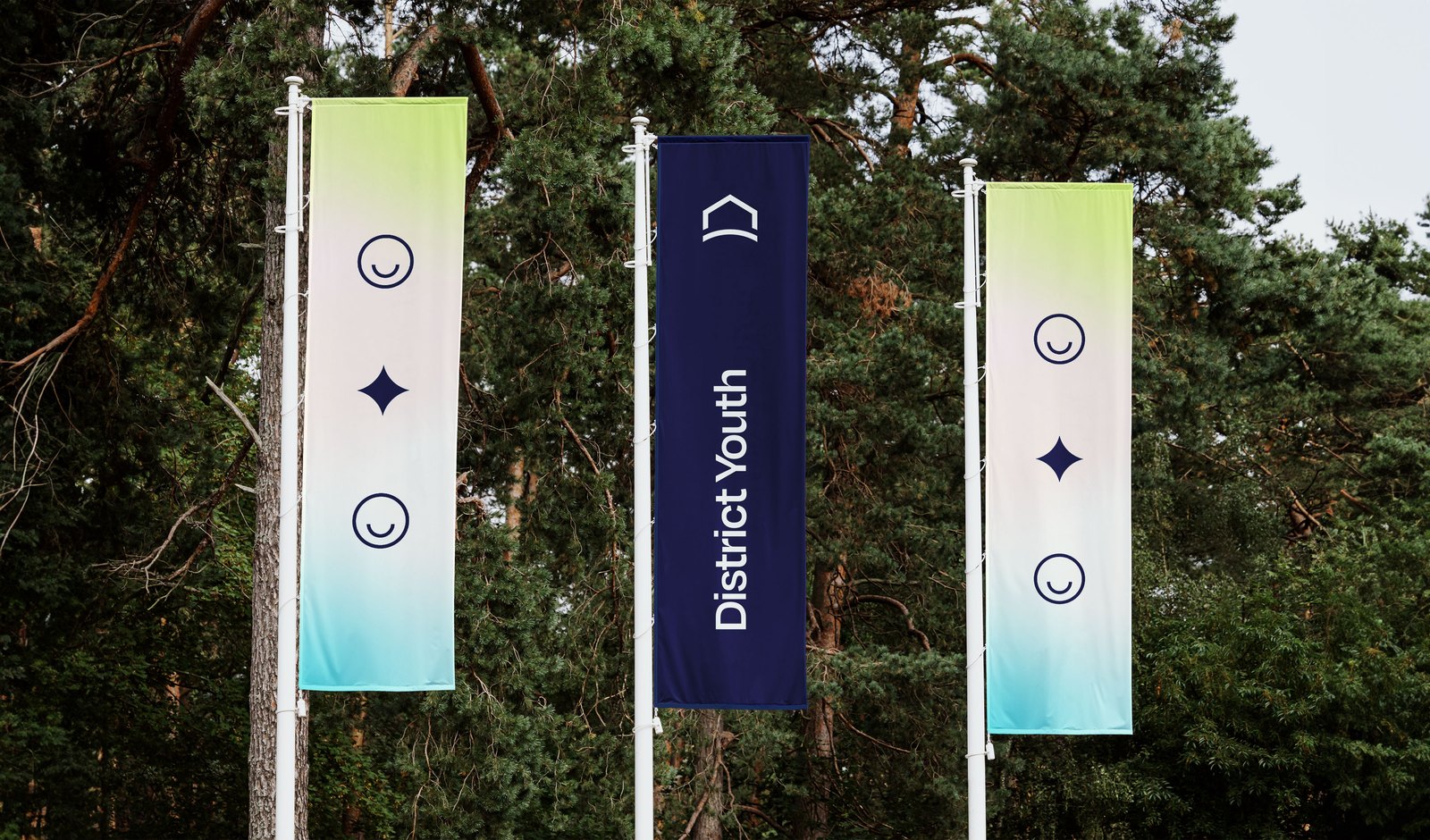
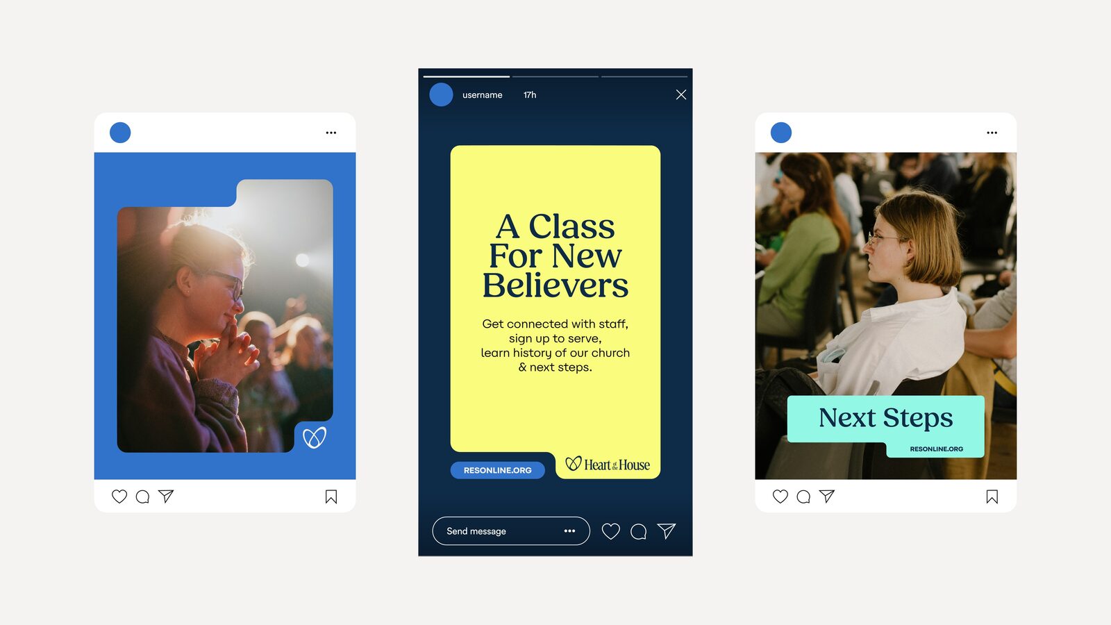
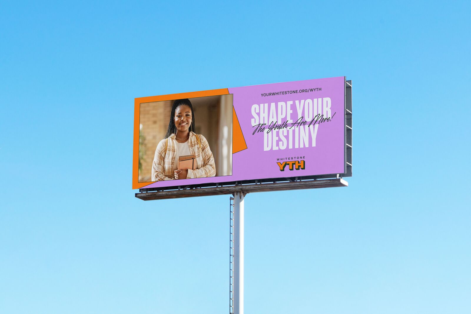
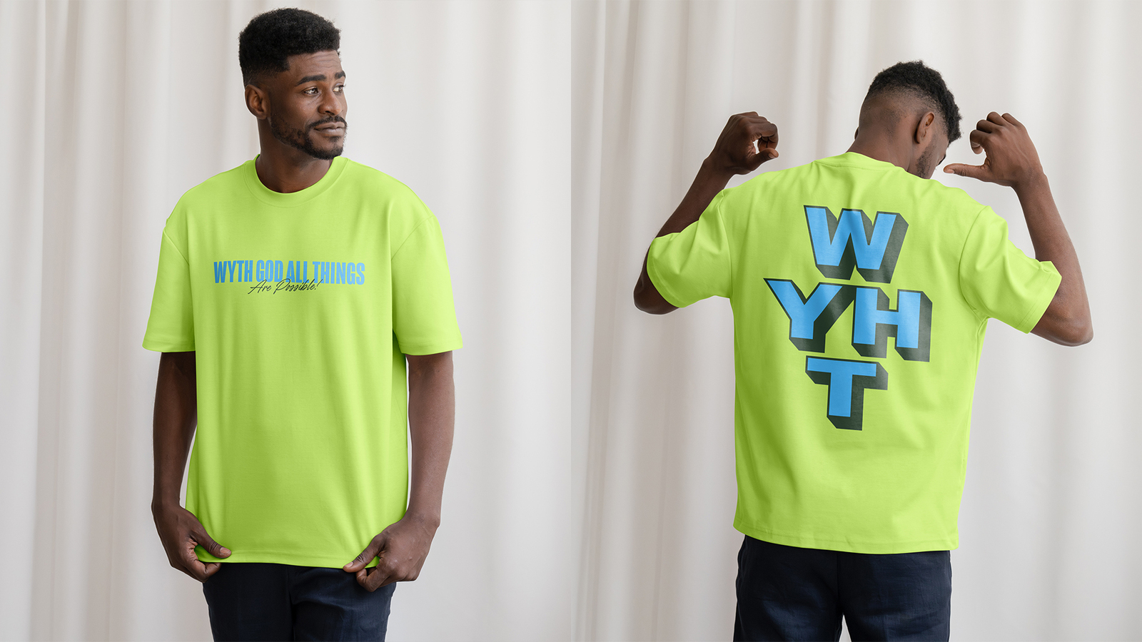
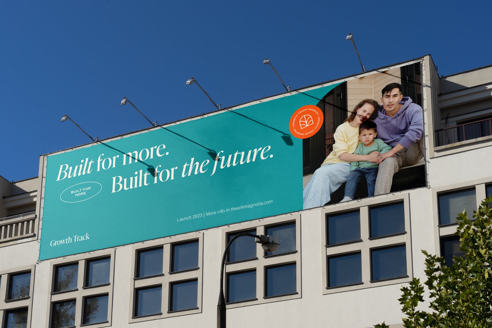
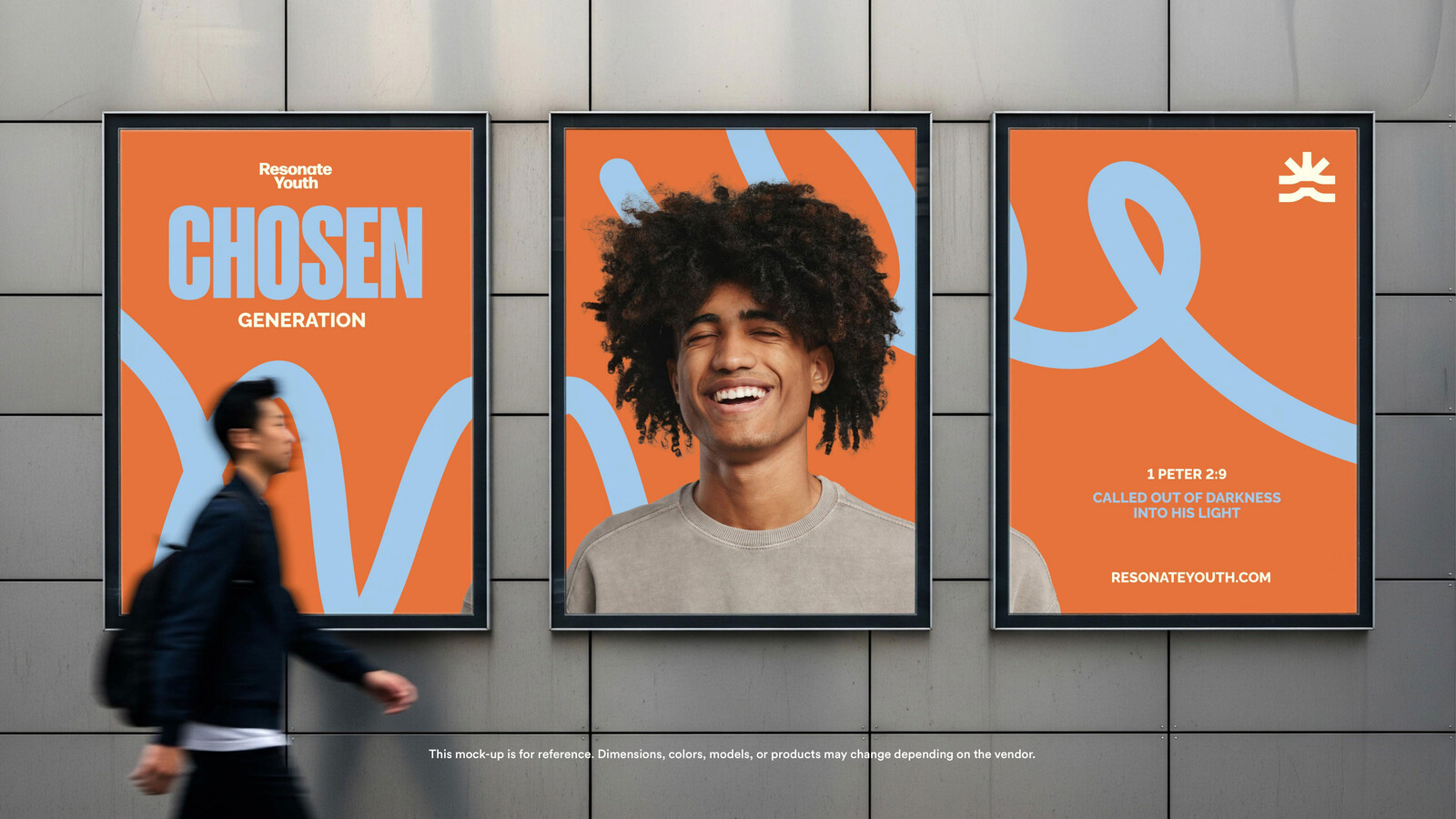
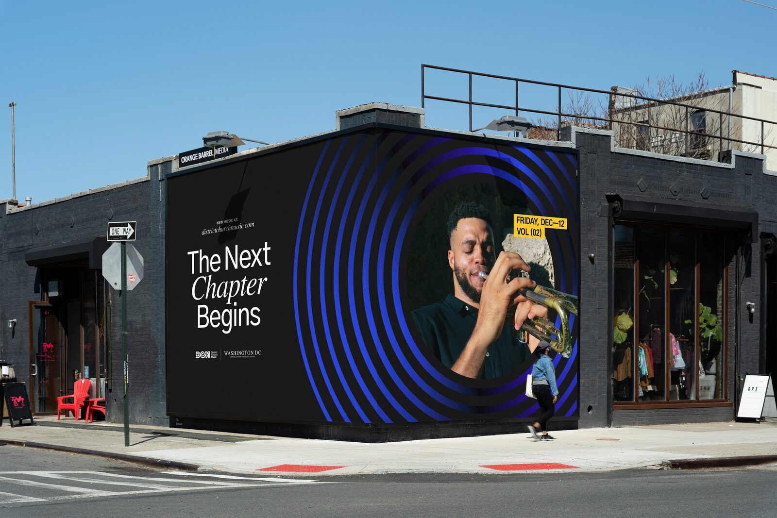
Applications: A-frame, billboards, bus shelter, pole banners, bottle, bucket hat, notebooks, tote, phone, social outlets.
Mailchimp templates for parent and volunteer updates; Canva slides.