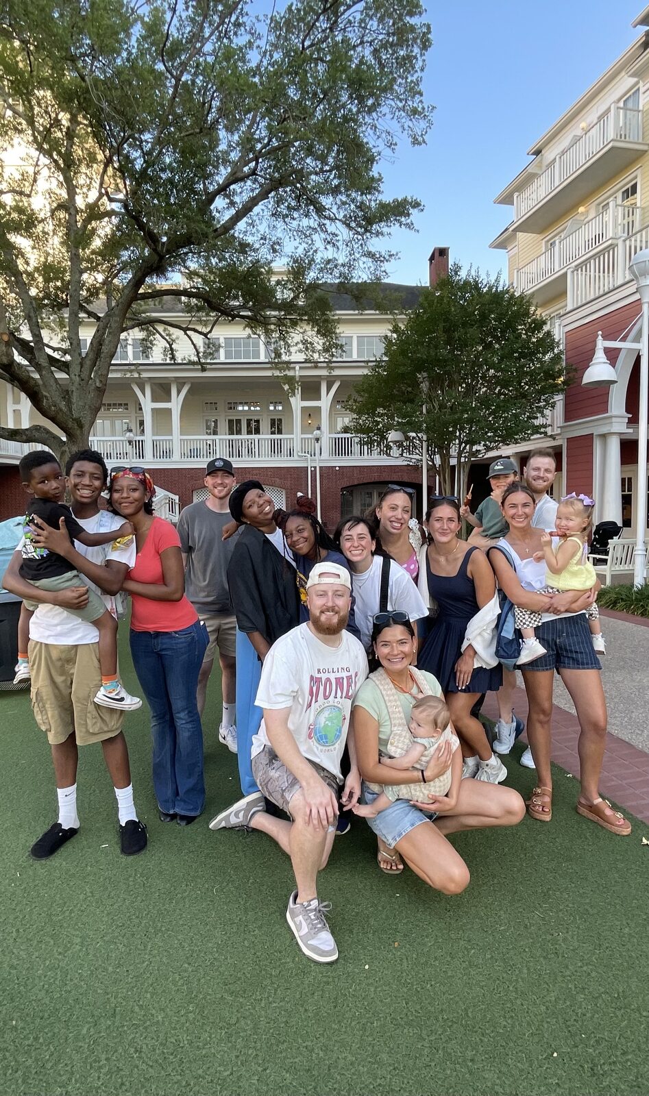
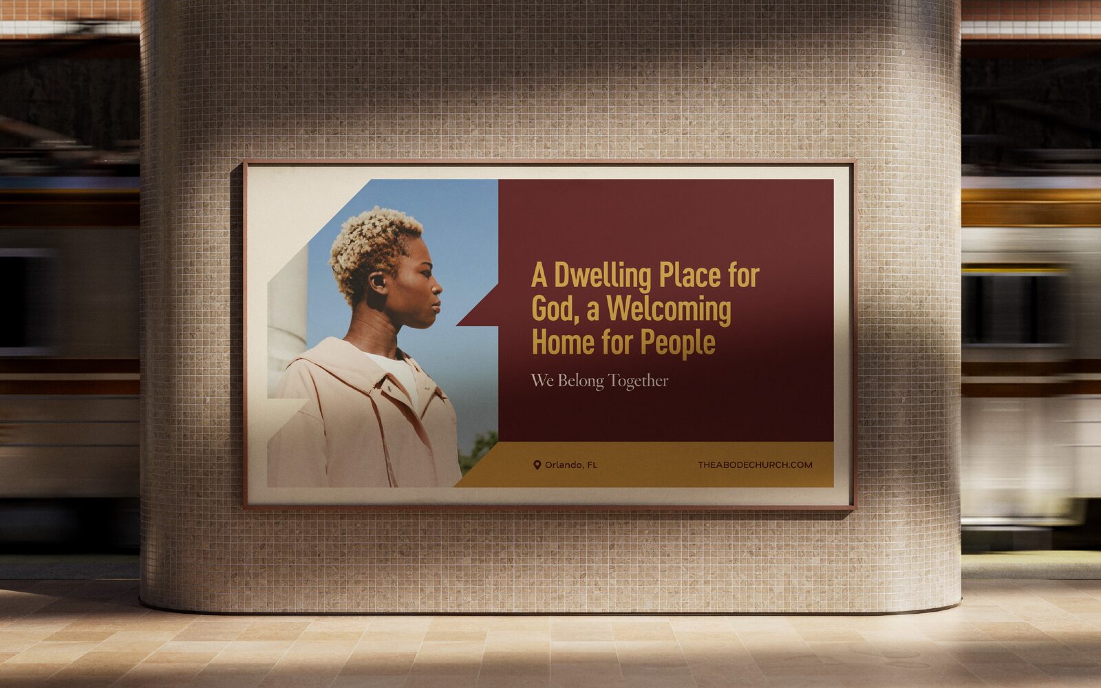
Leilani and Tanner Ming left California to plant a church in Orlando that had no name, no identity, and no gathering to point to yet. A launch team of about forty, half relocated with them and half gathered locally. They needed a full brand and web presence before they had a single gathering to point to.
For a church plant with no local reputation yet, the usual move is hype toward a launch date. We don’t do it that way. Visibility over a countdown: content built to introduce Abode to Horizon West before asking anyone to show up.
Branding came first: two full directions, then a round of revisions on the second. The Mings came back to the first—and brought the typography they loved from the second with it.

Most church brands ship with two colors and a neutral, so every piece ends up the same shade of safe. Abode has seven. That is what a working palette buys you: the same pop-up backdrop in Amber, Sand, Olive, Cloud, or Cocoa, and every one of them is unmistakably Abode.
The wider point, and why we keep pushing clients past beige: The Sad Beige Design Era.
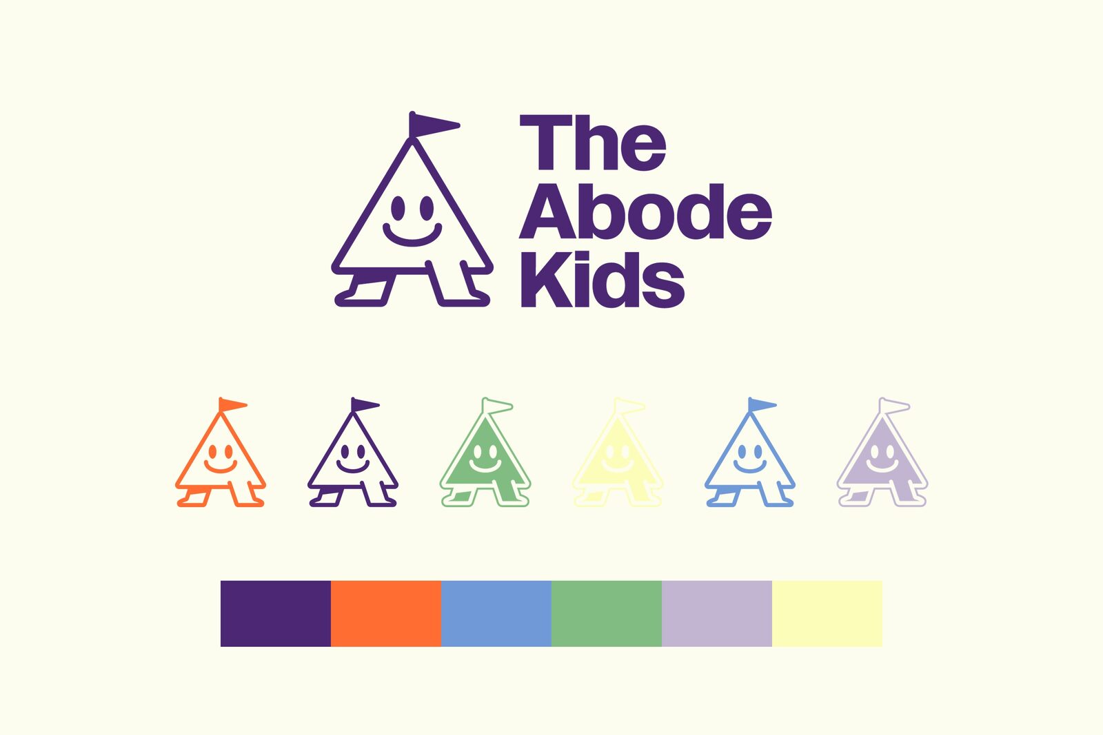
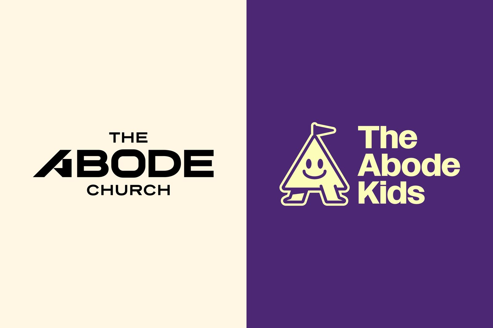
The kids got their own front door. Same house, kids format: a tent-shaped A with a pennant flag, six colors led by deep purple and bright orange, and its own type. It's a brand on its own, so it gets a page on its own. Walk through below.
Built on Webflow and handed over: their team edits it day to day. We host it, and our team takes the bigger changes.
Brand identity: full identity system; stationery and email templates; business cards, Connect Cards, gold-foil Invite Cards, Thank-You Cards.
The Abode Kids: tent mascot, six-color palette, and full logo system.
Launch: landing page/microsite; 30-post social caption library and launch content grid; Custom Launch Toolkit.
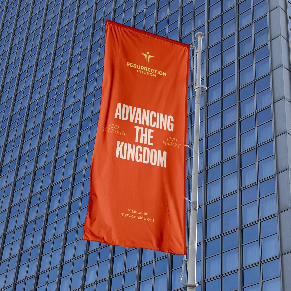
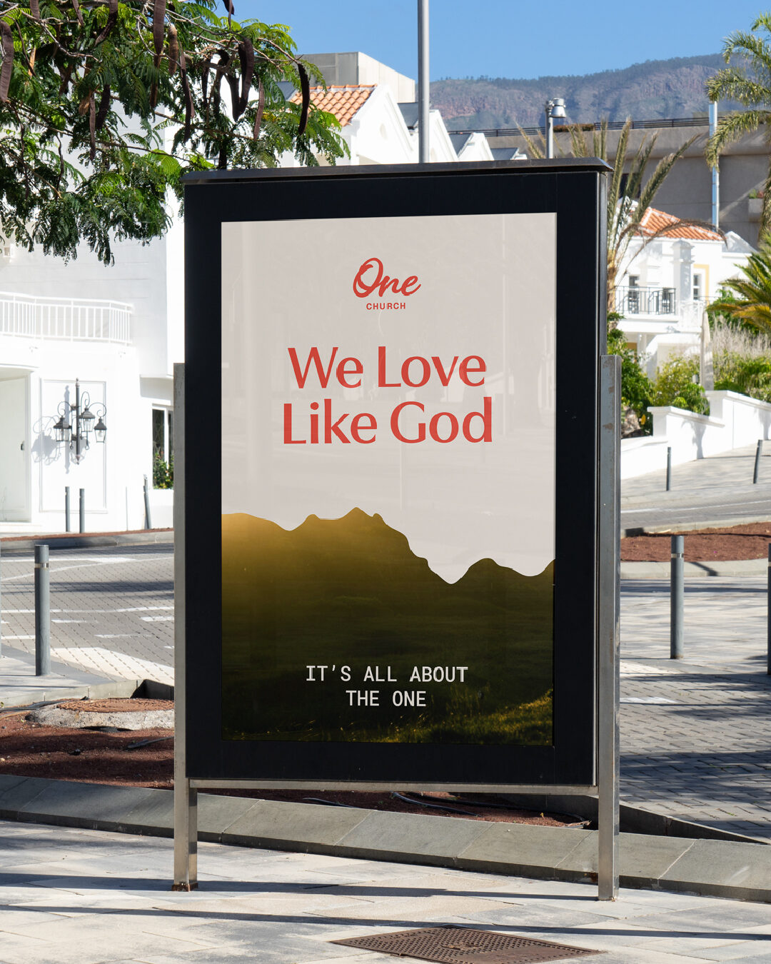
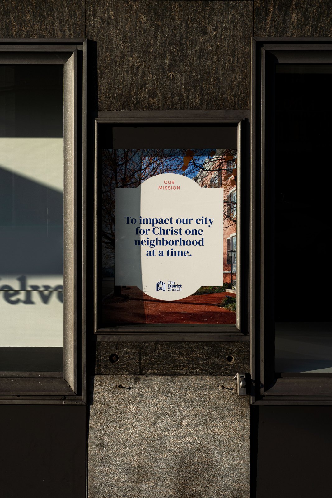
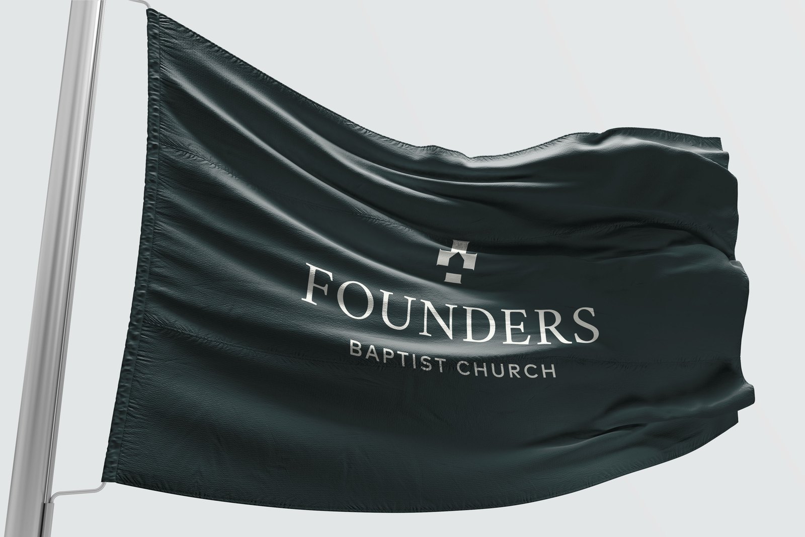
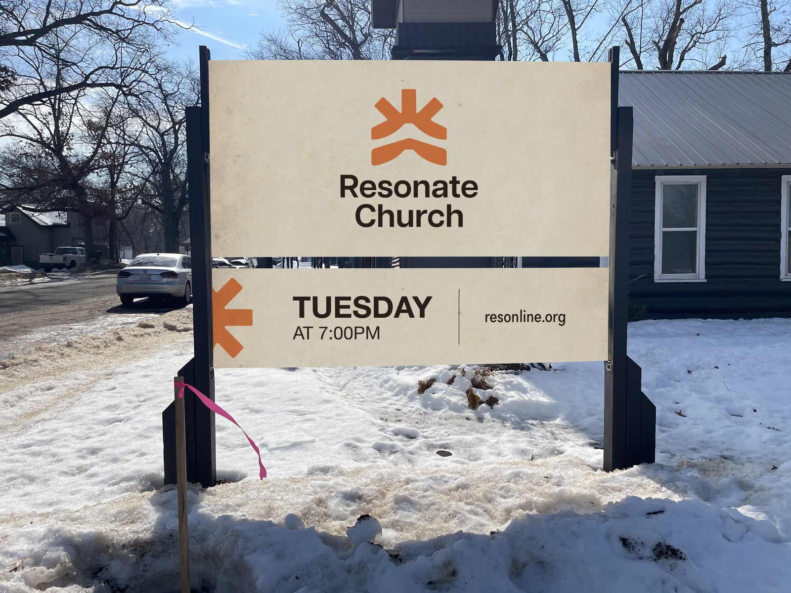
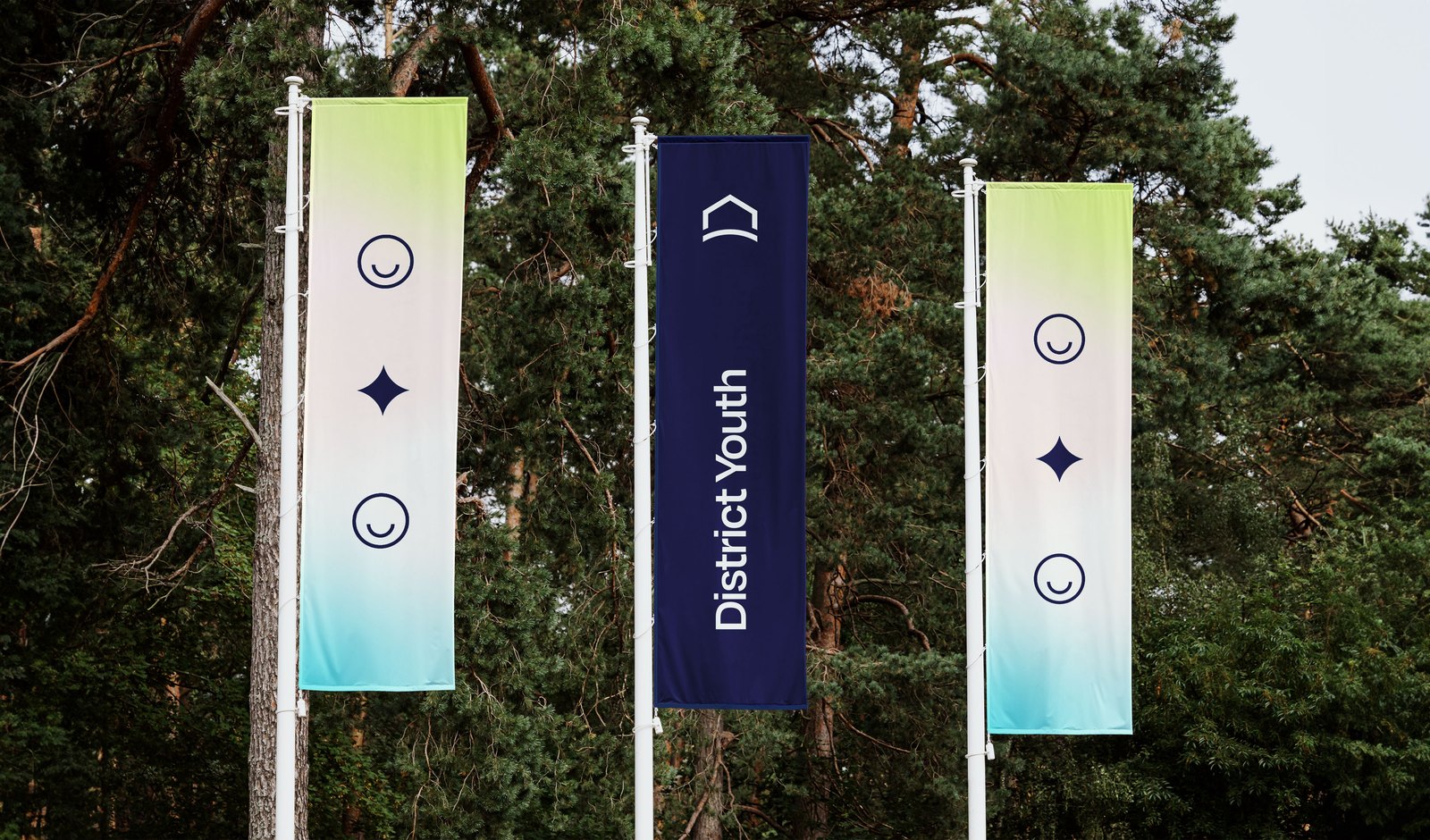
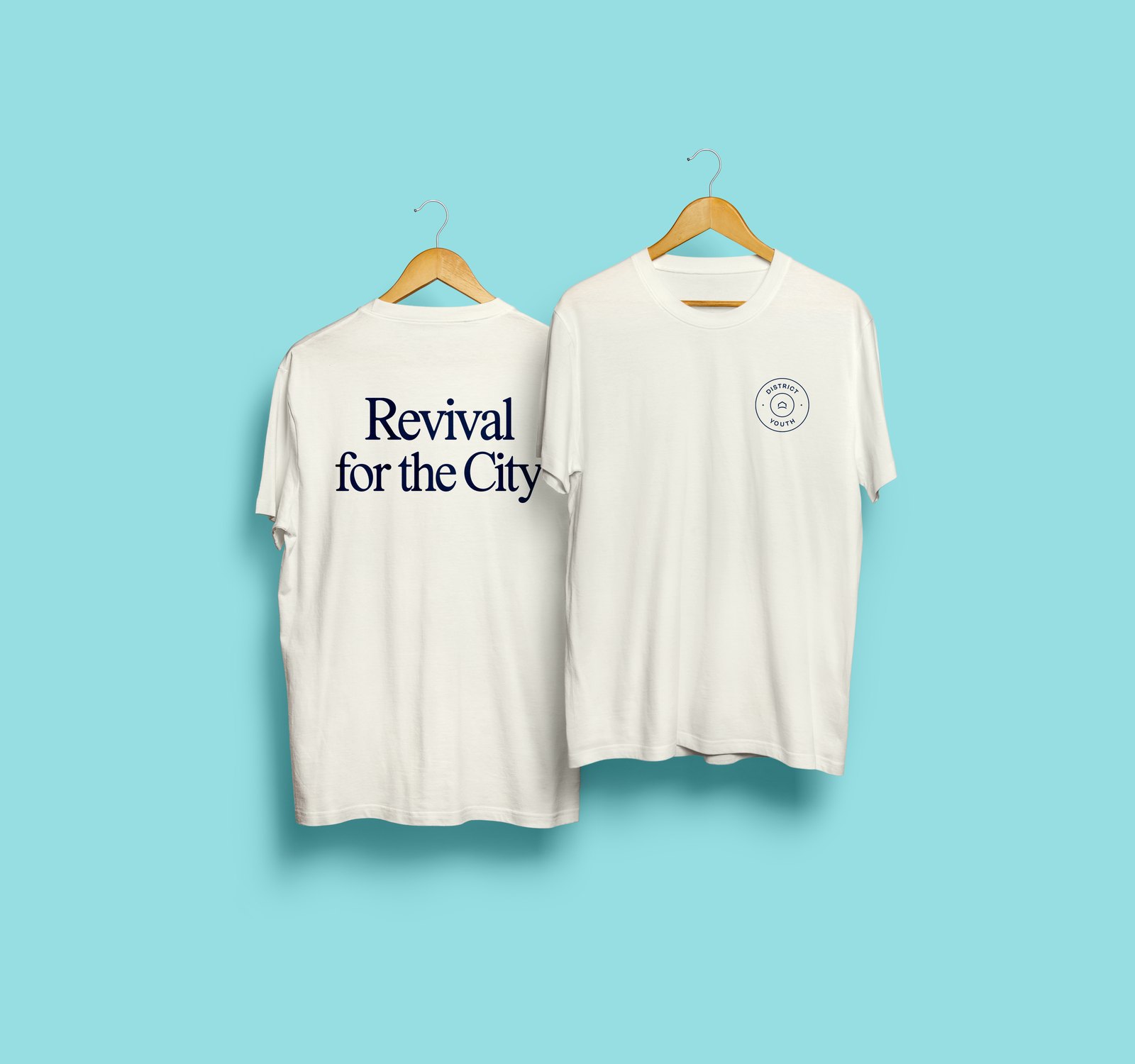
Environment: branded apparel; event signage, flags, banners, pop-up tent and backdrop; fundraising and giving materials.
























































We really love everything about it. And we trust you guys as the creatives.
Leilani Ming, Lead Pastor, The Abode Church


