Harvester's visual identity hadn't kept pace with the church's growth, and a name people already knew needed a look people could grow with.
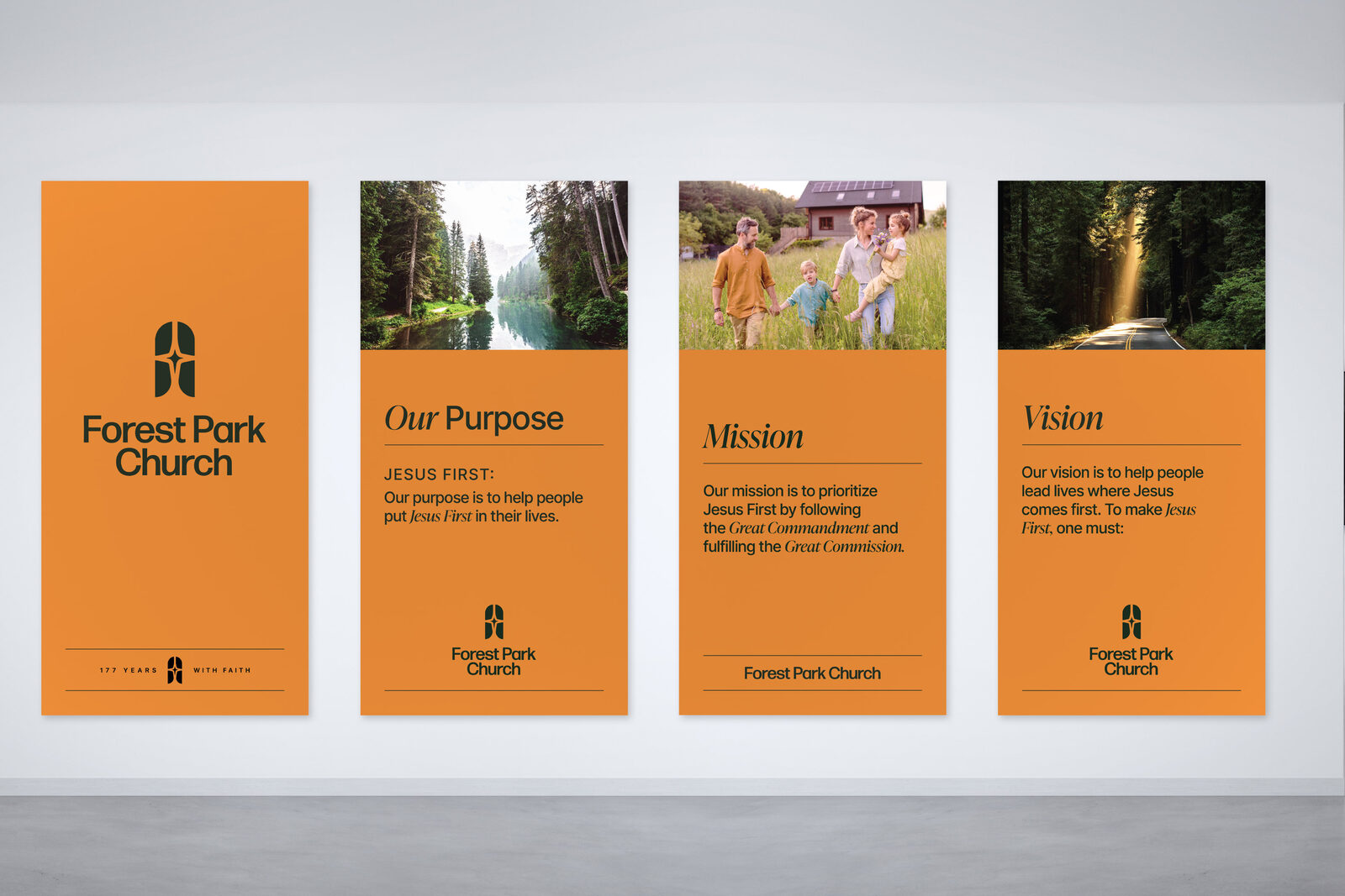
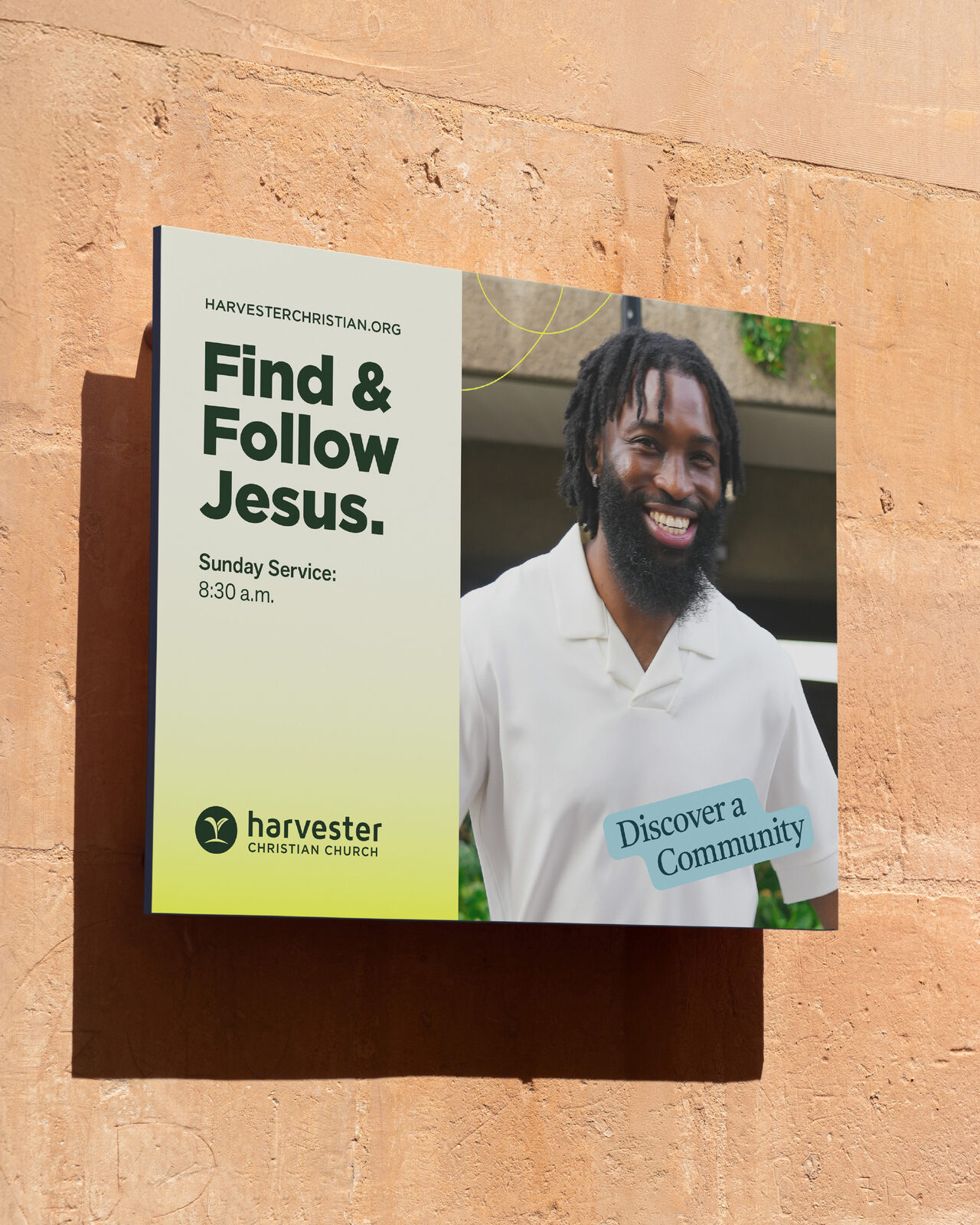
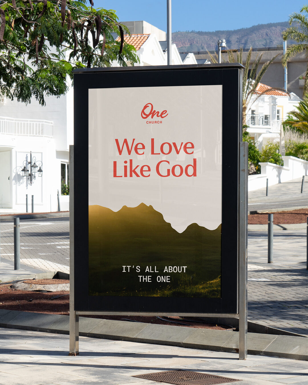
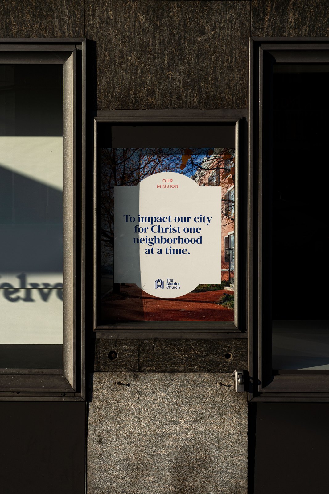
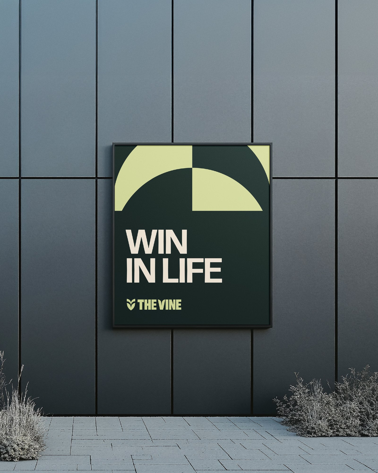
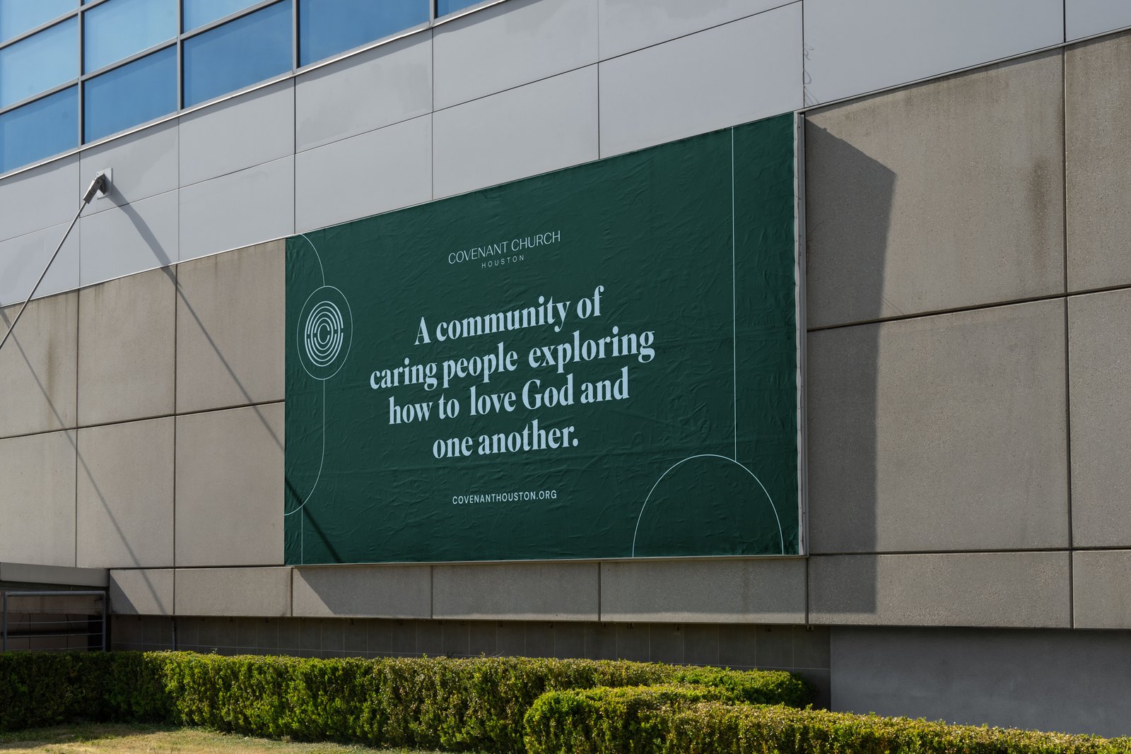
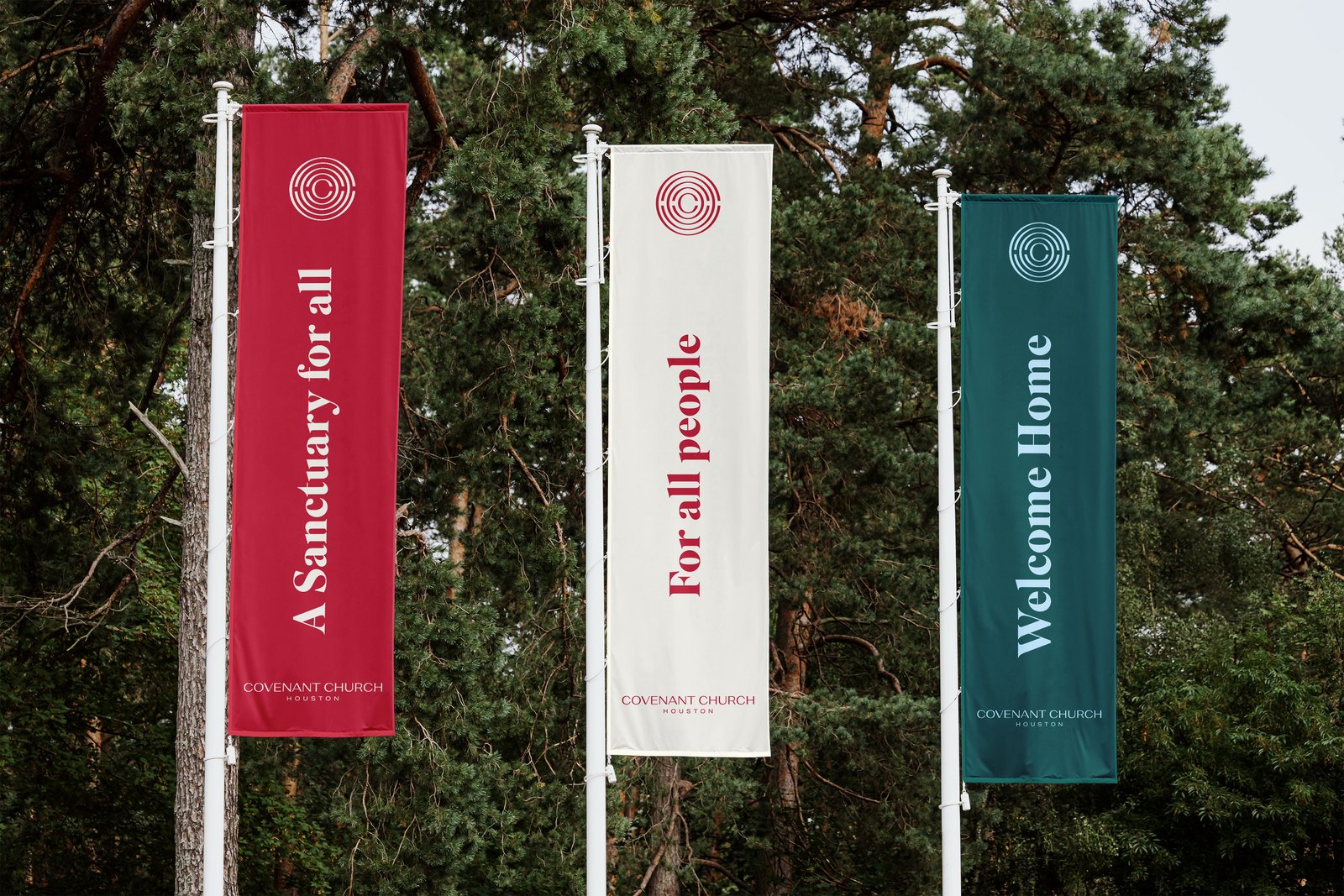
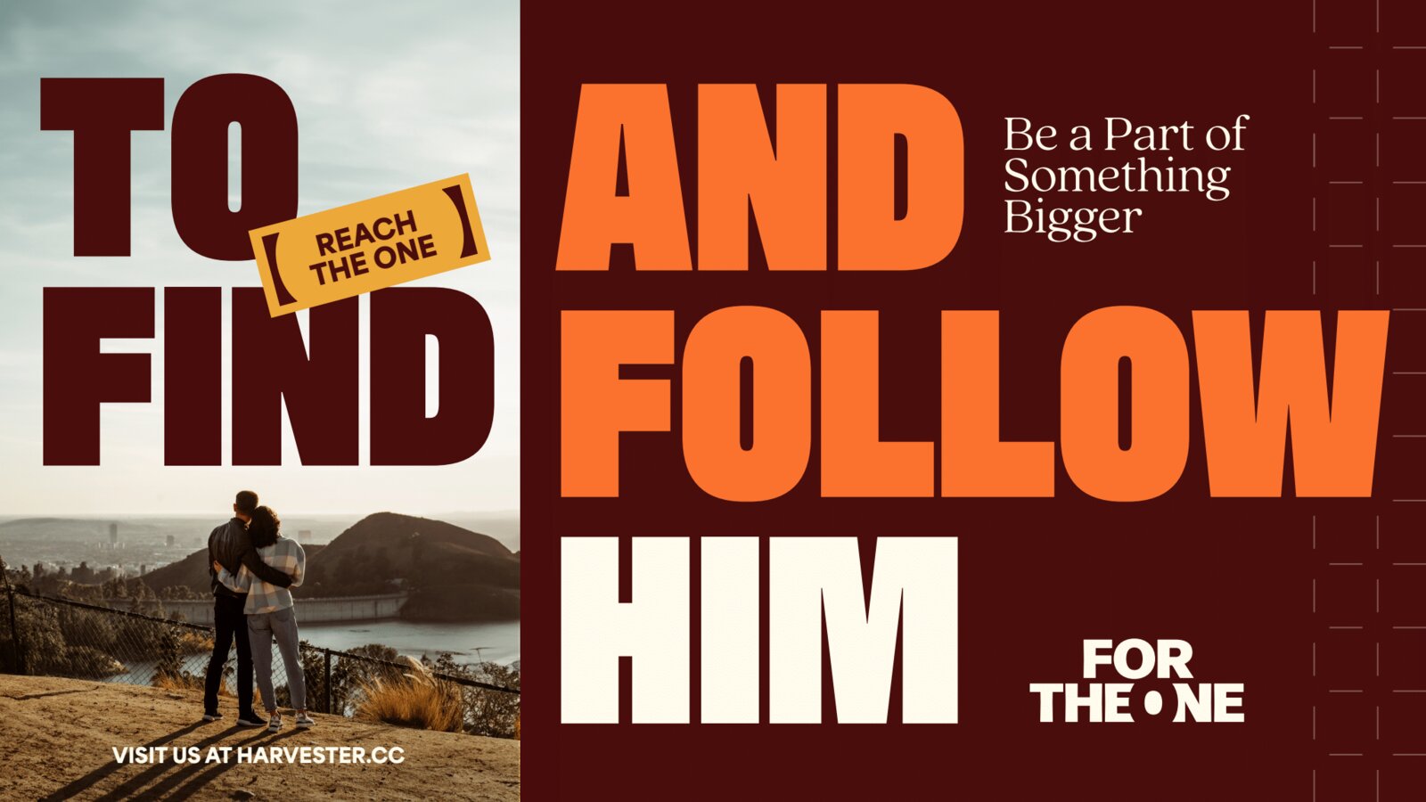
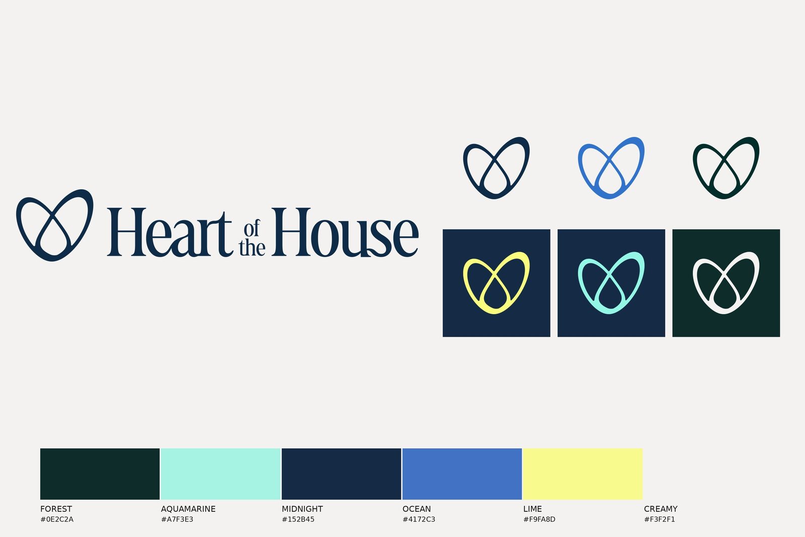
A discovery-first Brand Evolution—not a rebuild, a refinement: a sharpened icon, a color system expanded around "Harvest Green," and a new type system (Gotham Book/Medium and Castoro) built to hold up across signage, screens, and print.
YBX treated this as a Brand Evolution, not a rebuild—preserving the visual equity the congregation already recognized while fixing what no longer worked at scale. Two full creative directions were presented before landing on the final system, so the outcome was a deliberate choice, not a default.