Abode's brand was built to feel like coming home. The kids' side needed to feel like an adventure without leaving the house: playful enough that a kid would pick it, and still Abode when a parent reads it.
We didn't design a mascot and hang the ministry on it. We started from the parent mark, kept the A, and let it pitch a tent. The face came after the structure, which is why it still reads as Abode from across a parking lot.
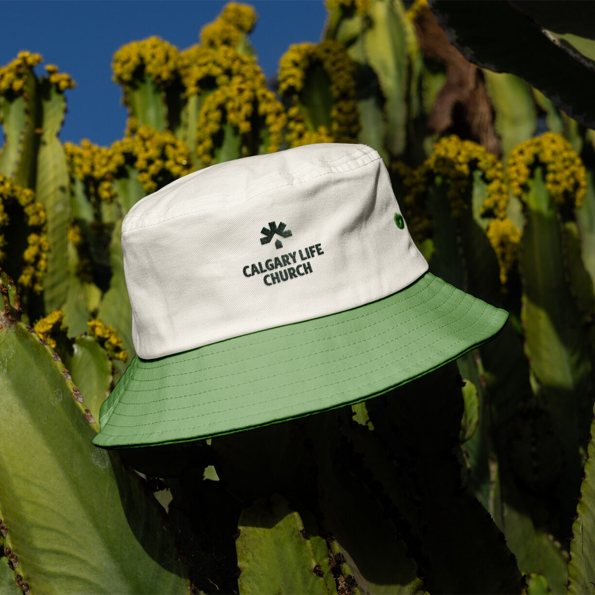
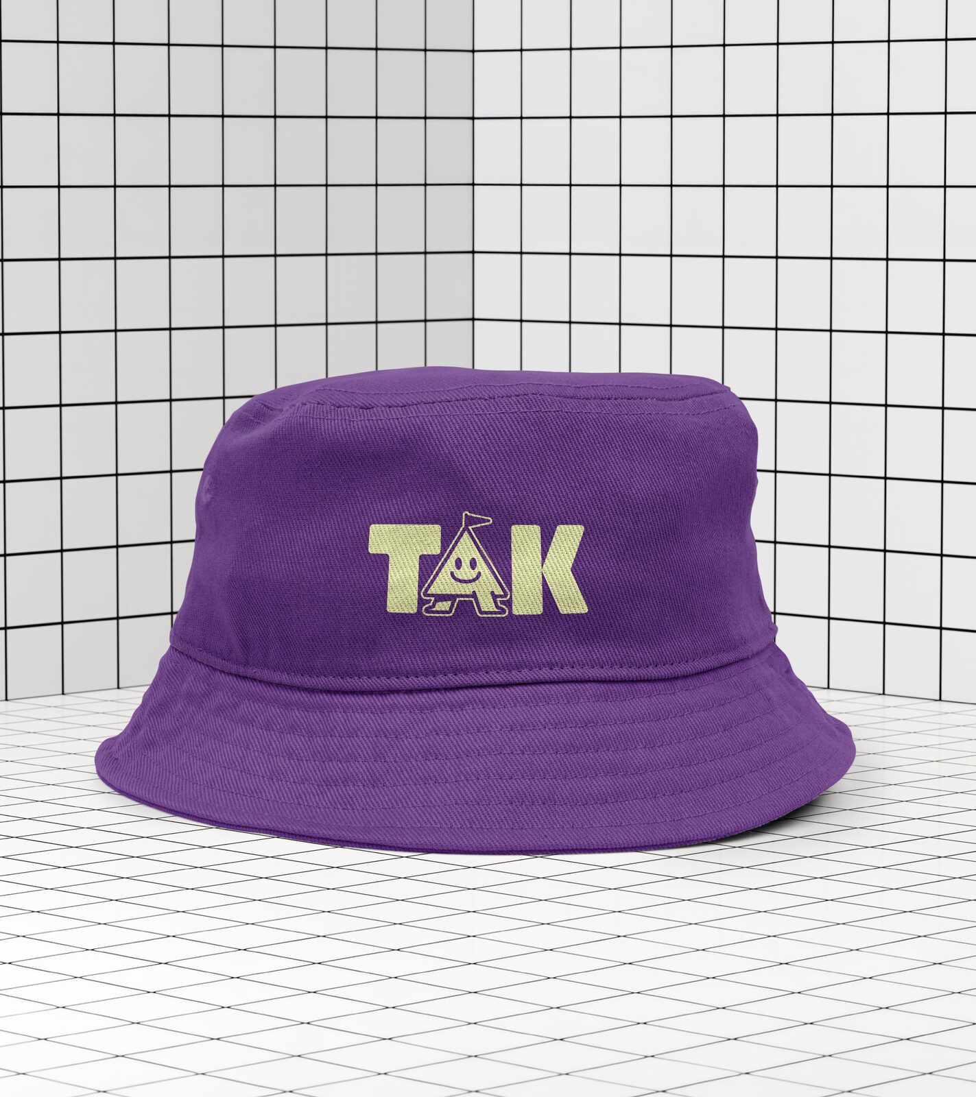
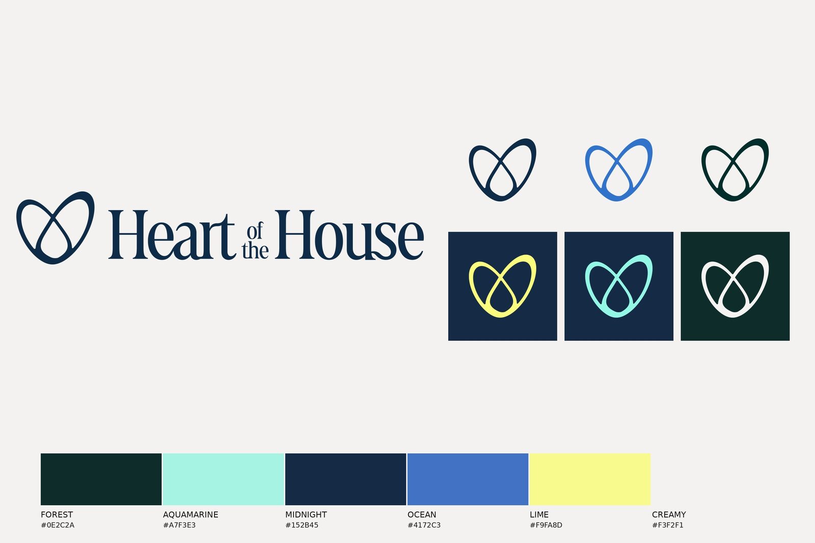
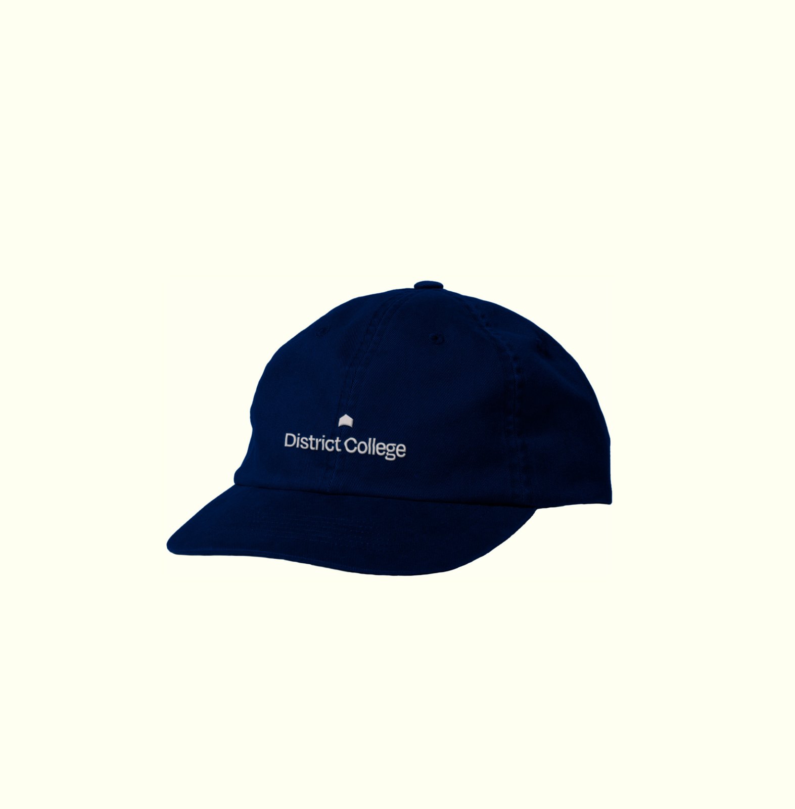
Six colors, each with a job: Deep Purple and Bright Orange lead, Fresh Green, Honey Yellow, Sky Adventure, and Soft Lilac fill in. The logo comes as an icon, initials, a wordmark, and a lockup, in all six, so a flag, a sticker, and a bucket hat can each pick the one that fits.
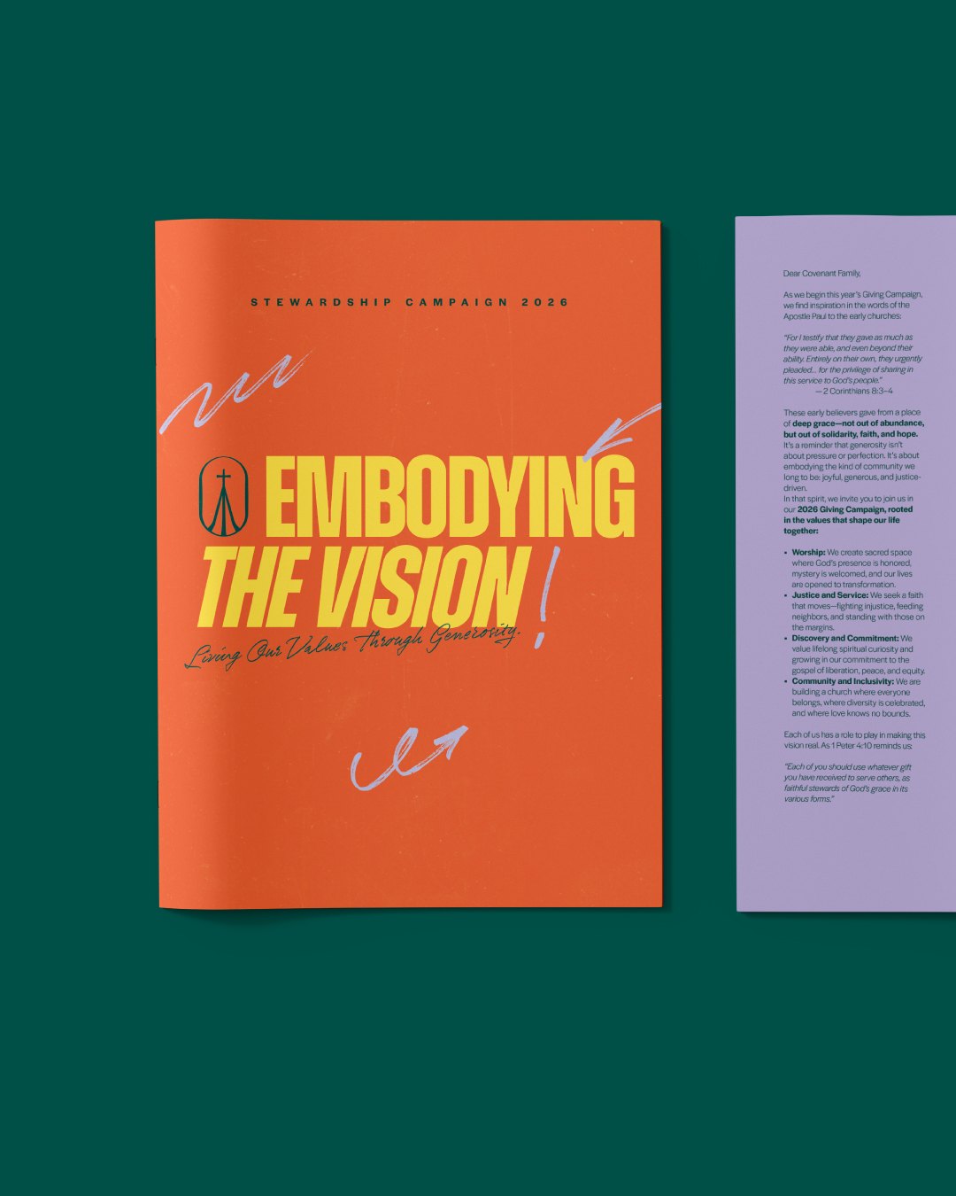
Logo, color, and type get a brand to baseline. The elements are what make it play: a set of faces and a family of shapes that can carry a piece on their own, with the logo out of the frame. On the brochure the face is the cover. That is the part a kid reaches for first.
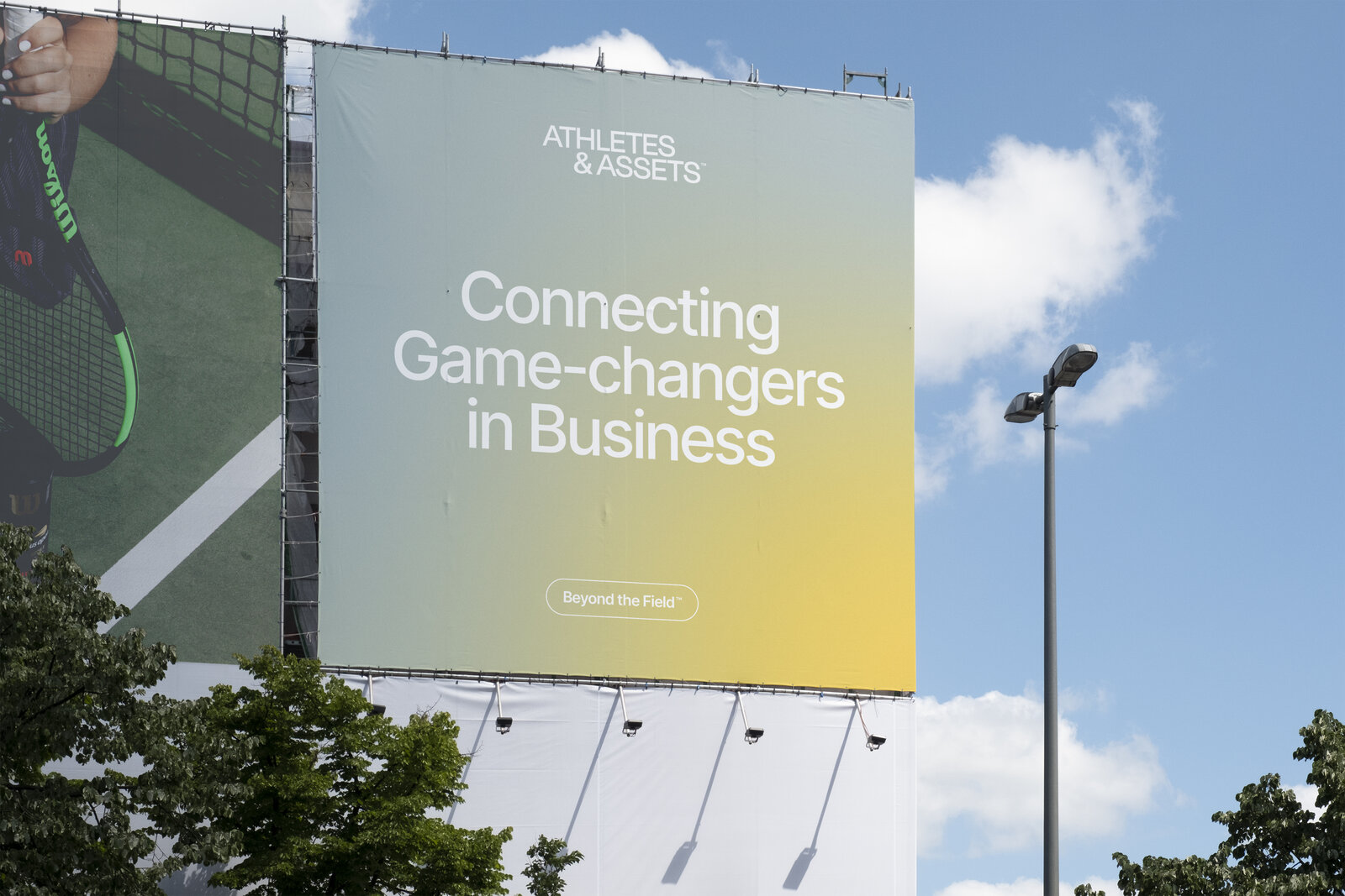
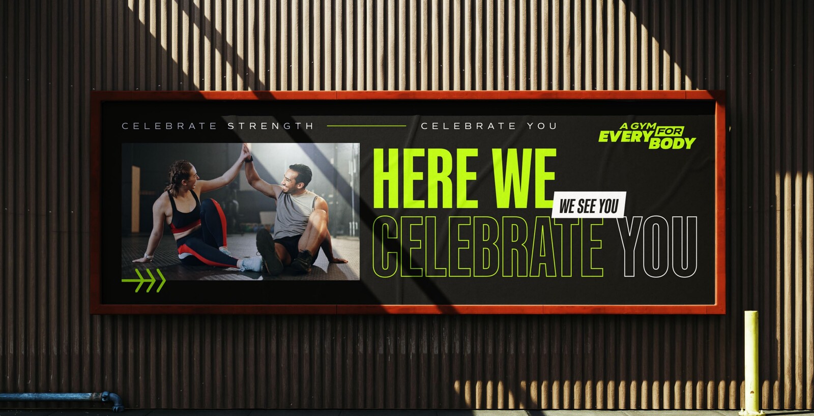
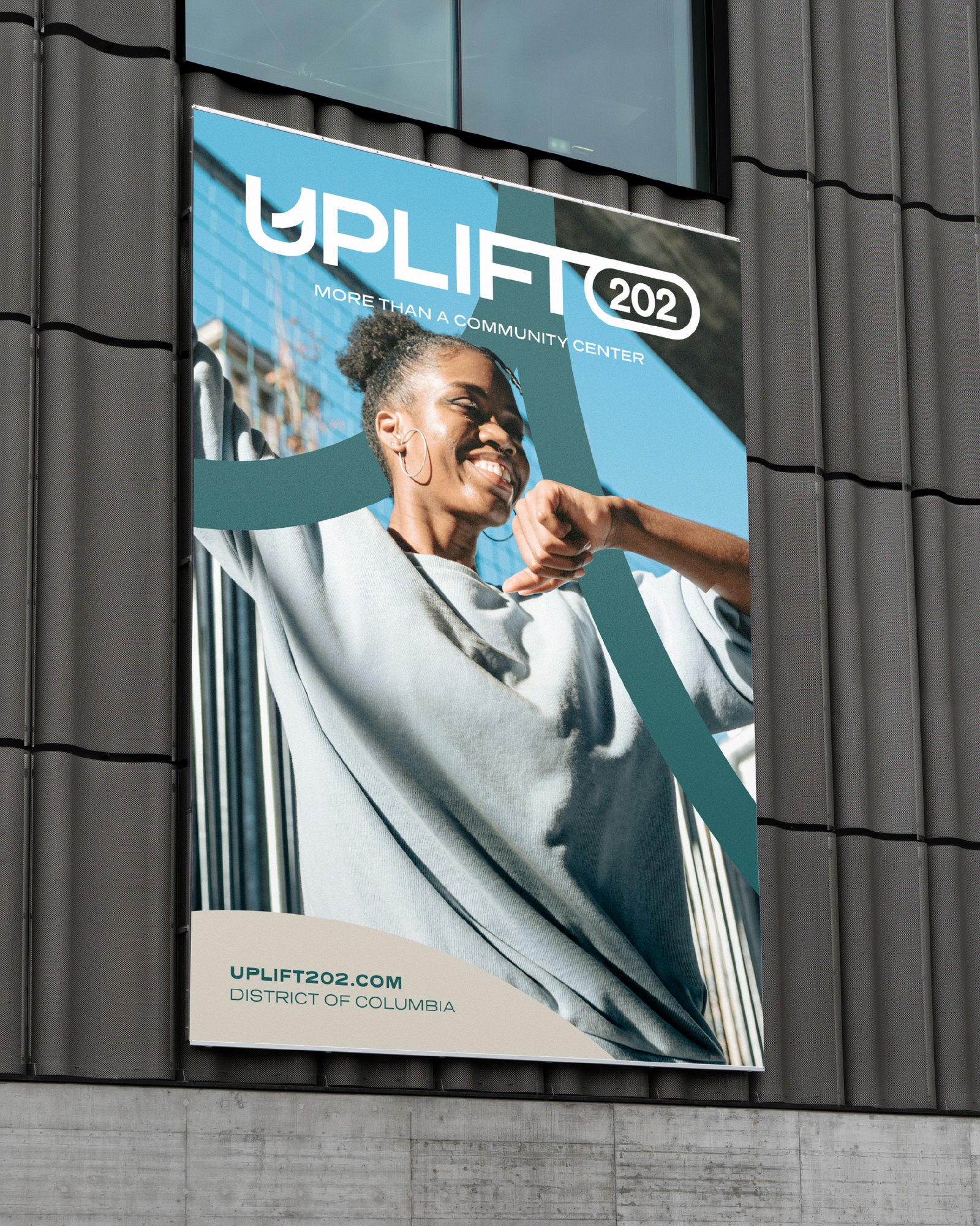
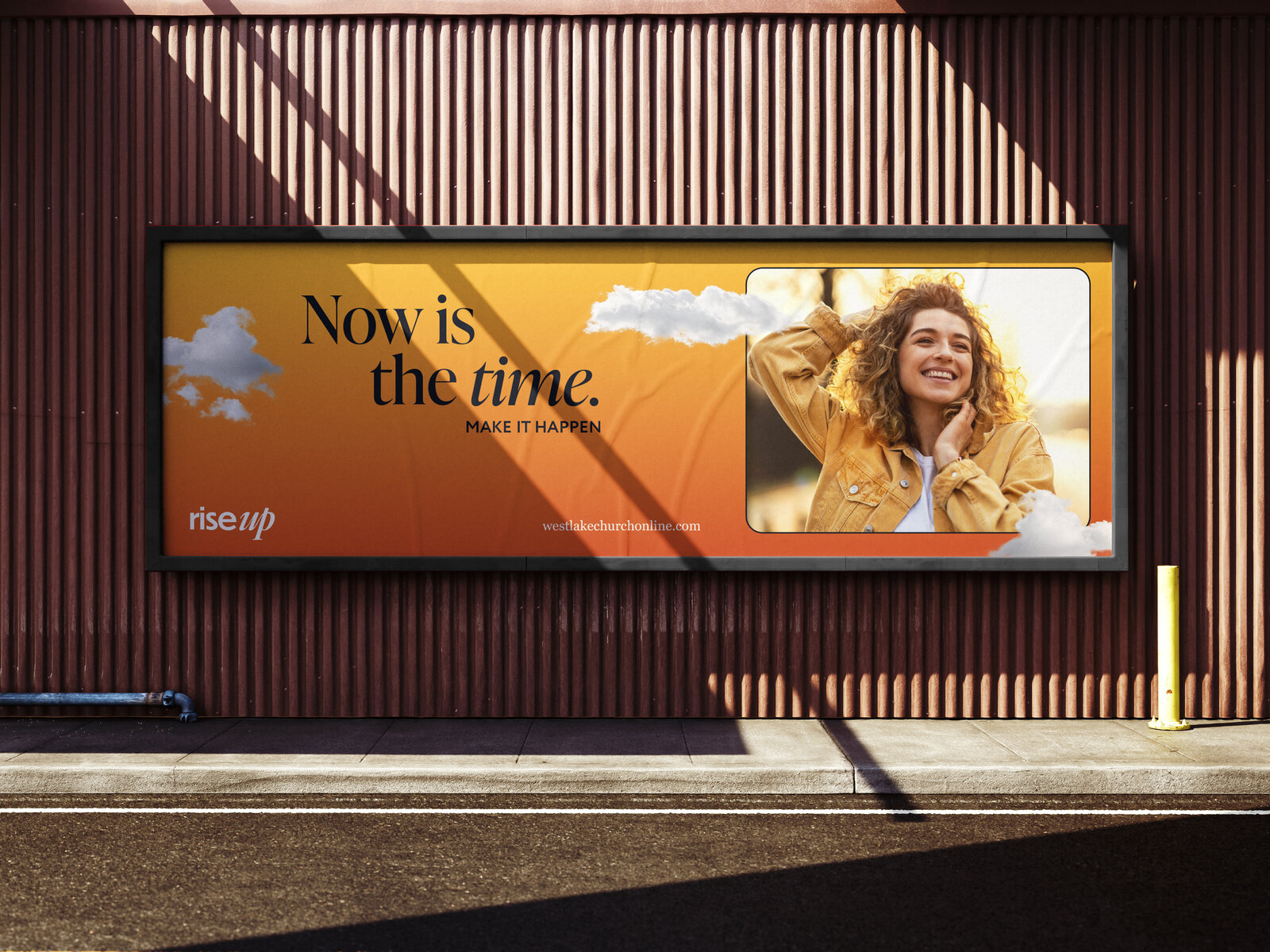
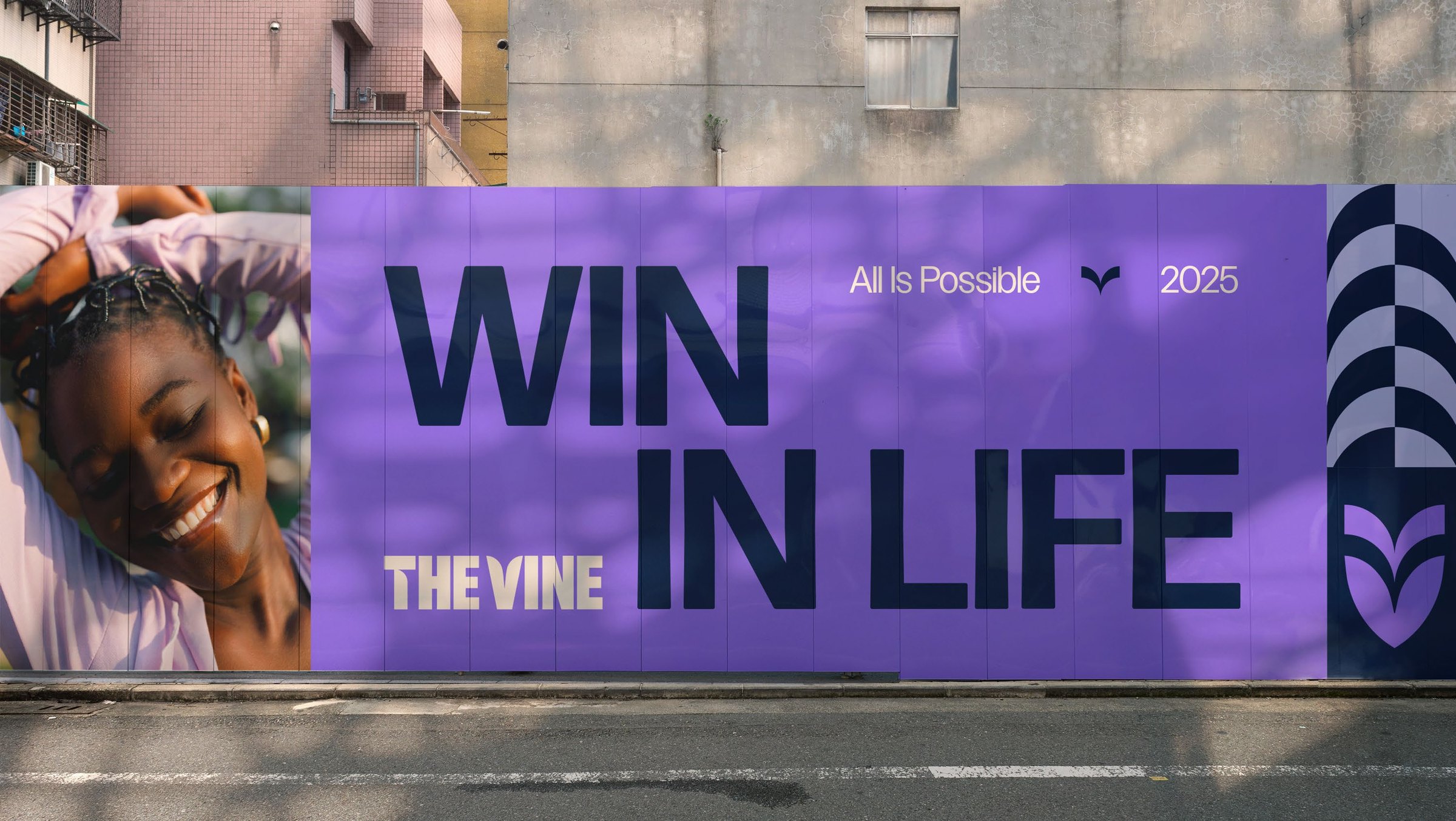
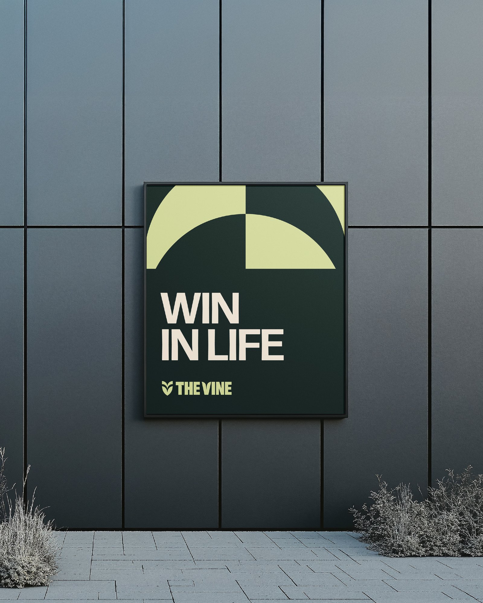
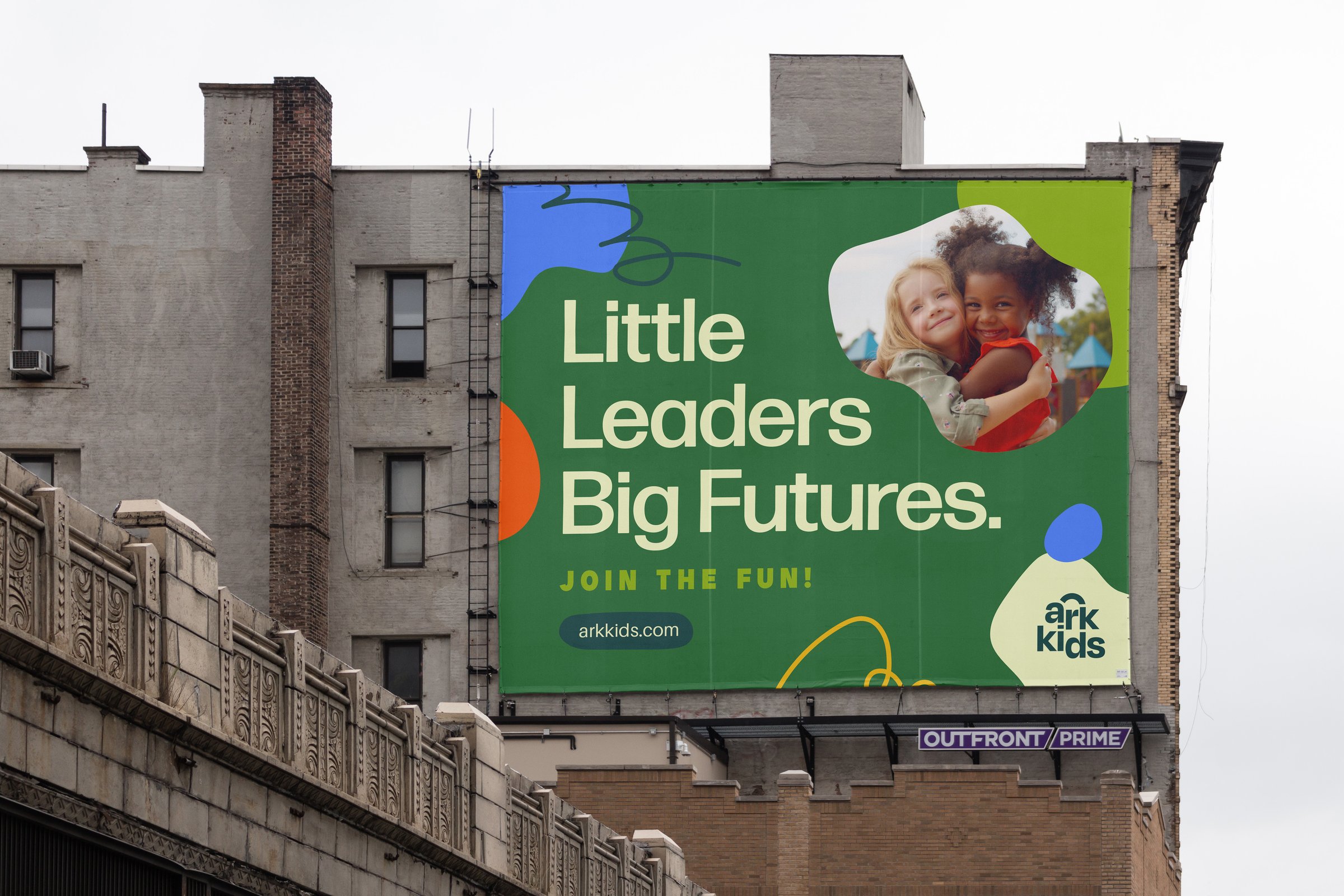
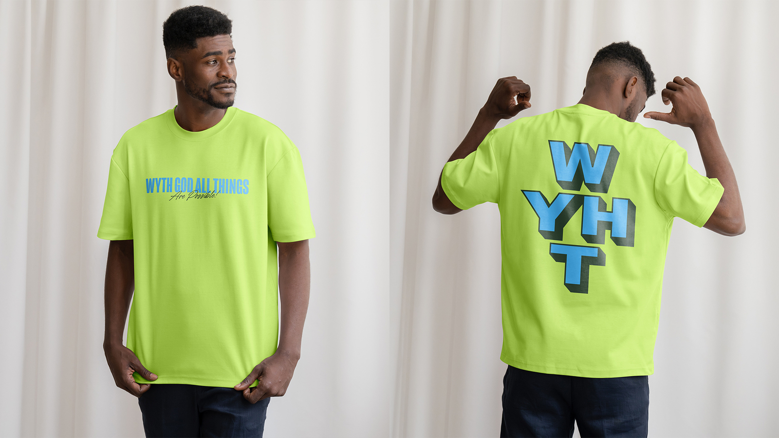
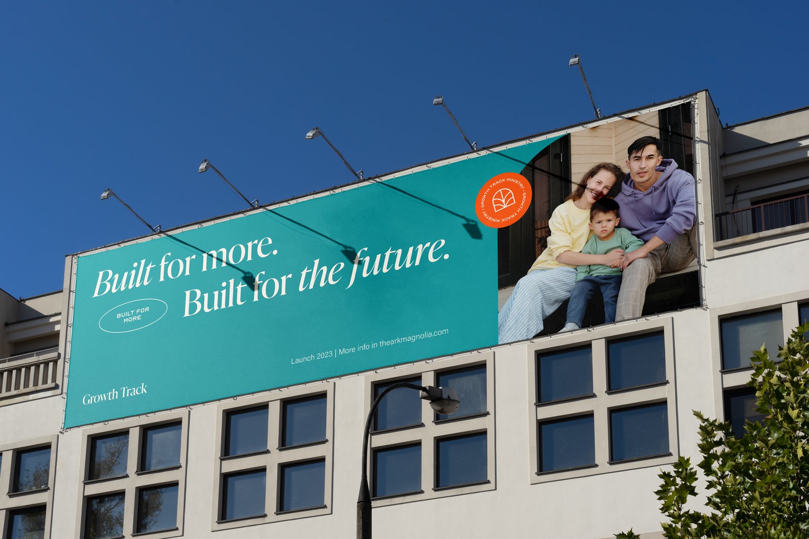
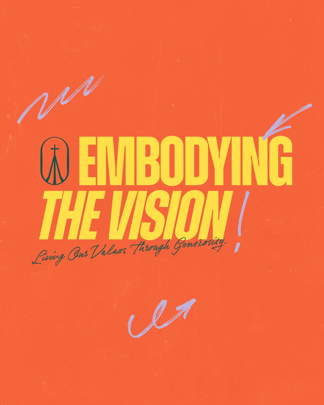
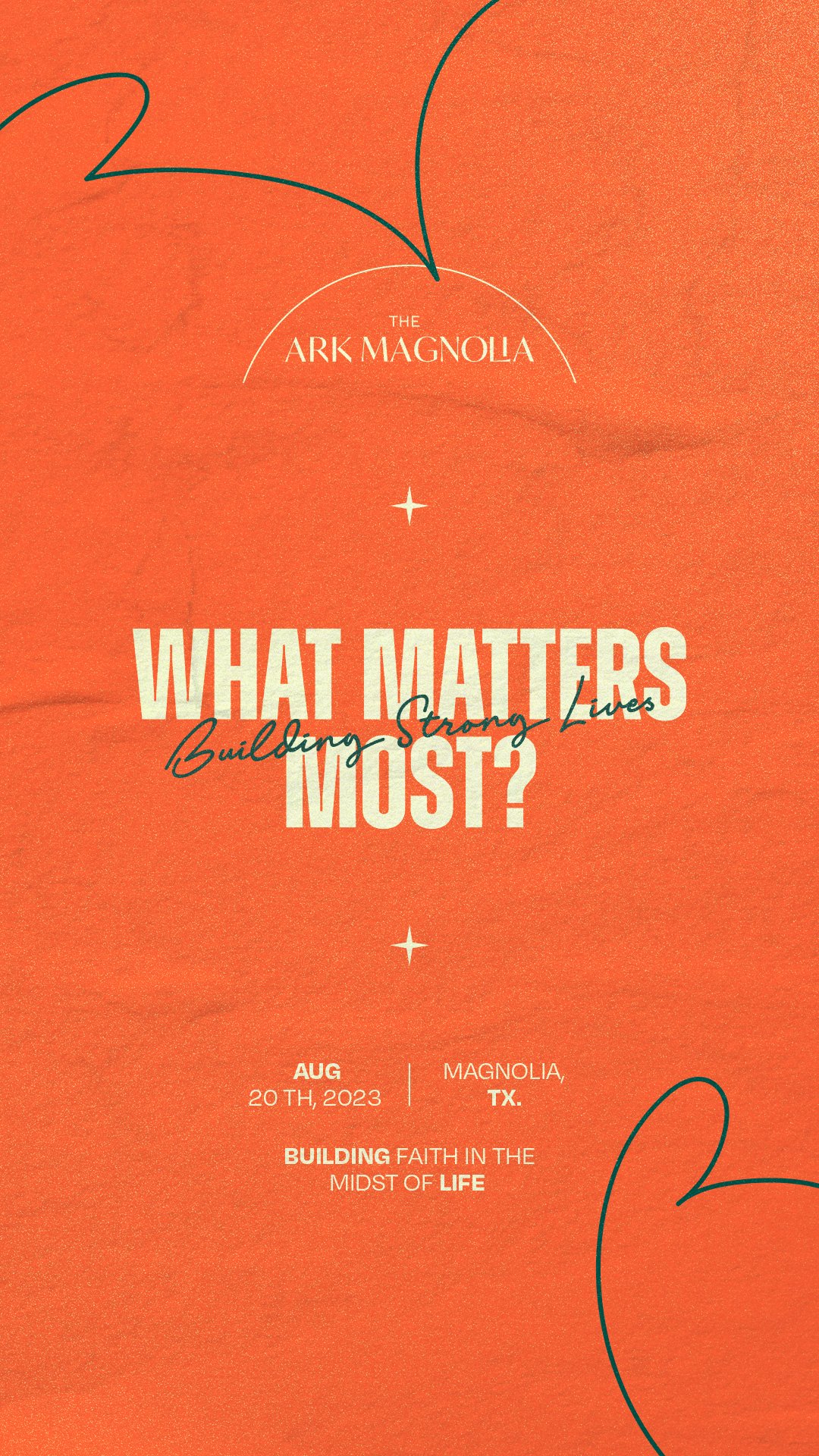
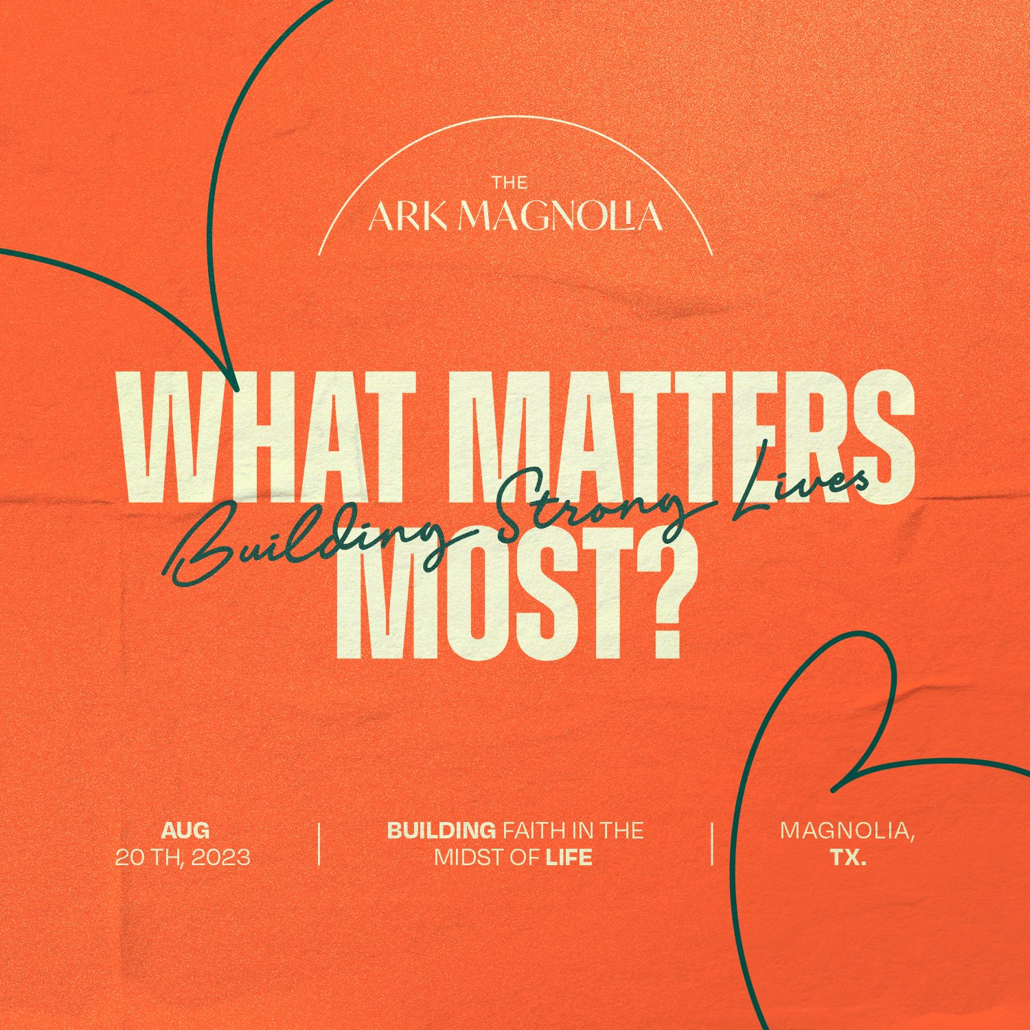
The lines carry it. "Faith is our Greatest Adventure." "Safe to Grow, Free to Shine." "Little Hearts, Big Faith." "Play, Learn, Follow Jesus." They run across a billboard, a brochure, a coloring sheet, stories, tees, and buttons, and every one of them sits next to the parent brand without a fight.
This is perfect. We love it so much.
Sub-brand identity: tent mascot, icon, initials, wordmark, and lockup in six colorways.
Six-color palette and type system; Brand Style Guide and logo formats (RGB, CMYK, favicon).
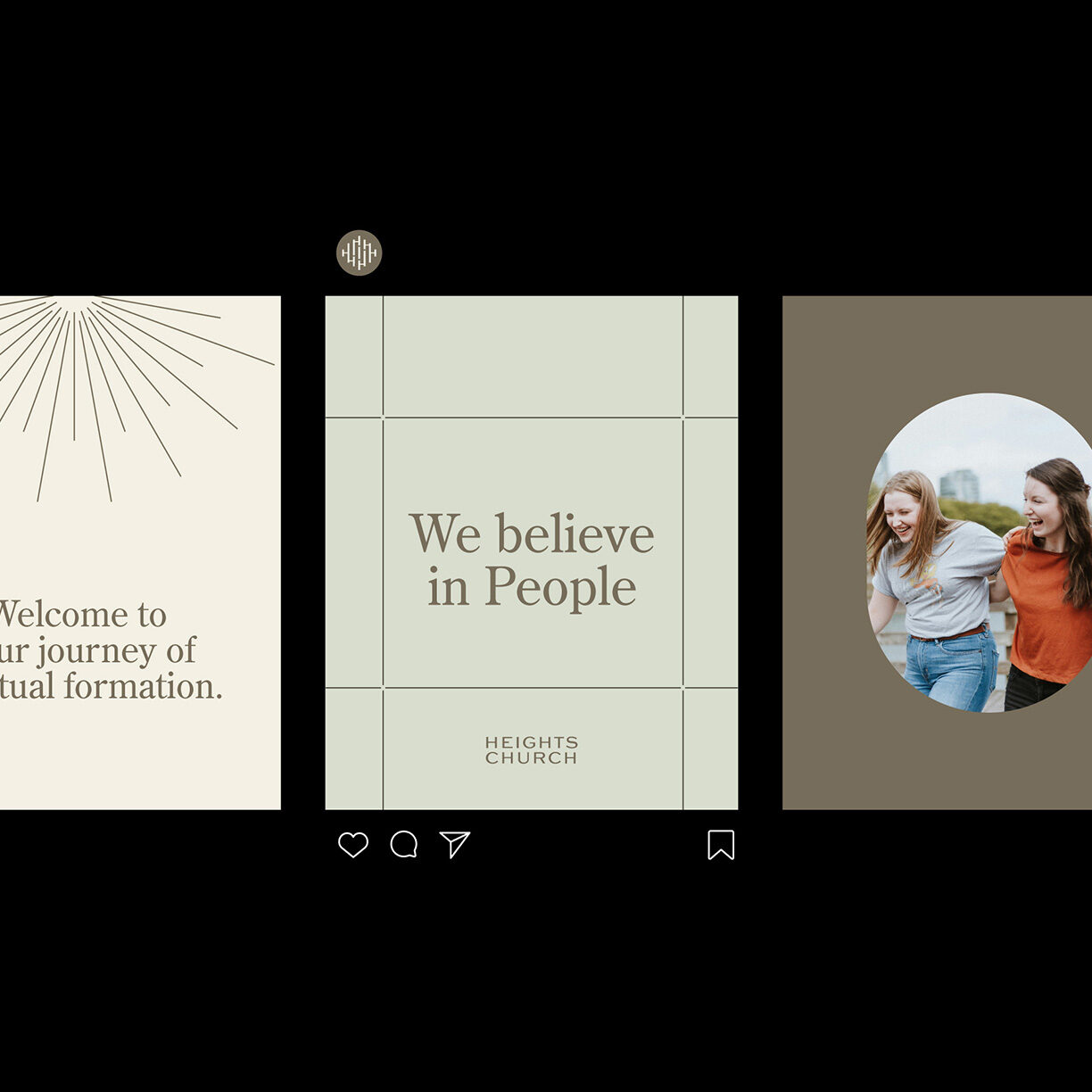
Social outlets: profile and cover art for Facebook, Instagram, and X.
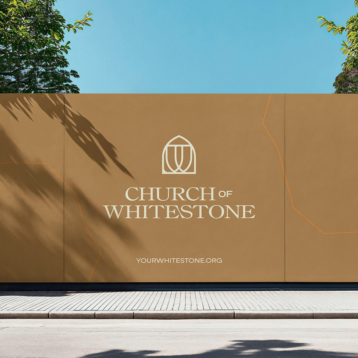
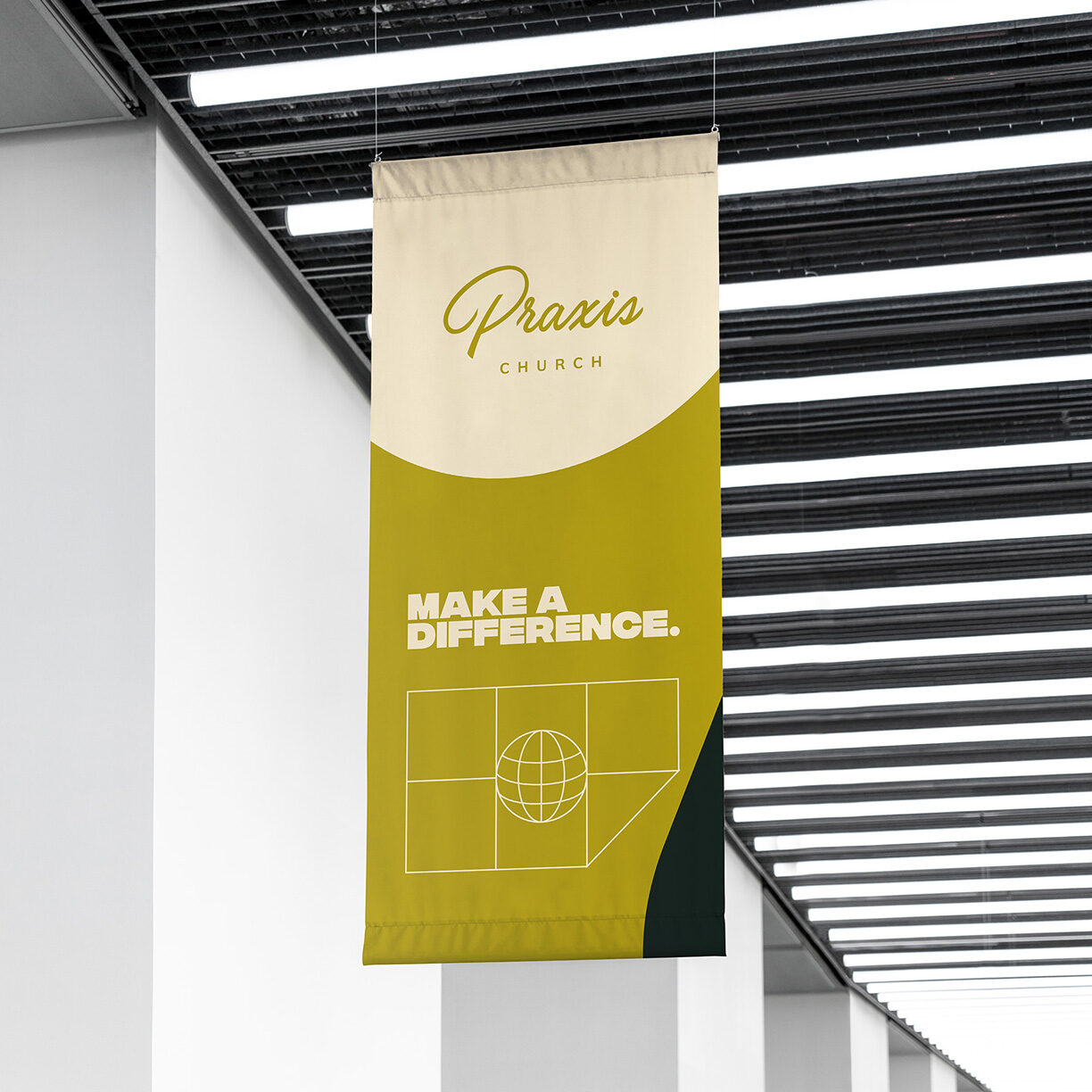
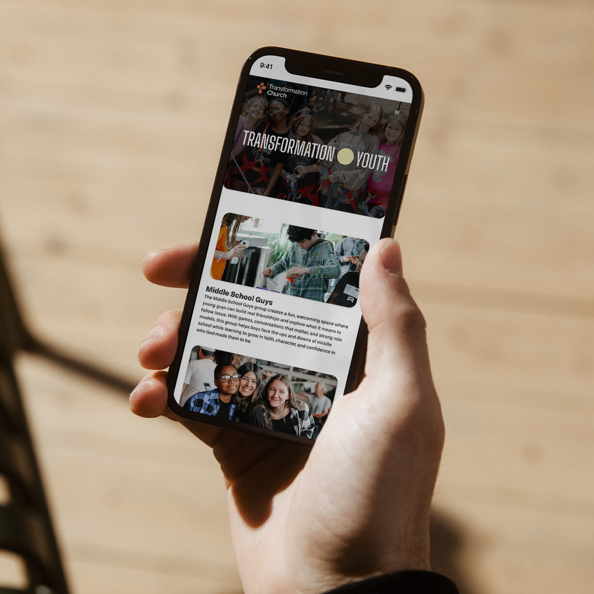
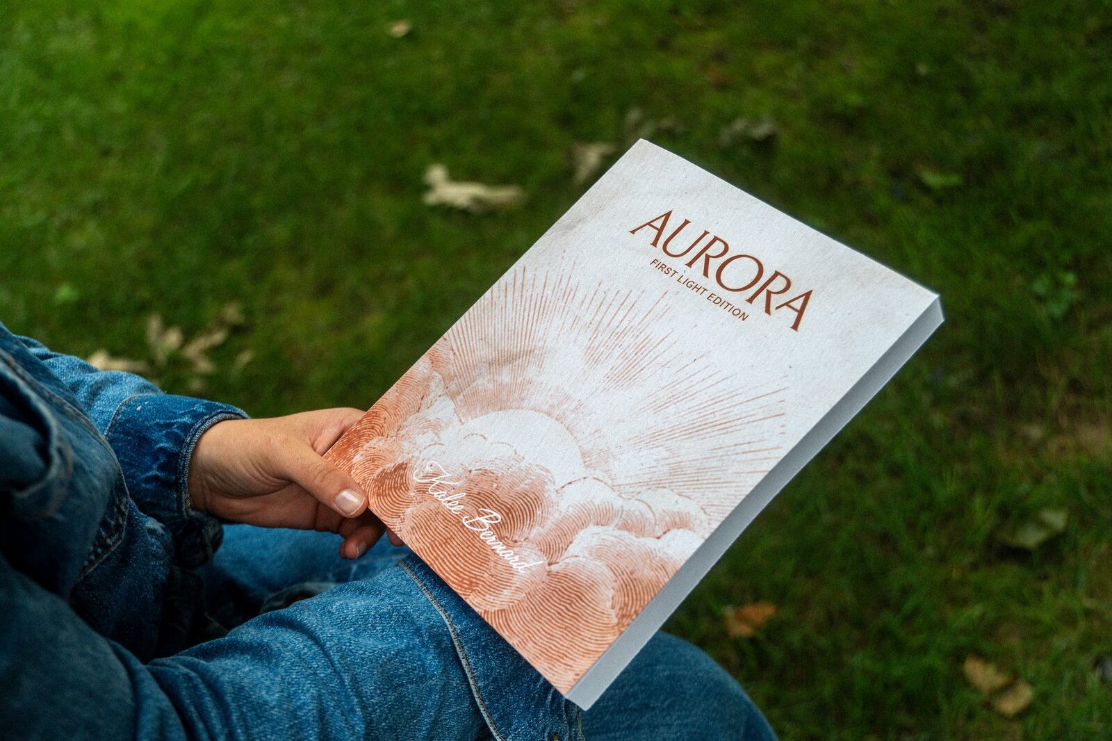
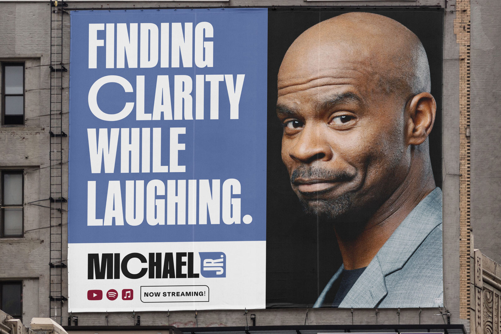
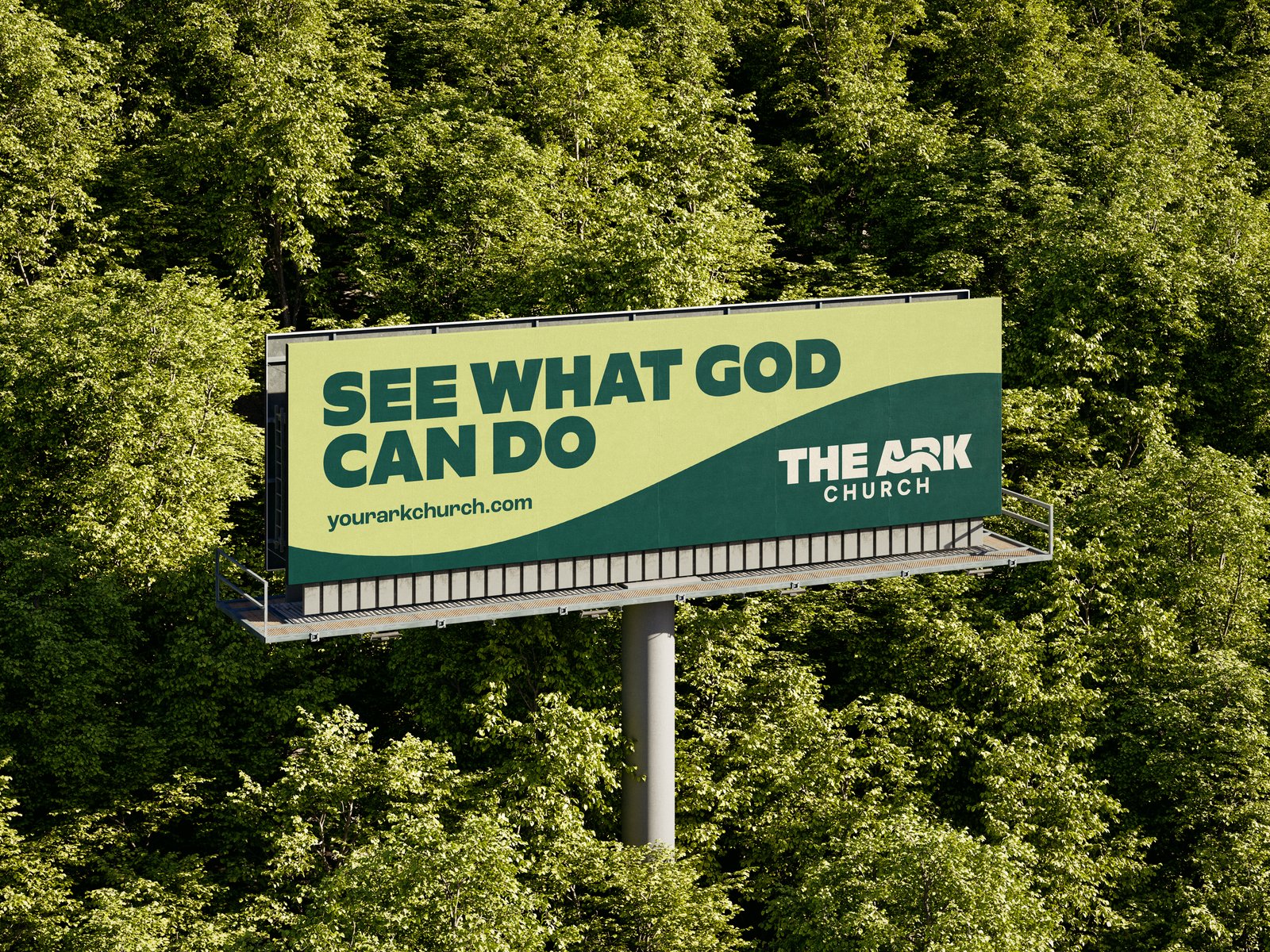
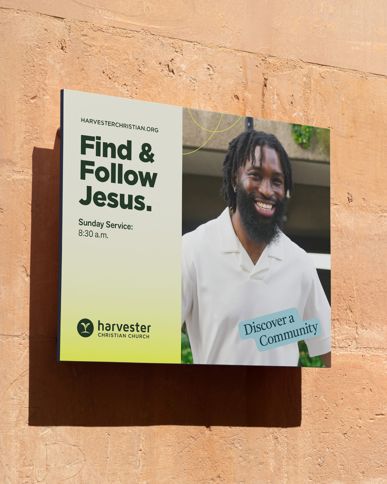
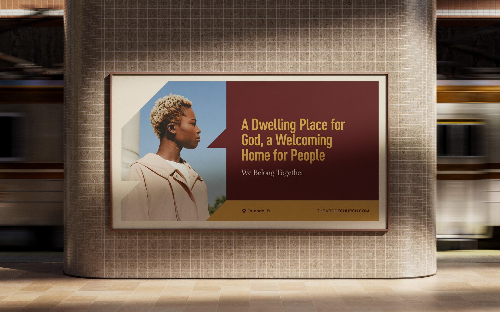
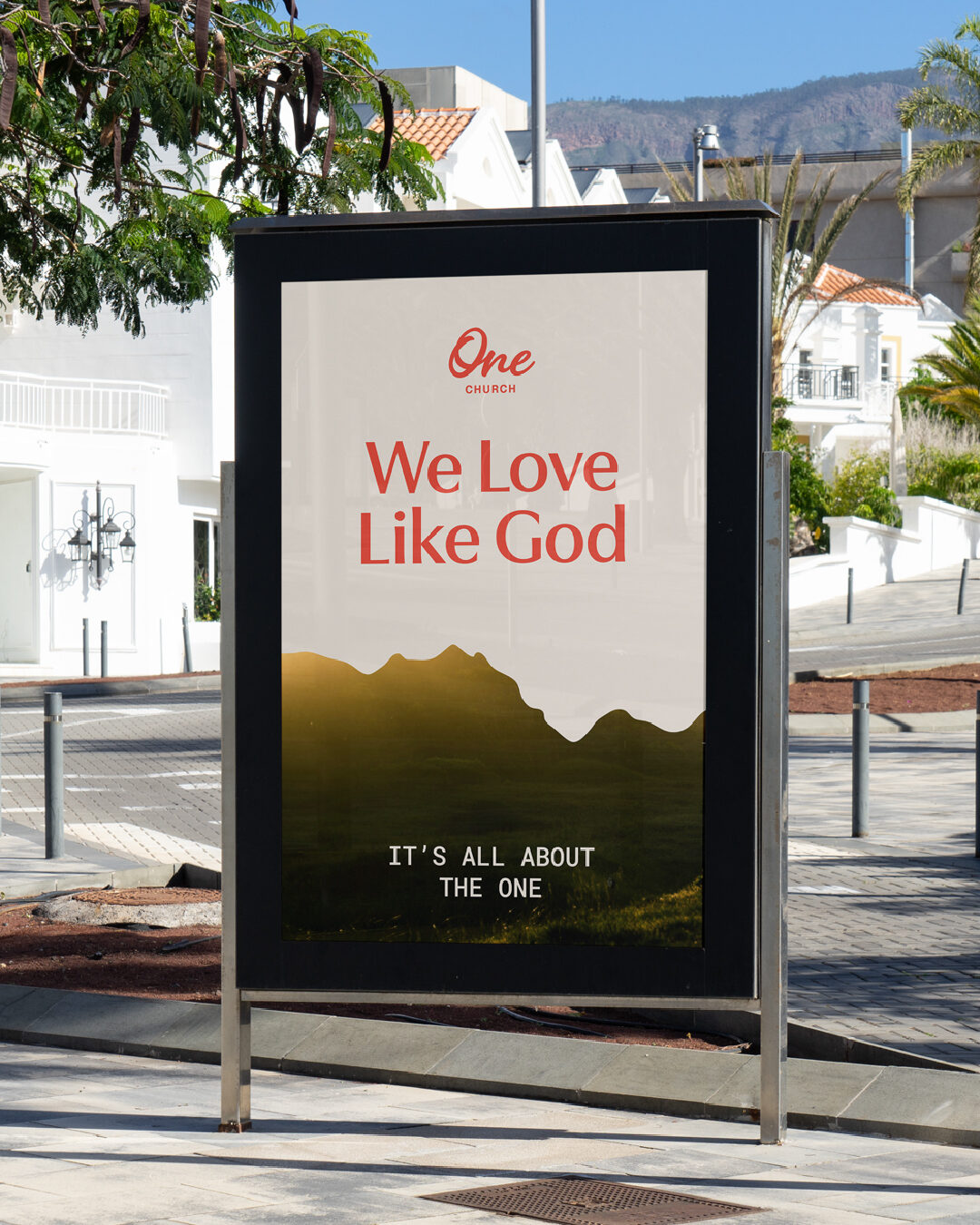
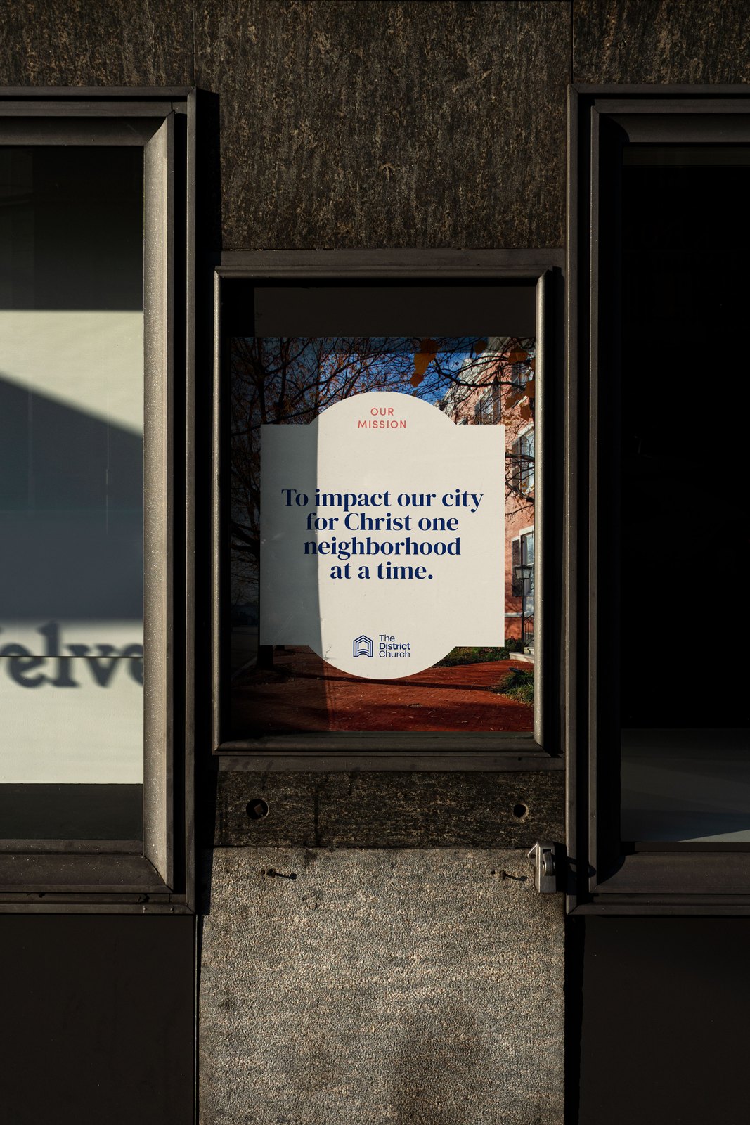
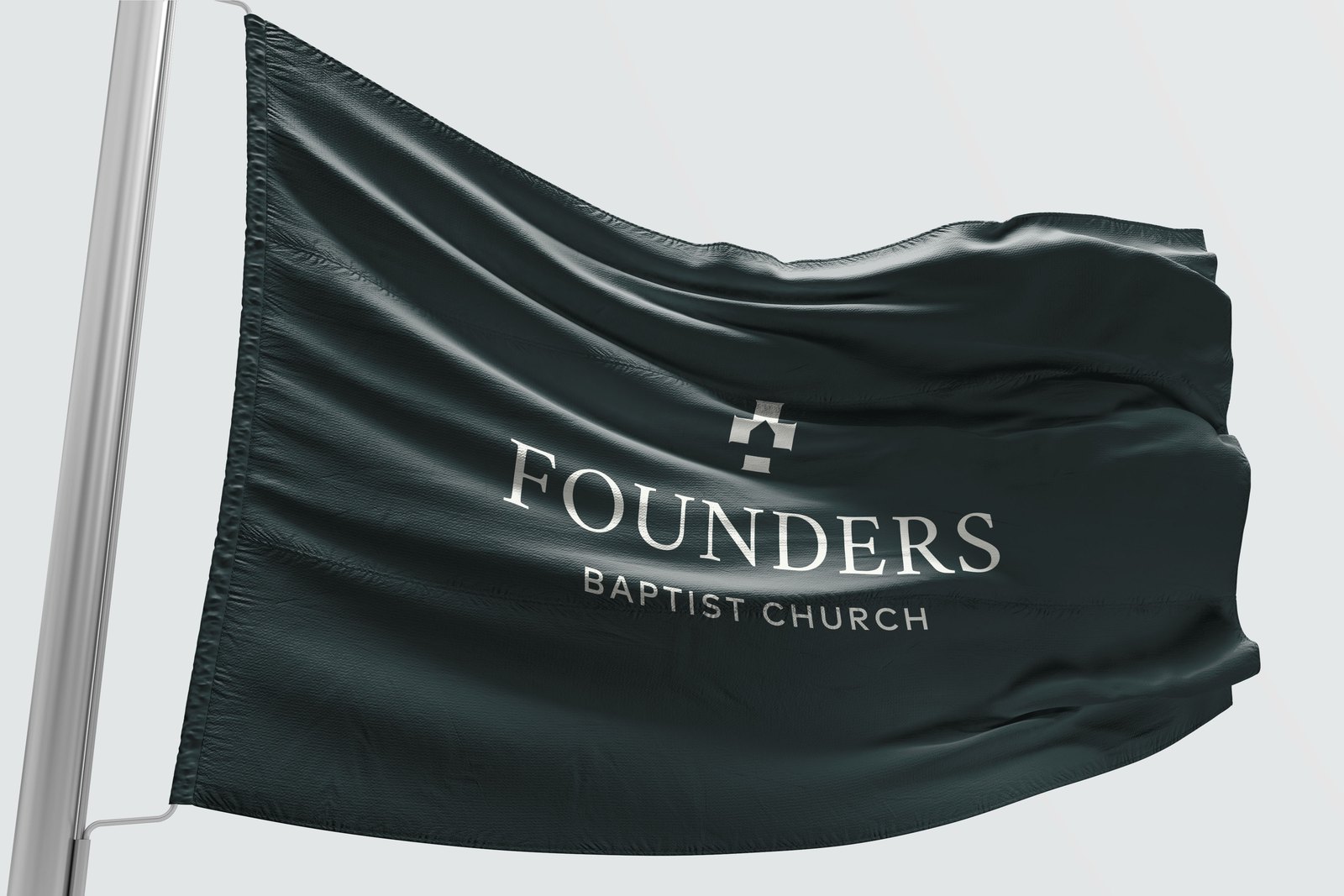
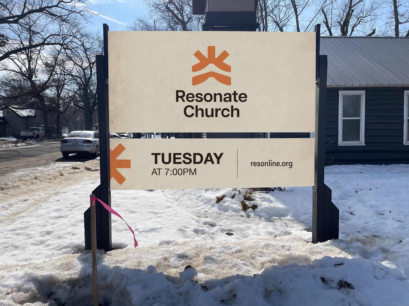
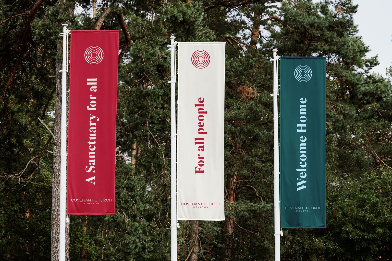
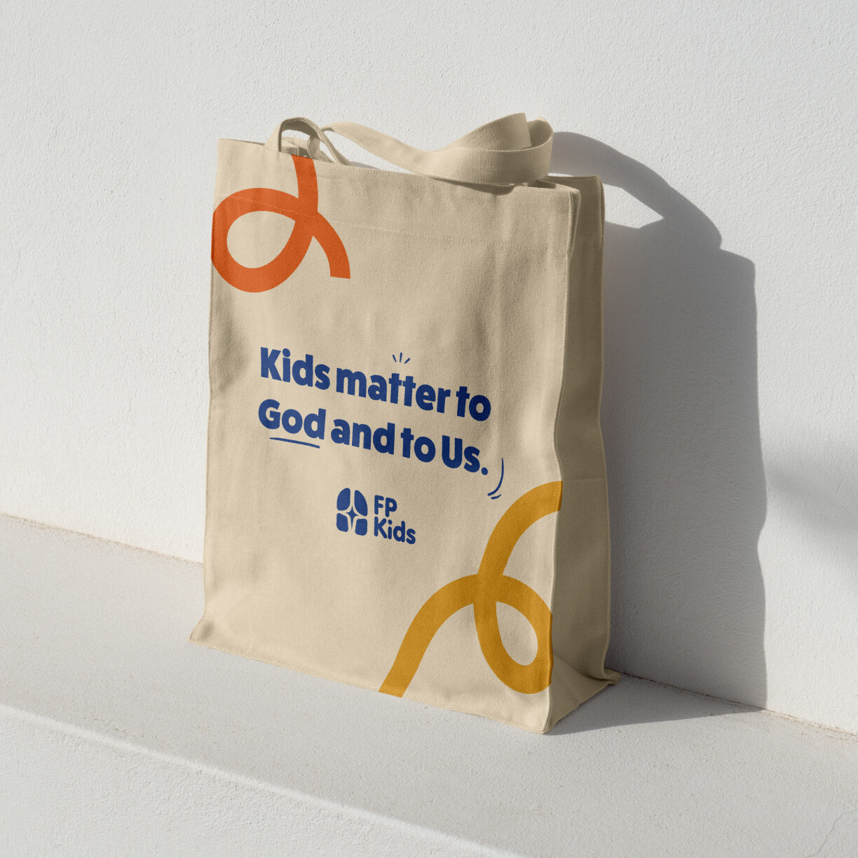
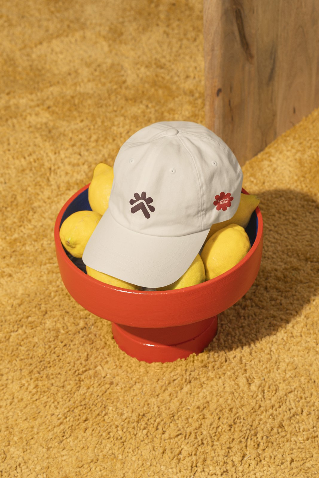
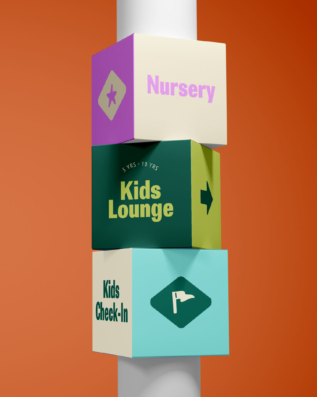
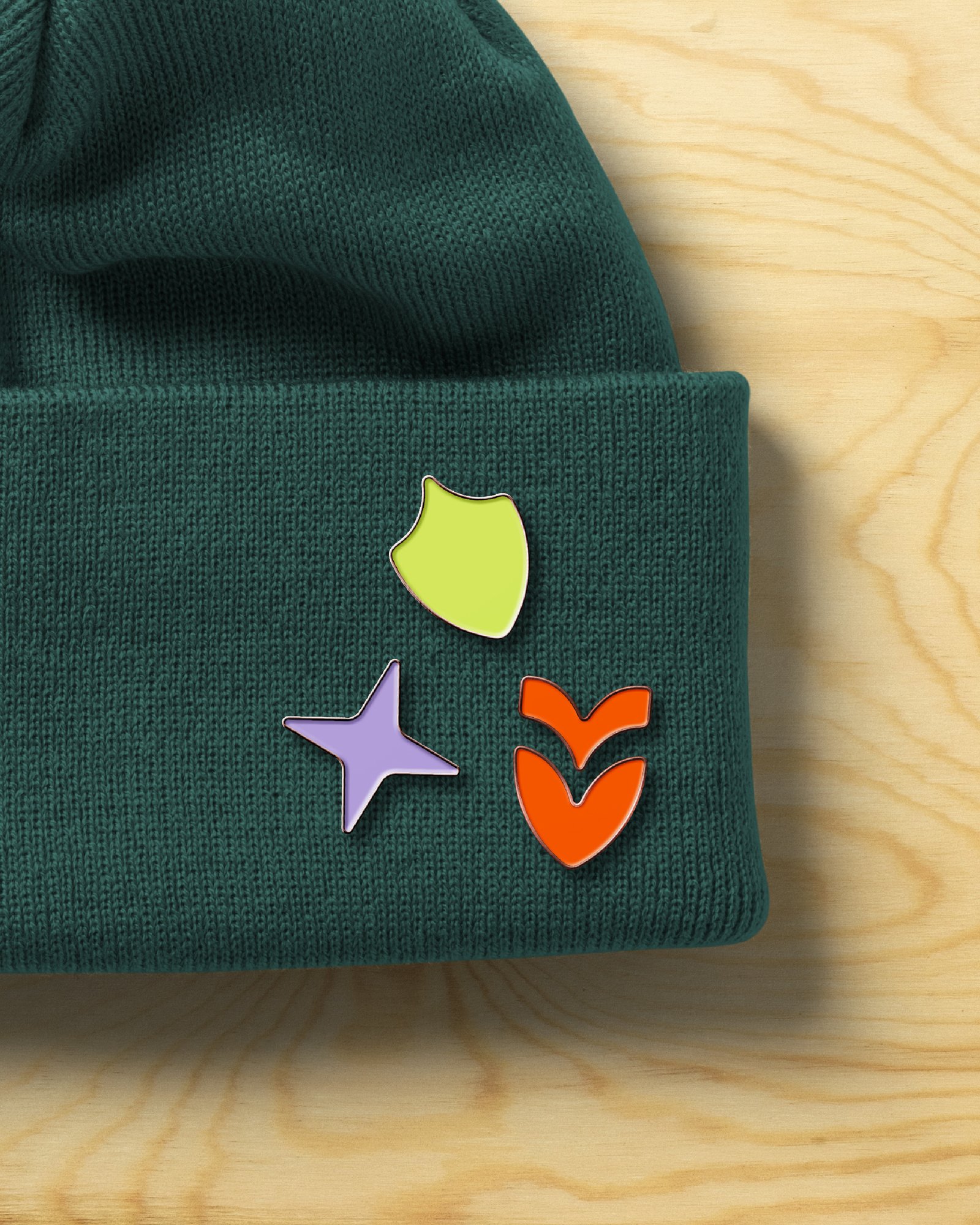
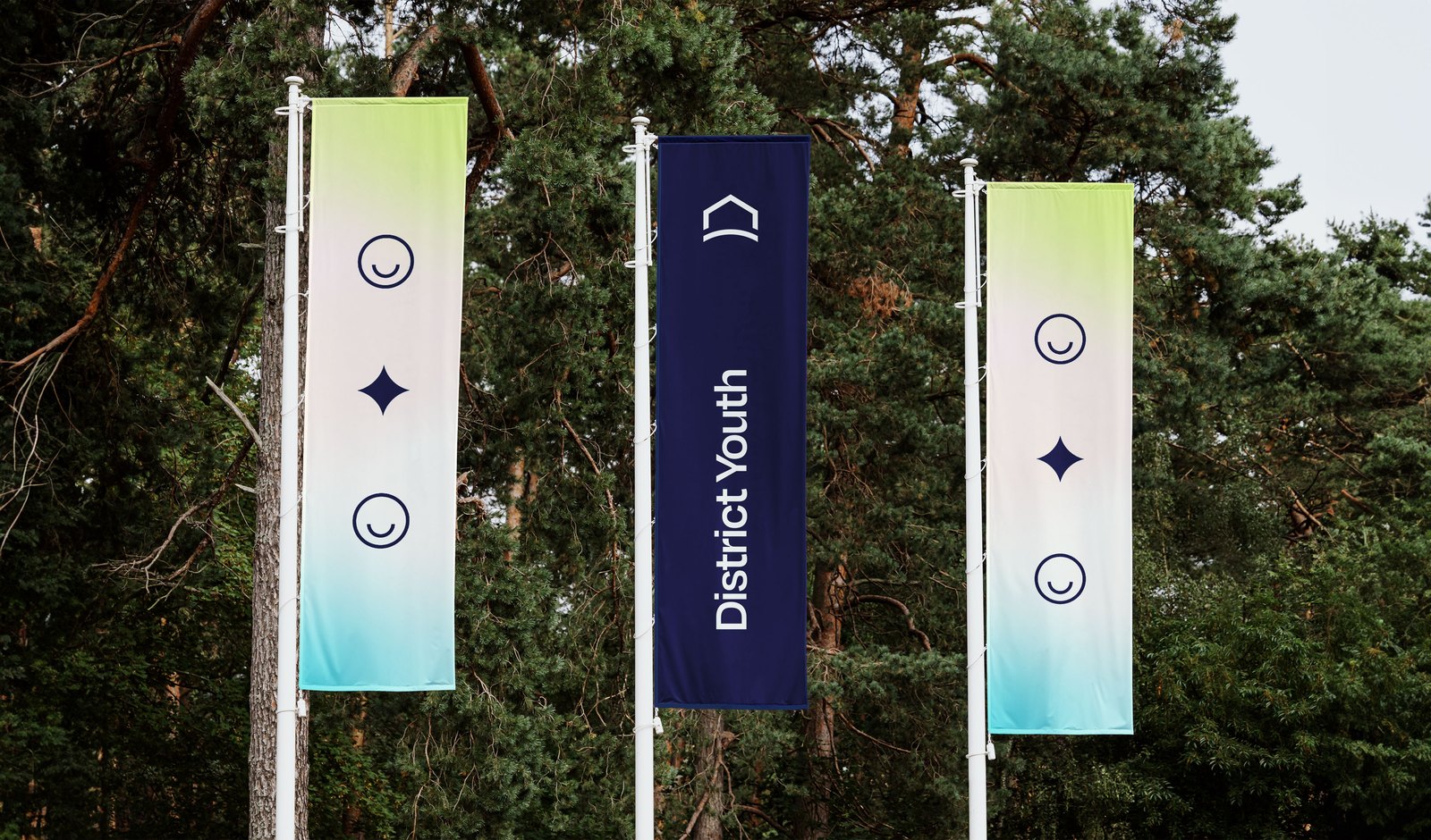
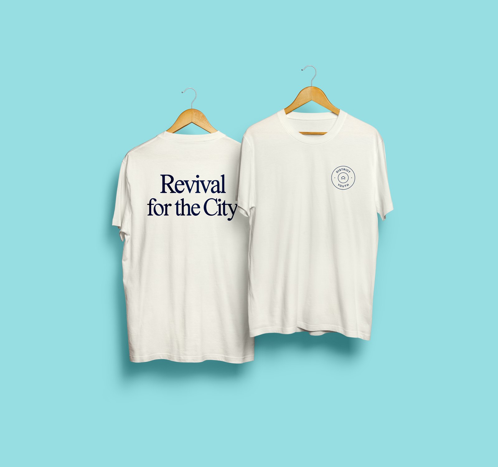
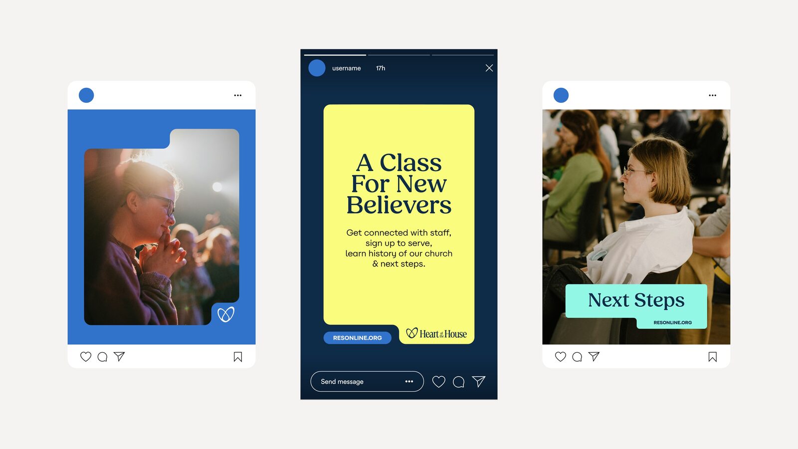
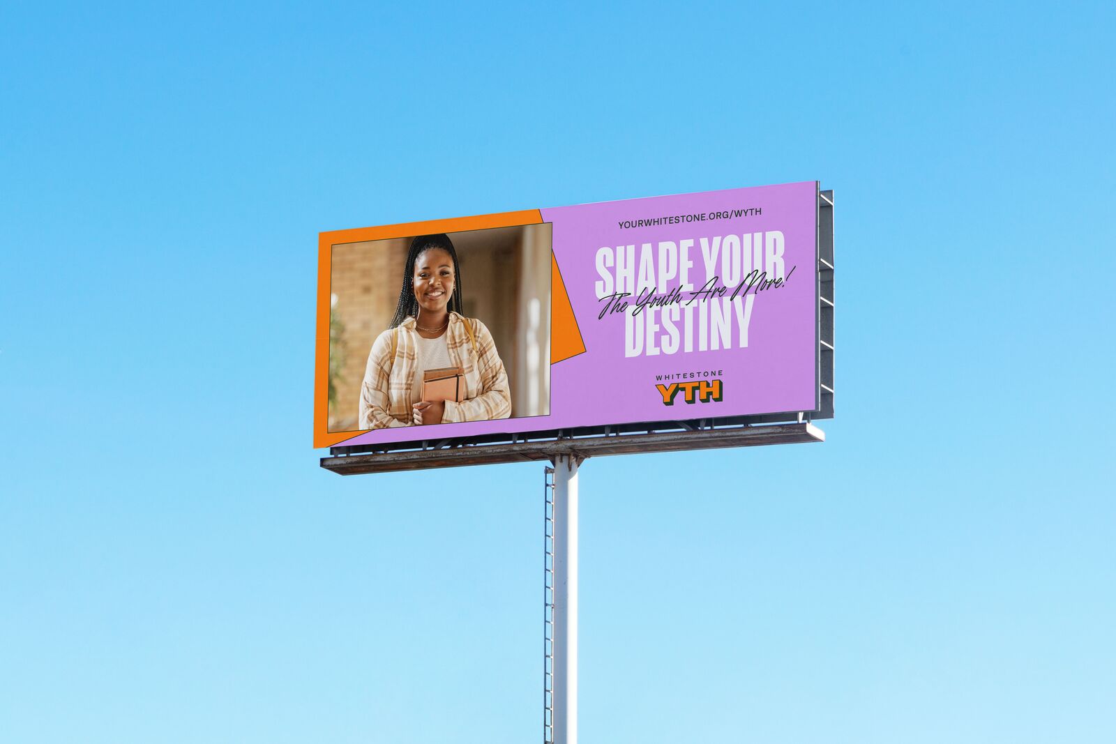
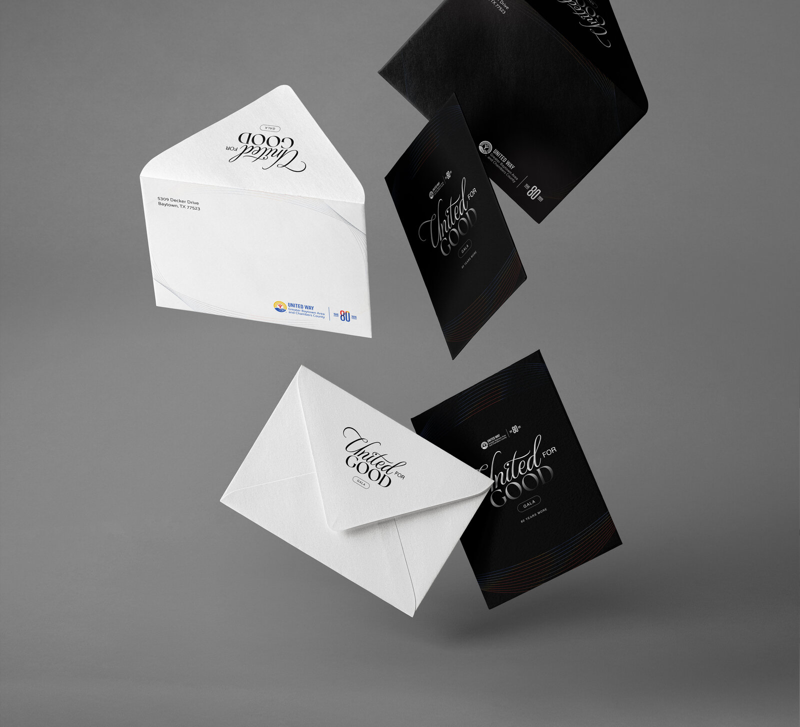
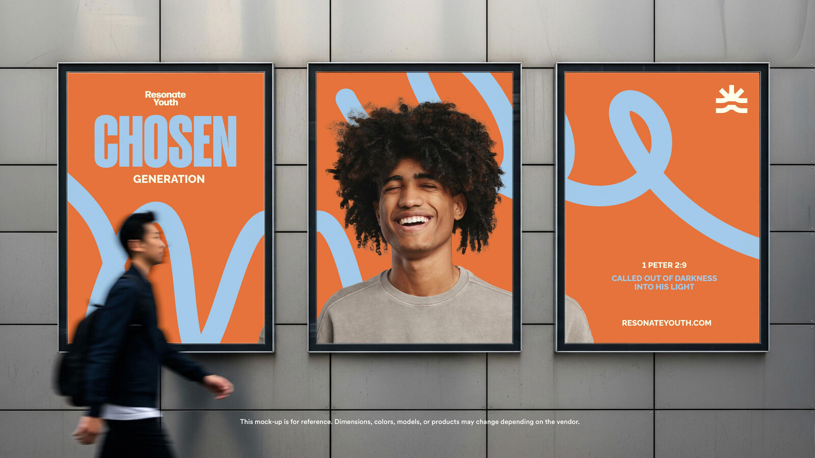
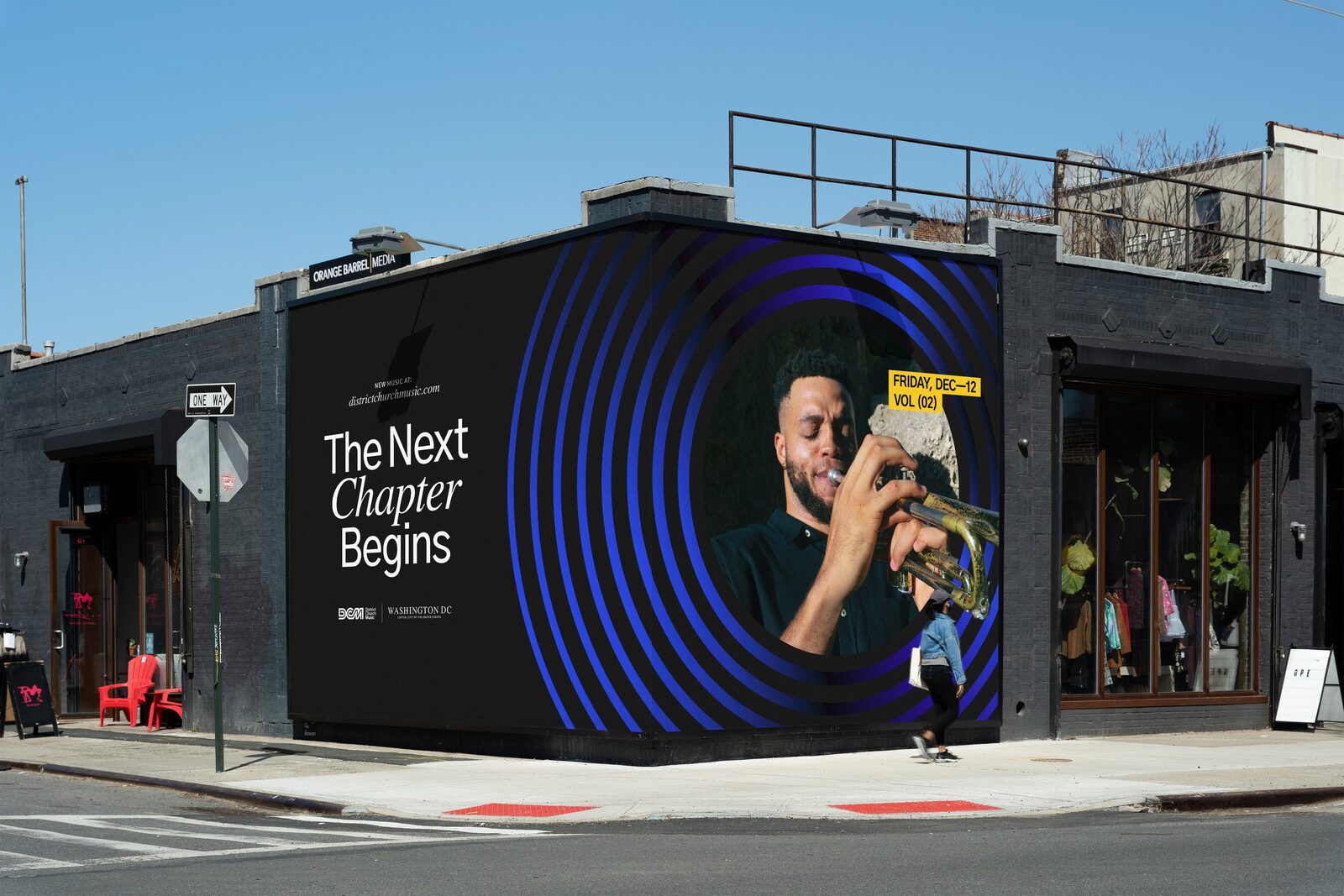
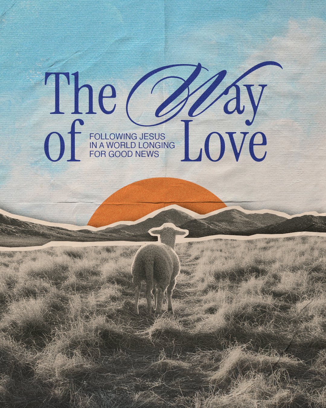
Applications: billboard, brochure, flag, stickers and buttons, tees, bucket hat, Instagram stories, coloring sheet.










This is perfect. We love it so much.
Leilani Ming, on the Abode Kids identity, July 2026


