A church we have served since 2012 was opening a seminary. The request came in March 2026. It needed an identity with the weight of a school and the family resemblance of the church, ready before the first cohort walked in that August.
We showed two directions on May 16. Josh came back with the idea that won: the pulpit. “The pulpit is more like our identity and connotes our whole philosophy of ministry.” We built the icon around his sentence, then spent three rounds on the Bible's edge so it read as a book from across the room. The palette locked on June 18, the icon on July 5, and the guide went out July 20.
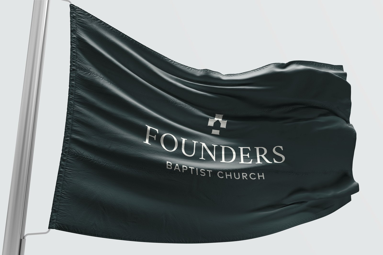
A serif wordmark with stencil details, and an icon that is a pulpit with a Bible resting on top. Stacked and horizontal lockups. Clearspace measured in the width of a P.
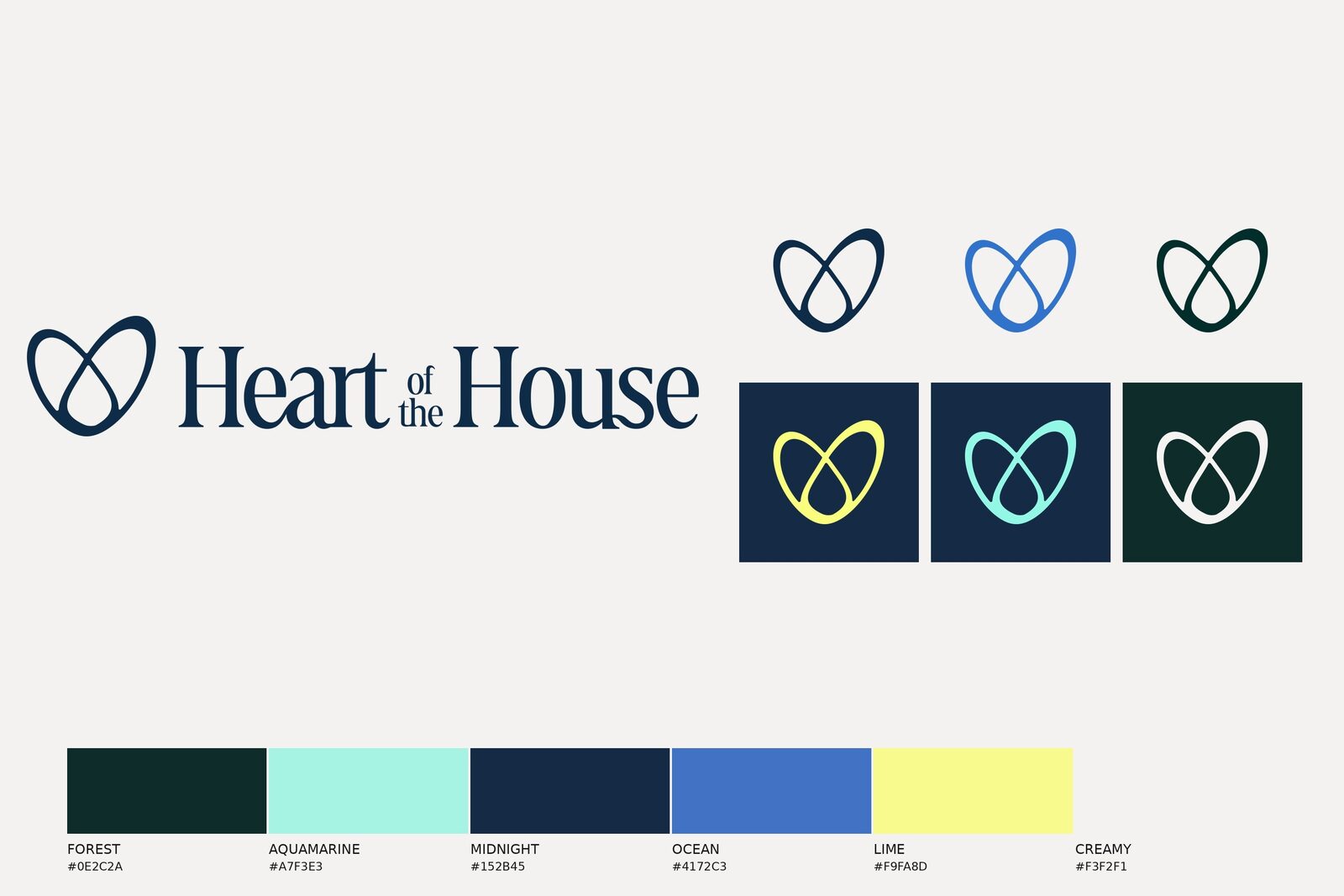
Deep green for the room, brass for the pulpit, beige for the page. Sage is the accent and stays the accent; the guide says so on page 5.
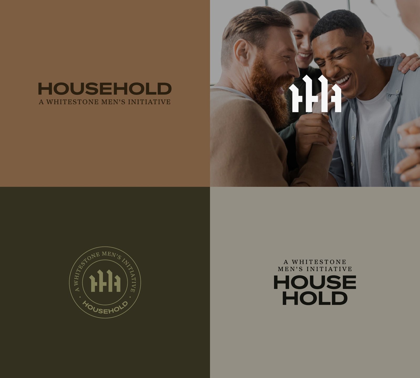
Every lockup in three colorways, the icon on each ground, and the four blocks the layouts are built from.
The pulpit is more like our identity and connotes our whole philosophy of ministry.
Sub-brand identity: pulpit icon, wordmark, stacked and horizontal lockups in three colorways.
Four-color palette; type system in Cormorant Garamond, Sweet Sans Pro, and Nimbus Sans; brand elements; photography direction.
Brand style guide, 36 pages. Logo formats in RGB, CMYK, and favicon.
Social outlets: Facebook, Instagram, X.